


Exploring the genetics between the football shirt and streetwear fashion, illustrator Josh Parkin has brought together several looks that work around specific international kits. No time like those moment between an international tournament and the next club season, it's an inspired series of designs.
Kits dominate a cultured game from the stands, what inspired you to put this down in an illustrative fashion?
"We kind of get a glimpse at how football and streetwear would merge, with many brands creating their own football shirts in recent years. I thought it’d be cool to take the mentality of someone interested in streetwear, to show how they’d match their shirt with the rest of their outfit. So colour matching, layering and accessorising to build a complete outfit was something I wanted to get across. That’s why, if you look closely, you’ll see shirts and socks matching/ keychains on belt loops/ patches sewn onto denim, as well as hats, lots of hats!"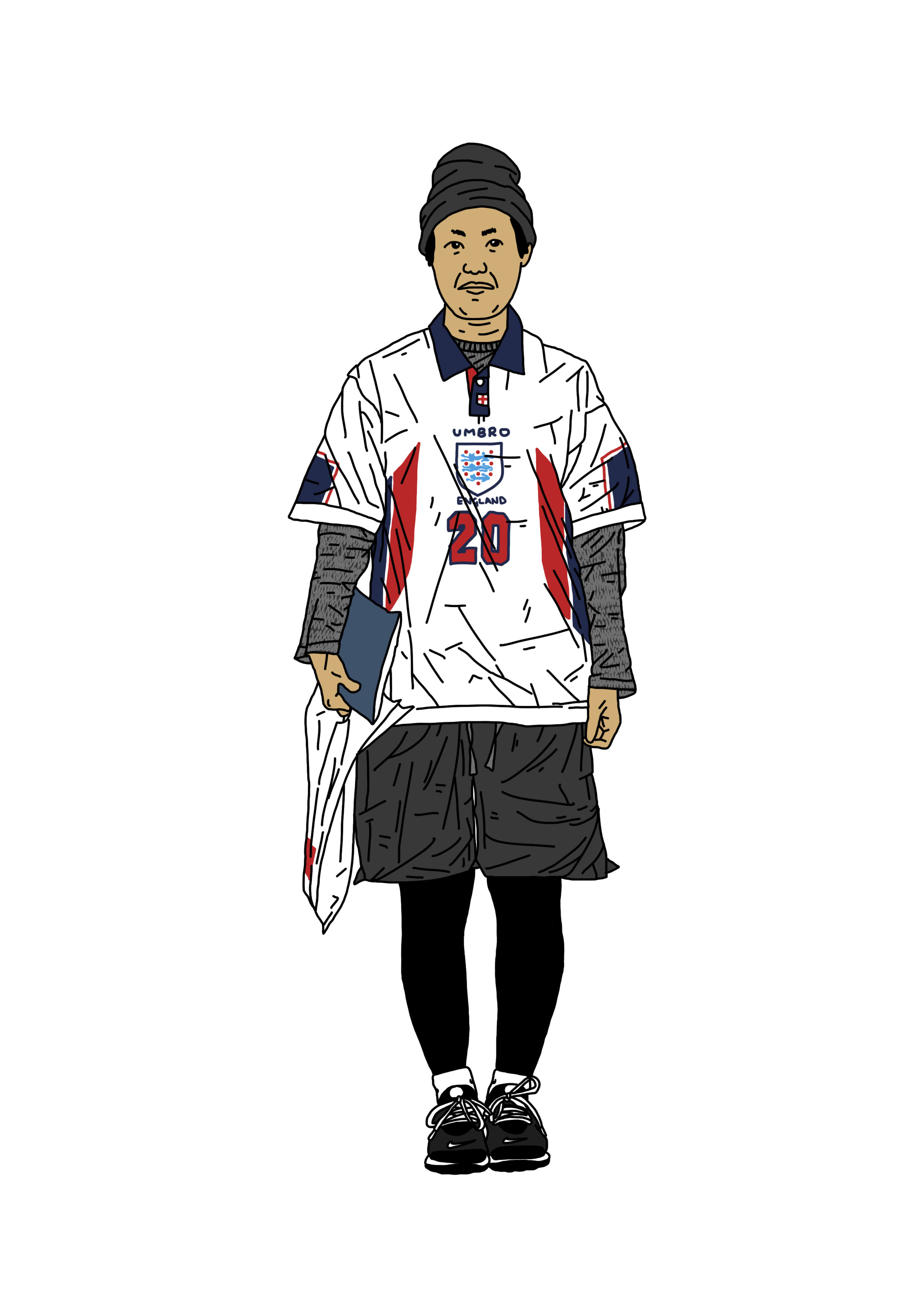
Of the kits you brought into play, why those ones - are they stand outs for you?
"Each kit for me has a memory. For example, the France and England ones worn in ’98 remind me of my first World Cup. Every fan remembers their first proper tournament, and for me 1998 was the one. That Owen goal! And then the Batty penalty miss. (Made far worse by me being a Leeds Utd fan.) I threw the Croatia kit in to mix it up a little. The classic checkered squares look great under the arms, as well as the Lotto script logo. Sweden was added to celebrate the Yellow army that seems to always brighten up any stadium/ tournament. The Portugal kit of 2004-ish was sick too, the one with the number inside a circle on the front. I don’t think anyone (to my knowledge) had really done that before, as well as sticking the swoosh near the shoulder. For me it shouldn’t work at all, but it does, for some strange reason."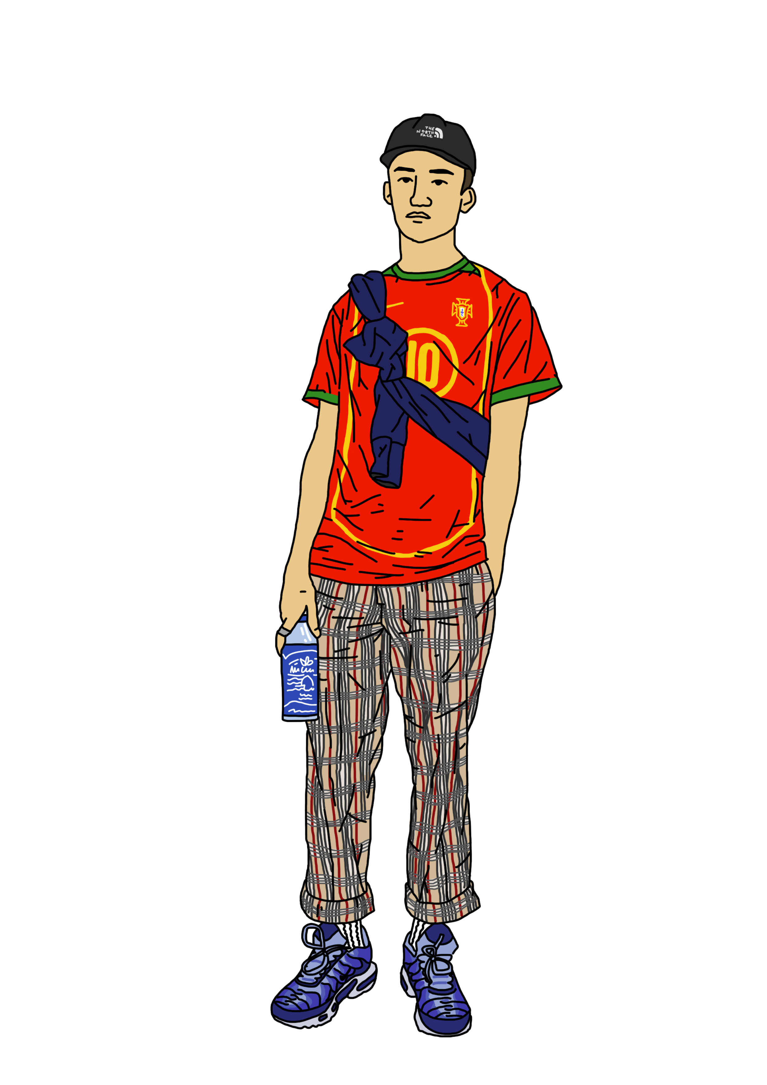
As for the clothing that accompanies the look, are you able to expand on the six looks you've put together?
"Yeah, that’s easy. The looks were inspired by an online community that I contribute to called The Basement. They recently launched a website to run along side their Facebook page, which provided me with a massive variation of people dressed in the types of clothing and footwear I wanted to illustrate. The key for me was to illustrate real life people, shot at natural locations. So many of the poses and looks are taken from various brand launches, open nights or season drops. I have to give a mention to Classic Football Shirts as well, their instagram feed made it incredibly tough to pick just 6 shirts. Their archive is unreal, and well worth a follow."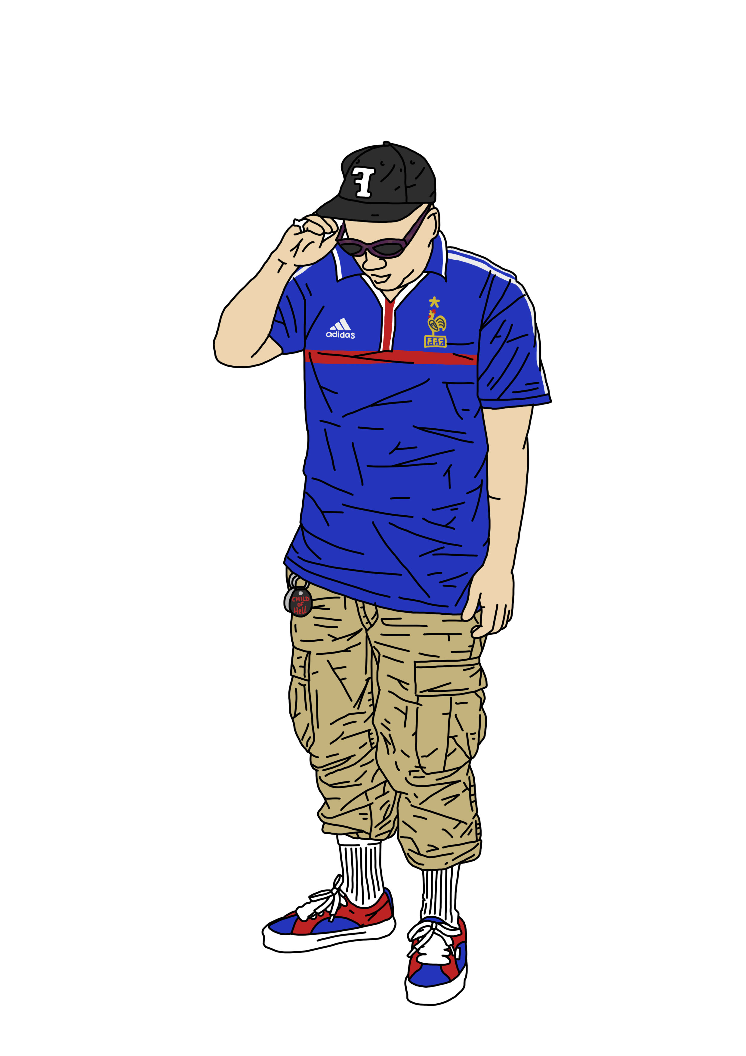
What's your take on the stylised side of the game, do you think it has ever been more on point?
"As an illustrator I love it. I follow loads of creative’s and agencies that revolve around sports. Merging the two together really excites me. The recent Palais Of Speed patch project that was created by I Love Dust/ the Germany Lego minifigures are all things you see as a creative and instantly become excited and inspired by. The build up to the tournament for me work wise was busy too, creating illustrations for the likes of yourself, Pog Mo Goal, Patterns of Play, Pickles and Mundial show how much the two industries compliment each other. My aim from the opening game was to try throw up something tournament related every few days. To illustrate a reaction to a player or moment that stood out to me. If you check my instagram feed you’ll see that, and see just how into the tournament I got! Haha."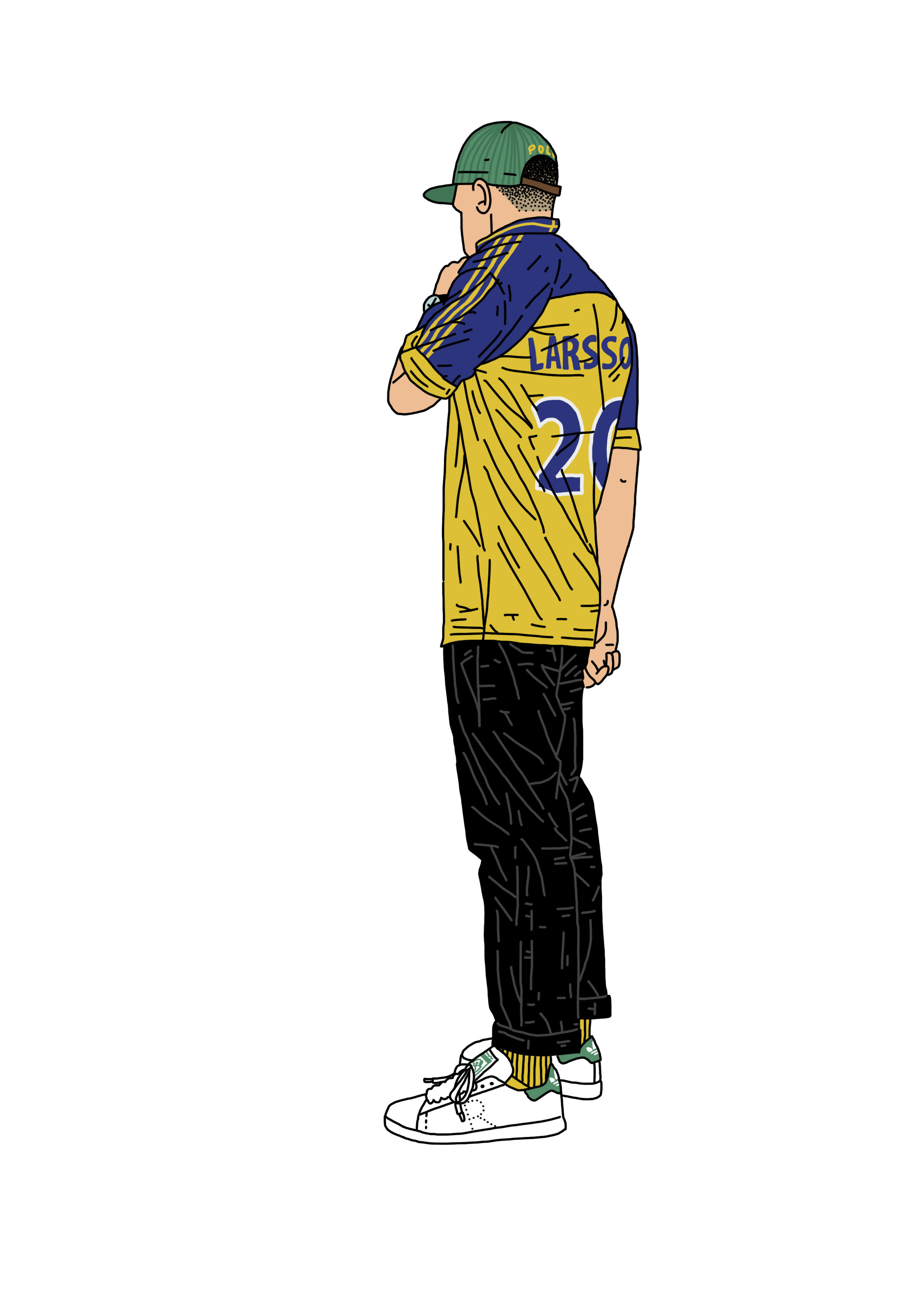
You can see more work from Josh Parkin, here.


