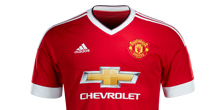
With the 2015/16 season impending and the Manchester United x adidas ship very much out of the dock our next look at the typography gracing football kits comes out of Old Trafford.
Designed by adidas for the towering brand that is Manchester United, it's an assertive collection of letters and numbers that matches the clean, contemporary take on a traditional kit. No inline here, the design is strong - symbolic of the might that the club holds in its grasp.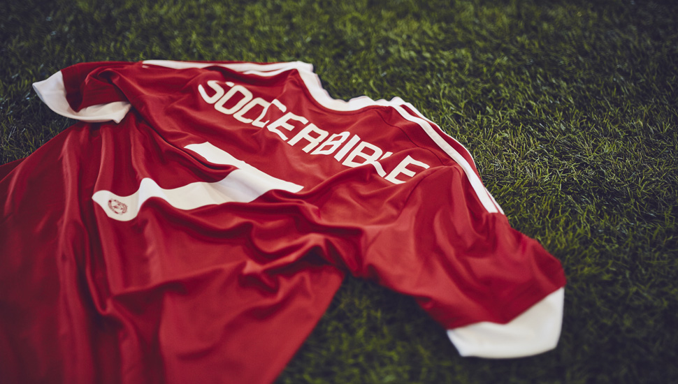
Worn in cup competitions including the Champions League should United make it through to the group stages it is efficient, tailored and potentially triumphant. Another sharp edge to the re-invigorated relationship between the club it's three striped chums. Offering a behind the scenes perspective, adidas Product Manager Oliver Nicklisch commented, "it is a bespoke design for the club, again inspired by the ’82 jersey number but now with letters/names of course. The name & numbering was and is very iconic and it actually helps to create a holistic look and feel to the kit and the re-united story. We worked on it closely with the club and they really do like the fact that every detail of the new home kit is authentic and delivers a holistic package."
Take a look at the 15/16 type used by Chelsea and Napoli - effective variation on show, for sure.