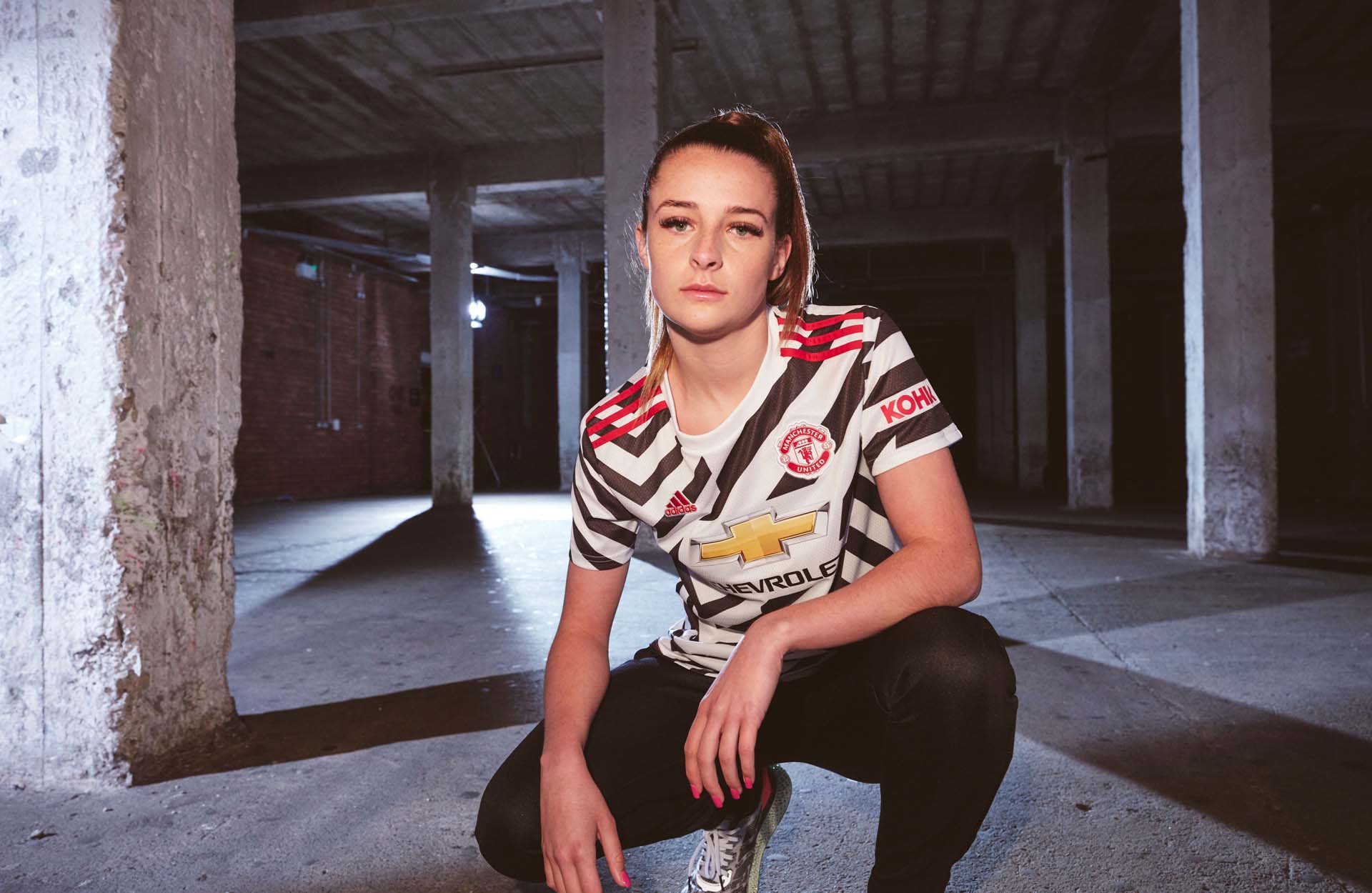
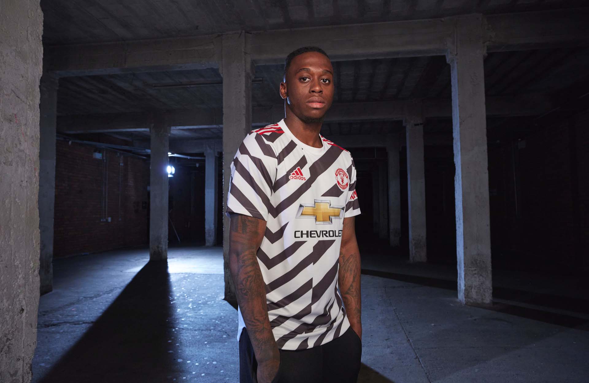
The Manchester United third shirt is certainly a wild design that has divided opinion. To find out more about the story and inspiration behind it, we spoke with adidas Global Product Manager Christiaan Barnard and Design Director Inigo Turner.
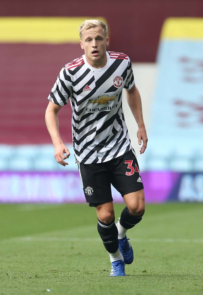
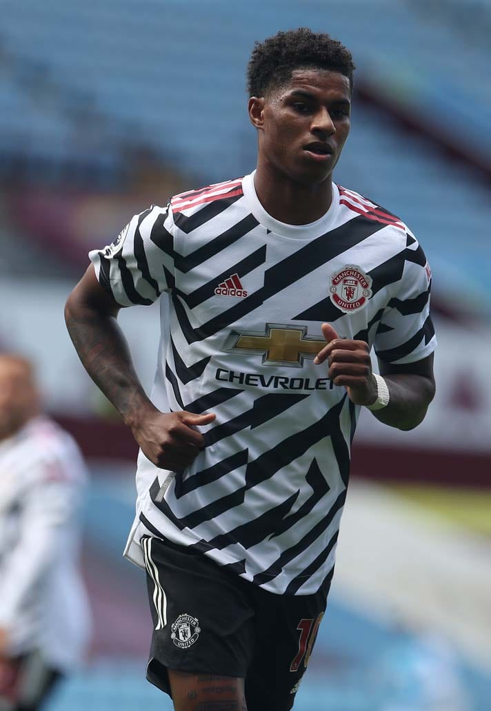
Anytime something radical hits the scene there will inevitably be kick back, and that’s been the case with Manchester United’s bold new third shirt from adidas. Debate raged in the SoccerBible office as to whether it should be included on our Top 20 Shirts for the 20/21 Season, ultimately earning its place on the basis of being a likely cult classic who’s appeal will grow in time. Sure enough, seeing it on the pitch in United’s recent preseason friendly – interestingly paired with black shorts in contradiction to reports that it would be white shorts – it instantly looked more appealing and certainly deserving of its place amongst the elite for the season.
Speaking to Christiaan Barnard and Inigo Turner, we found out more about the process behind this wild design.
So to start at the very top, if you could sum up the United 3rd shirt, what words would you use to describe it?
Inigo Turner: I would say it’s a bold, progressive and disruptive design leaning on authentic stories from the clubs history which have been re-interpreted for 2020 and a new generation of United fans.
Chritiaan Barnard: I would say it’s a “Modern Icon”. We wanted to create a modern icon with this kit as something people look back in the future.
It’s a bold statement of a design to say the least. What message to the football world would you say this kit sends?
IT: That was definitely discussed during the creation phase. We wanted to do something that would disrupt and which would lead. You have to take risks if you want to lead. There’s a lot of people out there doing a lot of different things right now and we definitely wanted to take a lead and make a bold statement and be iconic. To some extent we wanted to cut through the noise. We’re hopeful that this will achieve that.
CB: Both Manchester United and adidas are in the memory making business. Both have always stood out and wanted to be at the forefront of their respective industries. We worked very closely with the club and it was definitely an intention to do something completely different.
Paying homage to Old Trafford whilst dropping a radical kit, is it about taking a little look back but ultimately progressing forward?
IT: Yeah exactly. The anniversary of Manchester United playing their first season at Old Trafford was one thing that called out to us. That gave us a season to dig into and it was from there that we found this game where the club wore stripes at home, in that season. It was a blue and white striped shirt and we collectively thought it was a really interesting moment in time.
How that then became this finished design came from us trying to make it more progressive, more interesting and more modern. It was almost like taking that historic influence and applying our creative brains to something from that past and bringing it out into this shirt. We didn’t want to just do something that has been done before. We wanted to do something that had never been done before.
Across football in general, home kits can be a little safer, a little more in keeping with a club’s DNA but we’re definitely finding an acceptance around third kits where you can try and do more creative things"
How would you describe the Manchester United brand in today’s era – does this kit almost symbolise where the club wants to be as a brand?
IT: We work together with Manchester United as a partnership. We have a great relationship with the club. We both want to be leaders, we want to be the best and that philosophy is reflected in this kit. We change what we do season on season and I think this shows what we have built on over the past few seasons in creating a bold and progressive mindset. The idea is that we want to be leaders, the first to do things, we want to break new ground. That’s something we share with the club.
CB: This isn’t the first kit we’ve pushed the industry with. If you look back just a couple of years and we completely changed the logic behind the home kit. With the club, we produced a kit that was the first to have black shorts and socks that faded in. The club hadn’t done that with another brand before. Another example in that season was the pink kit. Clearly inspired by the local Manchester newspaper. That was another first for the club. Another season is last season's away kit. An almost savannah inspired colour which was completely new – the club never had something like this.
Fast forward to now and the new season and this becomes another example as to how we work well and closely together in moving things forward. The club has been a dream to work with in bringing new ideas to the table. It’s not been a case of us forcing ideas; the club has been great when it comes to bringing these stories to life.
IT: I think we’ve been taking those steps on the journey to push things forward. Looking back five years ago and paying homage to the relationship adidas and Manchester United previously had, that was the starting point. Since then however, it’s about growing that relationship and not just looking back but pushing forward. We want to create our own, new visual legacy for the club so that it’s not just those iconic shirts from the late 80s and early 90s that people look back on. We want to create new icons.
Going through the design process a little, the crossover with the art world, can you describe the journey with this kit and are third kits the ones where the design teams gets let off the leash somewhat?
IT: I think we approach all the kits, from all of the clubs fairly openly. It’s a little bit dependent on what’s going on in each of the club’s. I think now was the time to do something like this on the third for United. Having done a pretty bold Manchester United home kit in 2018 and a fairly loud Arsenal away shirt recently as two examples, they have changed perspectives and also shown the appetite for more abstract designs. They’ve moved us into a territory of creating new icons again – that’s what it’s all about for us.
Across football in general, home kits can be a little safer, a little more in keeping with a club’s DNA but we’re definitely finding an acceptance around third kits where you can try and do more creative things. We don’t start the season and say, home kits we’ll do this, third kits we’ll do that – it’s all born out of the creative process we go through with each club. It’s always quite a collaborative process between different departments on both our side and the respective club’s side. Looking at art as a starting point and inspiration for this season as a whole, it fits what we do in an organic way. I think it’s been an interesting season to design for.
What did the journey look like with this one? Was there a lot of back and forth with the club?
CB: The journey always starts early on for us. We went to Manchester for a cultural immersion trip and we came across all these cool visual cues but the story actually started before that. We posed the question “what can we do differently but still tie into the club’s heritage”. So we took all these visual cues that we had gathered to bring it all to life.
When Inigo and the design team were given all this research then presented back this design, it blew my mind right at the start. The club had seen the design very early on and bought into it instantly. There’s never been any shadow of a doubt that this was the shirt they wanted to go for.
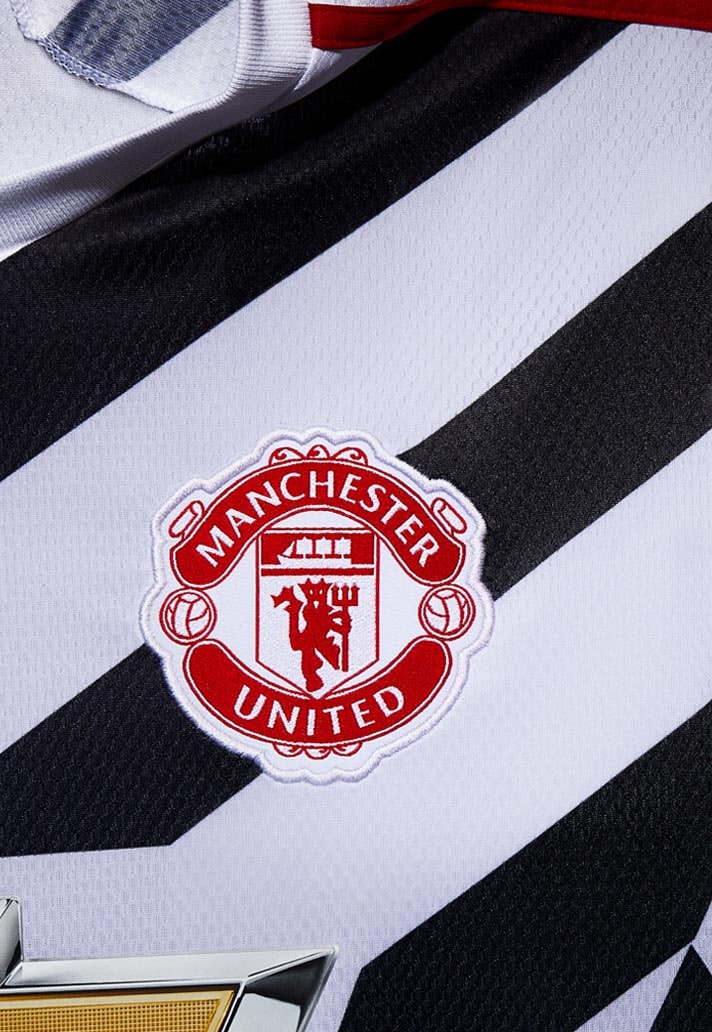
When you look at the detail of the shirt, it’s been designed with all parties in mind. The patterns around the sponsor, around the club badge and the adidas branding – it’s all bespoke to make sure all parties are accommodated. Creating a kit can be a long process but this one has been believed in for over a year. Everyone has just been so excited to get the kit out there. A new kit is an exciting time and we wanted to embrace that.
IT: We had this design from the start and we landed on it quickly. We went through a process in mapping out the story and then interpreting that into design but we got to this decision pretty quickly because there was a lot of love for it. Sometimes you see a shirt completely change halfway through the journey but this one pretty much stayed true from the moment it was born.
The club had seen the design very early on and bought into it instantly. There’s never been any shadow of a doubt that this was the shirt they wanted to go for"
It commands attention, it’ll turn heads when you walk into a room with it. Do you see it as a chance to break new ground and almost stick a finger up to the ordinary that’s out there?
IT: [laughs] I wouldn’t use those words but we definitely challenge conservative thinking. There’s a lot of people out there who are conservative thinkers. We want to do something that’s really progressive, that was the goal from the start. You don’t move things forward without challenging things, without challenging people and without challenging perceptions and we know a shirt like this would create a certain amount of online chat. That’s why it’s important to have these types of conversations because the story needs to be told. It’s not like we’ve thrown a random design out there because we want to do something wild. There’s a story and a process behind the kit. It’s not something that has been made up retrospectively and made to fit the kit release. This is the outcome of the creative process and the way designers have interpreted this story. At the same time, we’ve created something bold and provocative and we’re challenging conventional football shirts and conventional design. We’re really excited by this.
It feels in a good way, like you’re blocking out the noise of what other teams or brands are releasing. What about the trends that are in the football world right now and how have you brought them into consideration?
IT: I think two years ago, when we started this process, we were looking at trends in youth culture, or “creator culture” as adidas calls it. We looked at jersey customisation and that movement. You see individual people doing it and it’s really interesting. Our design team and the creative team here are no different to anyone else in the world in that we all use resources to pick up inspiration. How we interpret and translate that into design is the art.
Looking at this “do it yourself” design approach we were looking at the use of patterns and different techniques and enjoying how two things coming together can make something completely different. That’s informed our design process a lot. It was the almost clothes hacking approach that felt right here. Mashing up designs to create something new.
CB: Yeah hacking was very big for this though in a very literal way. Taking one shirt and then mashing it together with another. We looked at that as something that was happening in the creative football space so we saw that but then said, “ok, what can we do to take it a step further”. It was this customisation mentality that spoke further. Taking all those elements and putting them together to create something fresh.
Because we have to plan two years ahead of time, we have to push ourselves to not only create something bold in that point in time but something that breaks convention in the future. I think we’ve done that successfully.
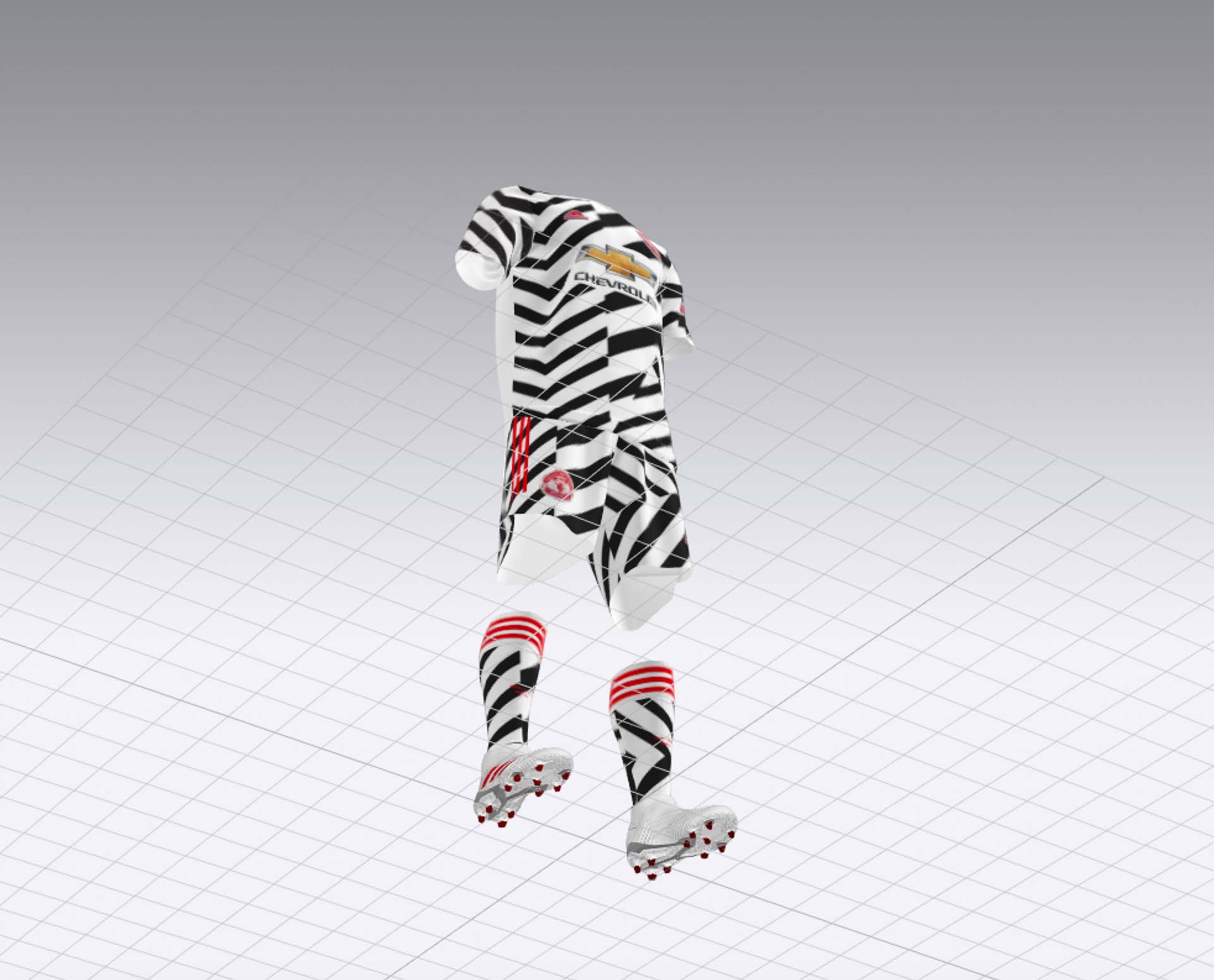
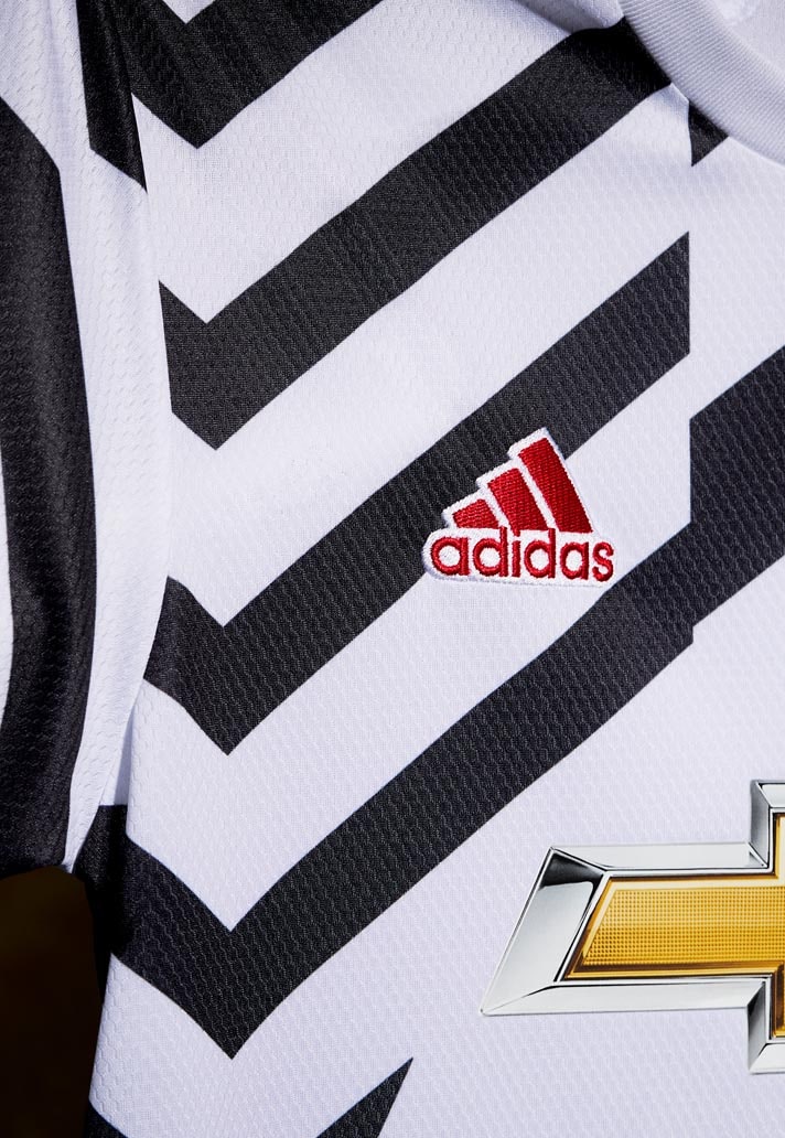
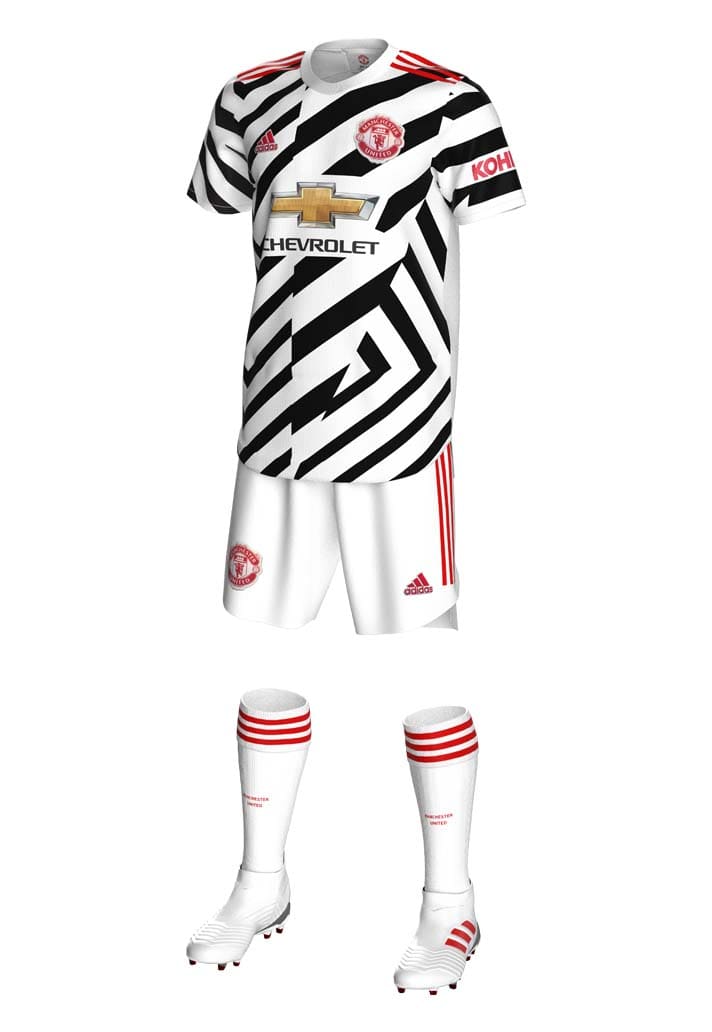
IT: We made this shirt black and white so that we made this surface into one entity. It brought it back to the clubs colour palette. The use of black, white and accents of red “United” the design so to say.

Pick up the Manchester United 20/21 third shirt at prodirectsoccer.com