Arriving with the claim that it’s “not for fashion fans”, VfL Wolfsburg and Nike unveil the club’s away shirt for the 20/21 season. And while we get what they’re meaning about not being for fashion fans, this is a mighty fine looking shirt in our humble opinion…
VfL Wolfsburg as a club are proud of the fact that nobody follows them purely because it is “the in thing”. They’re a club that revel in not being the most popular team, that thrive on the prejudice that’s thrown their way by rival fans. And that approach is pushed to the fore for the design of their 20/21 away shirt, which is unapologetic in its imposing look.
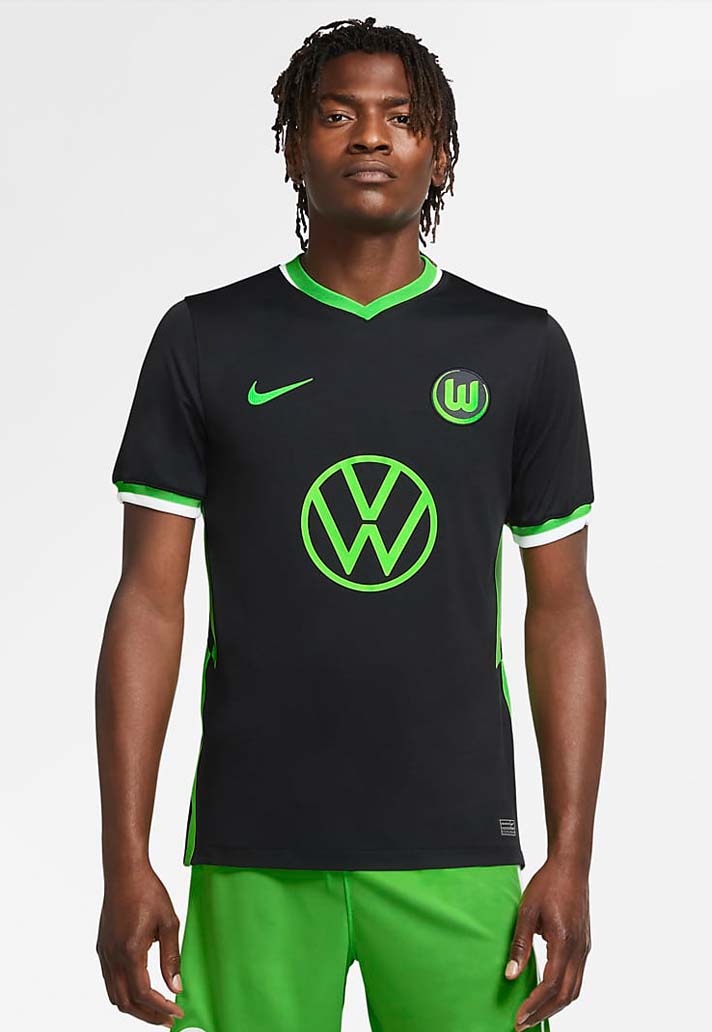
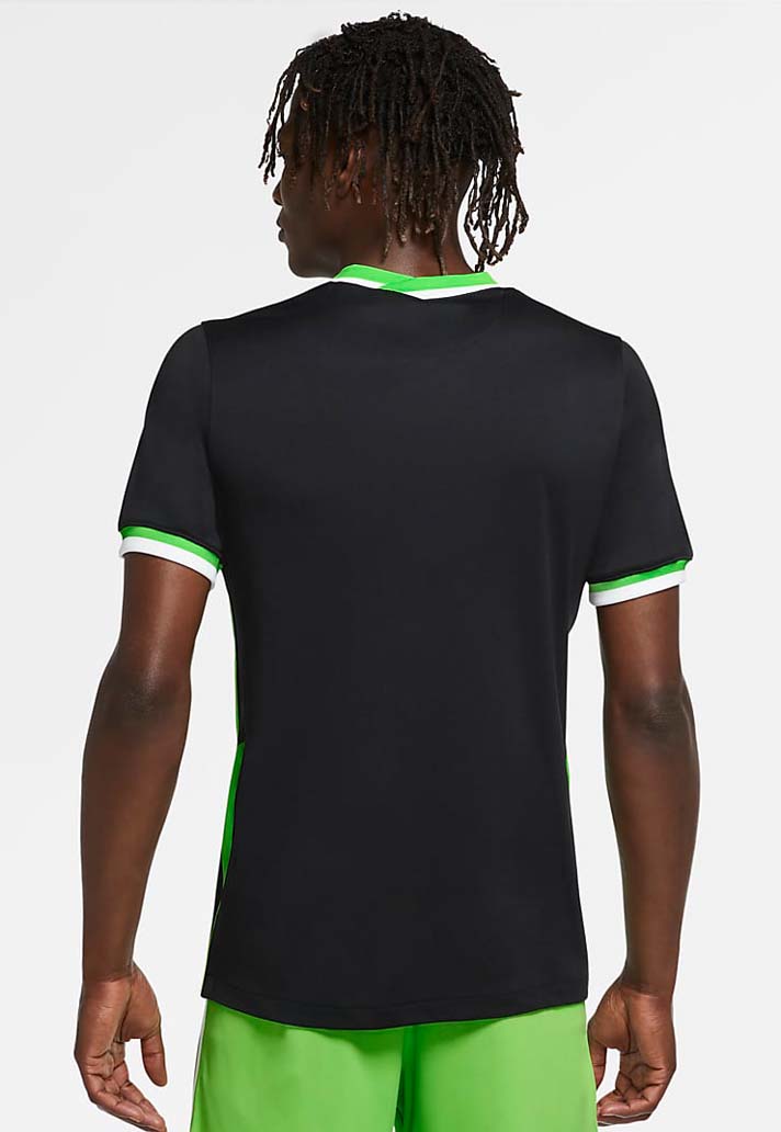
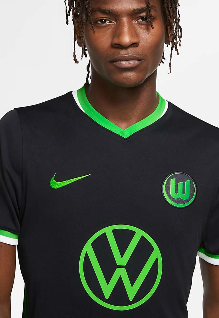
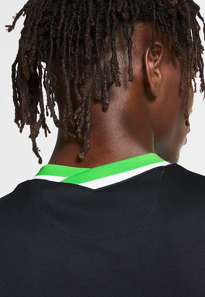
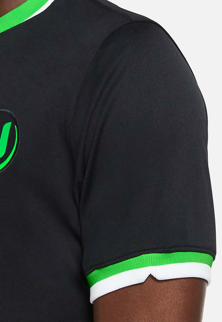
OK, so it’s a black shirt. Hardly going to put the shivers down opposition spines. And the irony of the design is that, while they say that it’s not for fashion fans, in actual fact, the clean, crisp look – accentuated by the club’s more familiar green and white featured on the arms, collar and the club logos, providing a stylish contrast to the darker overall colour, is actually right up there as one of the best of the 20/21 season so far.
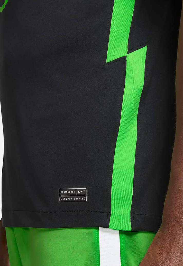
Interesting features include the collar, which features a fold over at the front and rear – one of the 65 chassis options available to Nike designers across varying necklines, sleeves, cuffs, badge placement etc. Will be interesting to see if that features anywhere else on Nike's upcoming shirts... The same zigzag pattern features down the sides, a feature that's been seen on a few Nike offerings already for the coming season, most recently on Bundesliga rivals, RB Leipzig's away shirt.
All round though, Wolfsburg aimed for intimidating with their away shirt and landed on impressive. Can't win 'em all.
Pick up the Wolfsburg 20/21 away shirt at prodirectsoccer.com