PSG celebrated their 50th anniversary in the most dramatic style last night, securing a place in the semi-final of the Champions League for the first time since 1995 with the latest of late comebacks against Atalanta. And to continue that celebration, we’re taking the opportunity to look back at the best kits from the club’s history.
Paris is one of the fashion capitals of the world, with style and culture at the heart of what the city represents. Paris Saint-Germain have taken influence from their home city, becoming trailblazers of the football fashion movement over recent years, with style both on and off the pitch a vital part of the club’s identity. But while that movement has only developed over the last half decade or so, the club have boasted some of the best kits in the game throughout their 50-year existence.
As classic as the shirt designs themselves are, they were often joined by the appearance of what are now timeless sponsors, together creating some truly iconic looks that encapsulate the eras that they were played in. With an honourable mention to some of the throwback fire from the 70s and 80s that have served as inspiration for future kits, our journey starts properly in the place where football shirt design became a thing unto its own; that glorious space where oversized, beautifully inconsistent, trippy patterns born from total freedom to create bespoke brilliance reigned supreme. Of course, we’re talking about the 90s…


1993/94 Home
A groundbreaking design saw a move away from the traditional look of the club in the early 90s, and it was joined with that classic Commodore Tourtel sponsor to create something completely unique. It achieved cult status on the likes of George Weah as the side went on to win the Division 1 championship in it.


1994/95 Home
This one was all about the collar; so brilliant that Nike brought it back for some of last season's third shirts. The vibrant royal blue and red look was made all the more iconic thanks to the fact the team found great success in it, winning the Coupe de France and Coupe de la Ligue double. The away shirt then swapped out the blue for white, creating a beautiful synergy across the pair.

1995/96 Home
The 95/96 season saw the introduction of the famous Opel sponsor, which became an intrinsic part of PSG shirts for most of the next decade. Another shirt made all the more iconic due to the team finding success on the pitch, this time in the Cup Winner's Cup, the design saw a clean and classic design for the Parisians.

1999/00 Third
Not many teams can pull off the glamour of a silver shirt. Barcelona are one, and PSG are certainly another. The Third shirt design was so good, especially with the likes of Jay-Jay Okocha and Nicholas Anelka in them, that it was promoted to the rank of away shirt for the following season.

2006/07 Home
The 2006/07 season saw the introduction of the fan favourite 'sponsor-less' look on the clean design that saw a narrower Hechter striper, but it also saw the beginning of the Fly Emirates partnership, and a new wave of PSG.


2009/10 Home and Away
This season saw a radical departure from the norm, with the introduction of more premium and intricate Parisian patterns in place of the traditional tones that had come before. The pinstripe elegance on the home was joined by a sublimated spotted design on the away. Two bespoke beauties that are often overlooked for their creative choices.

2011/12 Home
Taking a hefty dose of inspiration from the 90s, the central alignment of this design came in the season when Carlo Ancelotti took charge and the Qatari investment group began to splash their cash and brought the likes of Pastore and Thiago Motta in from Serie A in big money deals. But the way the red stripe was presented on a virtually black background, bordered by white, was not only a fresh take on the tradition of the club, it also gave off a basketball vibe, foretelling what was to come in the club's future...

2013/14 Home
New club crest, Ibrahimovic, Verratti, Cavani – the start of PSG as we know them today, boasting all that star power wrapped up in that sleek Tricolore design. Now let’s face it, we could pretty much include every kit the club had from this moment on, as PSG’s reputation as the kings of style continued to grow. But we had to remain selective…

2014/15 Home
Such a clean design, as the beloved Hechter stripe was reigned in to a simple red and white on that dark navy base. On the pitch, PSG were still trying to find that magic formula in Europe, but domestic success was now well and truly secured, with the club capturing a domestic treble.

2015/16 Third
One of the designs that kicked off the third shirt revolution, the 'Dark Light' shirt broke the game and changed the priorities of shirts as we know them. The visually powerful vibe infused the City of Light (La Ville Lumière) with a distinct, dark aesthetic, while detailing on the torso, sleeves and lower back accentuated the players’ powerful presence. Finished with a modern take on the club’s famed crest – reimagined in black, white and grey. Revolutionary.

2016/17 Third
After the belter that was the 'Dark Light' shirt from the season before, Nike released yet another piece of tailored beauty from Parisian quarters. This time they went the other way, with the premium white infused with platinum threads that were designed to shine under the stadium light. The design was finished with both the club crest and Nike swoosh in an iridescent finish. A delicious kit that set a new standard.

2017/18 Third
Inspired by Paris architectural icons, the 17/18 third once again went back to the familiar space of dark delight, one that kicked off a trend in black kit designs across Europe. Featuring a tonal dazzle camo design in shades of black and with Neymar now on board the PSG ship to model it, it was a shirt that further established the club as the boss of modern fashionable football.

2018/19 Home
Taking some inspiration from the electric atmosphere of the Parc des Princes, Nike reinvented the Hechter stripe, running PSG’s famed vertical red stripe through a speed filter and thus creating a visual effect similar to a sound wave. Honouring the tradition of the club while also being fresh and progressive; this design is what the Swoosh is all about.

2018/19 Fourth
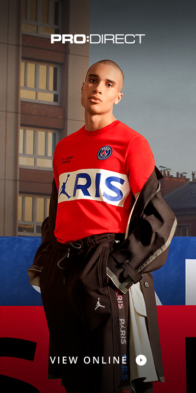
A fourth kit? That's pushing the realms of necessity a bit, isn't it? Yeah, but when it's this good, who's gonna complain? This season was era-defining, kicking off the club's partnership with Jordan brand. A collab like no other, this was PSG setting the benchmark, re-writing the rule books on branding, and sliding fashionably into alternative markets. Magnifique.

2019/20 Away
12 months on from the debut Jordan third kit and fourth kits, the club returned with more hyped-up fire for the new season by unveiling the famous Jumpman logo on their statement 2019/20 away kit. The Jordan Brand influence on the design ran deep: the kit was flooded in the iconic infrared shade first introduced on the Air Jordan VI back in 1991, and this resulted in the blistering away look.

2019/20 Third
Arriving as part of Nike's retro revival for their third kits, the 19/20 third shirt was an almost exact replica of the club’s classic kit crafted in 1989. But the shirt's special feels didn't just stop there. Alongside the return of the Nike Futura logo, a jacquard pattern rose from the fabric, taking the form of diagonal stripes with the word "Paris" subtly incorporated into the design. This was layered perfection, and with PSG getting past Atalanta in it in the Champions League last night, it could take on a whole lot more meaning for fans. Just the semis and final to go...
Your favourite not in there? Sound off on social, we can take it...