
With the 20/21 Premier League season set to commence this weekend, we’ve picked out our top 20 shirts. Home, away, third – they all count, and it’s based on our very scientific algorithm of whether we liked them or not.
Shirt design is in a very interesting place right now, with brands starting to be increasingly more adventurous with their offerings. But for every Arsenal away shirt, there’s a West Brom away. It’s a fine line between hit and miss, and as a result, some brand and team combos are erring on the side of caution, instead providing safe, clean designs. Either way, it has given us some interesting shirts to sift through as we select our top 20 ahead of the big kick off. Obviously going to court controversy, but the tin hat is firmly on and we’re ready for the inevitable barrage of insults telling us how wrong we got it. So here goes…
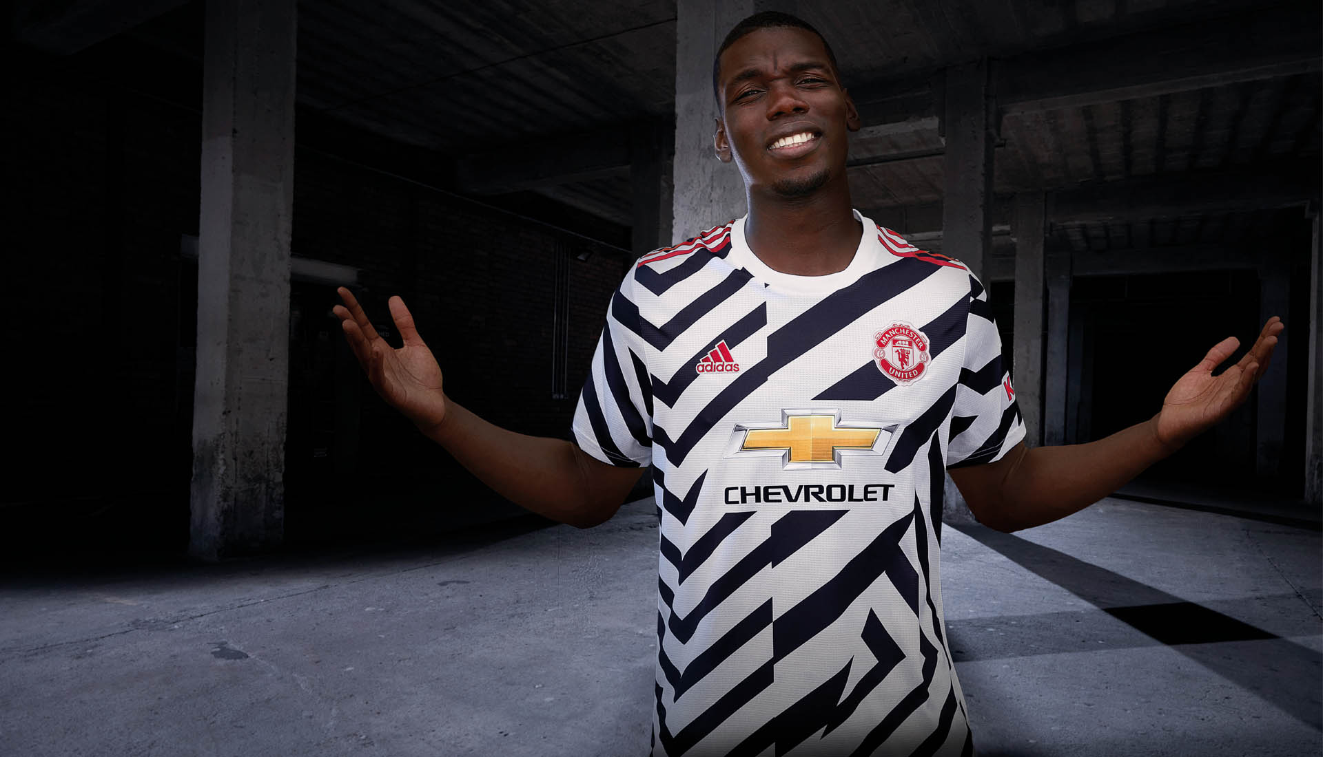
20) Manchester United Third
Starting with a controversial one. Is the Man United third shirt a stroke of genius, or a bit shite? Public opinion is certainly divided on it, but it takes its position on the list, scraping in by virtue of the fact that you know that it will be a collectors dream down the line.
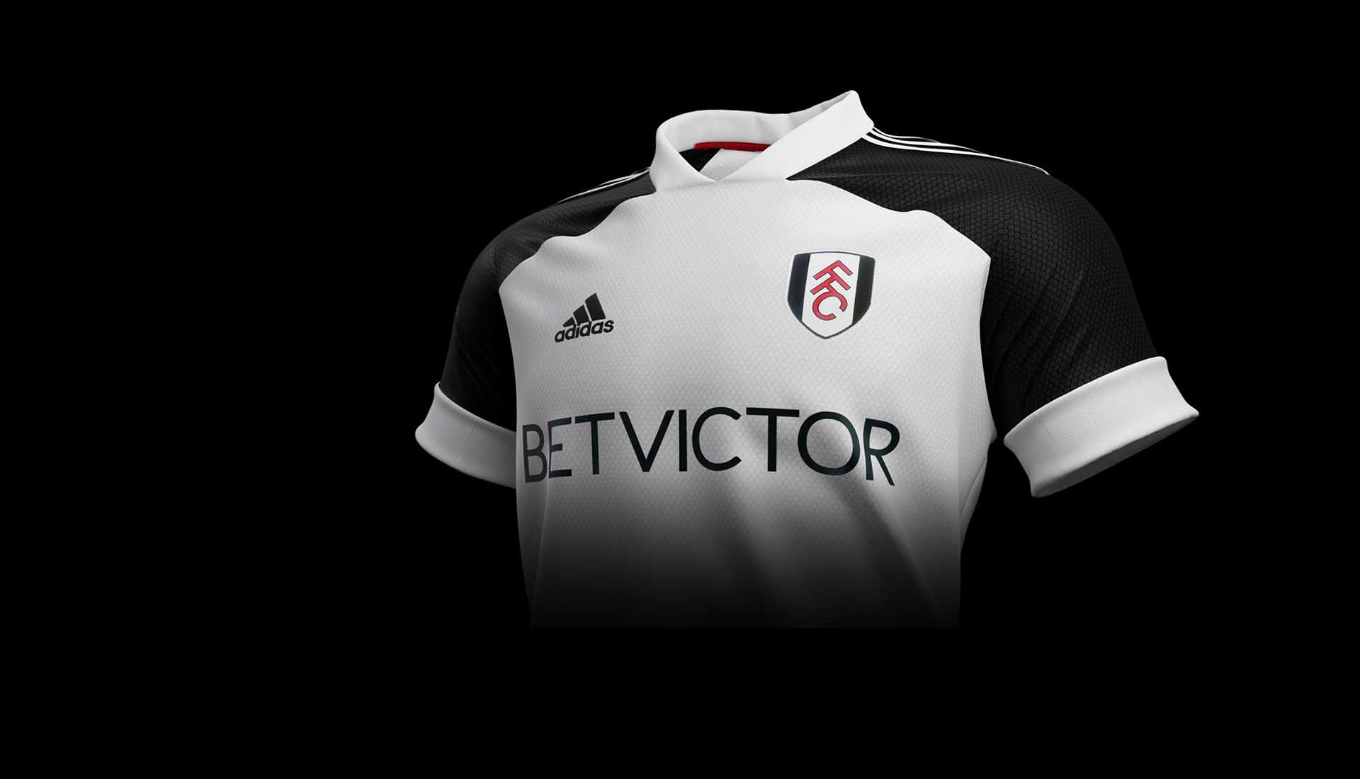
19) Fulham Home
Taking full advantage of the fact that the club colours are black and white, the Fulham home shirt is not quite a monochrome masterpiece, but it is a nice, tidy effort. Good to have you back in the Prem, Fulham.

18) Brighton Home
At first we weren't convinced by the Brighton home shirt. But then the throwback vibe, that white collar and pinstripe combo... it just won us over. Little fleck of gold down the side and on the Swoosh for added flamboyancy. Yeah, solid top 20 material.
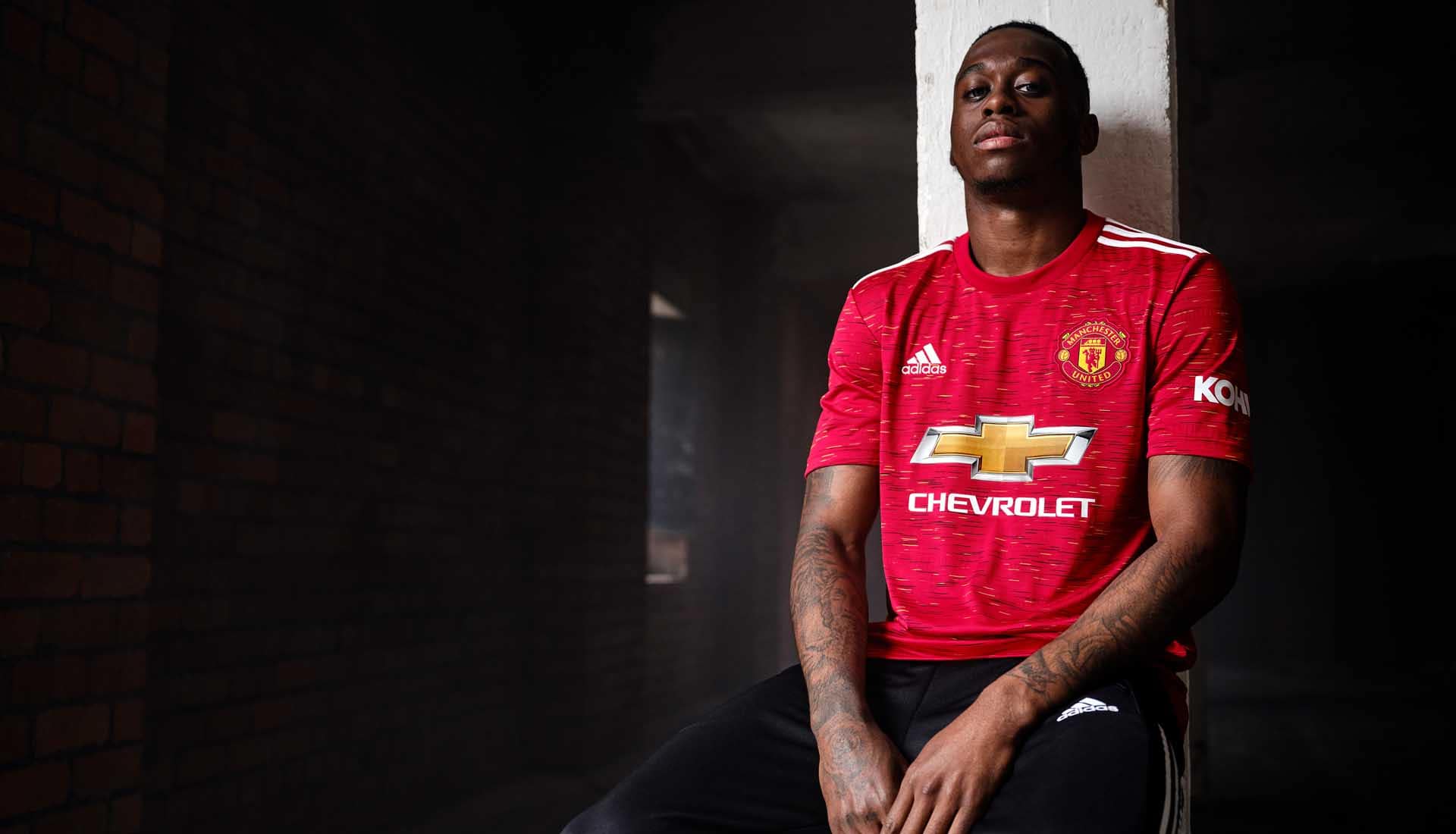
17) Manchester United Home
The story behind the United home shirt gives it a nice added dimension, with the design drawing influence from the club crest. The name of the club is also engineered into the print, visible through the use of different red tones. Nice touch and the type of preferential treatment that often sets the so-called bigger clubs' shirts apart. Would probably have ranked higher if it didn't also remind us of a bus seat.
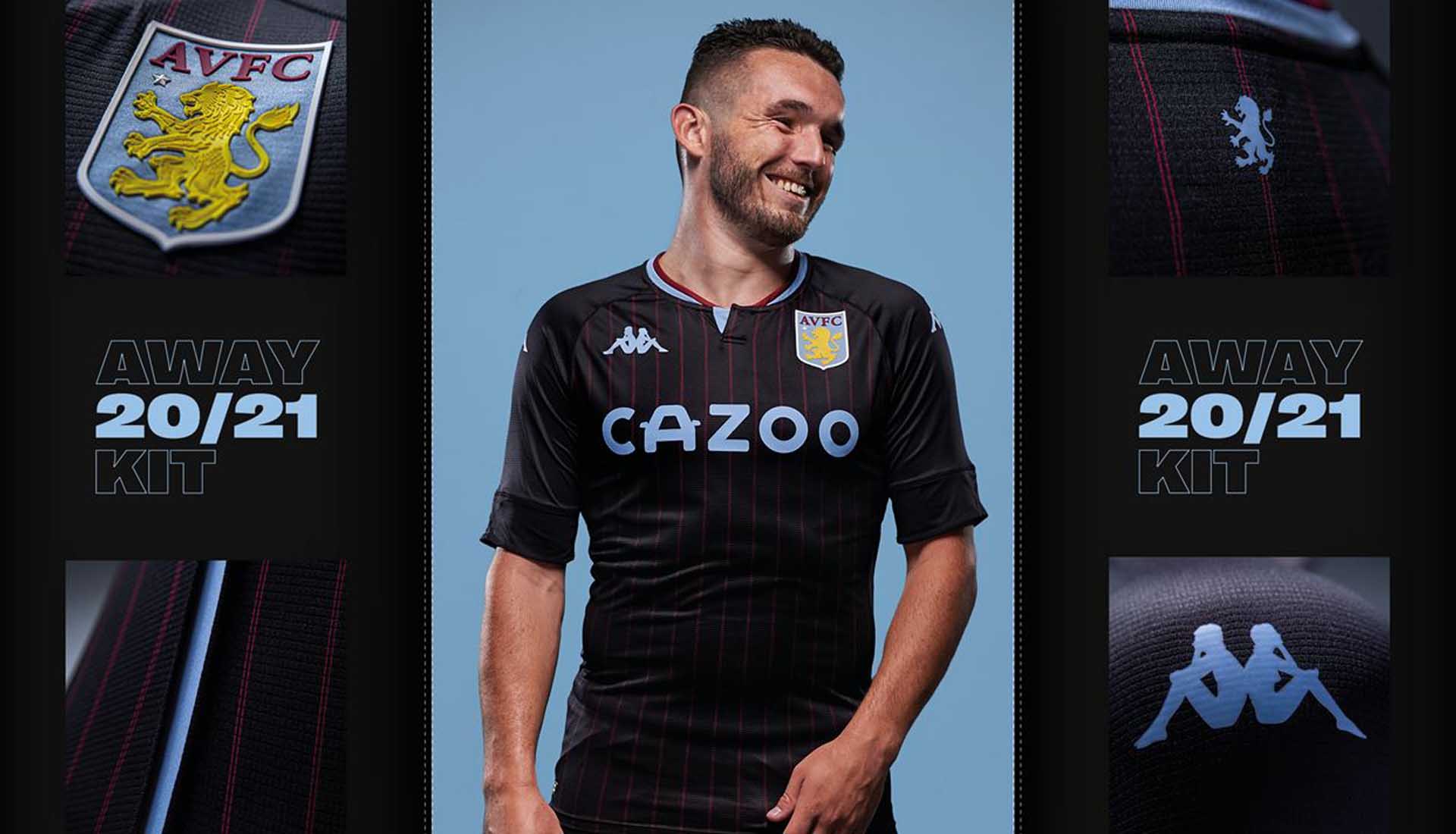
16) Aston Villa Away
Nice collar, and the blue accents hit the right notes, but let's face it, it's all about the claret pinstripes here. Nice upgrade on the home shirt, which itself was a nice offering from Kappa, and unfortunate not to sneak onto the list.
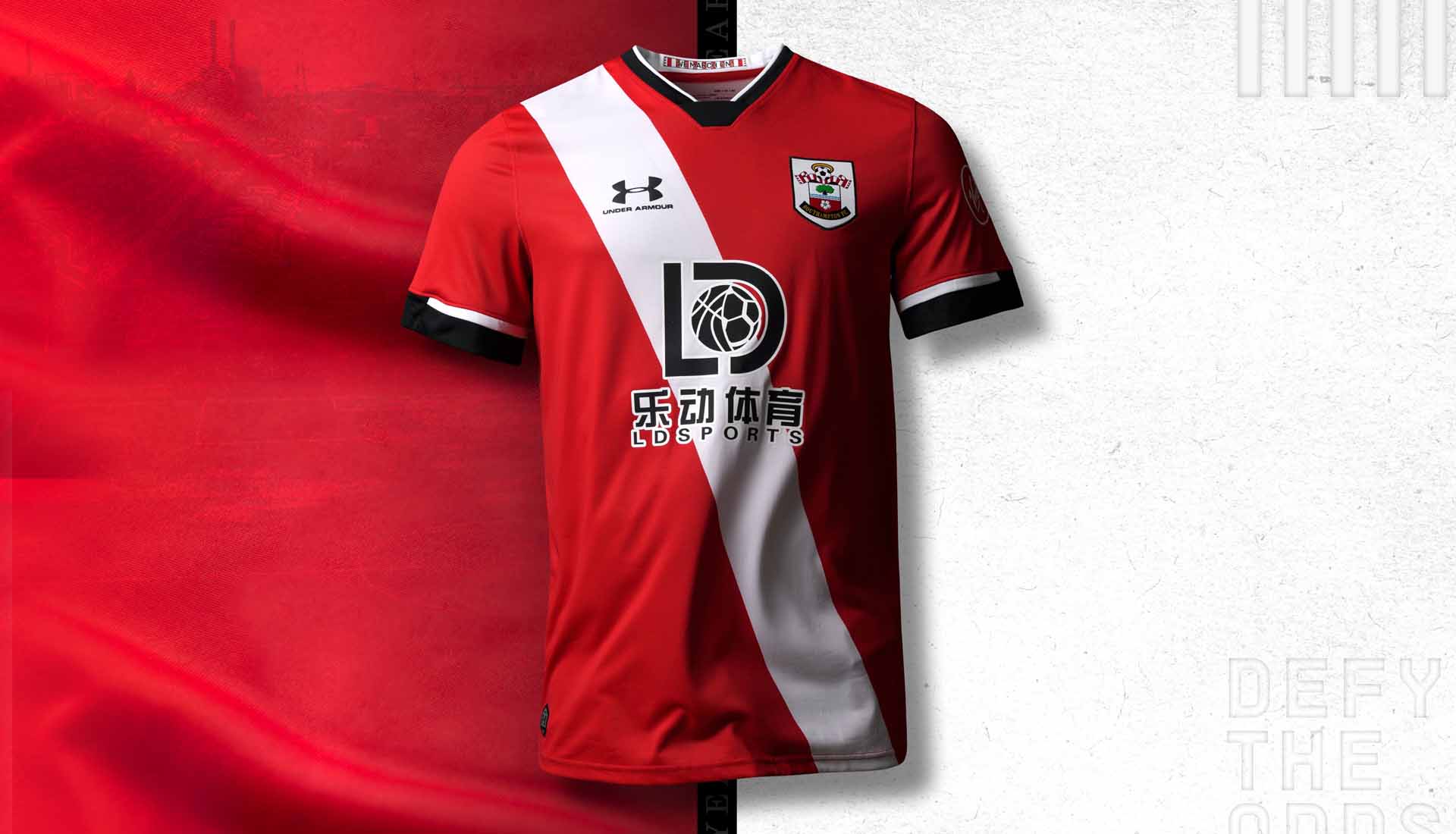
15) Southampton Home
A massive improvement from last season, we could just as easily have included the third shirt, with the inverted colourway. But we opted for the home on the basis of the sponsor not being quite as ugly, a recurring theme that holds certain designs back. Always got time for a sash though – never enough of 'em in the Prem.
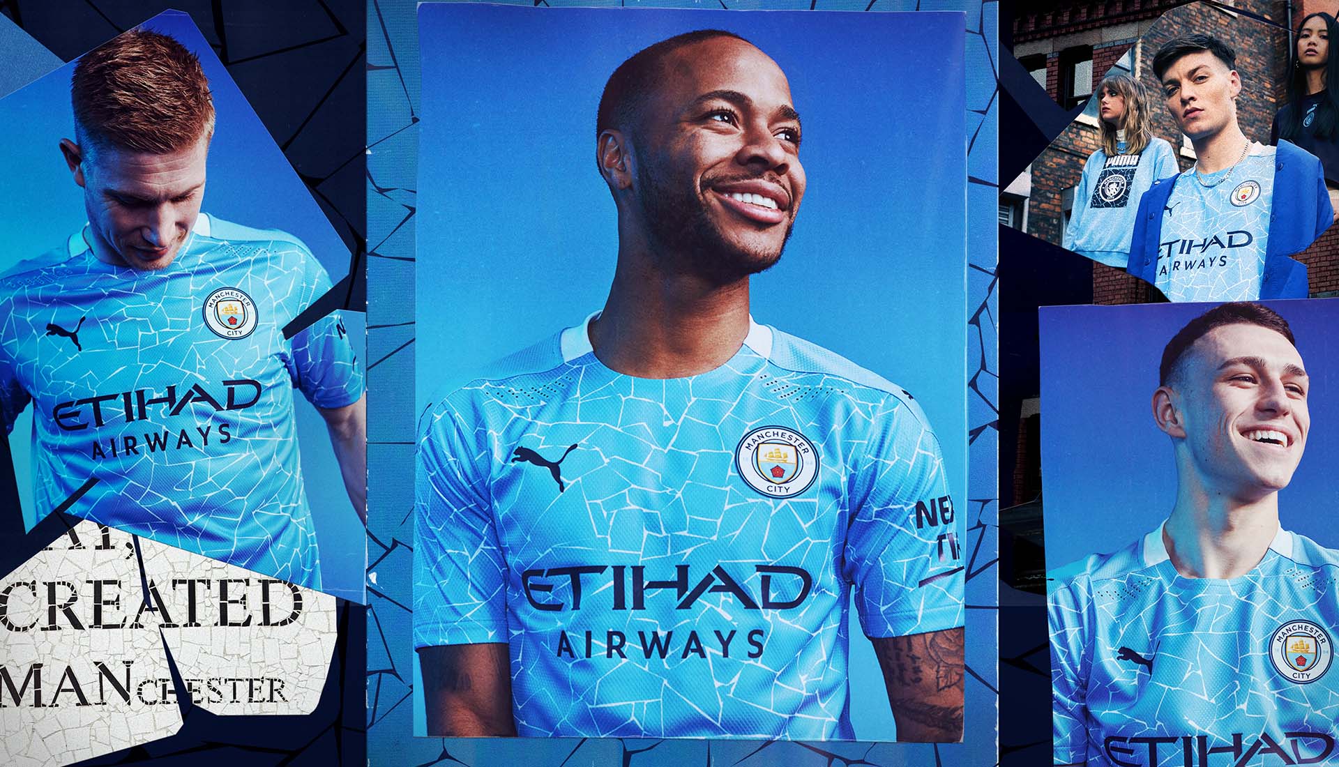
14) Manchester City Home
Despite numerous comparisons with a swimming pool, the design of the Man City home shirt is actually quite decent. The unique graphic has a strong link to the city itself, the only draw back being that it can't really be seen from a distance.
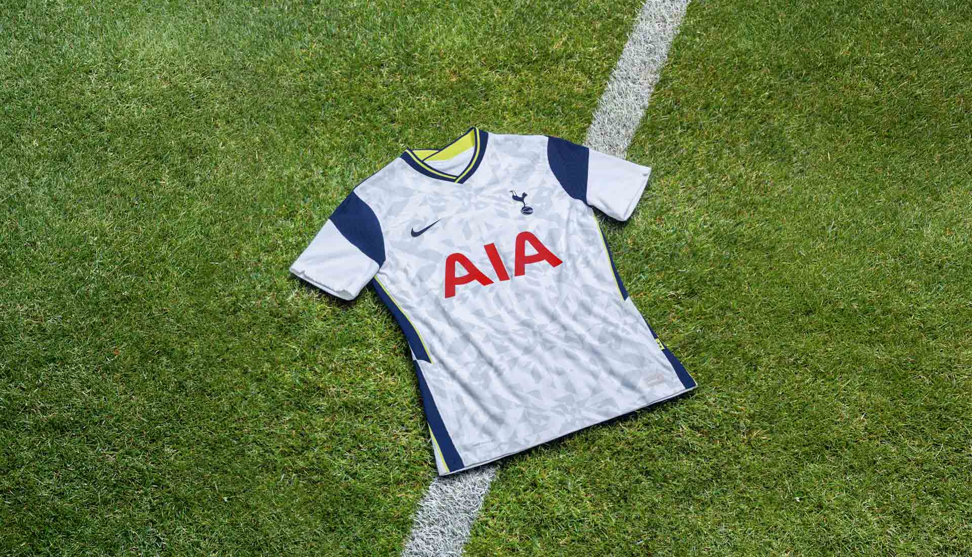
13) Tottenham Hotspur home
Giving it a nice differential from previous shirts, the Spurs home shirt features a bespoke knit pattern made up of graphics from old jerseys, while blocks of blue cover the shoulders and frame the pattern, and a yellow pinstripe lights up a dark V-neck collar. Certainly the best of what has otherwise been a bit of a bland offering for the North Londoners.
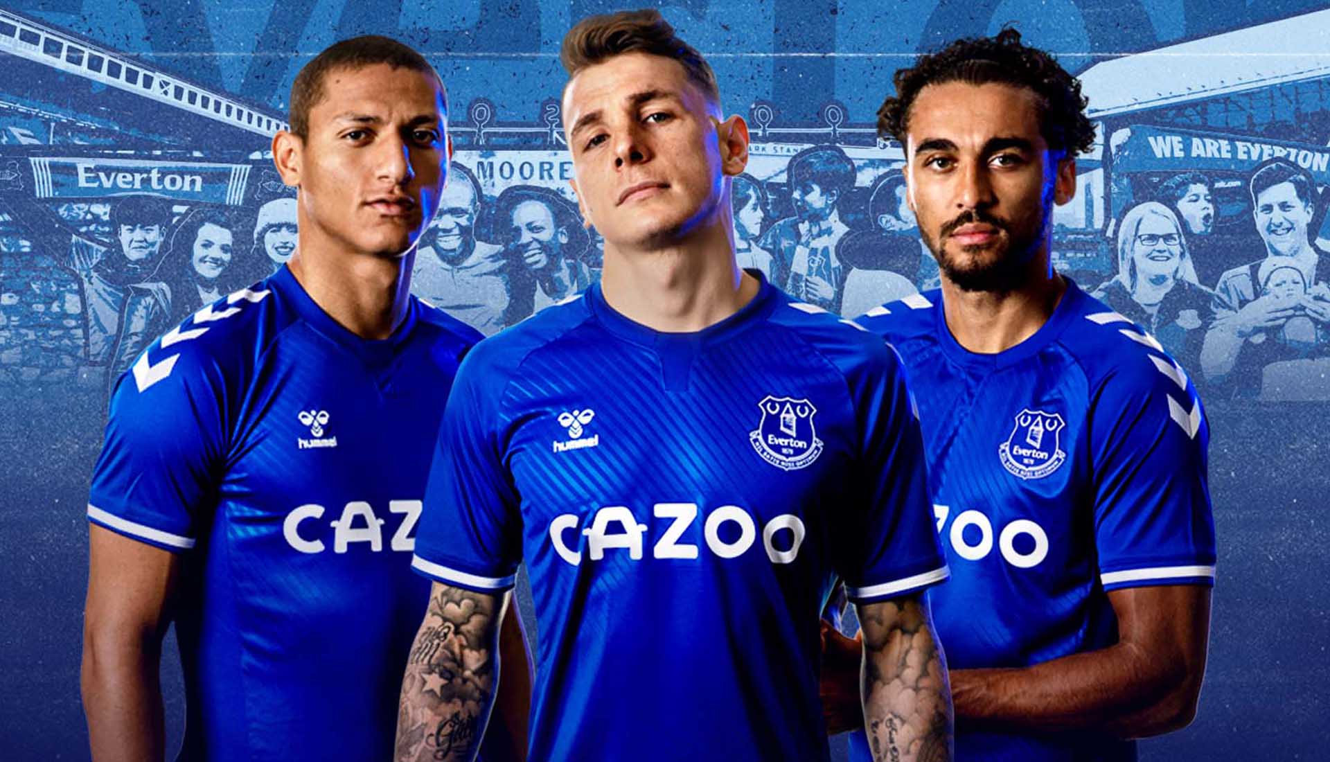
12) Everton Home
Great to have Hummel back in the Premier League, and for their first home kit with Everton they have produced a shirt that pays tribute to the Club’s iconic Z-Cars anthem with an image of the song’s soundbar expanded and embossed diagonally across the shirt. Slickly and finished with white details, this is a great start to the Toffees' new partnership.
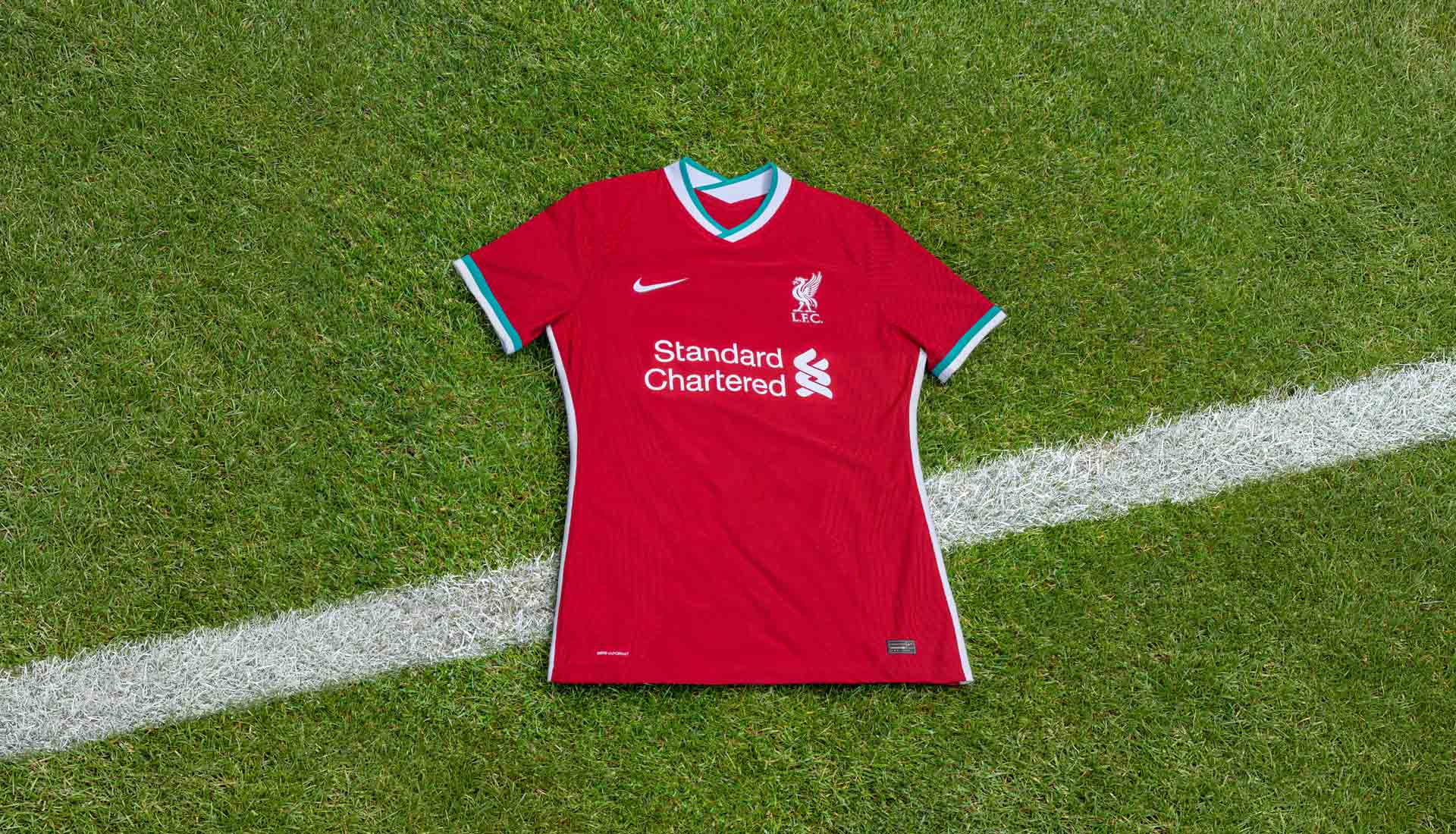
11) Liverpool Home
Kicking off the much anticipated partnership between Nike and Liverpool, this home shirt saw the reintroduction of teal into the design, something not seen since the early 90s and enough to give the shirt a unique feel from what’s come before.
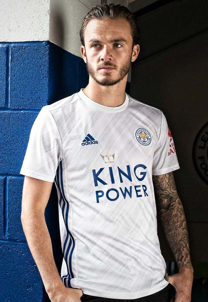
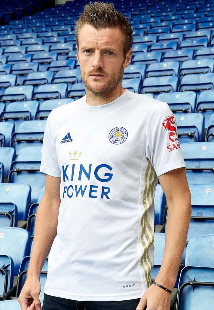
10) Leicester City Away
And starting the top 10 off we have this belter for Leicester. The real highlight is the contrasting Three Stripes running down each side – blue on the right and gold on the left. They finish off what is a clean white design with a smart sublimated graphic featuring through the body, lending it a greater depth. Just look at the shirt, not into Vardy's convict-esque eyes...
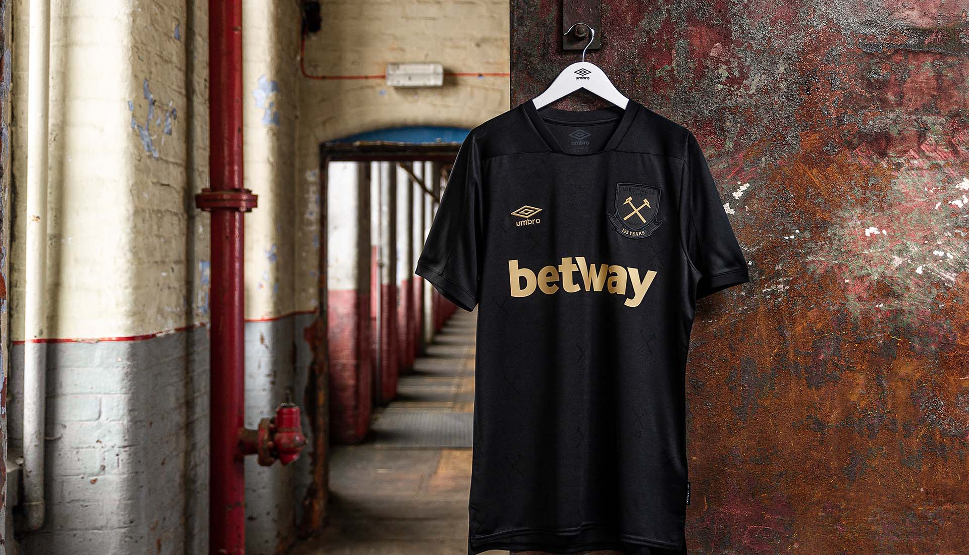
9) West Ham United Third
Were it not for the garishly oversized nature of the ‘betway’ sponsor on the away shirt, that would have made this list. On the third, the gold execution spares its garishness, however, it probably cost it a couple of positions. There's a number of black and gold shirts out there this season, but this is the only one in the Premier League.

8) Arsenal Home
Continuing where they left off last season, adidas nail the Arsenal home shirt once again, introducing a chevron pattern through the body that pays homage to Arsenal’s geometric crest which the club used from 1936 – 1949. And there's better to come from the Three Stripes and Gunners...
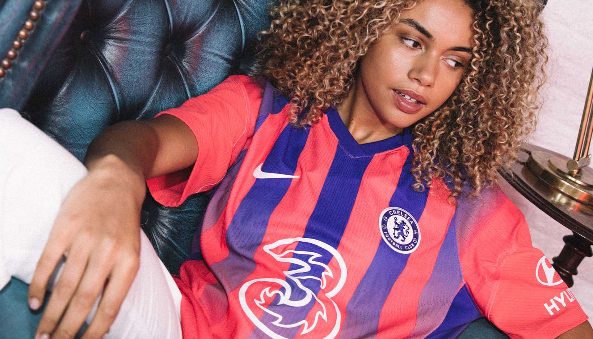
7) Chelsea Third
'Kensington Palace' this one’s been referred to as, and while the Eagles may well feel a tad aggrieved at Chelsea getting a far better Crystal Palace home shirt as their third than they have, it does not diminish the fact that this is a nice design, worthy of a top 10 spot.
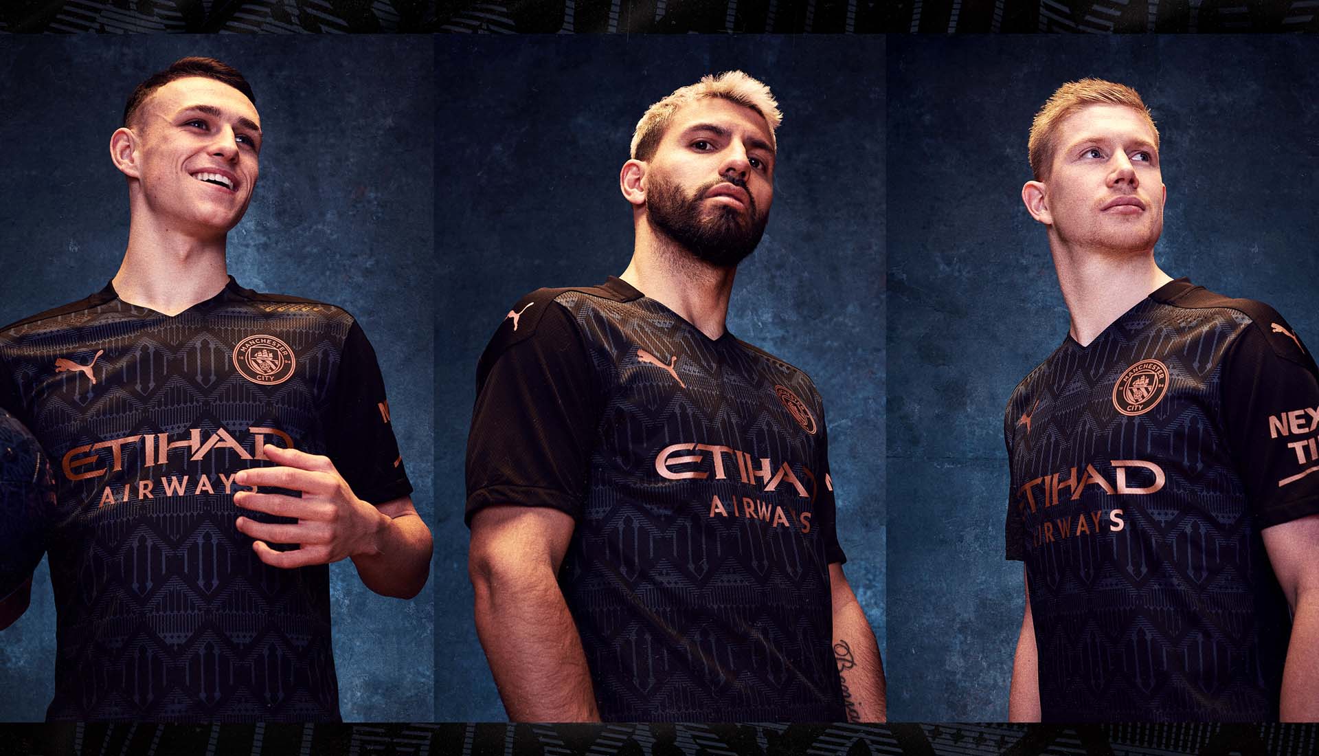
6) Man City Away
Copper on black where West Ham had gold (we thought we'd get in and say that before anyone else does), PUMA then add another level of class, with a graphic that pays tribute to the city’s historic Castleford and Bridgewater canal. Bespoke black beauty, this.
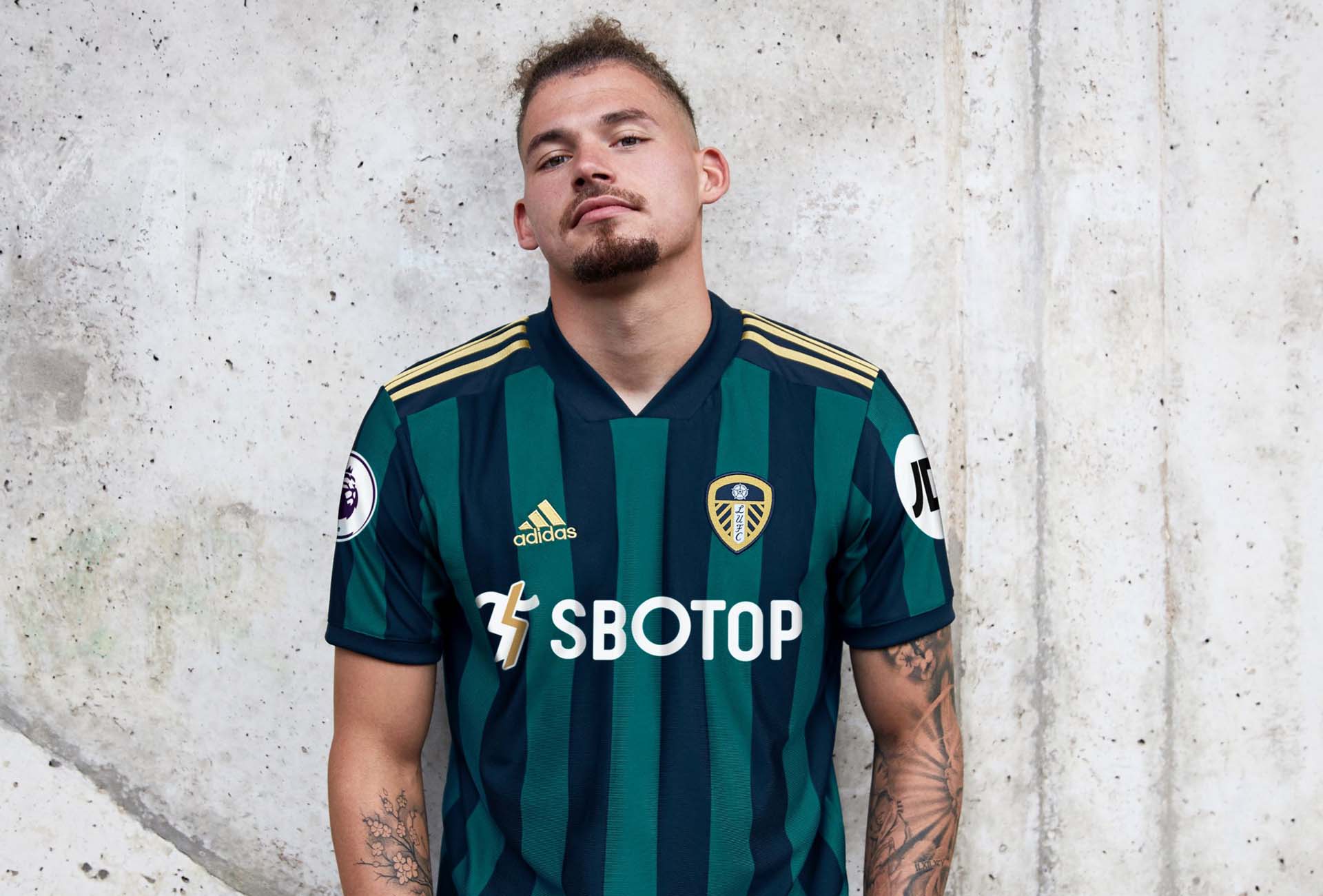
5) Leeds United Away
While adidas played things safe with a clean design for their first Leeds home shirt, their second became a something more experimental. Combining green and navy stripes with the contrasting yellow Three Stripes on the shoulders, this sits on the right side of hipster, just gaudy enough to be a cult classic. Leeds are back with a bang.
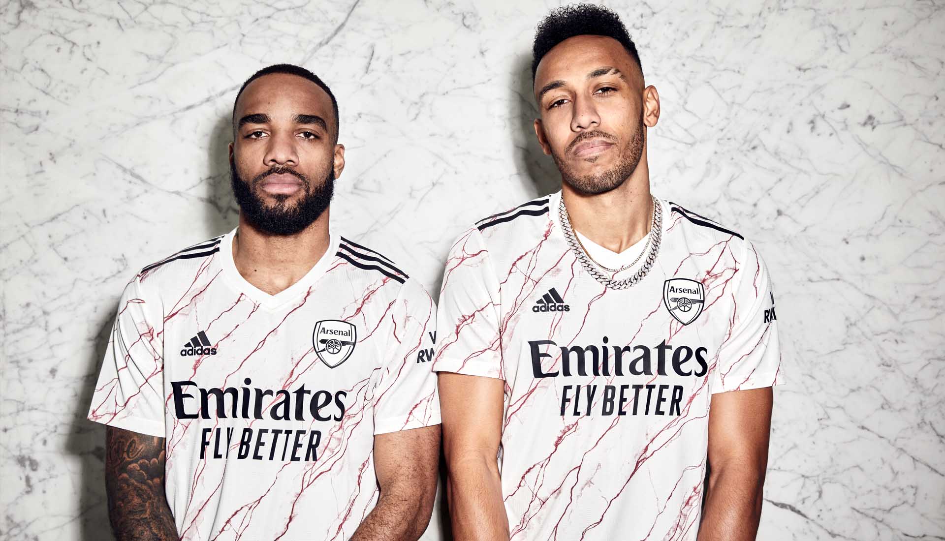
4) Arsenal Away
Following up last season's universally appreciated 'bruised banana' revamp was always going to be a tall order. And so adidas looked once more at the club’s rich heritage with a design that drew inspiration from the patterns, colours, and motifs found amongst the iconic East Stand of Highbury and its prestigious marble halls. Bloody beautiful.
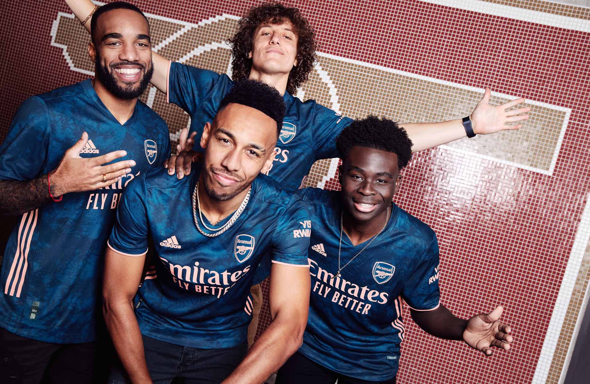
3) Arsenal Third
Completing a quick-fire one-two, we have the final shirt in the Arsenal repertoire, giving the Gunners a top 10 sweep for the season and the award for best dressed all round. Here it's all about the colour combo, which sees the "Flash Orange" details popping on the deep blue base. Another that can walk off the pitch into any setting and still retain that level of class.
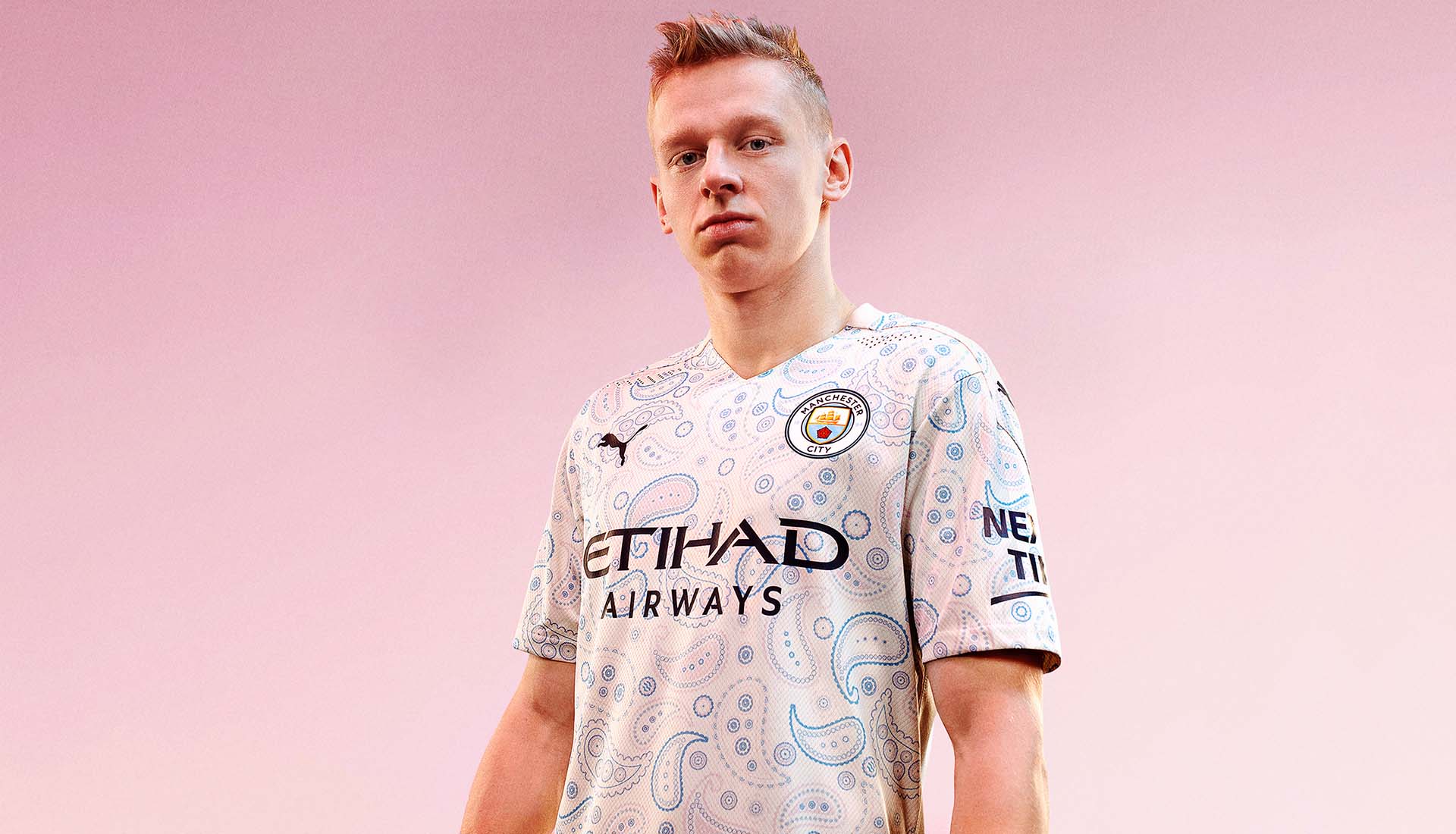
2) Manchester City Third
Proper marmite this one, with a 50/50 split of fans either loving it or hating it. But we land firmly in the former camp, with a wild design that epitomises where football shirt culture is right now. Your dad will hate it, but honestly, this is a shirt of art.
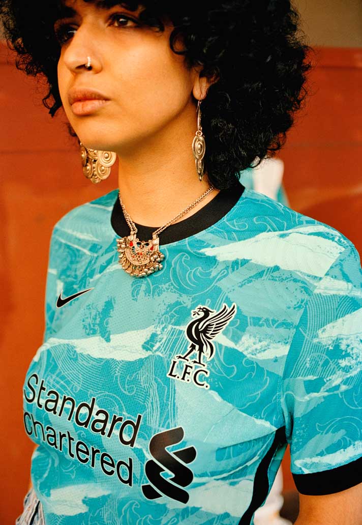
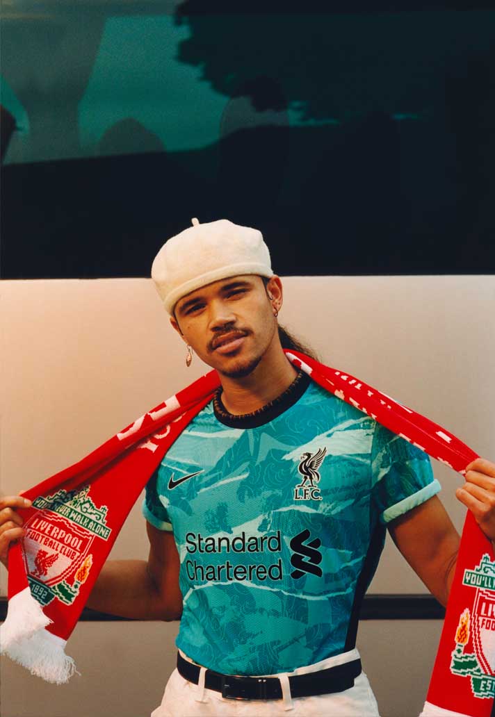
1) Liverpool Away
While they played it relatively safe with the home, Nike really let off the shackles for the Liverpool away shirt. The teal of the home shirt dominates the design, which is bold, brash, and out of this world. Champions of England dressed appropriately for their title defence.
And that's the list, like it or not. Honourable mentions for Brighton away, Aston Villa home, Leicester City third, Sheffield United Third, and Everton away. Your team not make the cut? Time for a refresh.
Shop 20/21 Premier League shirts at prodirectsoccer.com


