
The 2022 World Cup is done and dusted, and while we got to enjoy some truly amazing football, plenty of football shirts designed for the tournament never got to see action on the pitches in Qatar. Here, we round up the 10 best…
The reveal of the 2022 World Cup federation kits gave us a collection of some of the strongest designs for a tournament that we’ve seen in a long time. Anticipation of getting to watch them in action was high, but, whether it was down to poor performances and early exits or the fact the home shirts just didn’t clash with other group stage opponents, there were plenty that never saw a minute of action in Qatar. Sure, some were used ahead of the competition, and others will be used in the months to come, but it feels like an absolute crime that they didn’t fulfil the purpose that they were made for. So, giving them a tiny bit of the attention that they deserve, here are the 10 best 2022 World Cup shirts not to feature at the tournament itself.
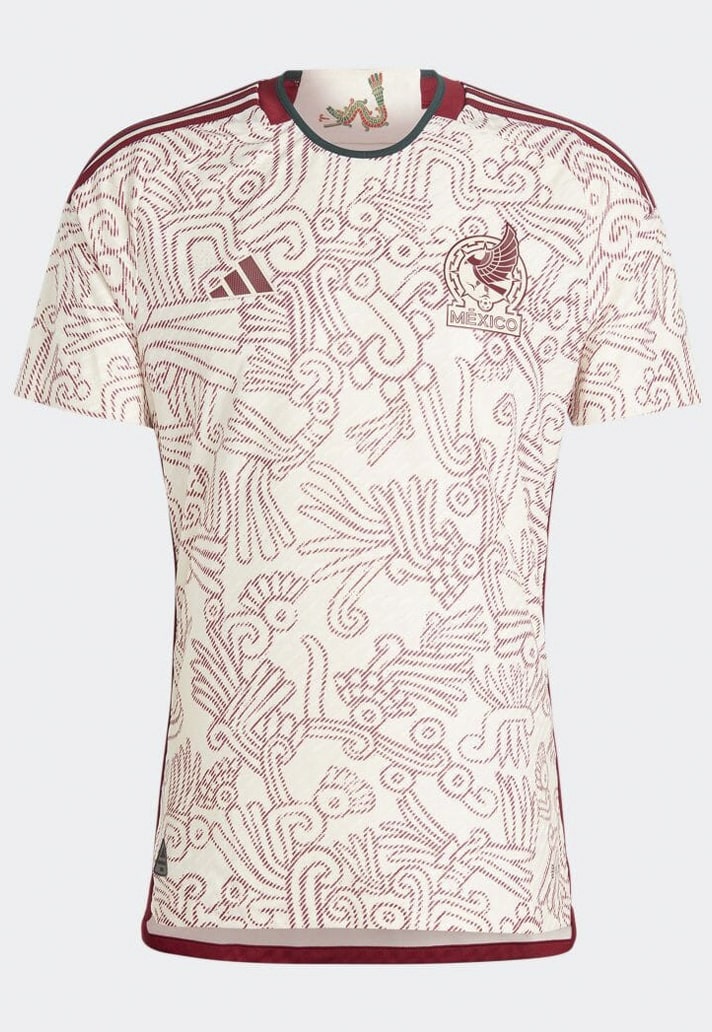

Mexico
Starting with possibly the best of the bunch, adidas infused Mexico’s away jersey with Mixtec art to summon the fighting spirit of the nation. Amidst the eye-catching all-over design, a sign off on the inside collar displays Quetzalcoat’s serpent body – a representation of humankind’s physical abilities. Stunning.
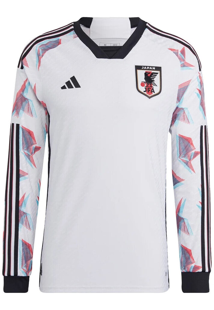
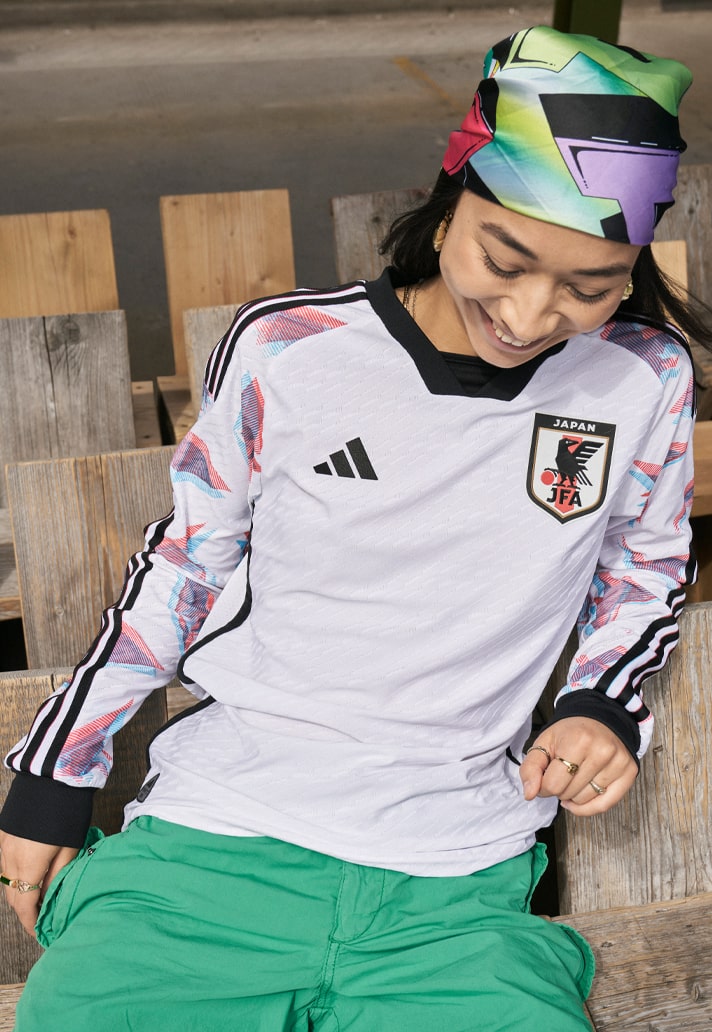
Japan
With a beautifully retro feel, the Japan away arrived in a simplistic white with black accents bordering the whole design. Simplistic, that is, until you get to the sleeves, where the same origami-style graphic that dominated the home shirt featured in subtle flashes of colour. Long sleeves with Three Stripes running right down to the cuffs? You know it.
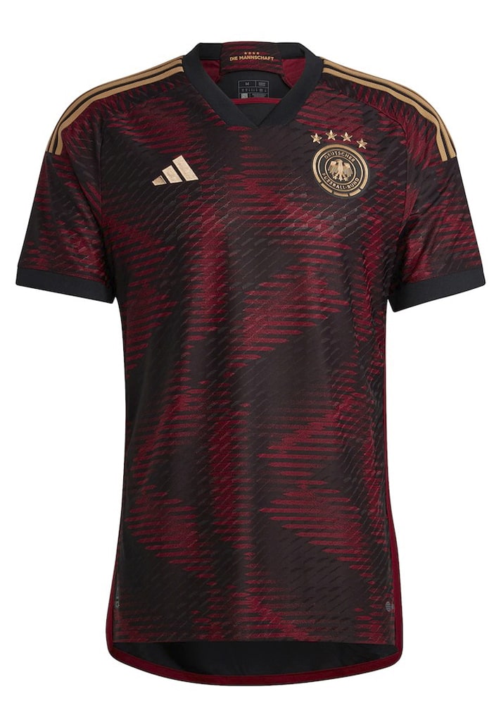
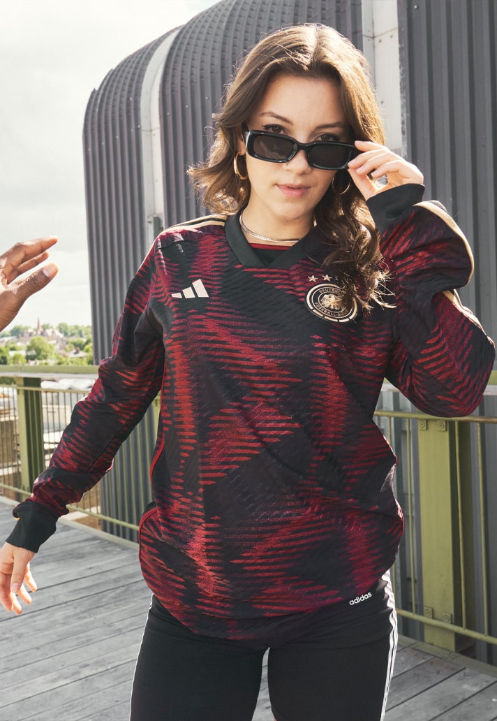
Germany
Denied an appearance due to the team's remarkable group stage exit, the Germany away came in a deep red and black, with a glitched graphic playing out across the body. The branding and crest then finished the design in bronze. Together with the home, these were two of the best kits in the tournament, and two of Germany's best ever. Shame they will be forever linked to a truly underwhelming campaign.
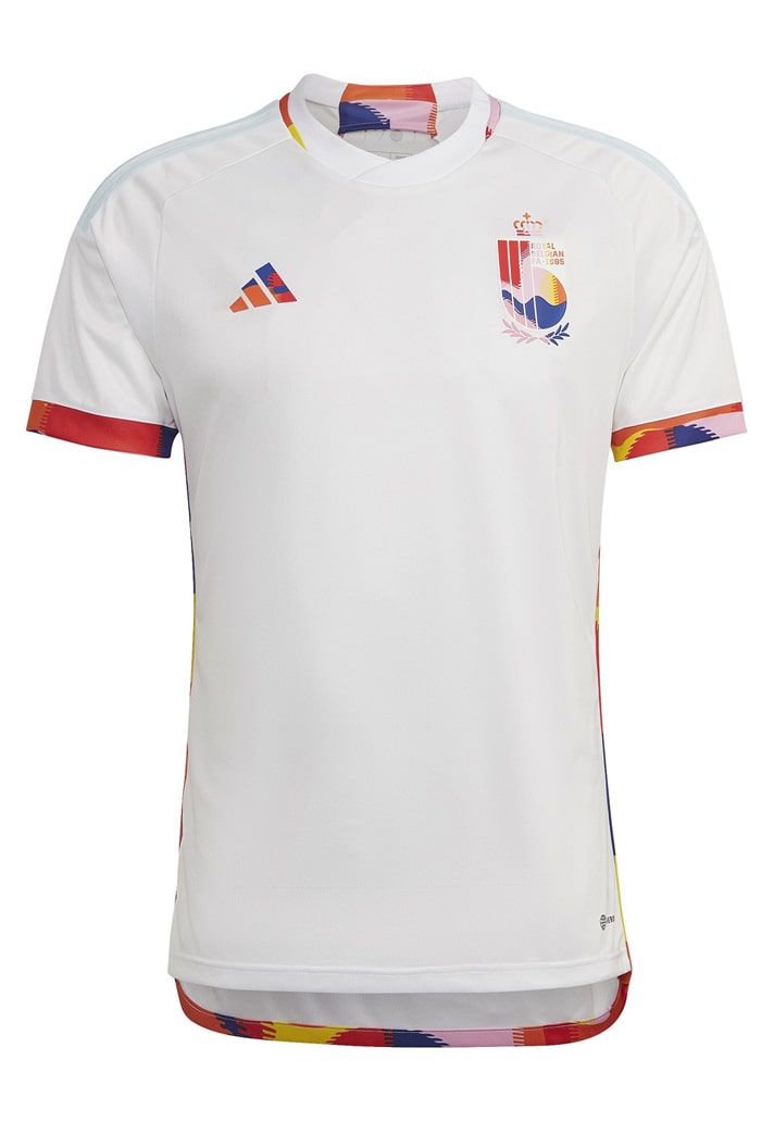
Belgium
Another that was denied an appearance mainly because of the nation's poor performance, the Belgium away shirt came with a message of Love. It was launched as the second part of the Royal Belgian Football Association’s (RBFA) unique collaboration with Tomorrowland, bringing bright and bold colours inspired by the music festival. Possible political reasons may also have prevented this kit from being used, as occurred with the similarly styled prematch shirt.
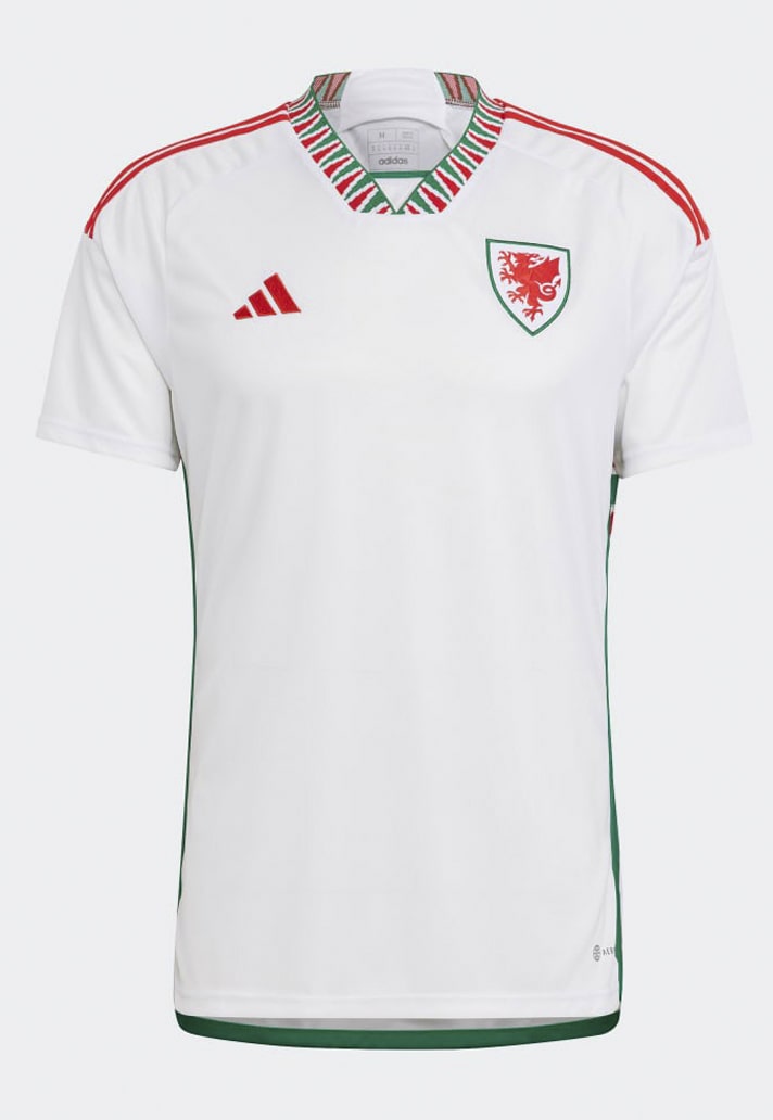
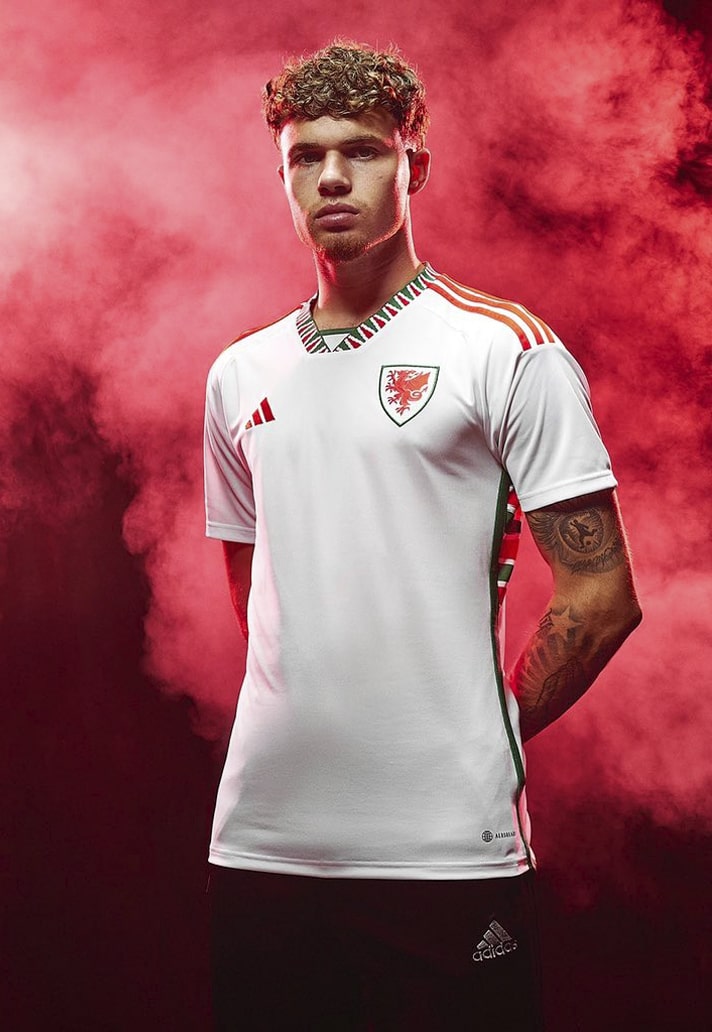
Wales
All about that collar and side panel execution, right? As strong an alternative design as you're likely to see, it's a proper shame that this one never got a run out in what was Wales' second ever World Cup finals appearance, and their first since 1958.
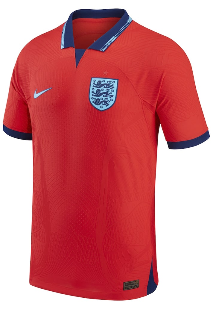
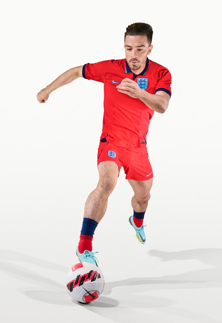
England
Bringing back proper Italia '90 vibes with its homage-fuelled design, the England away shirt got a run out in the pre-tournament friendly against Germany, but it was still disappointing not to see it on pitch in Qatar at least once.
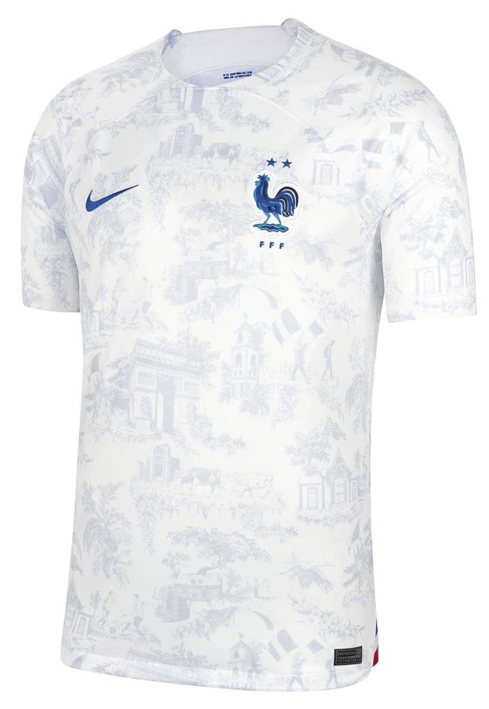
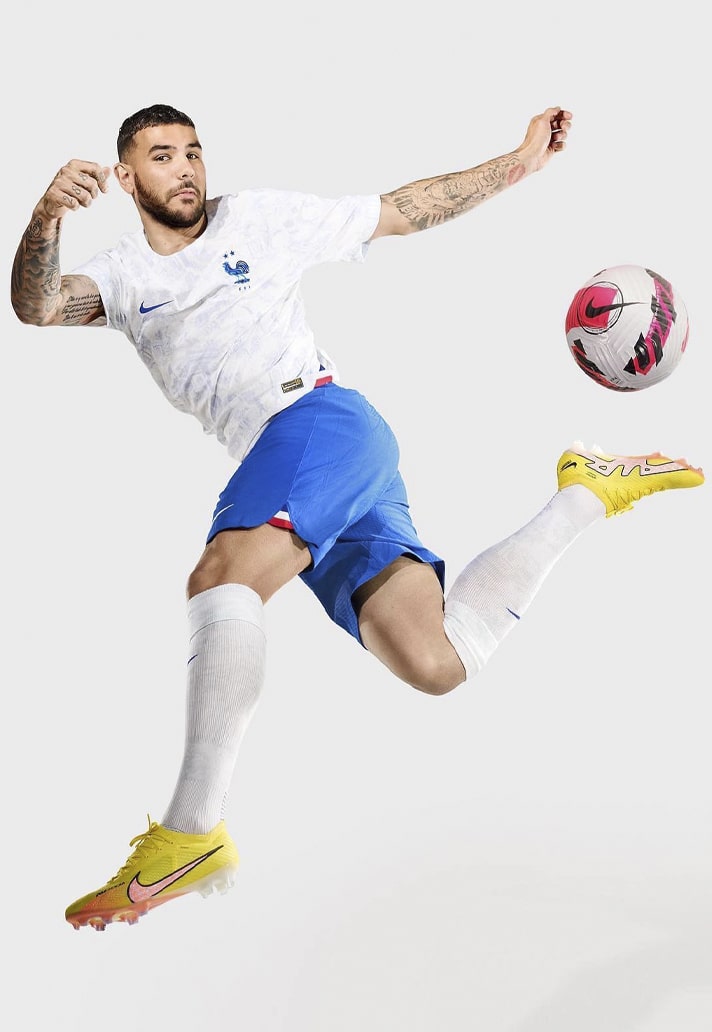
France
The France away kit is underrated in our opinion. Whilst some of the detail may be lost from afar, up close it is a thing of beauty. The all-over graphic, inspired by French toile de Jouy, was made up of iconic French and Les Bleus imagery like the Cockerel, botanicals, the Arc de Triomphe and Clairefontaine.
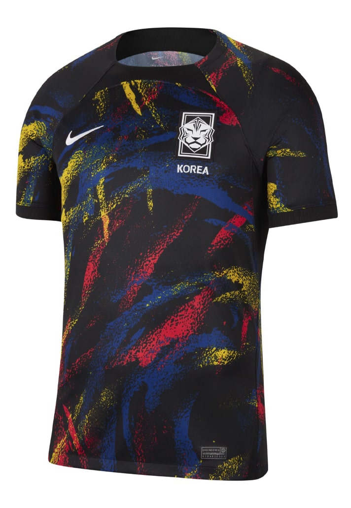
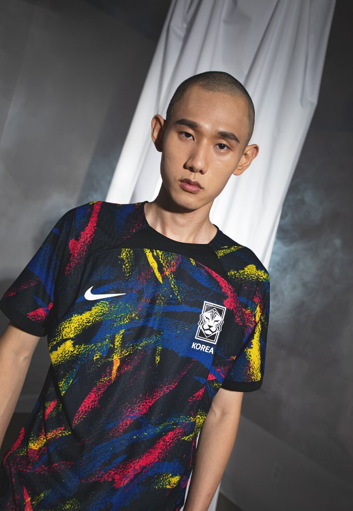
South Korea
Evoking a bit of Spurs 21/22 away shirt, which was fitting give a Mr Heung-Min Son would be wearing it, the South Korea away kit highlighted Taegeuk, the symbol found on the Korean flag that represents national pride and balance between heaven (blue) and earth (red). Wild.
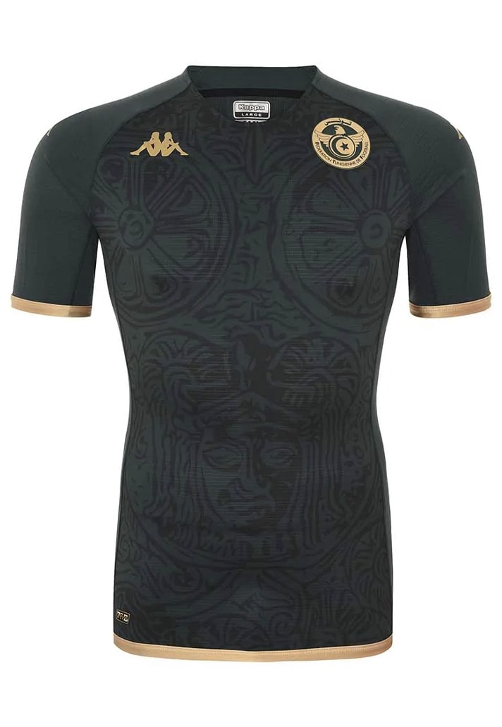
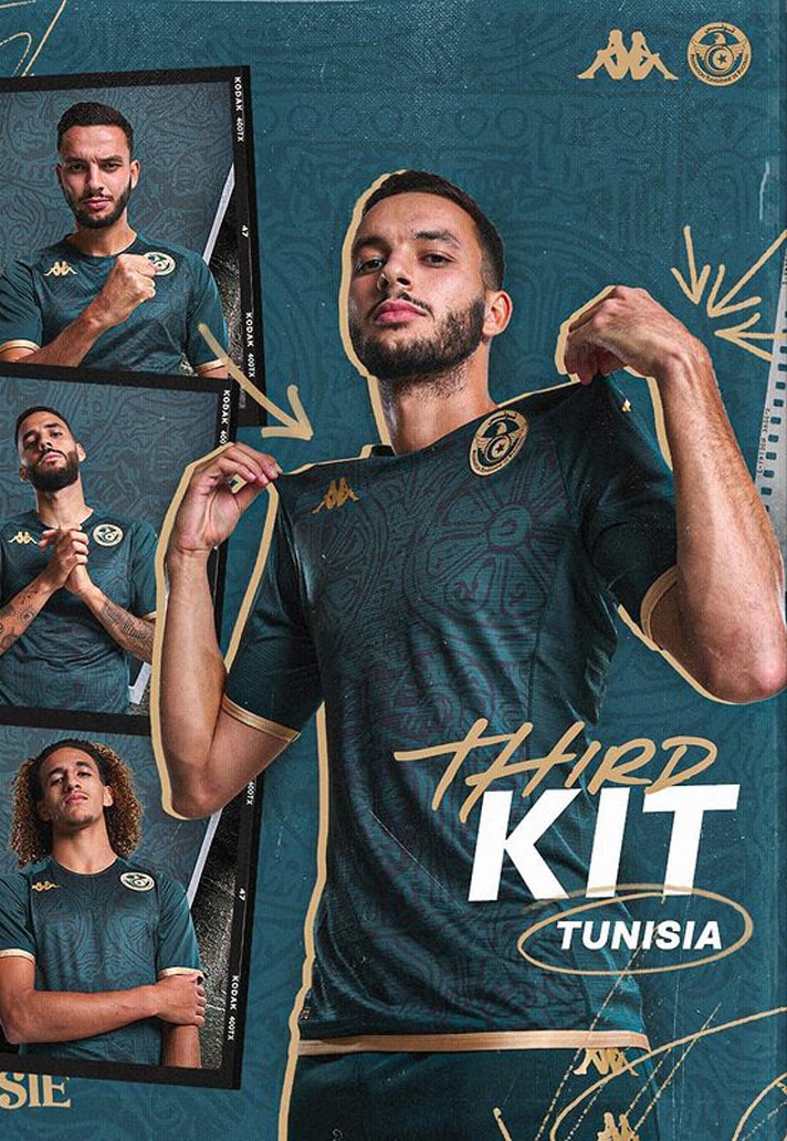
Tunisia Third
Admittedly, a third kit was always going to be a tad ambitious in terms of use, but when it's this good it really should've got a look in. With a design that represents the culture of olive cultivation in Tunisia that roots back to the Carthaginian times, and presented in a beautiful navy and gold execution, this is yet another example of Kappa's flex, as if one were needed.
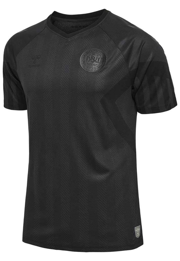
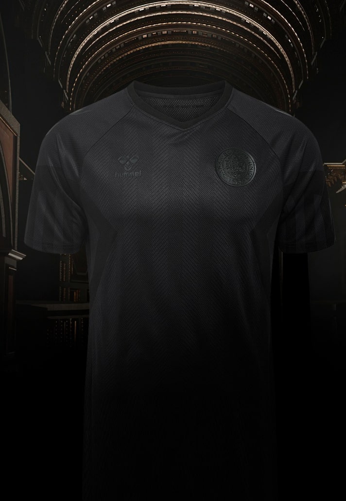
Denmark Third
Hummel and Denmark opted to make a statement with their kits for Qatar, washing out all three kits in monochrome presentations, including the national crest. "While we support the Danish national team all the way, this shouldn’t be confused with support for a tournament that has cost thousands of people their lives. We wish to make a statement about Qatar’s human rights record and its treatment of the migrant workers that have built the country’s World Cup stadiums." A message that definitely would've been strengthened had this one made an appearance.
Shop all 2022 World Cup replica at prodirectsport.com/soccer


