


With no sign of slowing, the Nike and FC Barcelona collaborative legacy has now spanned from 1998 through to 2016. In that time a plethora of kits have been designed and served up. This illustrated timeline by Ricardo Martin Weigend celebrates the shapes, the sponsors and the glorious typography that has locked each one into a vault of incredible footballing memories.
The joys of the football shirt are truly unique and with FC Barcelona, their offering of threaded goodness has been held up as a symbol of beautiful football, spanned multiple decades in the process. Huge names from Rivaldo to Guardiola to Messi, they are the epitome of supreme flavours. Since Nike joined forces, Barca have reigned happy and glorious upon the global scene and these shirts go the distance in telling a story. Each one holds a memory and marks an occasion while showing the evolution of the shirt.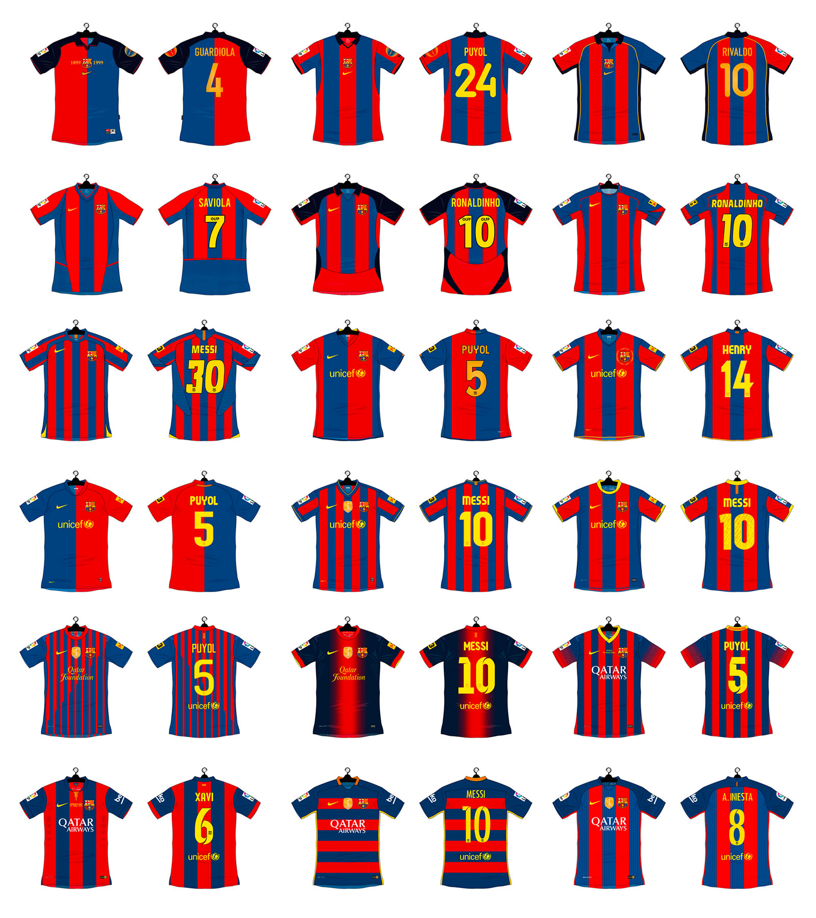
FC Barcelona shirts too have always been noticeably different to the run of the mill, where many shirt sponsorless seasons ensued. Through a choice of the club, the shirt has always remained prestigious. The less is more nature has always meant the Barca shirt held elusive characteristics and charm. Similarly, on the reverse of the shirt, typography has always played a major part. Trends from the '90s through to the '00s saw shirts almost become a little more disposable in the short term. It was a time where most teams transitioned from having two shirts that lasted two seasons to having three shirts per calendar. A change in the whole process, it saw more and more experimental kits that would try to outdo the last. Bright lights, short gains.
This timeline shows a combination of change in consumer tastes as well as the aesthetic design Nike employed. Through the '90s, performance was key but it was a nylon and polyester mash up that formed a heavy base and larger cut for the general football shirt. From the '00s to the teens, a combination of under the hood engineering and sophisticated styling has meant the focus has come away from experimental collars and overlaying materials and now resides in making a aesthetic that crosses over between pitch and pub, park and playground.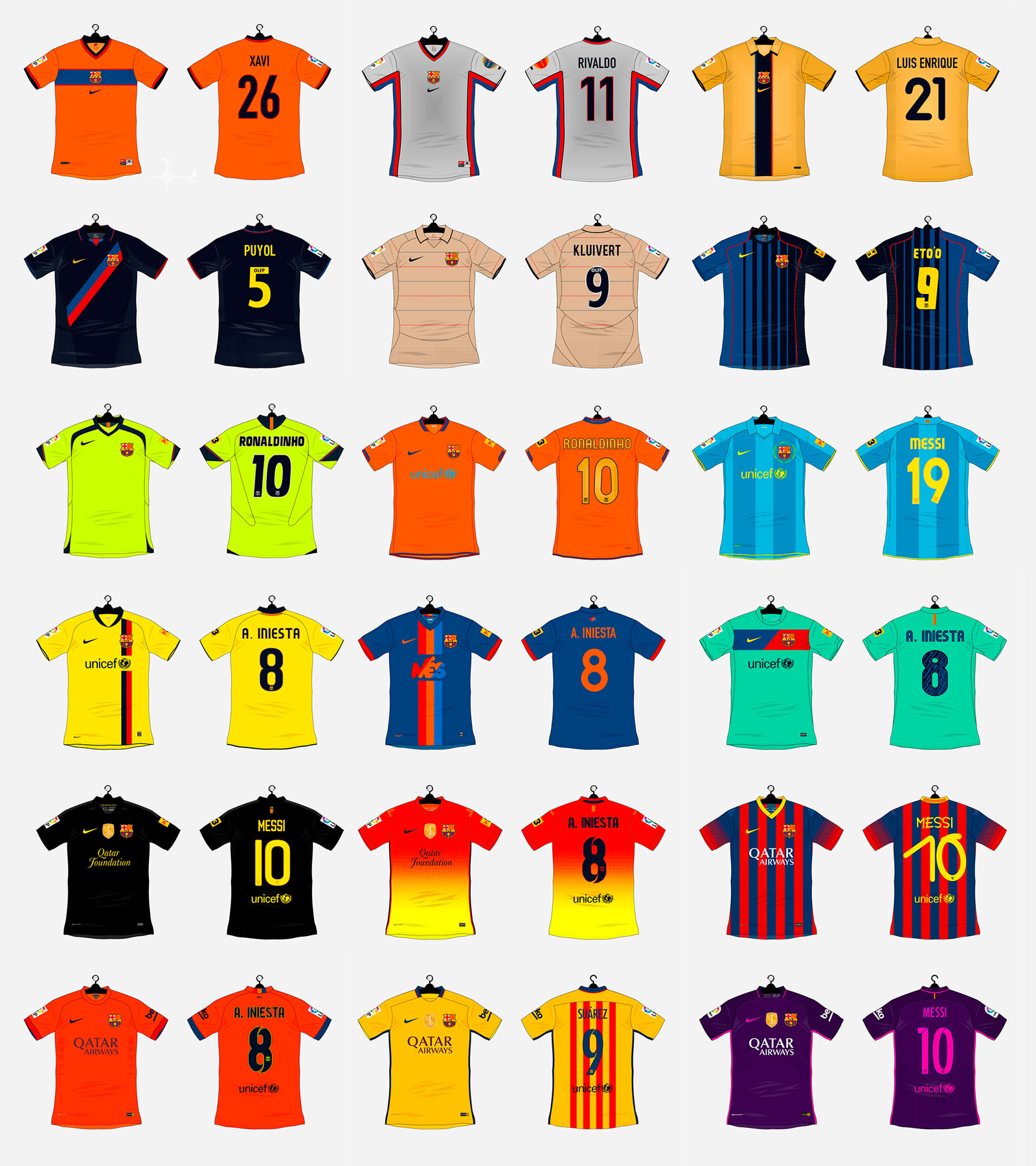
The away shirts over the years have packed some serious party. A chance to pay tribute to years held in high esteem from seasons gone by, many use historic themes to shift on forwards while others were completely fresh in serving up a completely bespoke offering. Shimmering silver, big golds and sashes all provide a base line of heavy punches for when the team travel to away territories.
It's designer Ricardo Martin Weigend we can thank for this one.


