The art of football shirt design is one of fine balance. Sitting in a space where traditions smash together with innovation and a hunger for more expression, it's a passionate place for design and football to cross paths. Adding a layer of detail, we speak to New Balance Apparel Designer Joe Gillibrand to get a look on how New Balance have led through Lille.
While we may often take football shirts at face value, not only is there usually more that meets the eye, there is always a process each kit has gone through to land at its final destination. Exploring one from left field is Lille; a relatively young club with a reworked brand image, they are looking to elevate their reputation and playing status while they're at it. New Balance are naturally a brand exploring the art of expression and through football shirts, there's no greater talking point.
To start with, can you give us the top line design story that goes with the 2021 Lille Home Shirt?
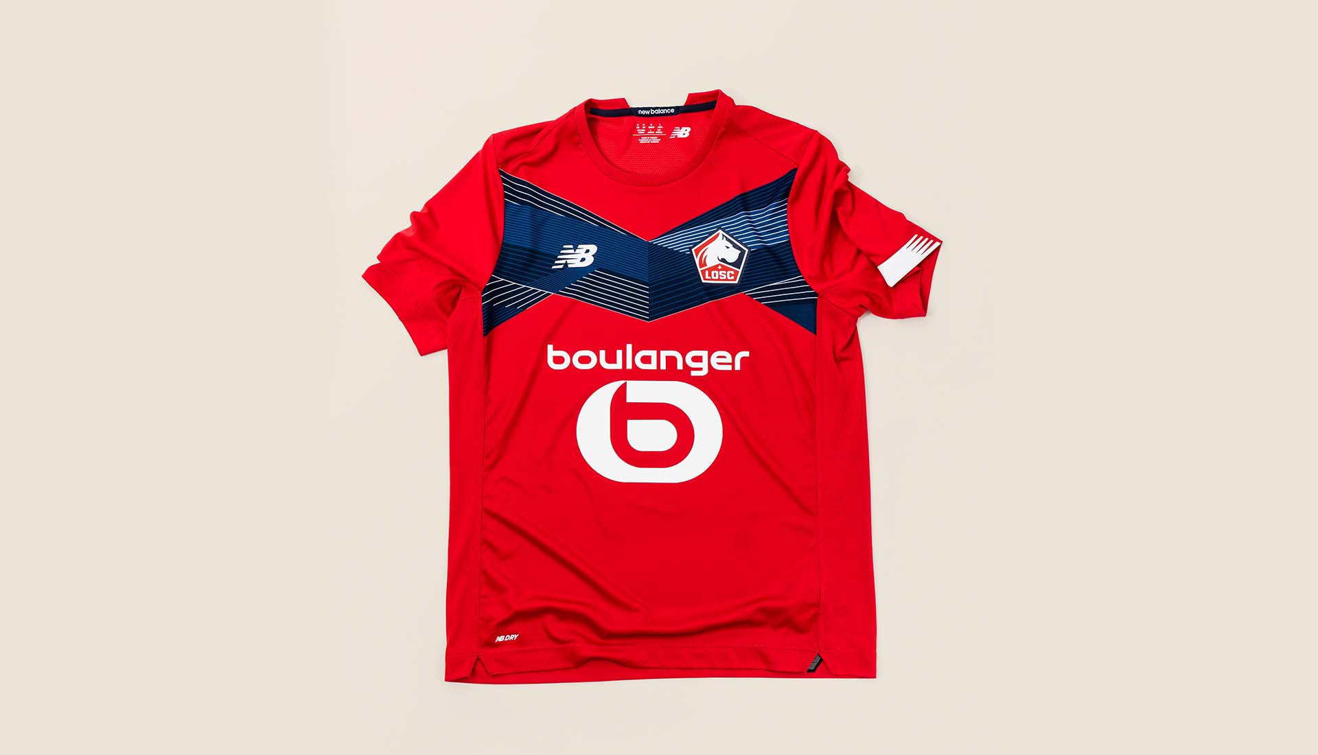
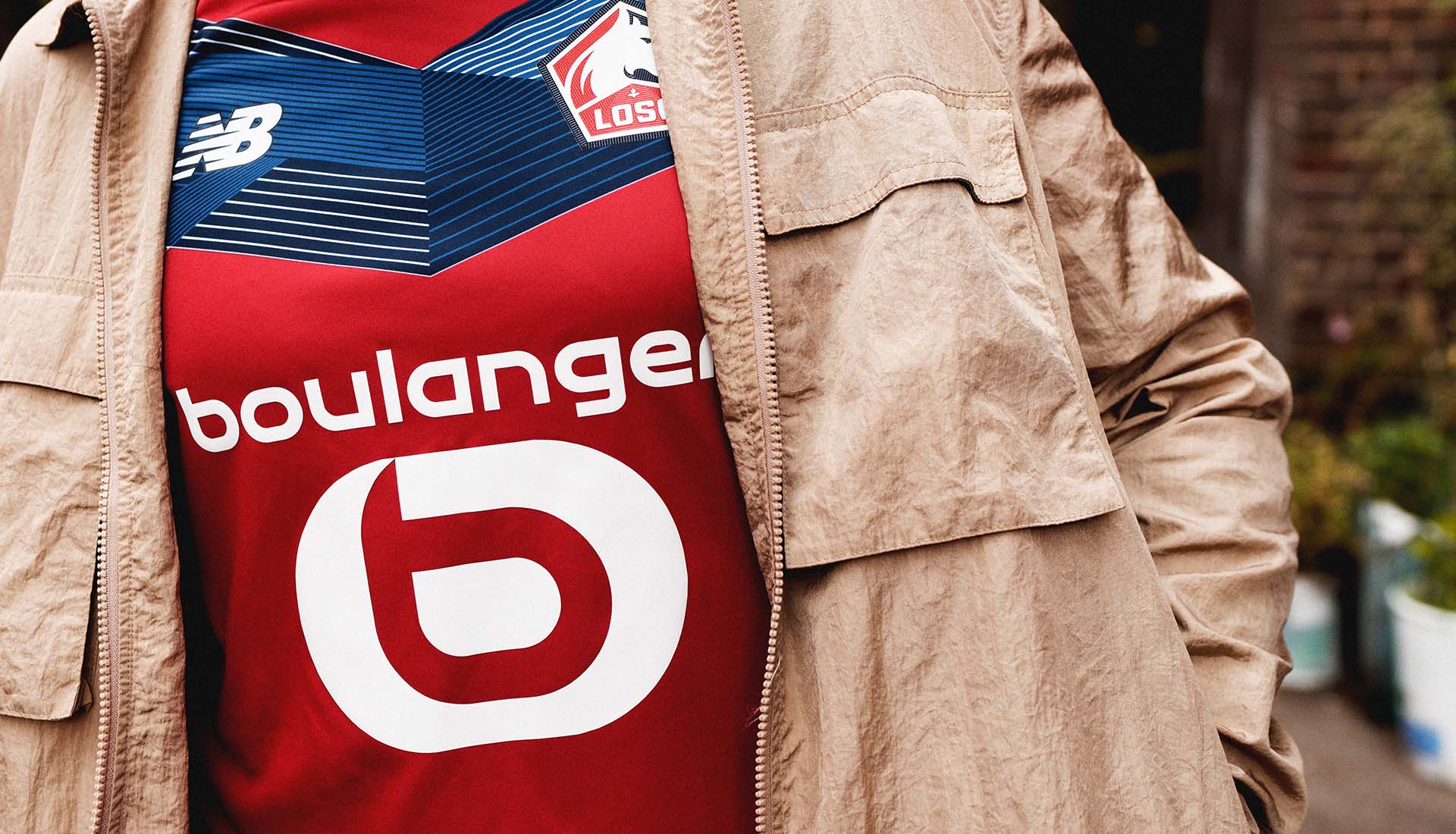
So it actually started when we did the 75th anniversary kit for Lille last season. We brought back one of their iconic first kits which had a very red and powerful chevron across the front of a white shirt. We wanted to nod to that and also bring that Chevron into the modern era. That’s where the inspiration comes from with the shirt. Naturally, looking to include the club colours with the use of white, red and navy blue.
What are the details that really stand out on the kit for you?
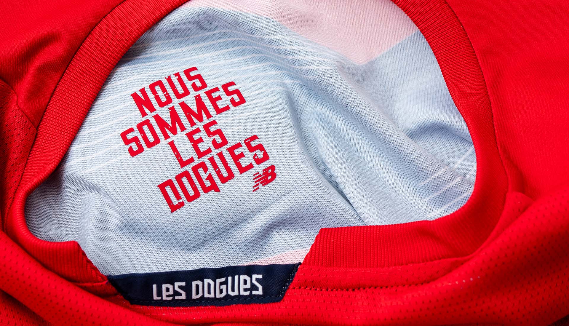
I think the first thing that really catches your eye is that striking Chevron across the front of the shirt. The key thing is that we’ve added a bit more dimension to that. We’ve added some linear language to that to make it stand out. We want to make it different to any other chevron that you’d see on a shirt. We’ve also added in something unique to be discovered on the inside of the shirt. When we were looking at the concepts for kit creation going into this season, we were inspired by how when a player scores a goal, they grab the crest. We decided to add in a bespoke discoverable detail on the inside of the crest. So on the inside of the shirt there’s a special message printed that is dedicated to the relationship shared in the shirt by fans and players alike. With it being on the inside of your shirt, the positioning is physically close to your heart - so it ties into the message of that shared passion and brings everything together.
I think traditions are being respected but in new ways. I think limits are being stretched for the better and we are really pushing our innovation and creativity forwards. The blend of football and street fashion was hot a few seasons ago. It’s now a common place consideration. It’s a necessity now."
You’ve touched on a few things like use of linear language on the chevrons, where else do you take influence for the design of the jersey?
With Lille, when you walk around the city, because it’s close to the border with Belgium, you get to see this interesting culture.. It’s kind of like a hub for international influences. I think that also shows in the players that Lille bring into the club. There’s a lot of international influence there as well. It’s important that we provide and support that in the kits that we provide for Lille. We want to capture the international appeal and influence in all we offer. With the home, we’ve played on a more traditional Lille route, there’s definitely a different flavour to The Lille range for next season.
How important is it to have that understanding of a city when going into the design phase of that respective club's kit? It’s obviously very important for a club to represent the city they’re in through their shirt isn’t it?
Yeah absolutely. For New Balance, it’s important for us to go and visit the city, especially when the vast majority of the clubs fans will be there. You’ve got to take into consideration their point of view, their affinity with the club, the attachment to the city, all they’ve been through, all they go through on a match day - that’s all so important. It’s also something that can be a gold mine for inspiration when considering kits. You’ve got to engulf yourself in the culture of the club and the city.
What makes Lille as a place and as a club of such unique character for you from a creative perspective?
I think the people at Lille are football people through and through but they have a definite plan and ambition to make Lille bigger in terms of culture, in terms of achievement and I think you’re already starting to see that. They’re establishing themselves at the top of Ligue 1 and they’re getting into European competitions now regularly. They’re also a bit younger than a lot of the other teams in France which means they’re more agile, they have more scope to move quickly and develop ideas. They’re always pushing us to do new things and we’re always more than happy to take on that challenge. They’re always up for trying something new and we thrive on that. We always want to work together to move things forward.
They re-branded fairly recently, does it feel like there’s a club with a blank canvas in how they portray themselves?
Absolutely, yeah. We’re one season into that rebrand and that all ties in to their strategy. They moved the logo to be more versatile for social, online and the whole digital era as a whole and we’ve got to move with them. With that re-brand, it gave us a fresh start and try things that are different. We want to make a statement with our work with Lille that brings back the historic Chevron but moves it into the new digital era. You can see that when we get a brief from the club. They are open to things but also have a clear direction. They really want to portray the history of Lille whilst being a different club to everyone else that is out there. They want to express their passion through the kits.
What do you make of where football shirts are in a time and place now culturally? Do you have to consider them as a wearable product off the pitch as much as a performance piece on it?
I think traditions are being respected but in new ways. I think limits are being stretched for the better and we are really pushing our innovation and creativity forwards. The blend of football and street fashion was hot a few seasons ago. It’s now a common place consideration. It’s a necessity now. We’re striving to show a club’s unique identity to an ever growing audience whilst remaining credible and captivating. When you get Lille’s colour palette, you can’t go wrong.
What trends have you noticed over the last year in terms of football shirt design?
We’re always looking to innovate and develop the ‘unexpected’ for the fans. A lot of kits are also being supported by creative training wear collections which then allows us to really express the brand and the club in so many different avenues. The playing kit will obviously have the most eyes on it. It’s what is seen on match day and on the TV but we want to tie everything together and extend the story through limited capsules and that sort of stuff. The kit is almost the leader for a much wider product range which the fans can tap in to.
Pick up the 20/21 Lille Home shirt by New Balance at prodirectsoccer.com