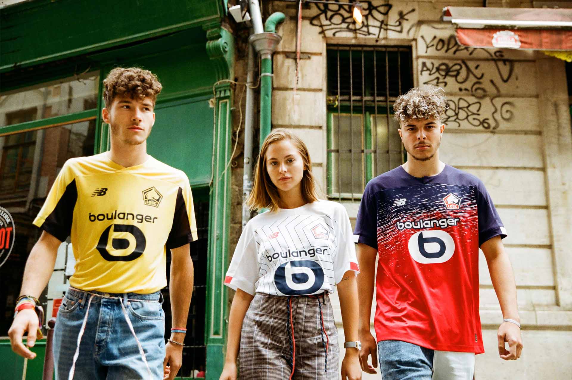
New Balance continue to showcase their 2019/20 replica work for some of their leading European clubs. The brand are celebrating the DNA of each club by creating unique and individual kits that speak of the very story at the heart of the cities that they represent. Next up we're in northern France for a nosey around Lille.
In the latest installment of the short series, we speak to the design team at New Balance to talk about the inspiration behind the design process for their 2019/20 kits, which has seen a celebration of the character of each individual city as an overriding theme. For Lille, it was all about positioning them as a club for the people, a club very much on the up.
Lille is a club with a growing profile in football; what are they like to work with?
Our team love working with LOSC, they’re very open and keen to try new things. A real joy to work with.
The club seem to want to be quite expressive through their kits for 2019/20, is that fair to say?
Definitely. After a conversation with the Director General Marc Ingla, it was clear they were keen to shake off the idea of being of a regal club only for the wealthy. Ingla was keen to show “Les Dogues” as more of street dogs, running the streets of Lille and becoming more in touch with the city. We believe we’ve done that for the 19/20 kits and can’t wait to see how the club and the designs develop for the following seasons.
Could you give us a topline summary of each of the Lille kits for the forthcoming season?
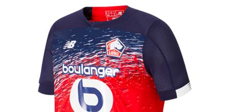
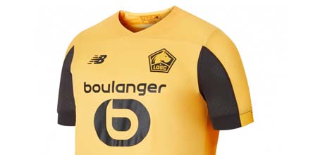
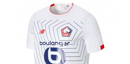
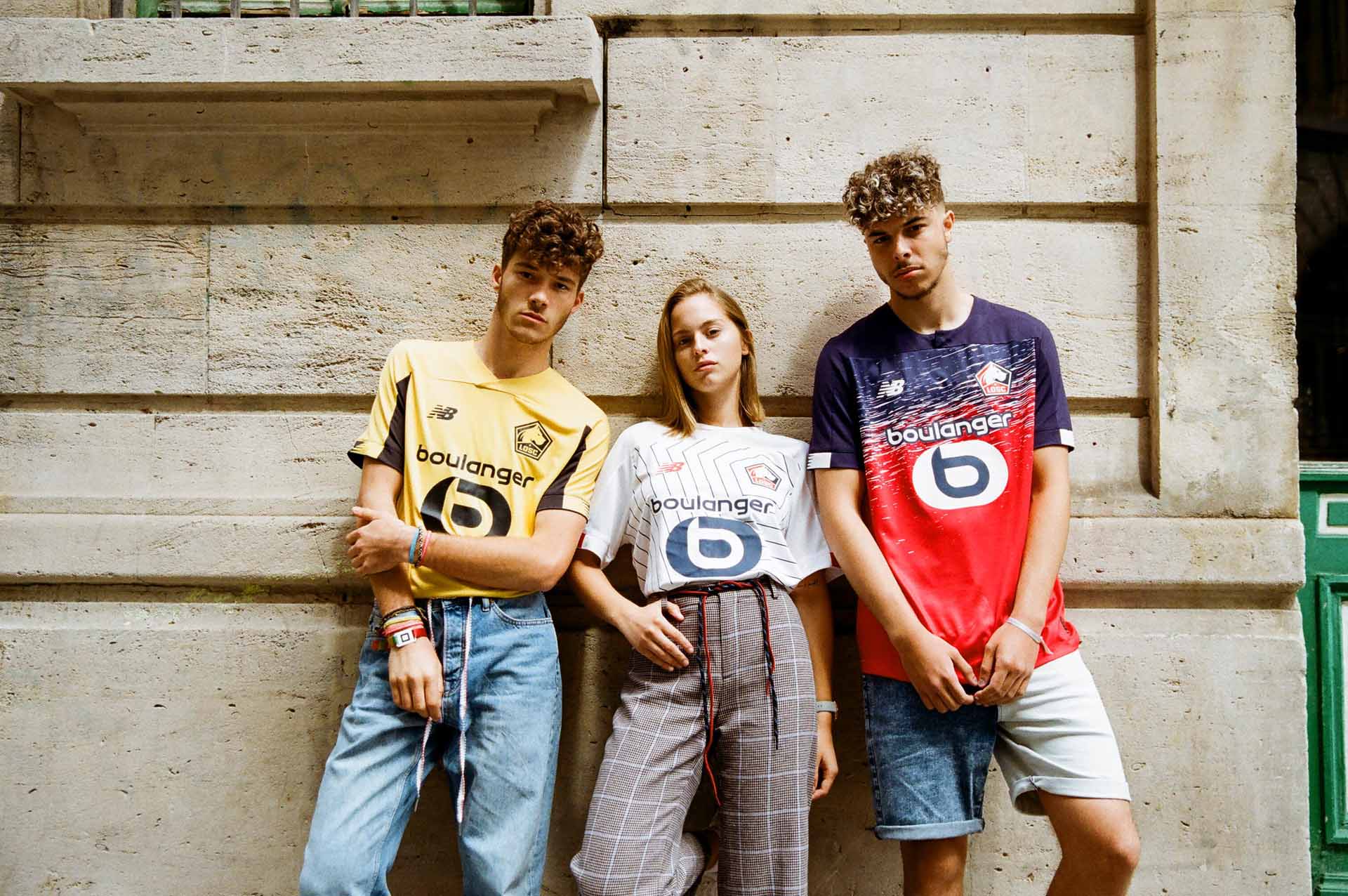
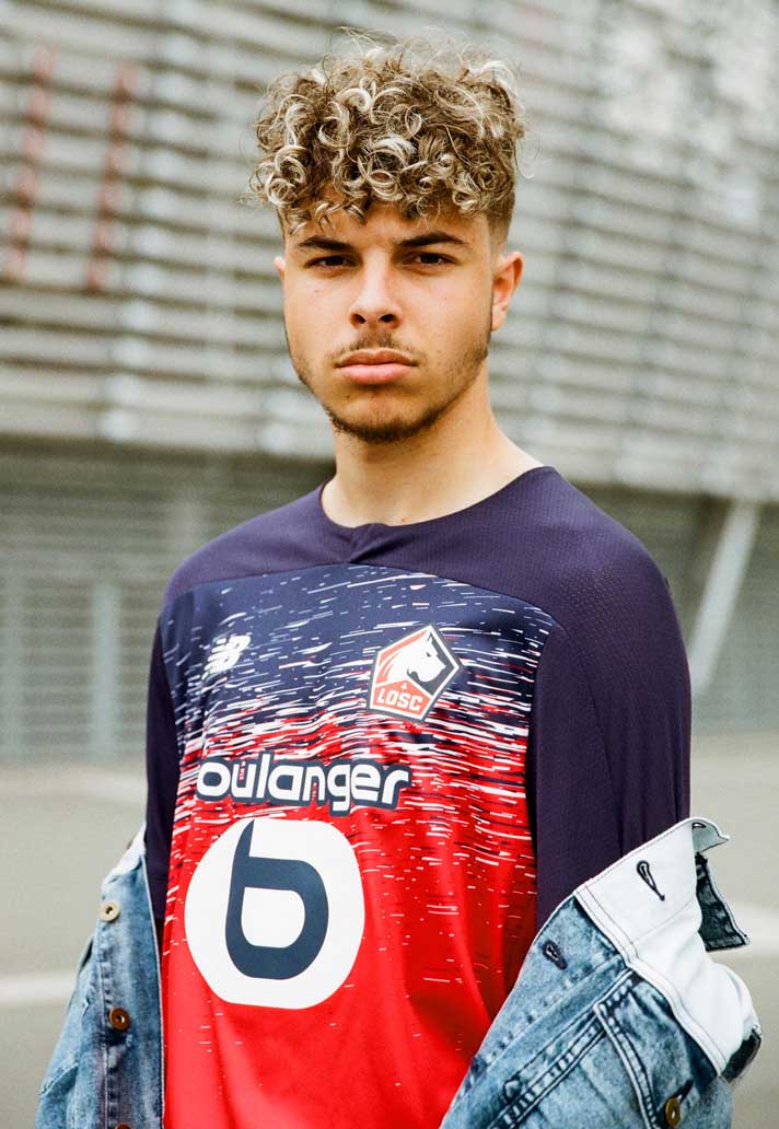
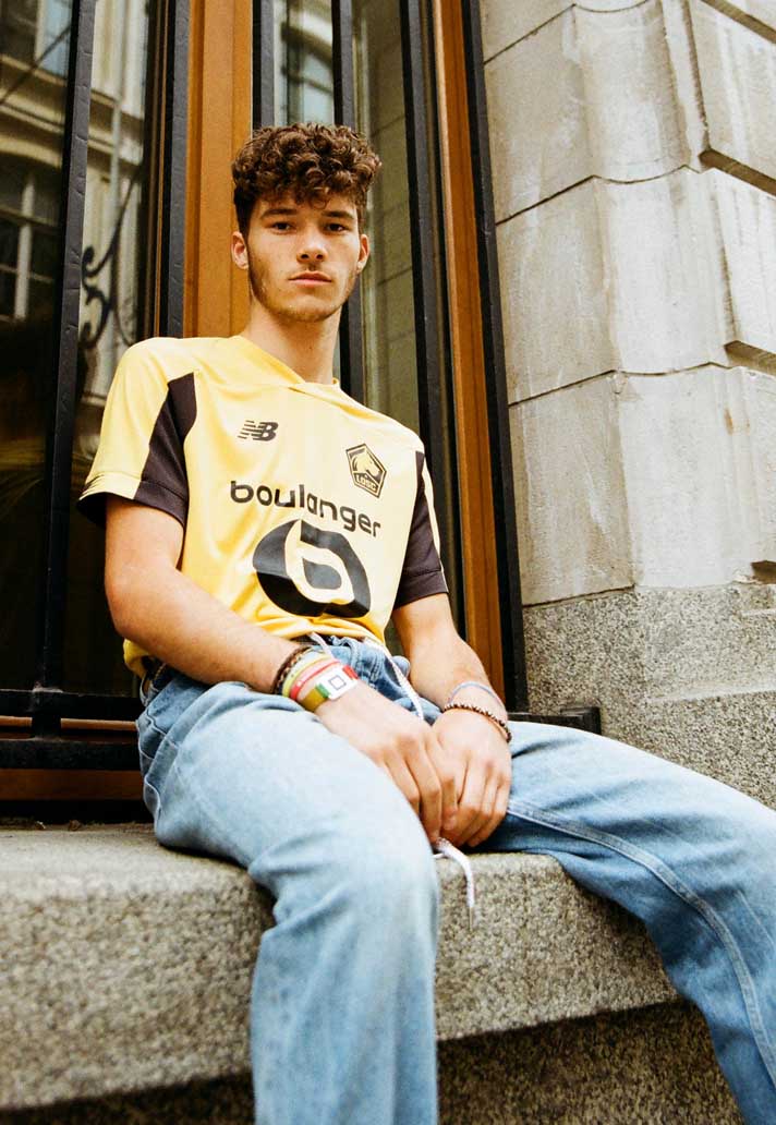
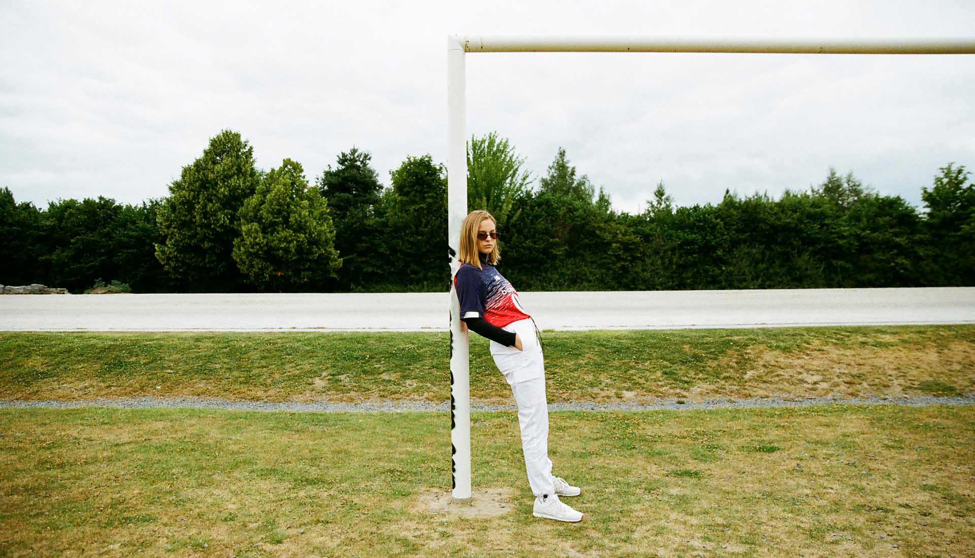
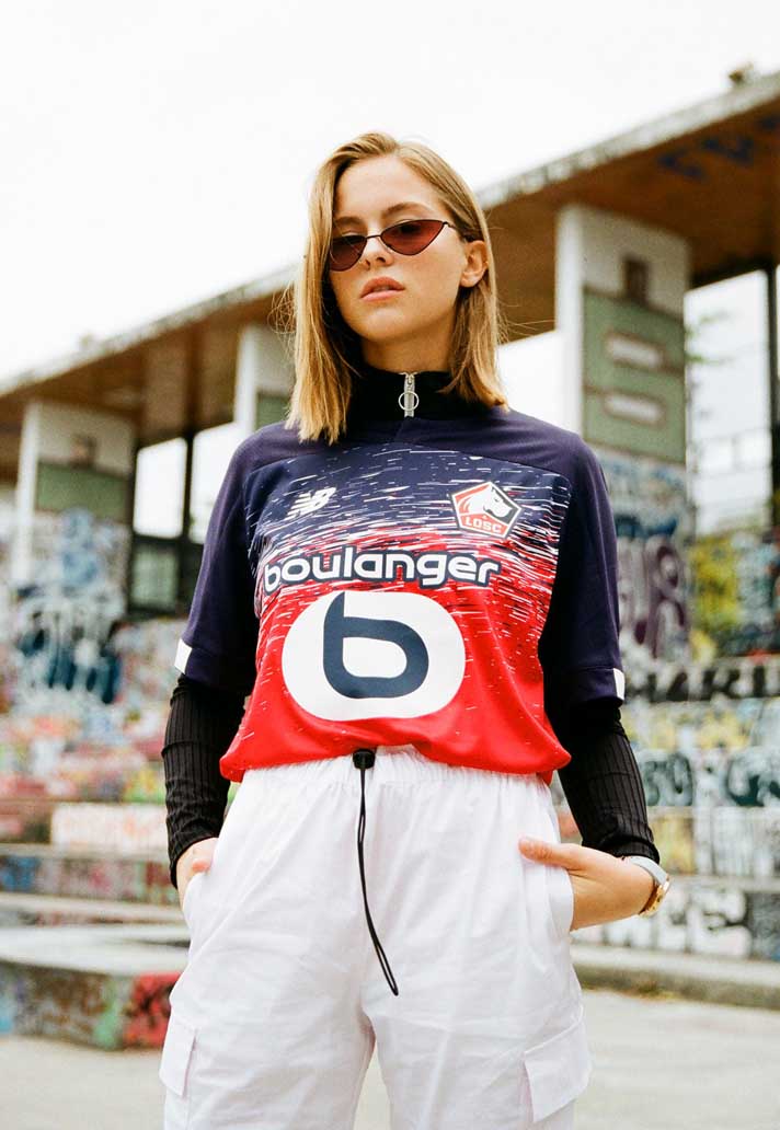
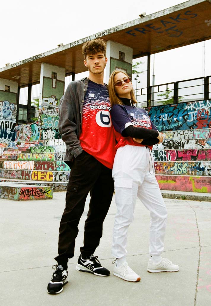
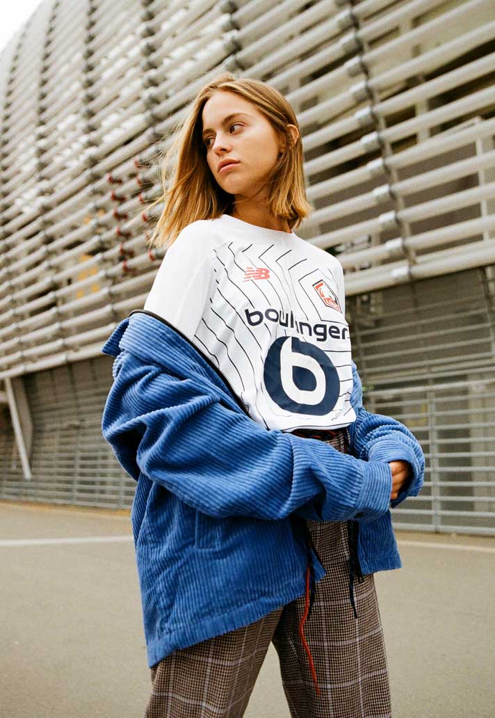
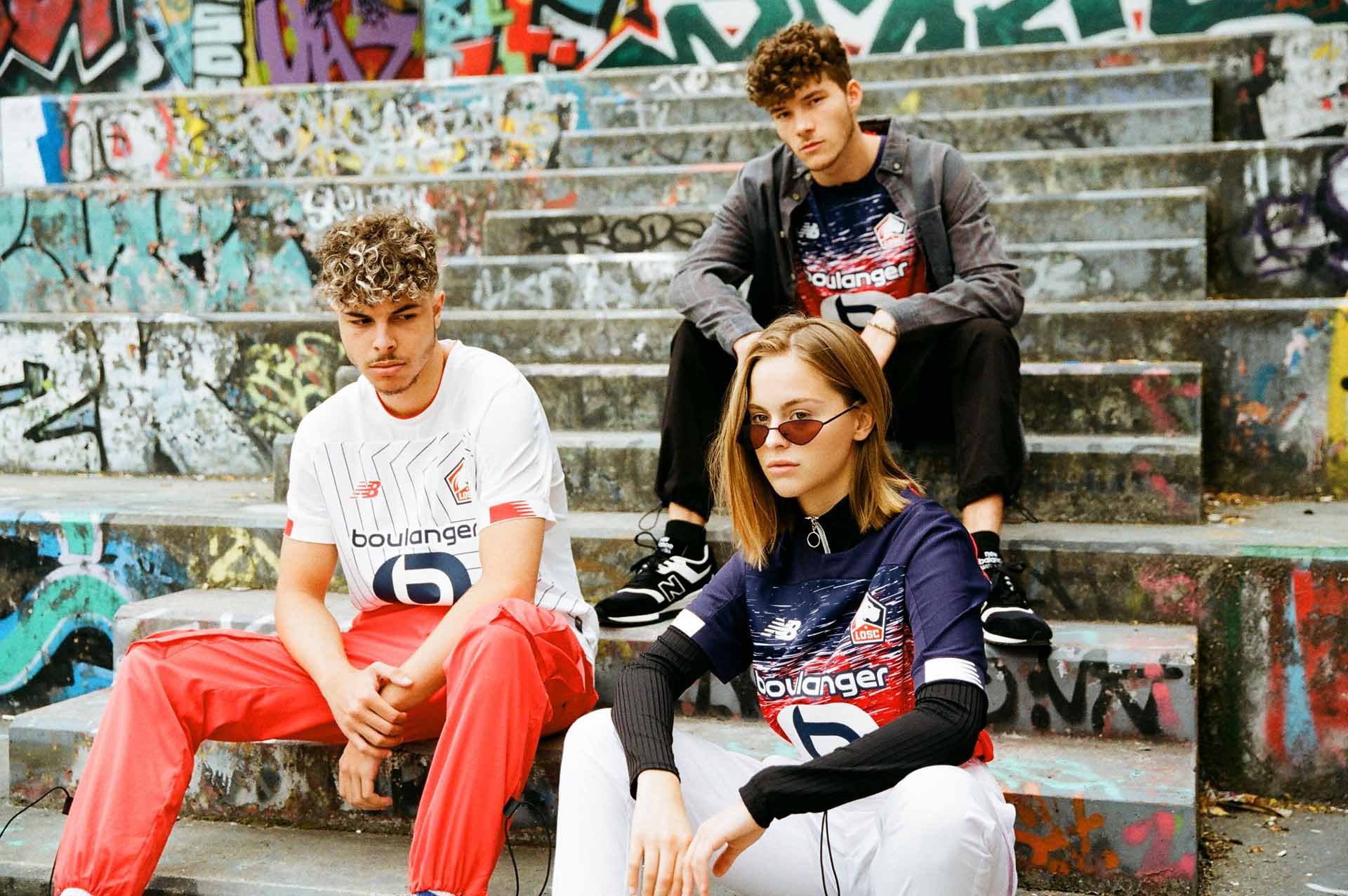
The home shirt is all about the energy in the streets of Lille, inspired by the expressive street art found in areas like Wazemmes. Lille is the capital of French Flanders and the away kit celebrates the colours of the Flanders Flag. The third kit tells the story of new beginnings, celebrating the new crest and also having a truly French feel.
Do you have free reign to design or does the club present you with a brief for each season?
This can vary from club to club. We work closely with all our partners to achieve the most meaningful designs. We simply can’t take a template approach and we’re glad not to. We work hard to make all our kits bespoke to the clubs whilst telling a harmonic brand story.
What details do you like most about the design of these kits?
We're proud of the impact that the home graphic has, the simplicity of the away, and how the third design is centred around the new crest. New for this season is the MegaSpeed sign off to the cuffs of the jersey, a new balance branding device that allows us to add more colour detail.
There’s also a re-designed badge and quite a prominent sponsor in the mix. How much do you have to factor these into the design of a shirt?
These should be considered right from the start. Like UEFA/FIFA regulations, all these fixed elements need to be factored in as soon as possible in the design process. They’re very influential on the final aesthetic and in the case of LOSC can make the jersey complete.
What have you learnt about the club through the process of designing the kits and what do you admire most about them?
Their drive to become bigger and their willingness to express themselves louder than ever before is evident. This isn’t just boardroom marketing speech either, their ambition is visible in their fast, attacking style, their results and last season’s league position of runners-up. It’s a fantastic time to be Lillois!
Shop the full Lille 2019/20 replica collection at prodirectsoccer.com