The new partnership between Italy and adidas officially commenced on 1 January 2023, and now we have the first kits to truly signal a new era for the national team. Ahead of the official reveal we spoke with the adidas Global Design Team to find out all about the process behind creating something so significant.
Joining forces with one of the most successful nations in world football would be a daunting task at the best of times, but on the back of that nation missing out on the latest World Cup, coupled with a rebrand that signals a new era of sorts, and it takes it to a whole other level of intimidation. And that was the challenge that faced adidas and the brand’s design team, coming in, as they were, on the back of a 17-year stint from PUMA to create new kits for the Italian national team that would act as a tangible representation of what the FIGC will be hoping is a fresh start.
It’s a challenge like few others in the the design industry: encapsulating a new era with a progressive design, while also respecting the values and traditions of a nation that has a very apparent divide from north to south. Certainly no easy task, but one that they've more than lived up to. So, sitting down with two senior members of the adidas Global Design Team, we were keen to find out all about the challenges behind the design, how they went about overcoming them, and what the whole process was like.


Talk us through the design process – where do you start with a nation as historically rich as Italy?
Italy obviously is a big responsibility, it’s one of the biggest federations and a real honour for any designer, and the approach is similar like for Germany and for other federations. So in the beginning it’s important to get as much input and knowledge from the market and about the federation and about the fashion in Italy. That's everything we try to gather together, therefore, especially in Italy’s case, it's important to have people who know the local market, people from Italy and people from the Italian federation from the very beginning so we can work with them collaboratively on the design concept and come up with ideas, sharing an insight.
I don't know how others are doing it but for for adidas it's rooted in our heritage with the brand talking directly to the athletes and federations, just as Adi Dassler used to do. This is what we're still trying to do and I think you can see this with the World Cup kits and as well now for Italy, with the federation's giving us trust and we pay that back with good designs which really represent the federation DNA of the respective country and that's basically how it was here from the very beginning.
It’s been 45 years since adidas last produced kits for the Italian national team – How did that past relationship affect what you were doing now, if at all?
Actually it didn't affect the approach now for the designs. Obviously it's good to know that we have a history with Italy, but there were no Three Stripes on them back then and I don't think we were really producing it so I don't know what the deal was back then really. We obviously had that track top, the Paolo Rossi one, which was really famous, and items like that are obviously in the background and are considered maybe for other things but for the approach for the jerseys it wasn't really taken into consideration for developing a new piece of kit for Italy.


What were the main inspirations behind these new kits?
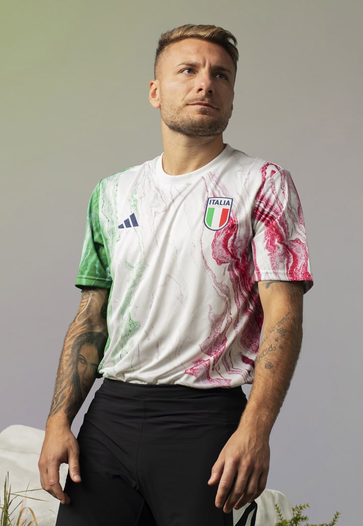
Finding something that can represent Italy, the entire nation, was the main issue because you have to represent a country that is different from north to South. That was the hardest part of designing this kit; finding something that could represent the entire nation. The inspiration actually came from nature. It was a challenge to find something that could represent Italy that doesn't fall into stereotypes, because that’s easy, especially with Italy.
We had discussions internally with Italian colleagues and the things that we found that were relevant that represents Italy that weren't pizza and pasta was marble. It's a material that you can find everywhere in Italy, from cities on the monuments into the museums, it’s something that you can find even in our apartments – we literally have this material everywhere. You can find it in the most northern region of Italy right down to Sicily, and when you think about it it reminds you of Italy, so we start to think how we could implement this design without looking cheesy.
Marble is nothing new, we've seen it in a couple of jerseys, but we wanted to do something different and have a new approach to it, something really fresh and authentic. So, the idea was to do something new with how we created the graphic, and for this we didn't work digitally; instead we handcrafted the artwork on real marble. We used several different types of marble and we basically used it as our canvas to create the artwork. We used different techniques because the marble does not absorb the ink, so we had different experiments using acrylic, Indian inks and the only technique that worked was water marbling.
We broke the marble into different pieces, and we tried different things, spraying the surface, working with different inks. We were experimenting and trying to create different layers and ways to see the reaction of the ink on the surface. The effect sometimes was really good and sometimes not so good, but it was always different on the different marbles. It was amazing to see the different results.


Being this hands-on and physical in a design process… is that something you’ve done before, or was this completely new for you?
This particular process is completely new, but we did do a lot for 2020 when we stopped doing things digitally and created everything by hand and we were united by art in football. All the designs for 2020 and 2021 were done by hand in the beginning, so that's a similar approach, but with the marble being the main element of Italy that unites the country, that's what’s different about this approach.
The marble is handcrafted, and we wanted to have the same approach, that physical approach, when you see the jerseys and you see how they were made now, the dedication that went into them to really make something more than just an illustrated graphic, hopefully you appreciate it all the more.
The kit itself is somehow classic but it's also progressive. The colour is slightly darker than the standard Italy blue, while trying to avoid getting too close to France. It’s slightly darker and you can see that the graphic is also on the shorts, which is new for a federation. We kept some gold details to link to the Crest on the cuffs and on the collar and the tricolore is visible on the binding on the side of the jersey and on the shorts. There's also another hidden detail with the triclore appearing on the Three Stripes. From far away they look white but underneath the first stripe is green, the second one is white and the third one is red. It's a subtle detail that you can see really close.
You mentioned going darker with the blue was there a conscious decision for that?
It was our proposal, and the federation was really happy. It's not that dark, of course, the colour has a really nice dapple and it's a really bold blue. We didn't want to do something dull – it's dark, but a nice deep blue. We want it to be different and we always try to give it a new approach and push it further, but with the sensitivity for the different nations and federations. We've also done a special font for the name and numbering which is tied into the heritage of Italy. It looks almost engraved.


What was the brief for this project like? Were there many restrictions in terms of where you could go?
It was very open in the beginning, very collaborative, and this is what we always do when we meet a partner for the first time; we see where the partner wants to go, what do they see in two years, and those meetings are very important for us to see if our visions are the same or are they different, and if it’s the latter then how can we bring them together.
Italy is a very good example of this process. Like the recent Germany home jersey, it was something completely new for most people but it was something that is actually rooted in the beginnings of the national team’s first jersey that had the big block on it. It looks new now, looks different, but it’s rooted in the heritage, so we have that sensitivity. It’s new, but it's part of the federation's DNA.
The brief here was very open from the beginning and that's a good start for a collaborative partnership; they were very open to trying different things and new things, the Italian mentality changed a little bit and they were not looking for just something classic. When we presented things that were classic next to things that were more progressive they were really open to explore new things.
Your hands are always tied with a home shirt to a certain extent, but how much freedom did you have with the away?
With the away kit we proposed something classic and something more progressive and we were surprised that they were impressed by something a little more progressive. The colour is mainly the most progressive thing; it's not straight white. Italy is known to have white away kits, but in this case we went with an off white colour. We also used the marble effect on the away kit, but it’s more predominant than on the home shirt. It's blue and gold with little gold veins running through, all to link to the home design. We tried to be progressive but still elegant and classic. The same tricolore is present again under the Three Stripes as well.


The new adidas Performance logo and the new Italian crest, both residing on the new kits – It feels a bit like a new beginning of sorts for Italy. How exciting is it to be a part of that?
New logos for us like the new performance logo is like the beginning of a new era, it starts now and we're looking to extend it and that requires new thinking. For example, how do we place certain things, how do we balance it from a design point of view, new measurements, new artworks, new tech packs, but most of all it delivers new possibilities.
With the start of the relationship with Italy with two new crest's or one logo, one crest, it’s really good and when you look back and there were logo changes from the trefoil to the performance logo for us it symbolises a certain era when one starts and one ends. So to witness the whole thing here is exciting for us.
On that new performance logo and in a broader sense, has its introduction changed how you incorporate it at all? It’s far more streamlined and looked fantastic at the World Cup…
It has an impact as it has different measurements, so you might need a different background outline or something, it’s all new. Everyone thinks we just deleted the adidas wording, but that’s not true; there’s new measurements and everything’s different, slightly. But that requires a new thinking and going forward we’re going to explore. Everyone knows that the Three Stripes is adidas, so you don’t necessarily need the wording underneath and so it looks different and cleaner and the beginning of something new.
23 March, Stadio Diego Armando Maradona. England. How’s it going to feel seeing those new kits in action for the first time by the senior men’s team in such a huge occasion?
It will be emotional for sure not only because it's your nation that’s playing but because it's your jersey, so it’s double stress! I’m already stressed when I watch the games, but now It’ll be double stress! It’s pride too though. It’s incredible. Proud to make something that represents the nation.


How do gauge the success of a kit? Are you scrolling like mad on launch day on socials?
The success for us is really when we see the shirt on the pitch with a partner, so in this instance seeing Italy and adidas together on the pitch. That’s the first success and that's for us designers, the biggest moment when you see it in the camera and you see it in match action, how it's moving etc. That's the most successful part
From a number perspective, that's not something we're really aware of. The shirt should sell and if we've got our job right then it will sell well, but you can still see how good jerseys can become iconic jerseys – delivering iconic designs is another marker of success for us. For someone to say that's a really nice jersey and for everything to work out with the federation, that's the most successful moment for us.
You talked about seeing the jersey on pitch but do you ever have any other idea about where you might see the jersey pop up, for example you might see a jersey appear on a catwalk… are you aware of these things?
Of course. When you look at certain web pages you see how football fashion can cross over into other cultures. A long time ago football was just football and shirts remained on the pitches, but in the 90s it changed, and it became part of the lifestyle and it's now a highly important part of street fashion, therefore the jerseys need to be wearable as well. So, it's important for us not to just checkout the football side of things but also be aware of what the trends are in fashion and try to make something that works on the pitch, off pitch, in the stadium, at school, maybe a wedding! – That's not happened yet but maybe! [laughs].

Pick up the new Italy home and away shirts at prodirectsport.com/soccer