


With European kits taking center stage amidst a full calendar of European fixtures, it's a chance to celebrate those finer details that add a whole new level of style and substance to a contemporary football shirt. We talk typography with Senior PUMA Designer Ulrich Planer.
The Italian home shirt catches the eye as one of taste; tailored for the pitch as well as the stands, it's a shirt that is coated in subtle but high value detail. The typography on the front and back of the shirt, a fine example and ever on the quest to get further under the hood of kit development, Ulrich Planer is an experienced and talented bank of knowledge to turn too.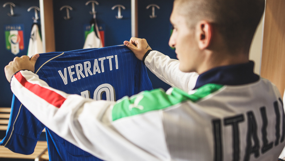
Where do you start when given the task of designing the type for a national teams kit like Italy?
"Well firstly, all the national teams have the same type. Only the Italian numbers have a slightly different shadow effect. To match the trims and details of the rest of jersey, we decided to make this shadow in contrast gold. All the other teams have a tonal shadow effect."
"We've started with the idea of making a fast looking type. Since last year PUMA declared being the fastest brand in the world. That´s why we have the slogan FOREVER FASTER. We wanted to express this fastness through the type. Motorsport was a good inspiration. Especially, race movie posters!"
"At a second stage we also started looking into different shadow effects. The idea was to highlight the numbers a bit more. How can the numbers stand out?"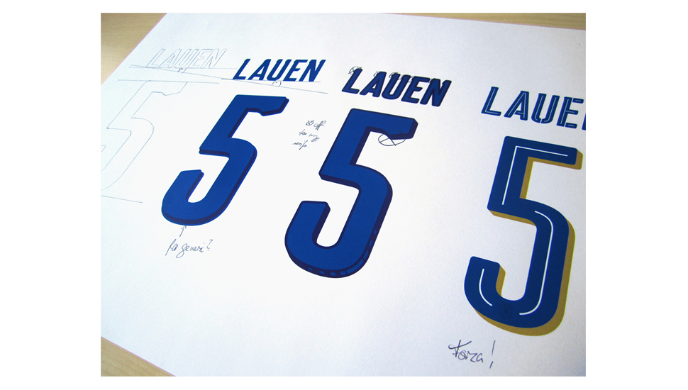
How many iterations do you go through before you've reached the finished article?
"In the beginning I had way too many serifs and soon figured out that they where the problem as to why the type did not look speedy enough. Since getting rid of most of them, this has resolved that issue."
"Initially, the idea was to rotate the names and the numbers by 8°. This again came from movie posters and also from Usain Bolts famous pose. The outcome was great, even better as the final outcome, but unfortunately, it is too complicated in production and once it has been applied on the garment. What a pity! Another fun part in the design process, was to see, how far we can go with special glyphs. In 2014 we had a special 'A' for the ITALIA wording. This time, we tried to go to the extreme, but played it safe in the end."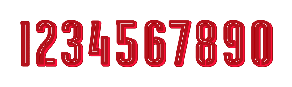
What particular features or character do you feel particularly fond of with this font?
"I personally like the 'button effect' of the generic numbers. The way, the outlines are set up, it looks like you can press the numbers down. Out of all 10 numbers, the number 8 is my favourite, as I really like how the 2mm laser cut stroke is set up."
The kit stands out as a sharp addition to the European scene, it must feel pretty special to know that some of the world's elite will be sporting your work?
"It is always great to see your work worn by famous athletes. This is the beauty of working on football products. It doesn´t matter if you work in apparel, footwear or accessories. We don´t watch football for the games sake, but just to see our products in action."
A positive response to this cultured kit that represents a gifted country - flair and style, they'll no doubt look the part. You can pick up an Italian 15/16 home shirt by PUMA here. Big thanks to PUMA and Ulrich for taking the time to share the craft and graft behind the shirt.


