

The big news over the weekend was the PCP's Capital Partners' confirmed takeover of Newcastle United. It’s going to mean big change for the club in the near future, and as well as Steve Bruce being on borrowed time, could the same also be said for the club’s crest?
Newcastle United have long been something of a sleeping giant, but now it appears that that giant is ready to get out of bed and cause some havoc. Yes, Mike Ashley’s reign is over and Newcastle United are now the richest team in the Premier League. While the Toon will fantasise about the inevitable big money signings to come in the near future, the Saudi-led takeover could also be a cue for what some will say is a long-overdue makeover for the club, starting with the club crest.
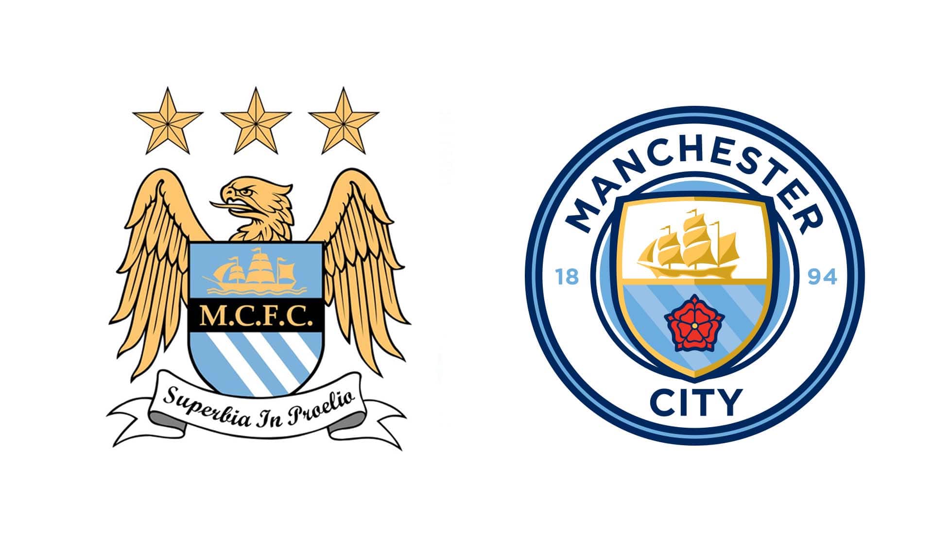
Commonly, a big money takeover fuelled by oil is followed by a club rebrand, with an updated crest high on the agenda. Roman Abramovich bought Chelsea in 2003, and the crest was updated in 2005, initially to coincide with the club’s centenary, but adopted permanently from then on. Manchester City were bought by Sheikh Mansour in 2008, with the crest update coming in 2016, a move used to freshen up and unify all teams under the City Football Group ownership. In 2011, Qatar Sports Investment purchased a then under-performing Paris Saint-Germain side, and that was followed in 2013 by a – you guessed it – crest update in 2013. You can see the trend…
Club crests are a sacred part of the club’s identity. Get a rebranding wrong and you risk the wrath of the fanbase, but get it right, and you’re looking at a fresh visual identity that can usher in a new era for the club – very fitting for Newcastle United.
Often, particularly with English clubs, a crest is steeped in history. Some elaborate designs feature several elements, all building a picture and telling a story. But we’re living in a new age; an age where less is more, where it pays to have a streamlined logo that is more social-media friendly. Newcastle’s current crest, which features several elements within its design, has been in use for over 30 years now.
The new Newcastle owners will undoubtedly want success on the pitch, that’s the priority. But further than that they’re probably going to want to turn Newcastle United into one of the biggest global brands, able to compete in a commercial sense with the likes PSG, Manchester City, Manchester United and Real Madrid. So it stands to reason that they may want to freshen things up at the club a bit.
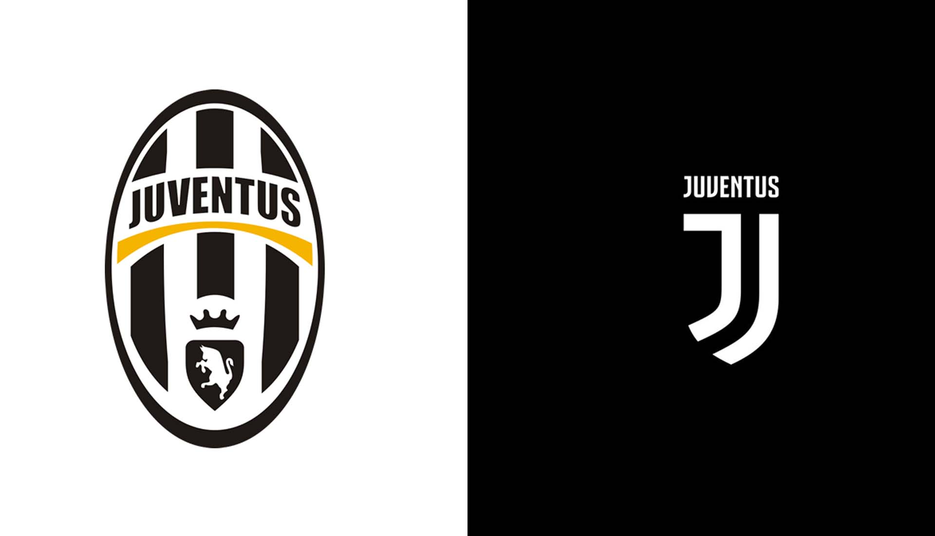
Sure the history and tradition is there for all to see, but that doesn’t mean that the club can’t also be progressive with it, and that could potentially all start with a new club crest. Just look at Juventus and what they did back in 2017, kickstarting the radical and modern overhaul of traditional club crests. Yes there was kick back initially at the redesign, but now that the dust has settled, few would argue with its sleek, stripped back simplicity, instantly recognisable as it is.
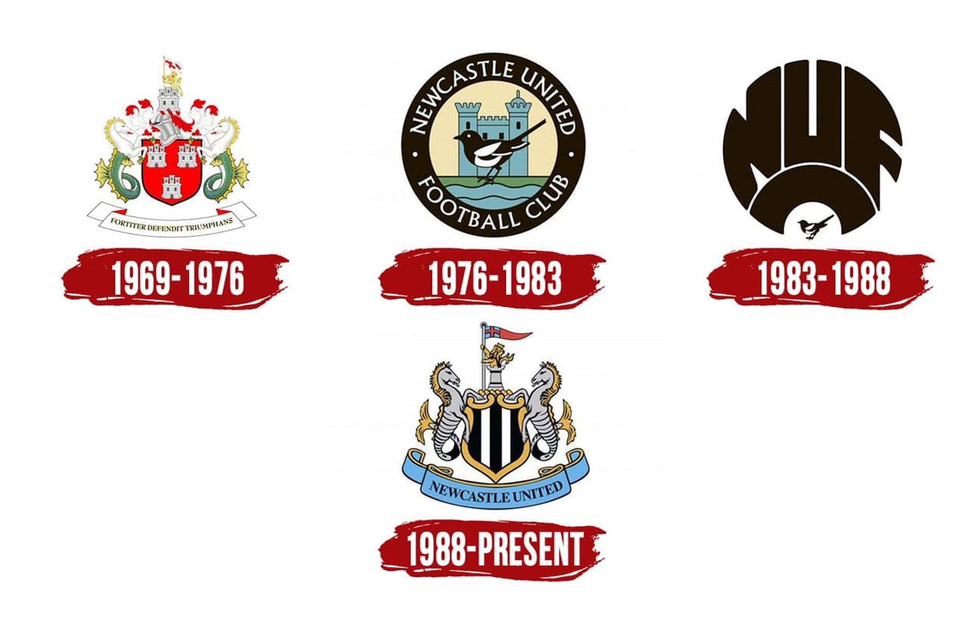
For the Toon, the current club crest was first used in the 1988/89 season. The crest includes elements from the coat of arms of the city of Newcastle upon Tyne, with the two sea horses – a feature lifted from the club’s first crest – representing Tyneside's strong connections with the sea, and the castle representing the city's Norman keep. It’s a glorious design for sure, but it’s a busy one not necessarily suited to the streamlined demands of the modern day.
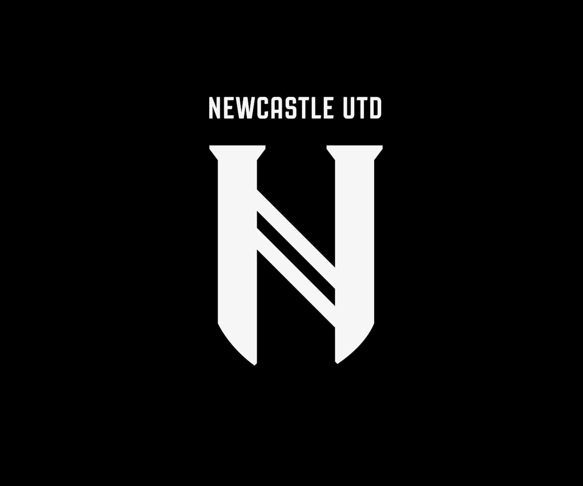
So what could we be in for? As we’ve mentioned, it has to be streamlined, but at the same time it needs to maintain certain elements. Picking up influence straight from Juventus after a trip to Turin, Art Director Kevin McKay took an in-depth approach to recreating the club crest. Paring back the many elements currently within Newcastle United’s crest, he aimed to make a minimalist typographic solution for a more contemporary rebrand. Using the letter form’s serifs to suggest castle turrets, the design focuses on the unification of Newcastle East & West that occurred in 1892 – the key moment that brought about the Newcastle United that we know today – and how they are now connected by the black & white stripes of NUFC.
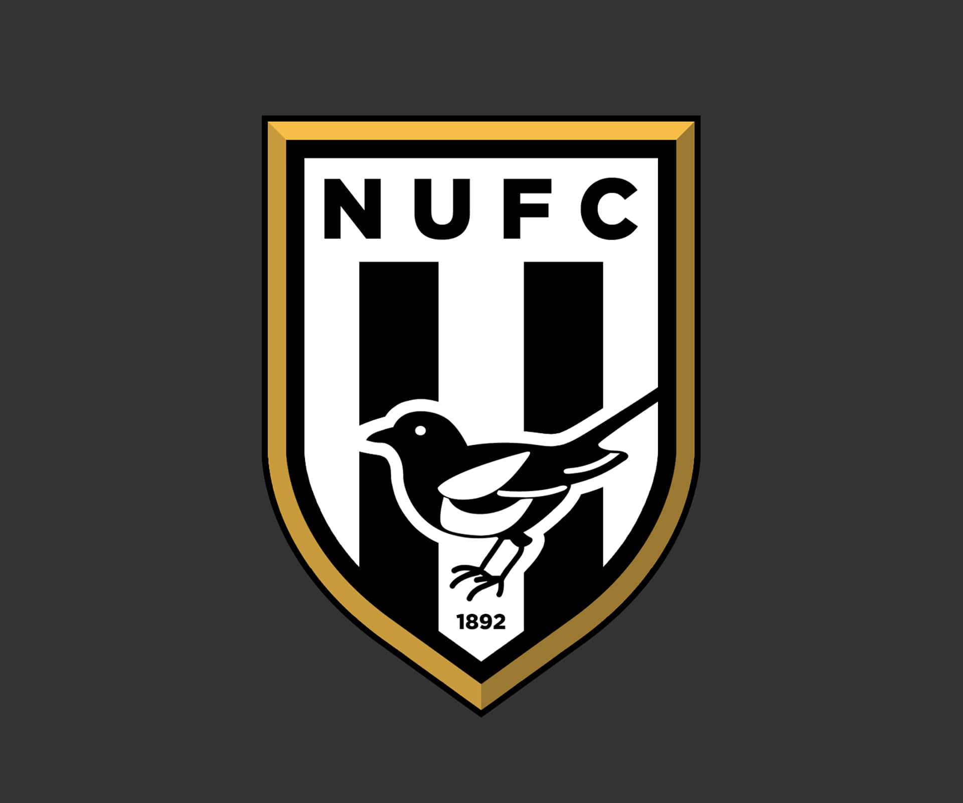
Some have called for the return of the Magpie to the crest, seen prominently in the 76-83 crest and again appearing on the 83-88 crest, and designer WestwardLord posted an option for this on reddit a year ago. It also featured just the NUFC lettering, a further nod to the 83-88 crest.
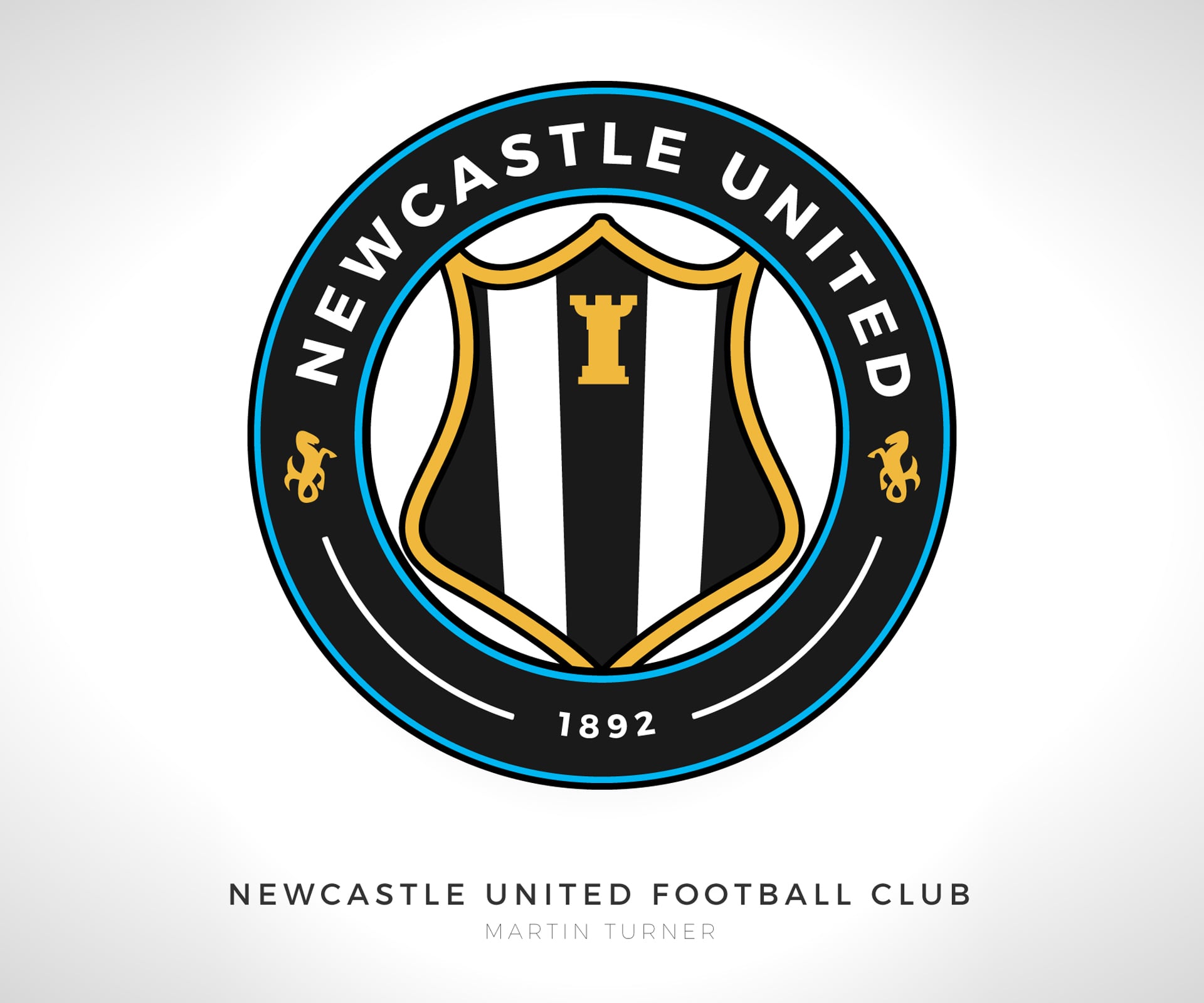
For those not keen on losing so many of the elements present in the current crest, designer Martin Turner offered up an alternative on designfootball.com that retains the core elements of the current crest, but streamlines their appearance. It’s a look that is in line with what both Manchester City and Chelsea have done with their updates.
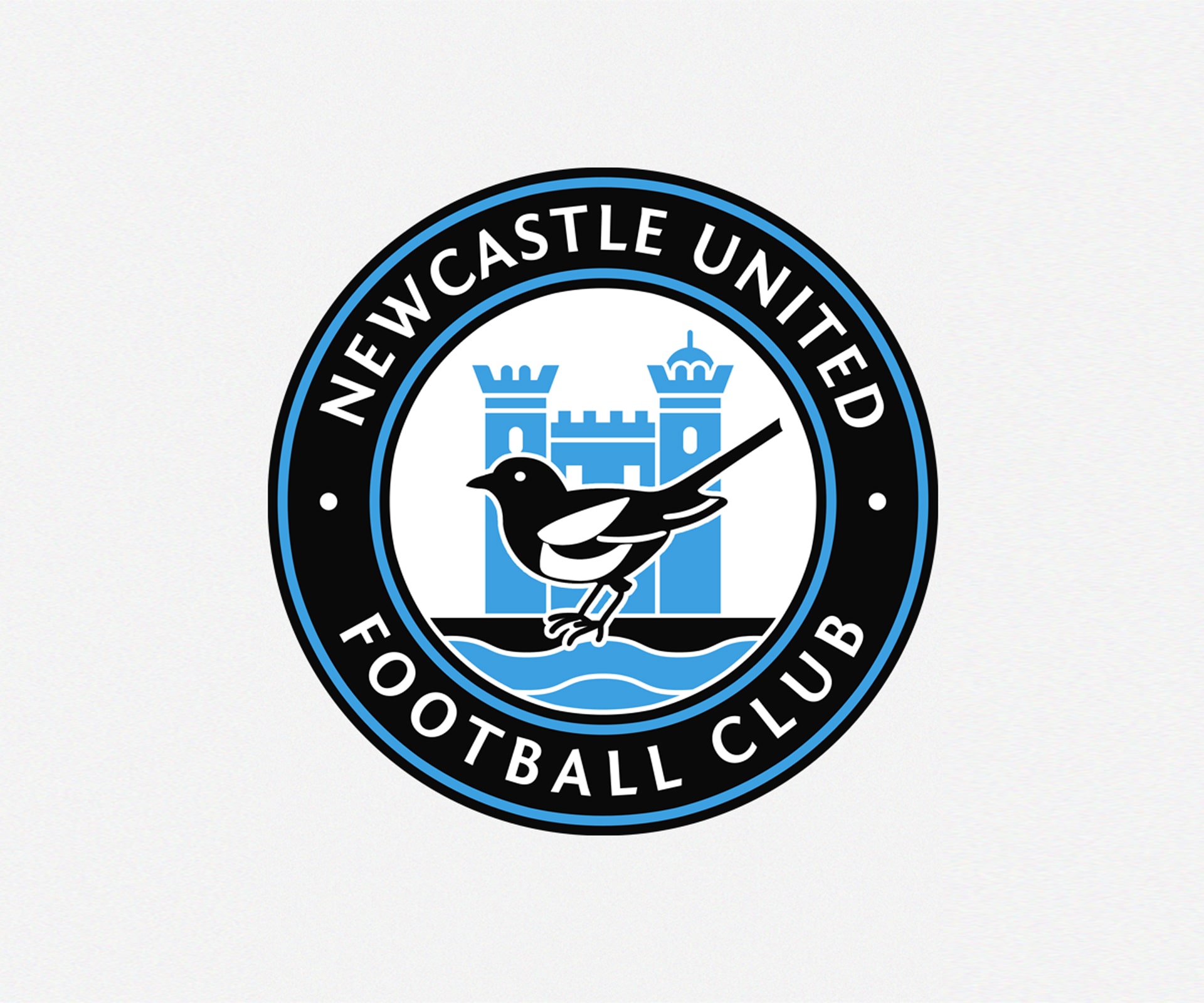
There will be some that just can’t let go of the past and don’t want to see drastic change though. For those, designer turbinal, again on designfootball.com, simply updated the 76-83 crest, which is already not far from modern day rebrands. It shifts the colour palette slightly, removing the yellow background and green ground, a simple tweak that provides the desired streamlined effect. Should please the Toon and social media alike. But not those who love seahorses.
It may be that this change doesn't happen for a few years, but we'd fancy it happening at some point under the new regime. Until then Toon fans, keep dreaming of those big name signings...
Check out some of the best logo rebrands in modern football here.


