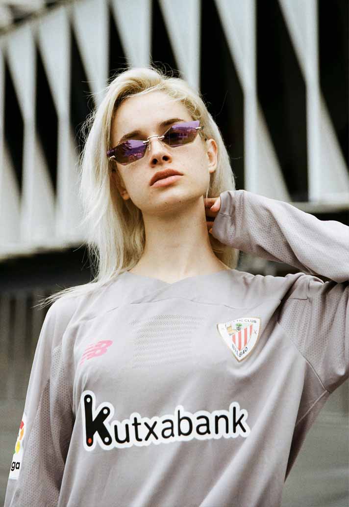
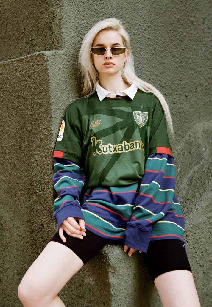
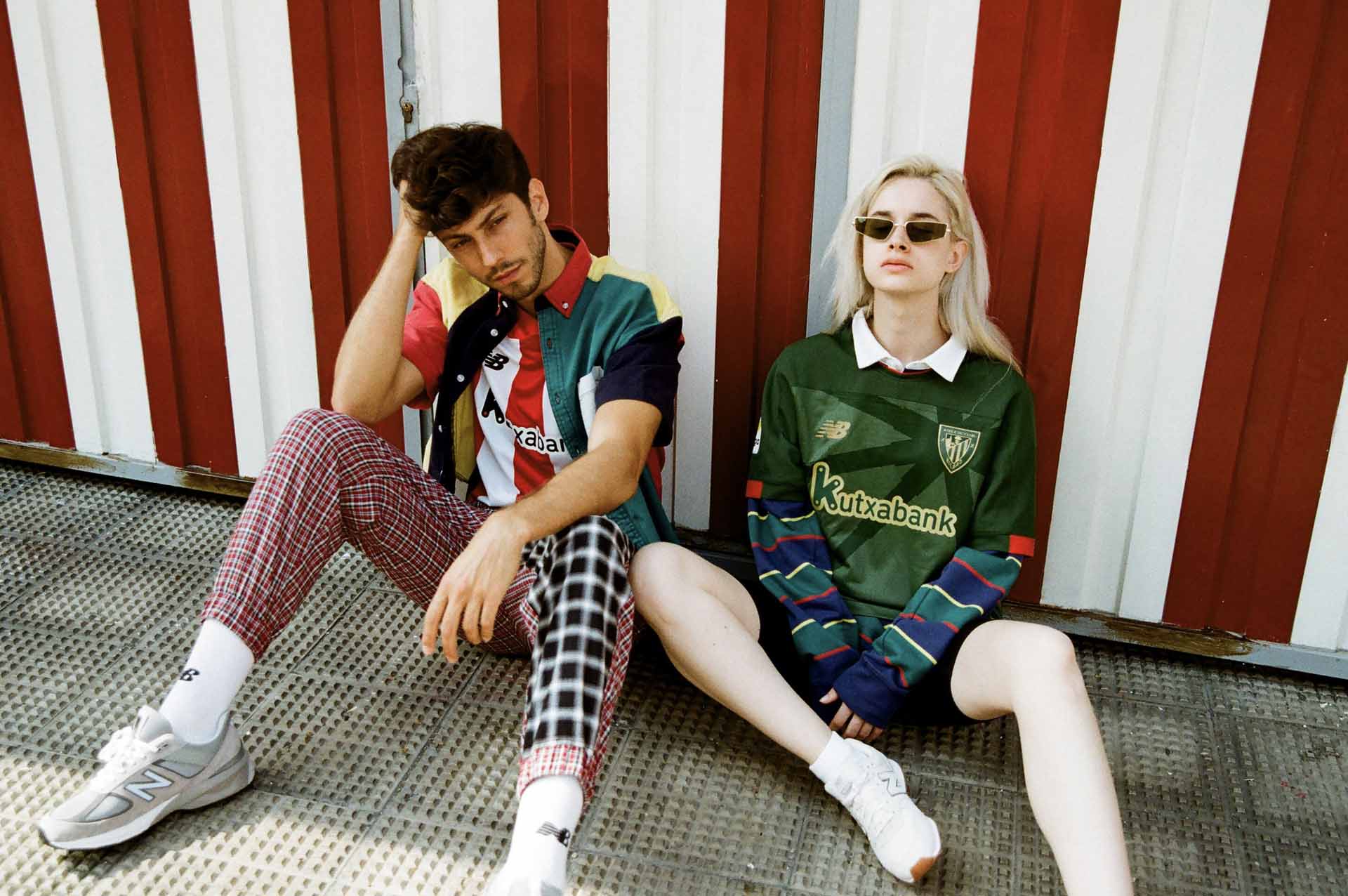
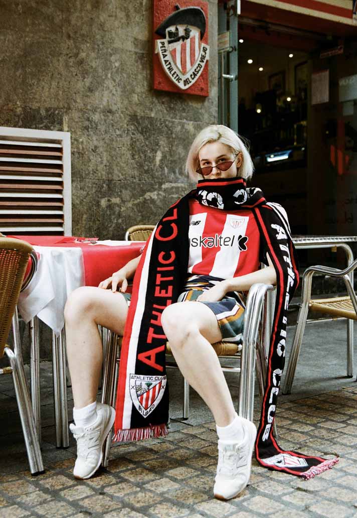
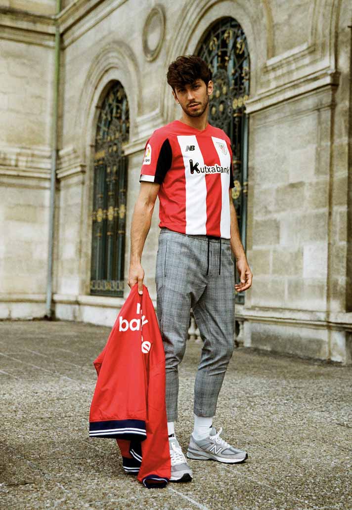
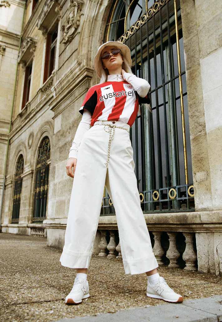
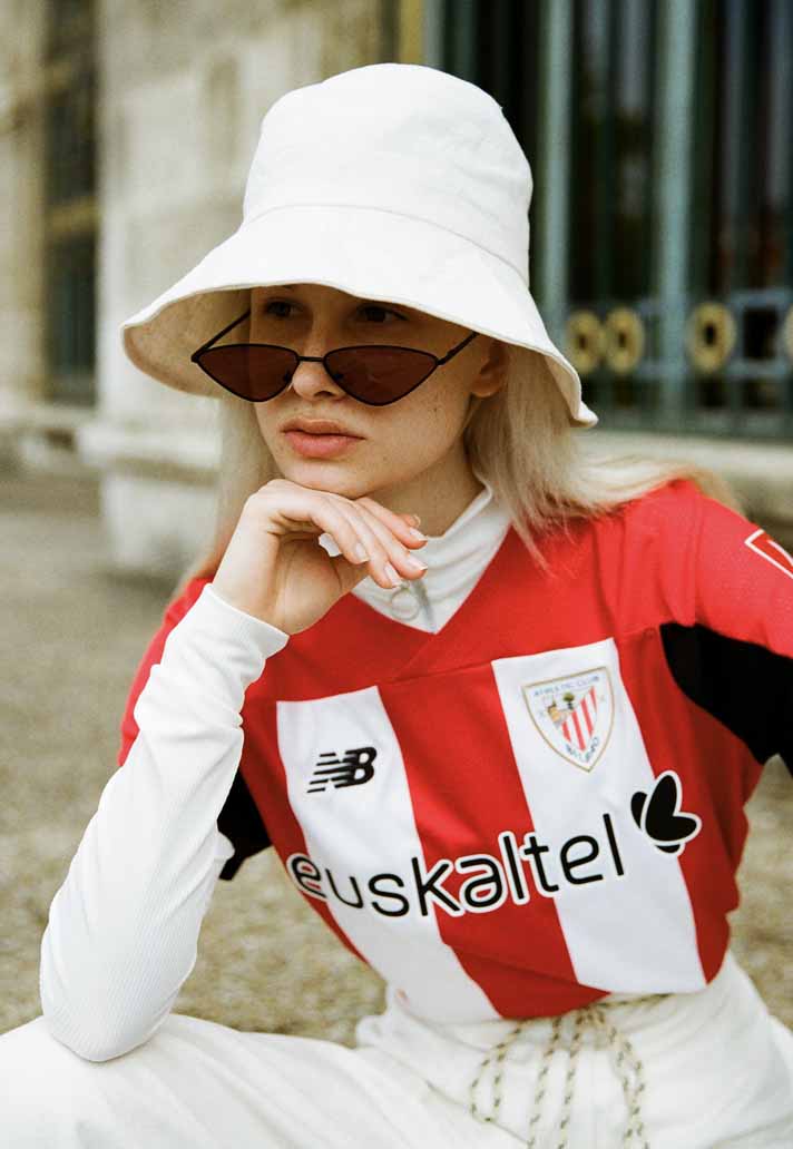
New Balance continue to showcase their 2019/20 replica work for some of their leading European clubs. The brand are celebrating the DNA of each club by creating unique and individual kits that speak of the very story at the heart of the cities that they represent. Cities such as Bilbao.
In the latest installment of the short series, we speak to the design team at New Balance to talk about the inspiration behind the design process for their 2019/20 kits, which has seen a celebration of the character of each individual city as an overriding theme. Next up, we're in Basque country for Atheltic Bilbao.
Bilbao is such a beautiful place; how much do you want to portray what the city is about through a shirt?
Bilbao is an amazing city. We always aim to tell a story through our jerseys, whether that’s about the city, the club or something else close to the hearts of the fans. It’s always a pleasure to design for this club in the amazing setting of the Euskal Herria.
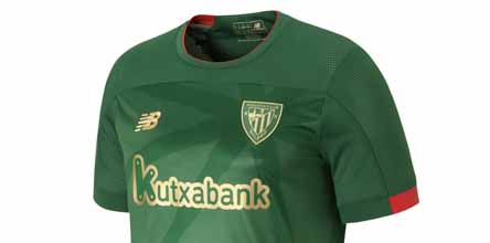
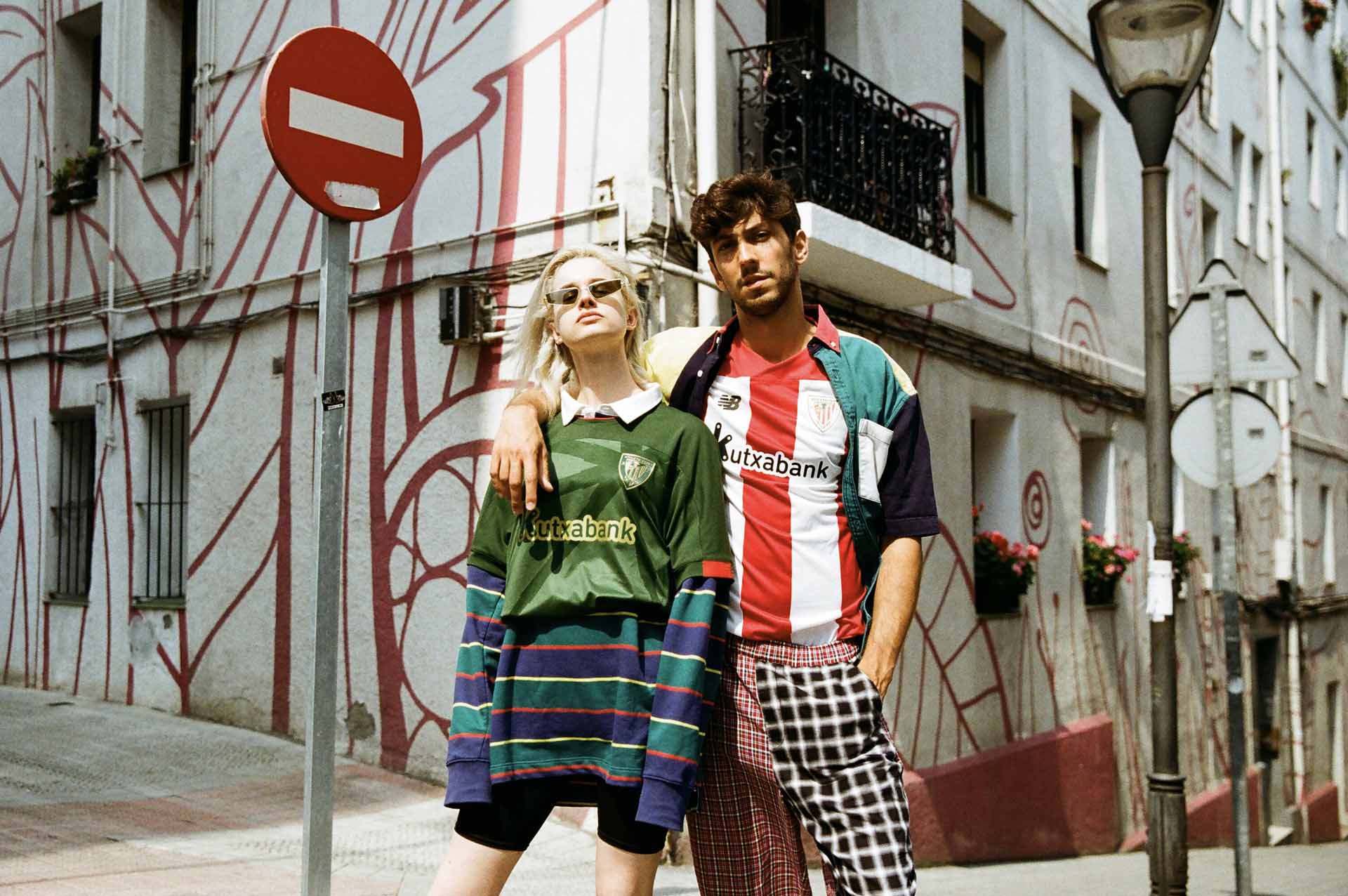
When you look at the away kit for example, you’ve worked in the Basque flag. Was that something that came from you or the club?
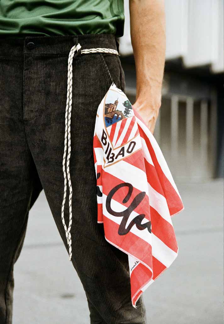
It was an open brief, as usual with Athletic Club. They like the Basque flag to be displayed somewhere on all kits, usually as a back neck sign off but for the away kit this year, we decided to celebrate the flag and amplify it’s visibility on the jersey.
How many iterations of a design do you need to go through to get to the finished article?
In any sector of design there is back and forth between key stakeholders but when the club and ourselves have a clear vision, it’s not long until we’re all on the same page.
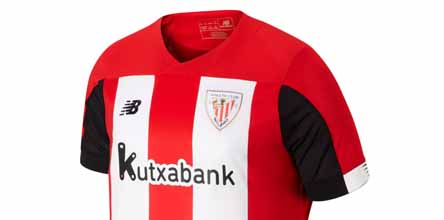
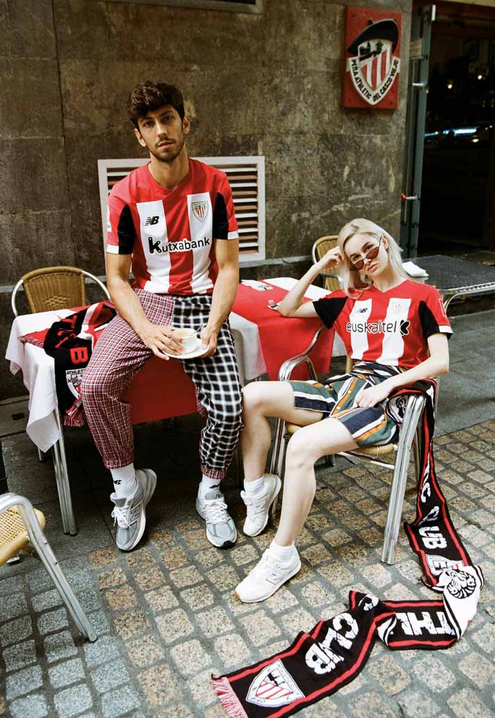
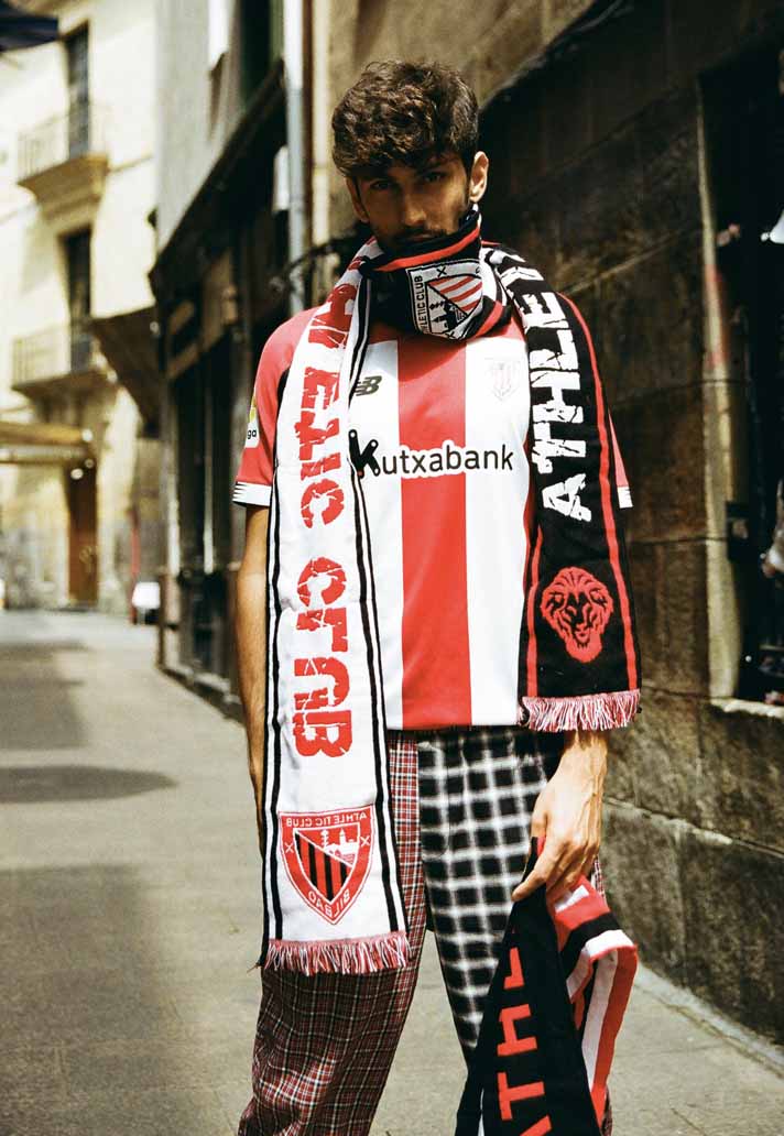
The home combination of red, white and black is so powerful. Does it come with added pressure when you have such a strong colour palette to work with?
Yes and no. You have to get the balance right of these dominant colours but when they are so iconic and typical of Athletic Club, they do the talking for you.
What have you learnt about Bilbao as you’ve been designing the kits? Is there something specific you think the club stands for?
The overwhelming principle that emerges from the fans, the city and the club is local pride. The partisan devotion to the players, the region and everything within it is so strong. It makes you want to be part of it!
How important do you think it is to create something that works off the pitch just as much as it does aesthetically on the pitch?
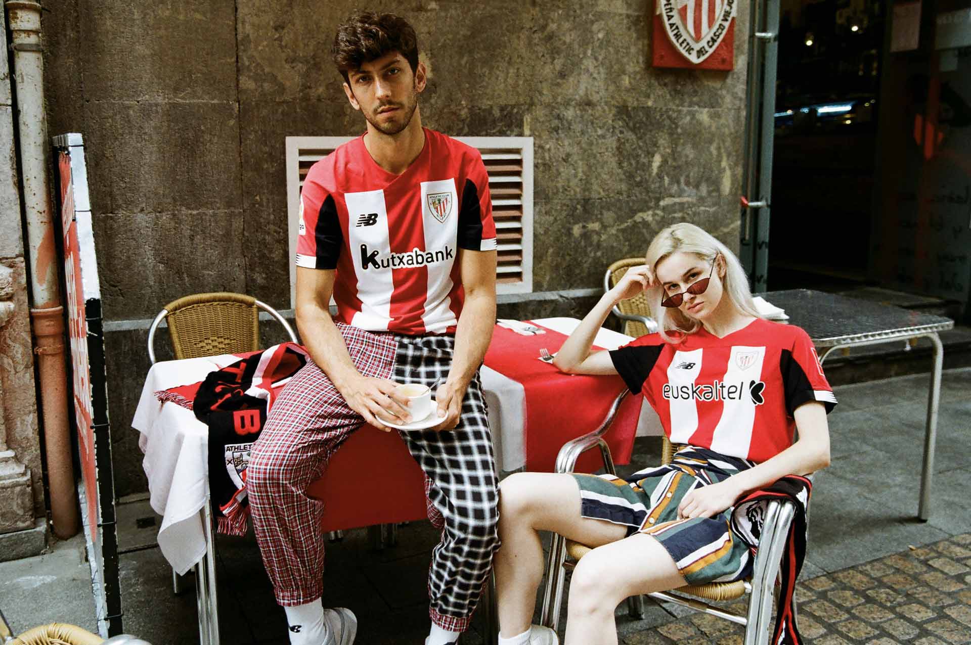
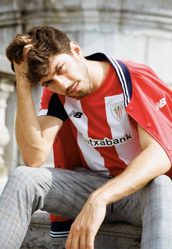
We are fully aware of the impact that football is having on wider culture, high street and underground fashion and other walks of life. The lines between are blurring and our jerseys have to work in all these areas. It’s a challenge but a one we relish each year.
Do you have a favourite out of all the Bilbao kits this season?
The away kit looked incredible in pre-season. That's the one that stands out most for us.
Once the season starts and you see the squad playing in something your team has designed... how hungry does that make you for the next one?
Well by that time, the next season jersey is already designed and signed off. It’s then the season after that which gets the attention. We’re always looking for ways to improve the design, the colour choices and graphic applications and all of us get very excited to get designing again and composing unexpected but real and stories.

Shop the full Athletic Bilbao 2019/20 replica collection at prodirectsoccer.com