It’s official: after over a quarter of a century, Pirelli will no longer be the front of shirt sponsor for Inter Milan, bringing an end to what has been one of the most instantly associated pairings in modern football history. Only fitting that we now look back at the best shirts from this iconic era…
Since 1995, Pirelli have been one of the few sponsors that have actually accentuated the look of the shirts upon which they sit, becoming an integral part of the Inter Milan shirt design over the last two and a half decades. So it’s a sad day to hear that, confirming previous reports, Inter Milan are set to part ways with the Italian tyre manufacturer bringing the curtain down on one of the most enduring partnerships in the game. The latest deal between Inter and Pirelli was signed in February 2016, but it appears that there is big change ahead for the Serie A side.
So it seems the only course of action left to us is to look back on what has undoubtedly been some of the best shirts of the last 26 years. With so much quality, this list could have been seriously extensive, but we’ve managed to whittle it down to 15…

1995/96 Away
Big, baggy, brash and with a collar... everything you could want from a 90s-era shirt. The first season for Pirelli, with Inter's shirts still being produced by Umbro. Would happily see a modern remake of this. Sad we'll not get it complete with Pirelli sponsor...
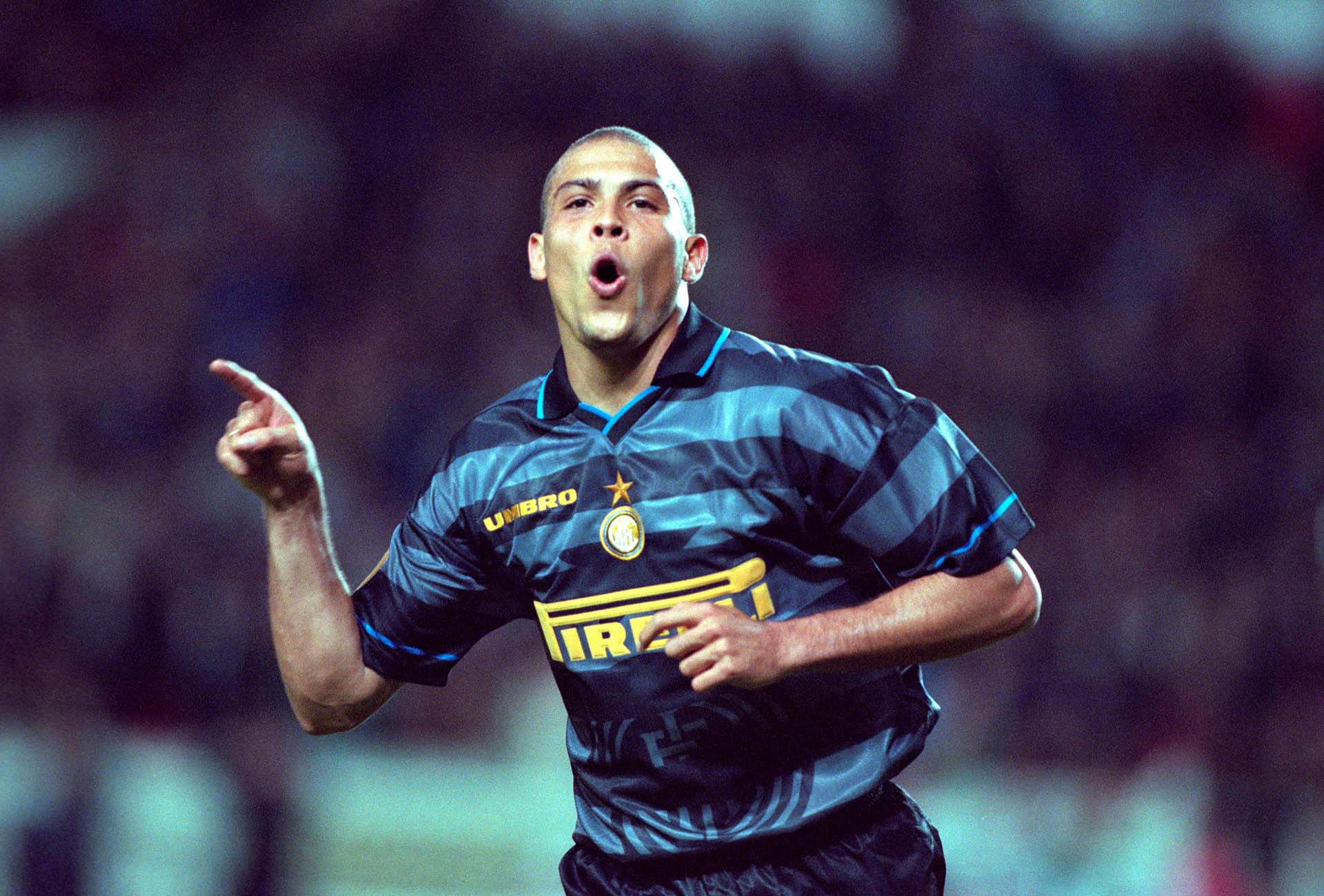
1997/98 Third
Iconic doesn't even cut it for this. Peak Ronaldo destroying teams left, right and centre. Think Pirelli and Inter and this image shouldn't be far off what you're imagining.
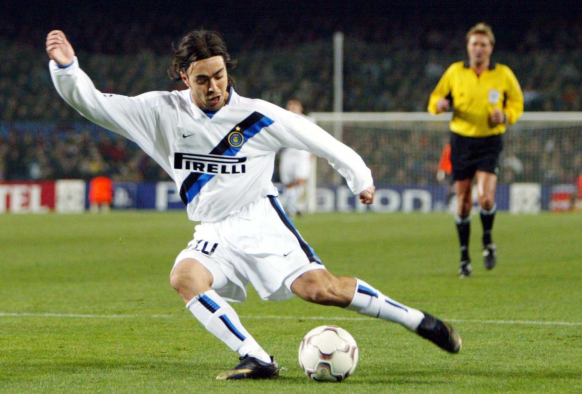
2002/03 Away & 2003/04 Third
Nike took over the reigns at Inter in 1998, but despite some solid efforts it took the Swoosh until the 2002/03 season to really find its Inter groove. The way that diagonal band ran into the shorts... So good they kept it on for another season.

2007/08 Away
Celebrating the club's 100 year anniversary, the Pirelli logo graciously made way for that large St. George's cross design, shrinking down and taking its place just below the club crest. Nike, take notes for the next England kit please...

2008/09 Home
To celebrate their Serie A title win in the previous season, the 08/09 shirt was gilded in gold, including, for the first time, the Pirelli logo. This was the first home shirt in the successful Mourinho era.

2010/11 Home
At the peak of their powers, this was one of the first times that Nike experimented with the shape of the famous stripes – a sign of things to come. Inter went on to win the FIFA World Club Cup under boss Rafa Benitez this season.

2010/11 Away
How many teams could get away with having a frickin' dragon on their shirts? Not many, but Inter were definitely one.

2013/14 Home
A shift in tone for the recognisable blue stripes of Milan, probably brought on due to their worst league finish in almost two decades in the preceding season. Can't take anything away from that fresh take on the classic look though. Looks all the better with Javier Zanetti doing his best Saturday Night Fever impression too.

2014/15 Home
The struggle in the league continued, but the fresh takes on the traditional club look stepped up a gear with a shift to pinstripe. That dark base accentuating the white Pirelli logo, which by now was intrinsic to the design. Pure class this.

2019 '20th anniversary' Home
Nike and Inter Milan released this special mashup jersey to celebrate the 20th anniversary of their partnership, taking some of the highlights from Inter’s last two decades of competition, selecting the 10 kits that marked the club's biggest achievements and fan memories.

2019/20 Home
A simple enough switch up, but incredibly effective. Taking inspiration from the classic away kit the Nerazzurri wore in the 1989/90 season, the 2019/20 shirt featured a band of diagonal stripes stretching across the chest, with Pirelli proudly sat on top. A stylish intersection of the famous vertical stripes, the fresh approach kept the home shirt fresh and modern whilst respecting tradition.

2019/20 Away
The 2019/20 away shirt arrived in a vivid aquamarine colourway that brought back memories of the goalkeeper shirt that Julio Cesar wore when the club clinched a historic treble in 2009/10. That alone would serve as enough inspiration for most shirt designs, but this one didn't stop there, with some black and gold trim featuring on the collar, cuff, rear neck strip and club crest that’s a homage to the elegance and grandeur of the city of Milan.

2019/20 Third
Completing the treble and setting Inter out as one of the most stylish clubs across Europe, Nike graced the side with a retro fuelled third kit that placed solid emphasis on Inter’s long-running partnership with Pirelli. The return of that classic Nike Futura logo didn't hurt either.

2020/21 Home
Taking that subtle shift from the 19/20 season and running with it, Nike went full on with a design Inspired by postmodern Milanese designers of the 1980s. It featured reimagined Nerazzurri stripes in a pop style, designed in waves and zigzags, alongside a crew neck collar and black side stripes.

2020/21 Third
Instantly bringing to mind images of peak Ronaldo, the Inter third shirt is undoubtedly the best of the Nike third shirt brigade for this season. It draws inspiration from one of the most iconic Air Max styles — the Air Max 97 “Silver Bullet”, but it's those retro-vibes that had us sold. Pirelli popping in yellow. Circle complete and all that.
Shop Inter Milan shirts on prodirectsoccer.com