
Where do you go after having not one, not two, not even three but four absolutely top-drawer kits in one season? Well, for the maverick force in football culture that is Venezia FC, you simply reinvent and go again, starting with a new home shirt.
For their return to Serie A last season, Kappa blessed Venezia with four beautiful kits. Sadly, they alone were not enough to keep the club in the top flight of Italian football for a second season, but as the the Venetian side have proudly stated, “Failure is success in progress”. With that in mind the club have been through a rebrand ready for a new charge, and the 22/23 home shirt arrives as the first of the club’s new kits for the coming campaign, complete with reinvented club crest and all created in collaboration with design studio Bureau Borsche.
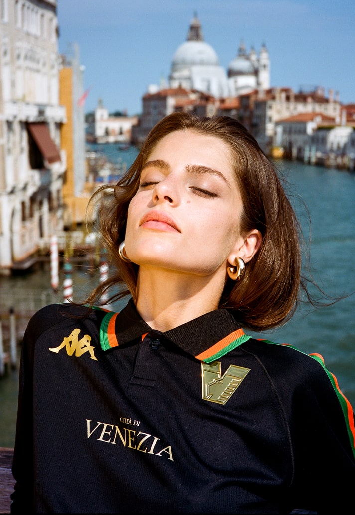

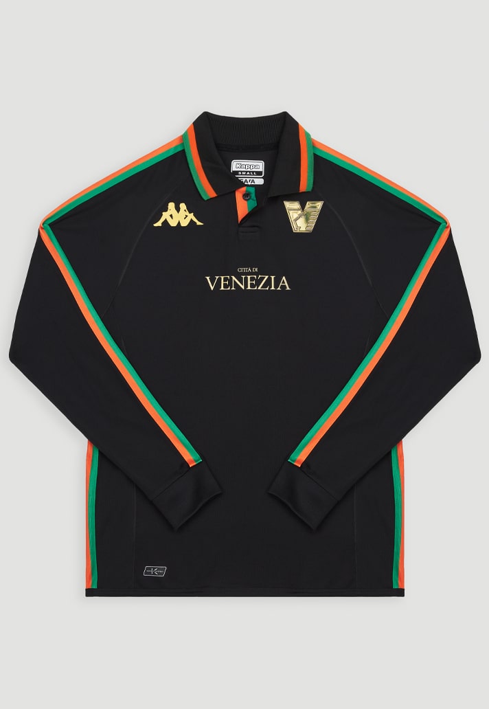
The design of the Venezia 22/23 home shirt flips vintage football into high fashion with a return to 90s aesthetics thanks to the addition of a collar and the option of long sleeves. As with last season’s home shirt, the deep black base is once again elegantly accented with rich gold embellishments — specifically, the new club crest and new Città di Venezia city script — while thin, understated orange-and-green taping borders the whole look, running along the sleeves and down the sides. It also features as the trim on that collar, with its single-button closure, perfectly maintaining the flow of the shirt’s orange-and-green stripe motif.
It has to go down as yet another win for both Kappa and Venezia, reinforcing the Italian side’s position as one of the most modern and innovative clubs in world football. Roll on the 14 and 21 July for the away and third shirts respectively.

As with the recent rebrand, we were able to get some inside insight into the design process behind the new home shirt – particularly the option to go long sleeve – from Venezia FC CMO Ted Philipakos.
So tell us about the return of long sleeves. What drove that? Was there an era or time that inspired this when coming up with ideas for it?
We like to play with tradition and modernity. In thinking about this year’s collection, we wanted to express something more classic, and in particular we wanted to reference the 1990s. The period from 1987 through the 1990s was an important era for Venezia FC, which reached its high point with Álvaro Recoba’s legendary performances in 1999. When you look back at images of those days, it’s inspiring.
So, we wanted to feature collars and long sleeves in the collection — especially the long sleeves, because people have been wanting to see that return. We took the concept to the design team at Bureau Borsche and shared some references of 1990s-era football kits, specifically from England and Italy. We knew we had the perfect partner to produce the work, because Kappa has an amazing heritage from the 1990s, having created so many iconic looks that people still talk about today, and they fit seamlessly into the narrative. But you don’t want to just repeat the past; the key was to strike the right balance between past and present and create something original.


It brings such a level of premium to football shirts – was that conscious?
We do think it elevates the shirt, but the motivation was purely aesthetic rather than to create a more premium item. It should feel equally relevant on the pitch, in the terraces, and on the streets. You should feel a blend of past and present, with classic elements meeting a very clean contemporary look.
It also makes them so wearable. It transforms them into way more of a lifestyle product – was that the aim too?
We definitely think a lot about wearability, and that’s just one of the reasons why we view the 22/23 collection as our strongest ever. We've noticed fashion brands like Balenciaga and Aimé Leon Dore releasing these more minimal long-sleeved football shirts, but we were already on this track. Our collection was shaped by the past and our team's sensibility more than it was by any prevailing trends.
What was the Kappa response when it came to proposing this idea? It’s probably something brands have not had to think about so much over the last few years?
They were a bit thrown at first. But once they understood how serious we were about it, they were all in. It was not an easy process, especially with the home shirt which has the taping down the sleeves. But in the end they executed beautifully.
It feels like the club are so in tune with the trends of football culture or moreso, the missing gaps. Is that fair to say?
If that’s true to whatever extent, it’s probably because we’re genuine enthusiasts. It's probably also because we don’t have an owner meddling out of ego or an overbearing corporate structure; we hire talent rather than puppets and we have a lot of freedom to work.


Long sleeves will make people fall for Venezia all over again. How do you process all you’ve done with Venezia in turning them into the benchmark on the planet? You must be proud of that?
Our team should definitely feel proud of the work we’ve done over the last few years. When you start to process it, it’s always in the context of where we started, which were humble beginnings, not too long ago. And since then, it’s always been the same. As cliché as it sounds, the whole thing is just a love story — what you see from Venezia FC is ultimately just people who love the city, love the game, and love the culture around it, which is unconditioned by whether we win or lose on Sunday.
How’s it going to feel when you see full sleeves sweep the market the following season?
If that happens, I’m sure we’ll love it and hate it at the same time.
The 22/23 home shirt is available at shop.veneziafc.it


