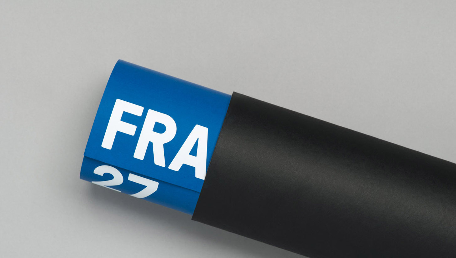
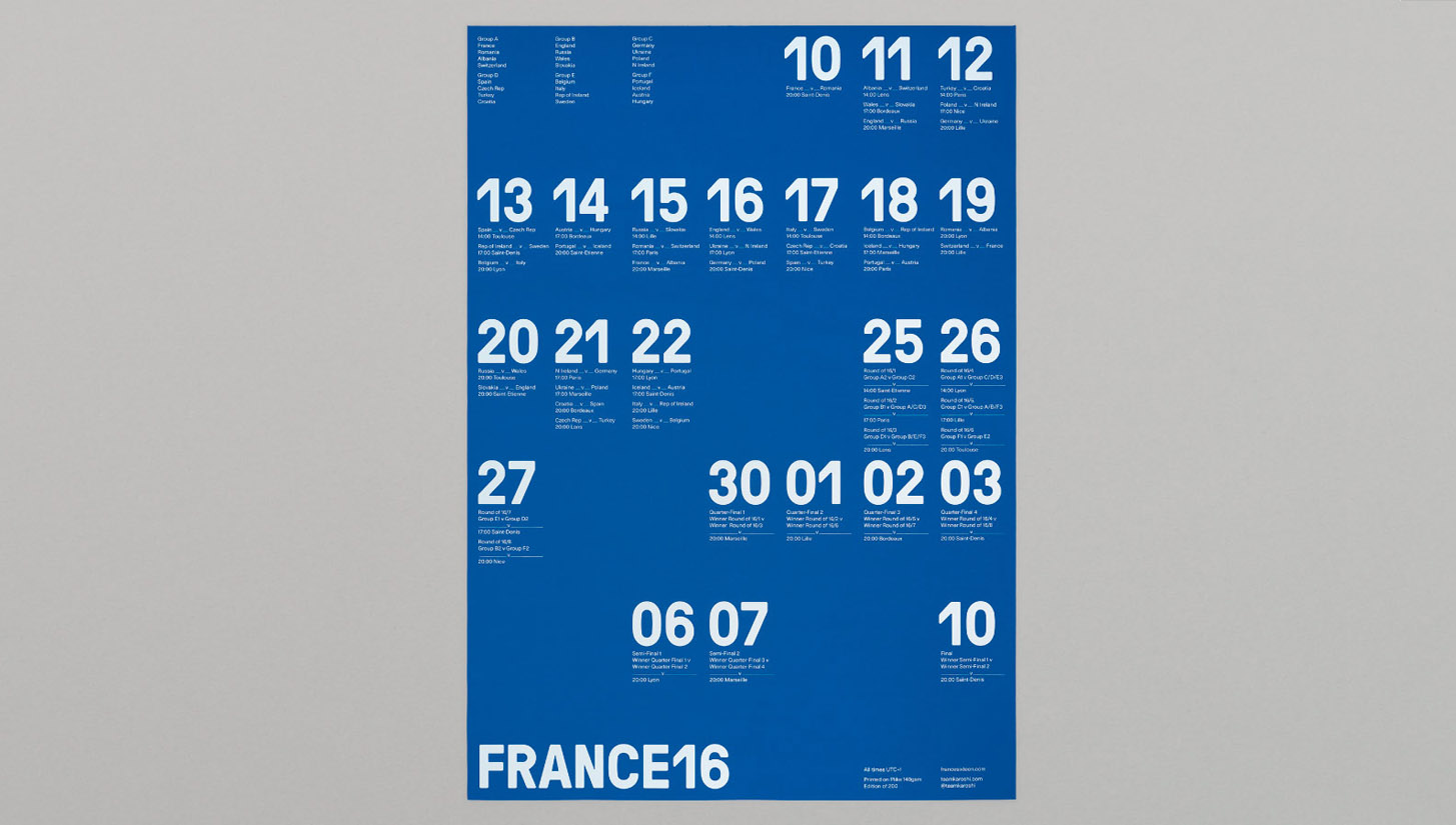
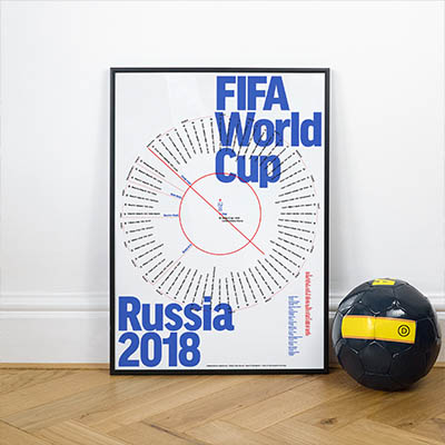
A serving of beautiful minimalism sees the team at Karoshi combine their passion for football and design whilst showcasing their talents with a wall chart that crosses through both print and digital disciplines.
A unique take on what traditionally was always quite a disposable tournament companion, this piece of work turns the cliche nicely on its head once more. No messing around either, straight to the point and entitled 'France16', it is an internal project for the agency that continues from where Brazil 2014 left off.

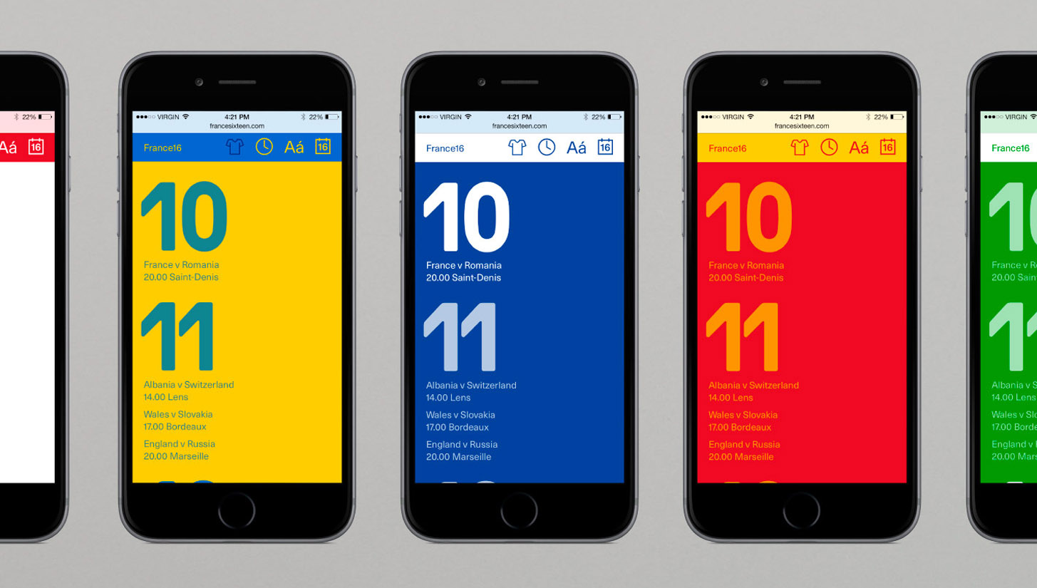
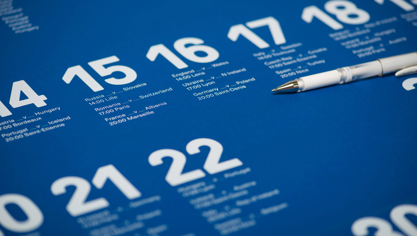
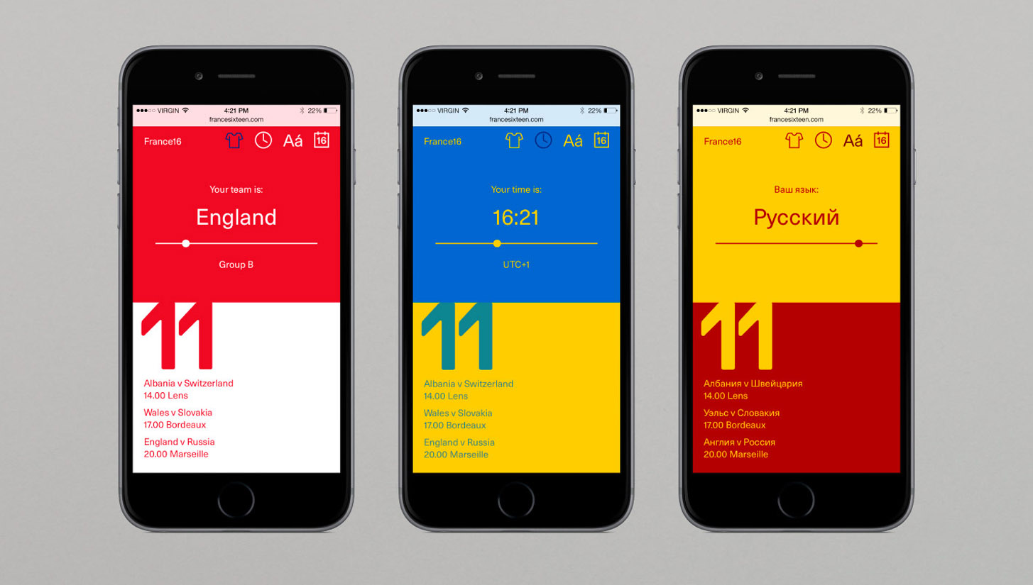
A self-imposed question penned this brief: "How do you enhance the sporting experience of an international audience?" Their answer: "Driven by the success of our Brazil World Cup project, we indulged our passion for football and information design, in both print and digital. Our responsive website is now translated into 11 European languages across 41 time zones. Featuring a downloadable fixture list, the site is updated as the tournament progresses and can be customised based on the user’s team colours. The website is complimented by a limited edition B2 poster, screen printed in white onto Royal Blue Plike, and supplied with a white pen allowing fans to record the results."
Beautifully done, you can find out more information here.
