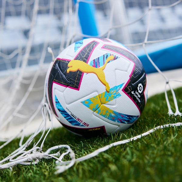
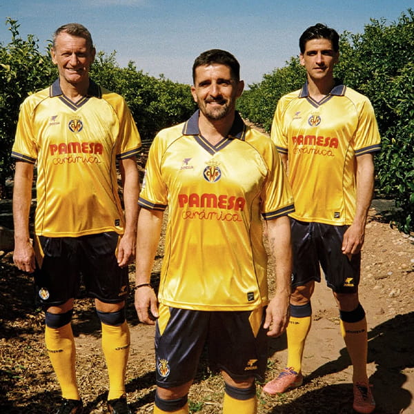
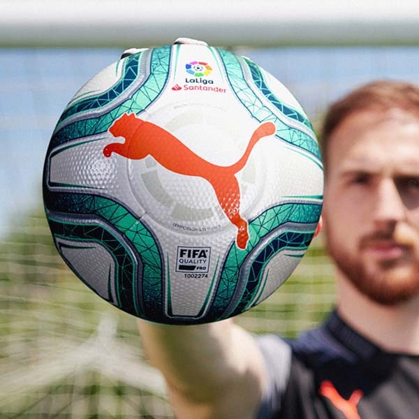
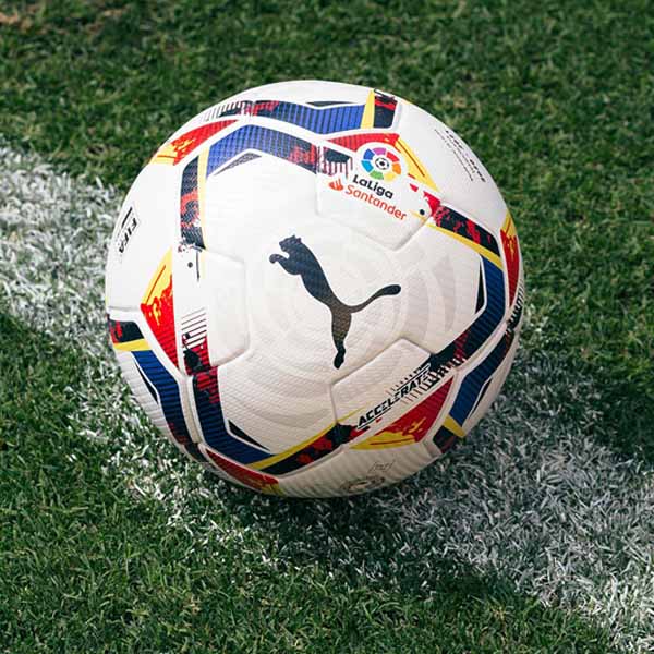
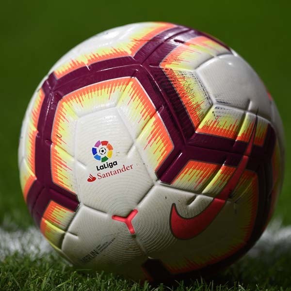
Given the task of refreshing the branding for one of the most inspiring and creative leagues in the world. It's no small task. Inspired and re-engergised with cool shades of subtlety all over, IS Creative Studio when to work behind the scenes with this re-branding project. A beautiful tidy, it's a monumental piece of work.
Quite the case study to have in your locker, this enviable re-brand is one that is considered at every angle. Reworking the basics with time and a detailed approach, the more you look, the more you appreciate. Naturally, it's one that people may be quick to judge but when you examine the finer detail, it's certainly one to appreciate.
Equally, it's easy to draw comparisons with the work done in re-branding the Premier League. In similar fashion, it's about bringing the aesthetic of the league to contemporary places. 
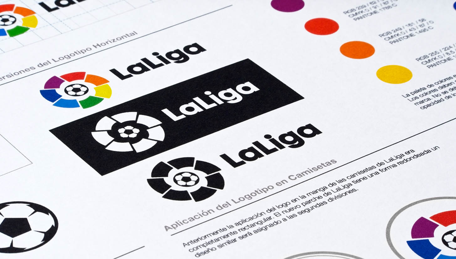
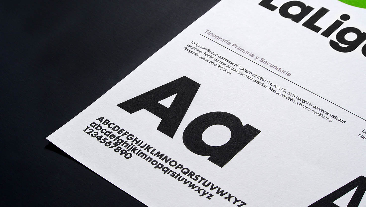
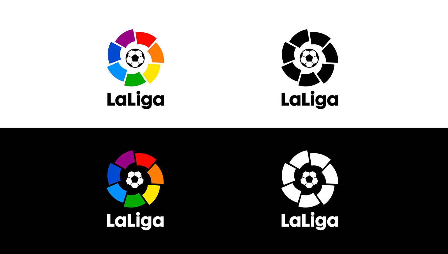
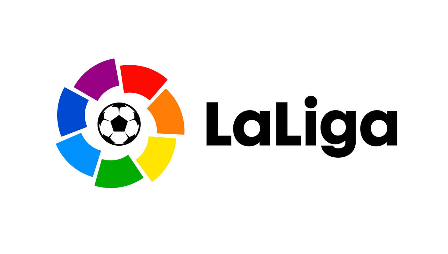
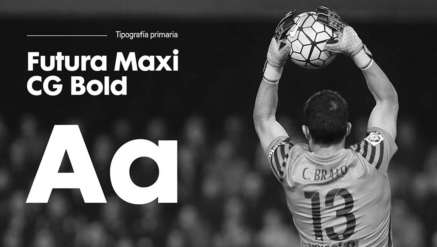
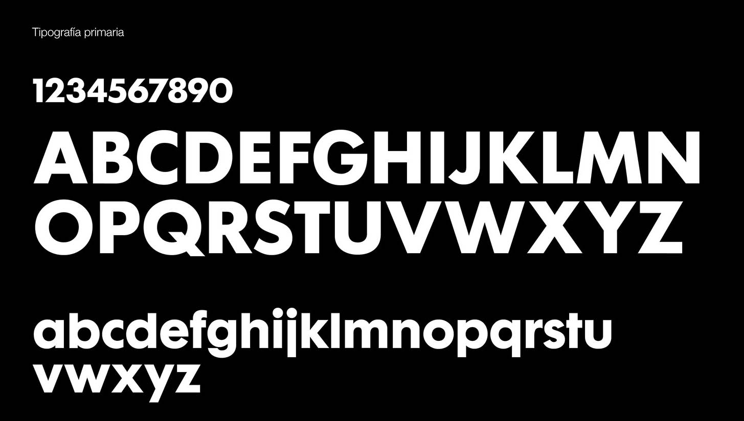
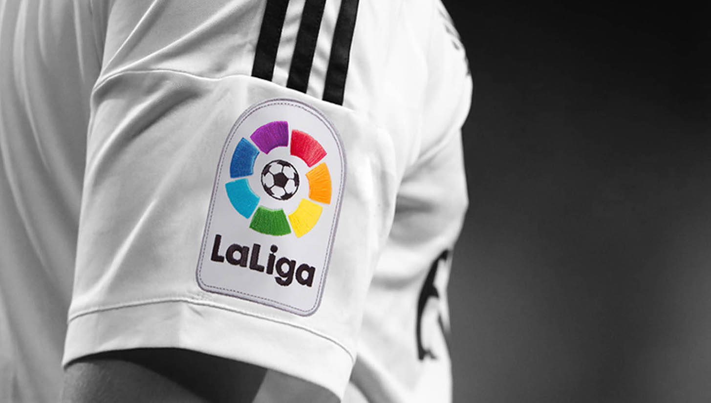
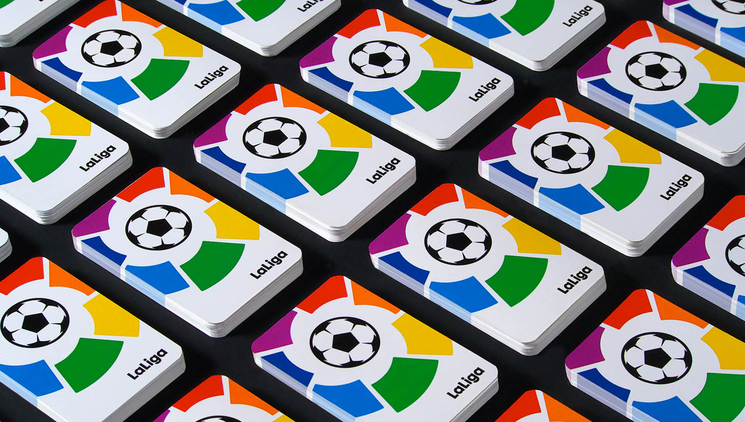
Describing the project, IS Creative Studio outlined proceedings as well as the objective as being, "A huge challenge that filled us with excitement to work with the best football league in the world. The goal was to design a contemporary evolution towards a strong, vibrant and dynamic identity that express the values of unity and team spirit. We went through a thoughtful and detailed process. We reconstructed the symbol and the ball, accentuating the shapes with rounded angles to give the brand a more friendly, warm and human approach. Also, we define the typefaces and the right proportions of the new system for the various applications of the brand. A solid and coherent evolution for a brand that is recognised and admired by millions of fans worldwide."
An identity that is refreshed and disciplined. You can explore the project further here.

