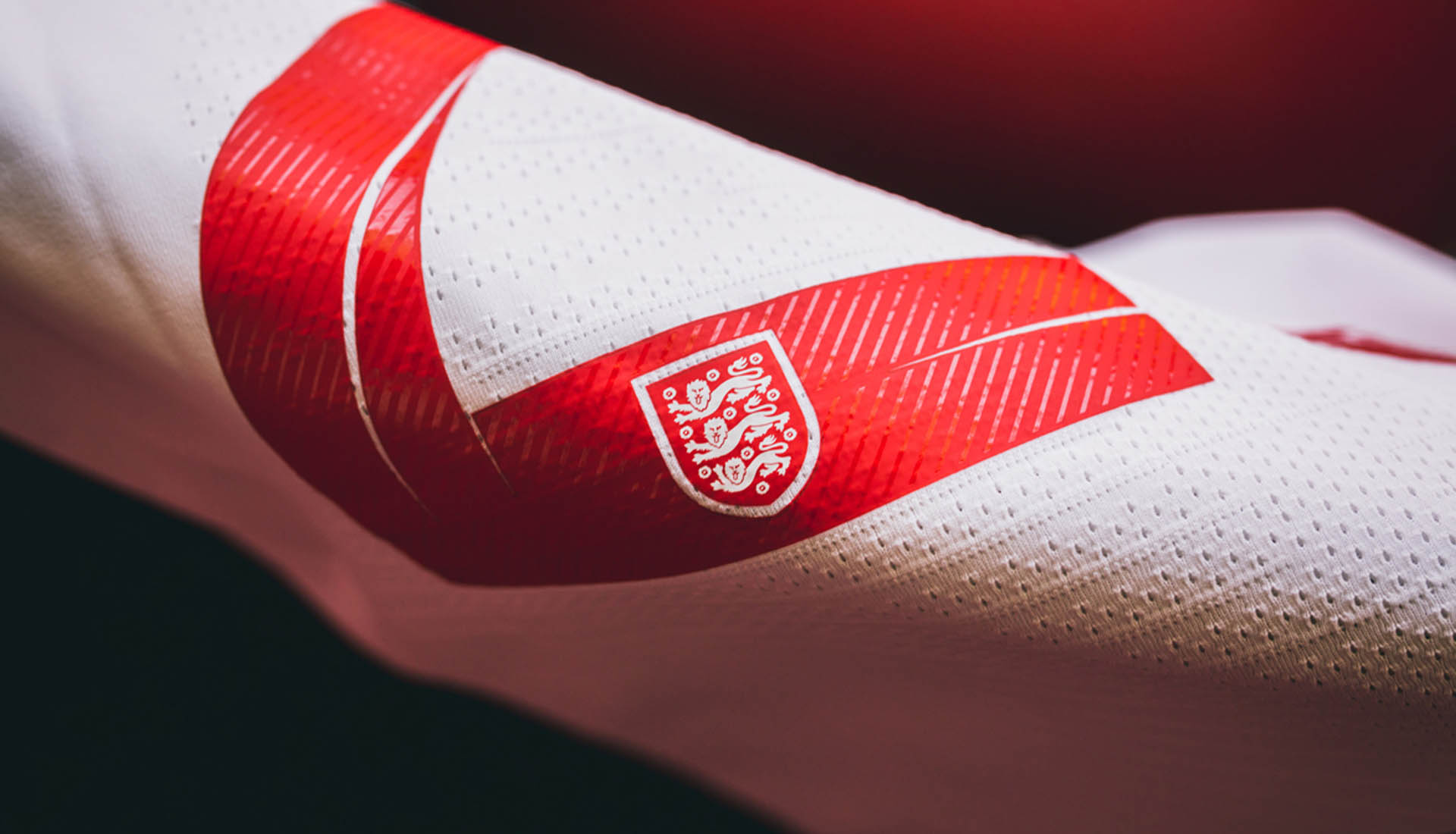
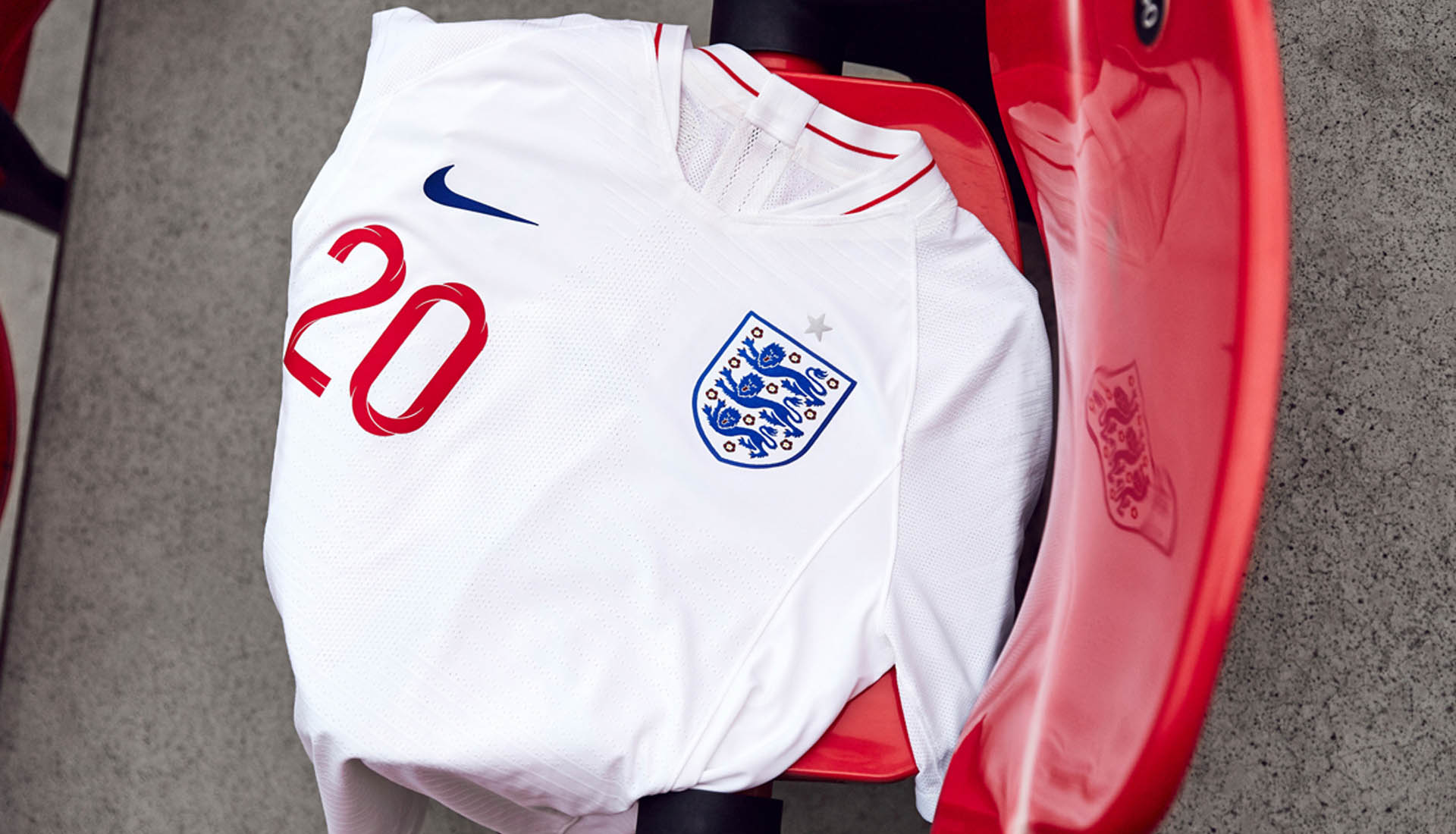
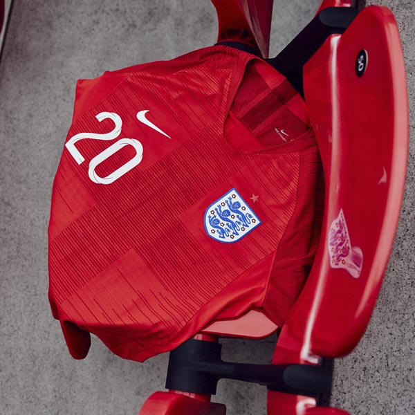
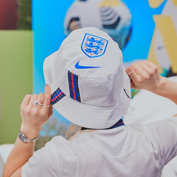
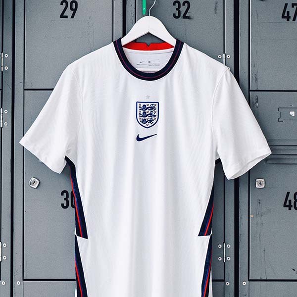
The 2018 England World Cup kits by Nike lent on minimalist values to have a big effect. Taking pride in the detail, the brand linked up by designer Craig Ward to produce the bespoke typography that will dress all England apparel in the lead up to the World Cup in Russia and beyond.
Talking through the project, Craig explains the process and goes under the hood on an element of creative good that shines strong, "I was honoured to be asked to create a custom typeface for England's 2018 World Cup kit. Commissioned by Nike, the type was modelled in 3D to feature the St George's cross and create a dynamic, twisting design which features inline, outline and fill weights along with a complementary numeral se for use at larger sizes."
"I began by looking at the clarity and geometry of classic English typefaces (Gill, Flaxman, Johnston etc) – particularly when condensed, as that was also a requirement. I noticed how they lost some of their implied geometry in these instances and decided to create something that didn’t buckle like that. Parts of the type actually quote aspects of other fonts to feel a little more familiar – the W in Railway Sans in particular, and the flare of the alternate R is a nod to Gill. I also included a perfectly circular O should they want to use it."
"I really wanted to create something dynamic that hinged on the cross icon, so I modelled and animated the core of the type in 3D software. I created a simple grid, drew single line paths for the letterforms and added a cross as a sweep around the path, which went on to inform the inline aspect and the twists in the letters. I’m hoping that the movement that went into creating the letterforms comes through in the final pieces."
See more of Craig's work here. You can suit up in Nike England apparel here.
