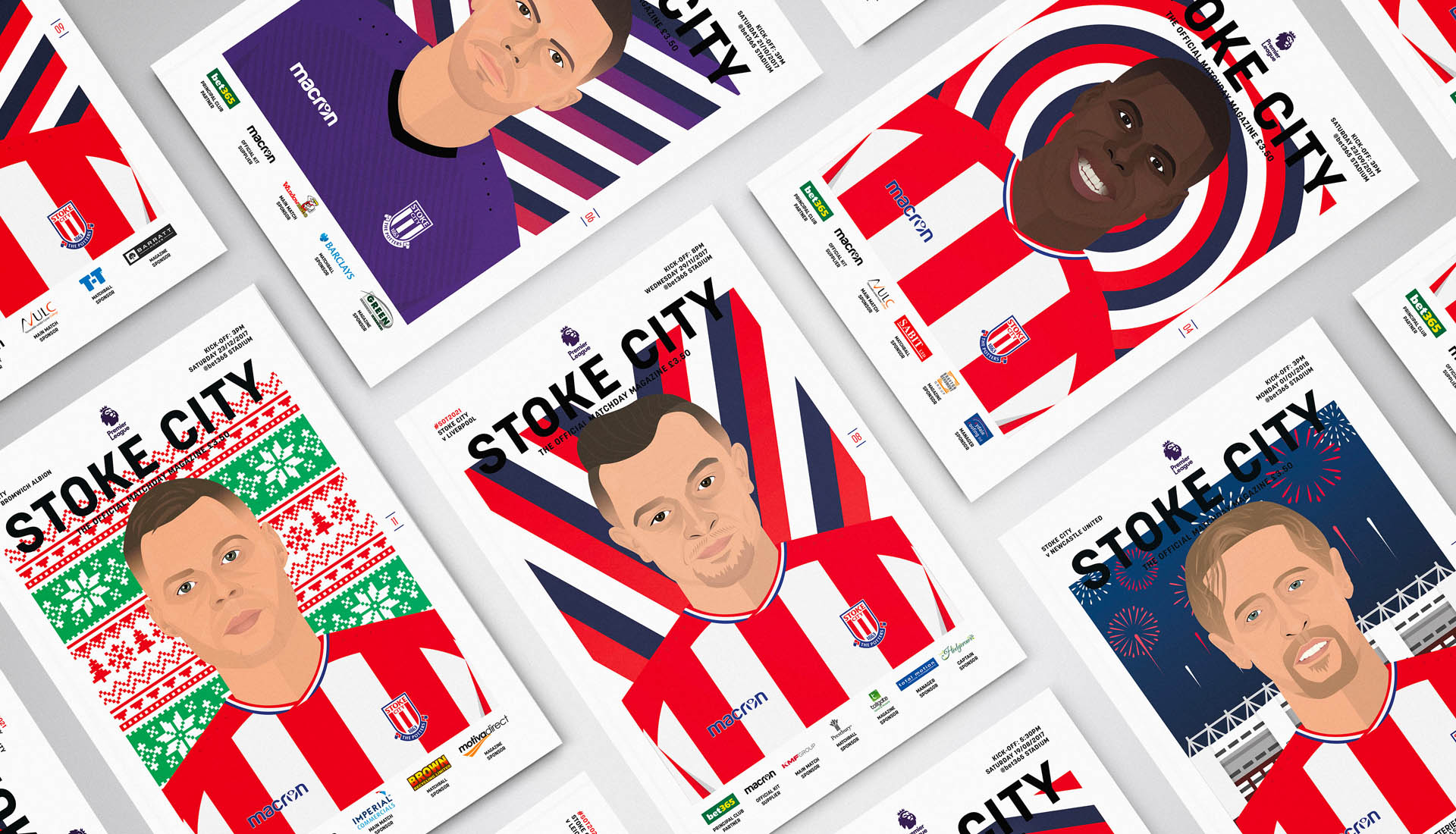
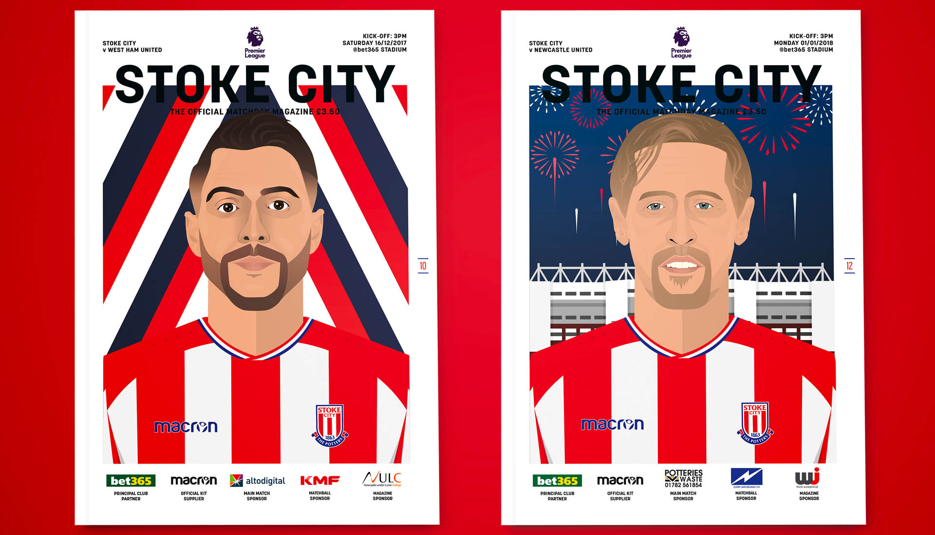
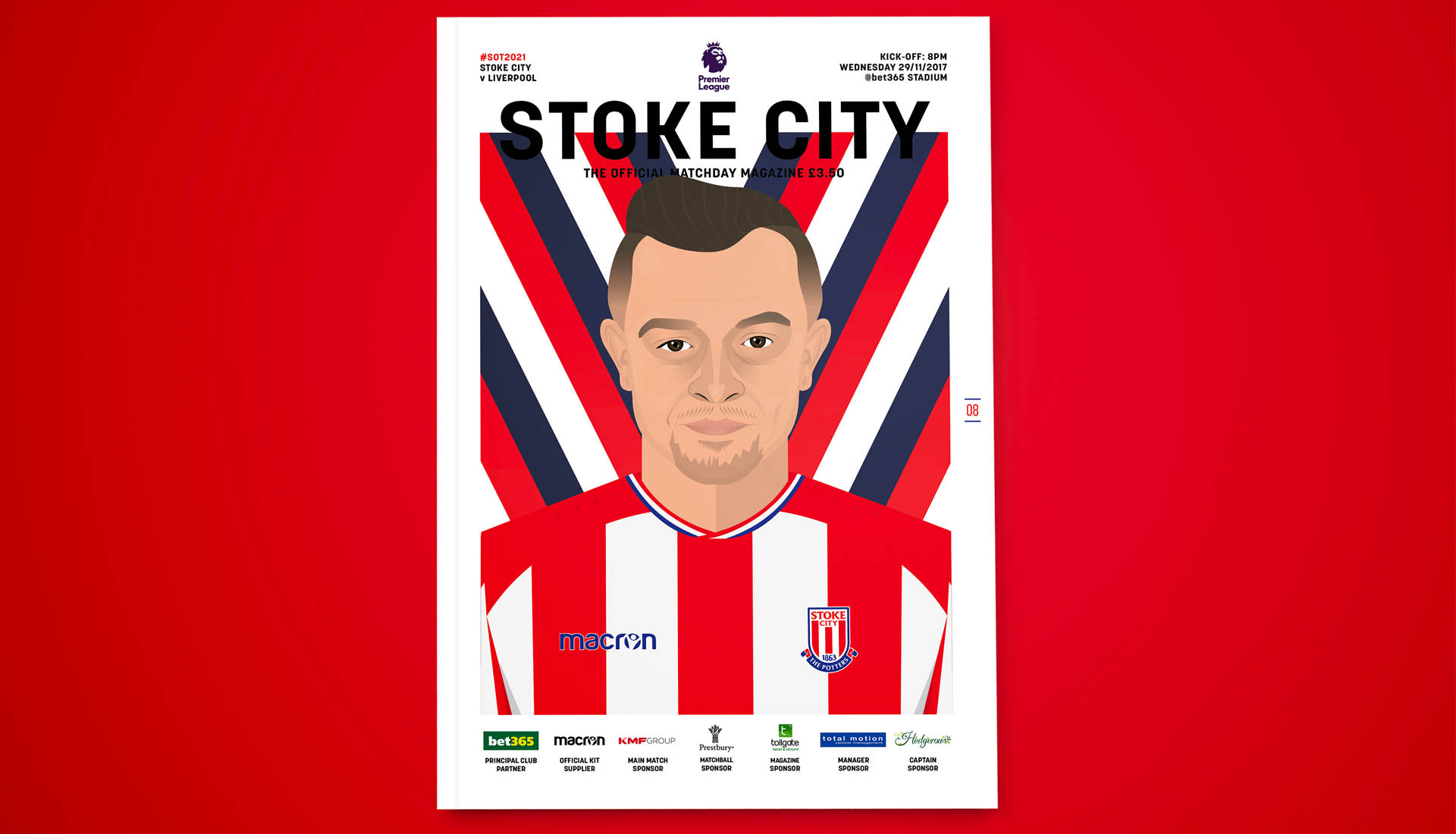
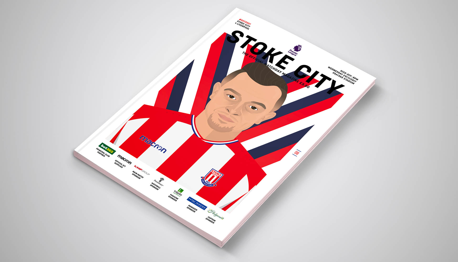
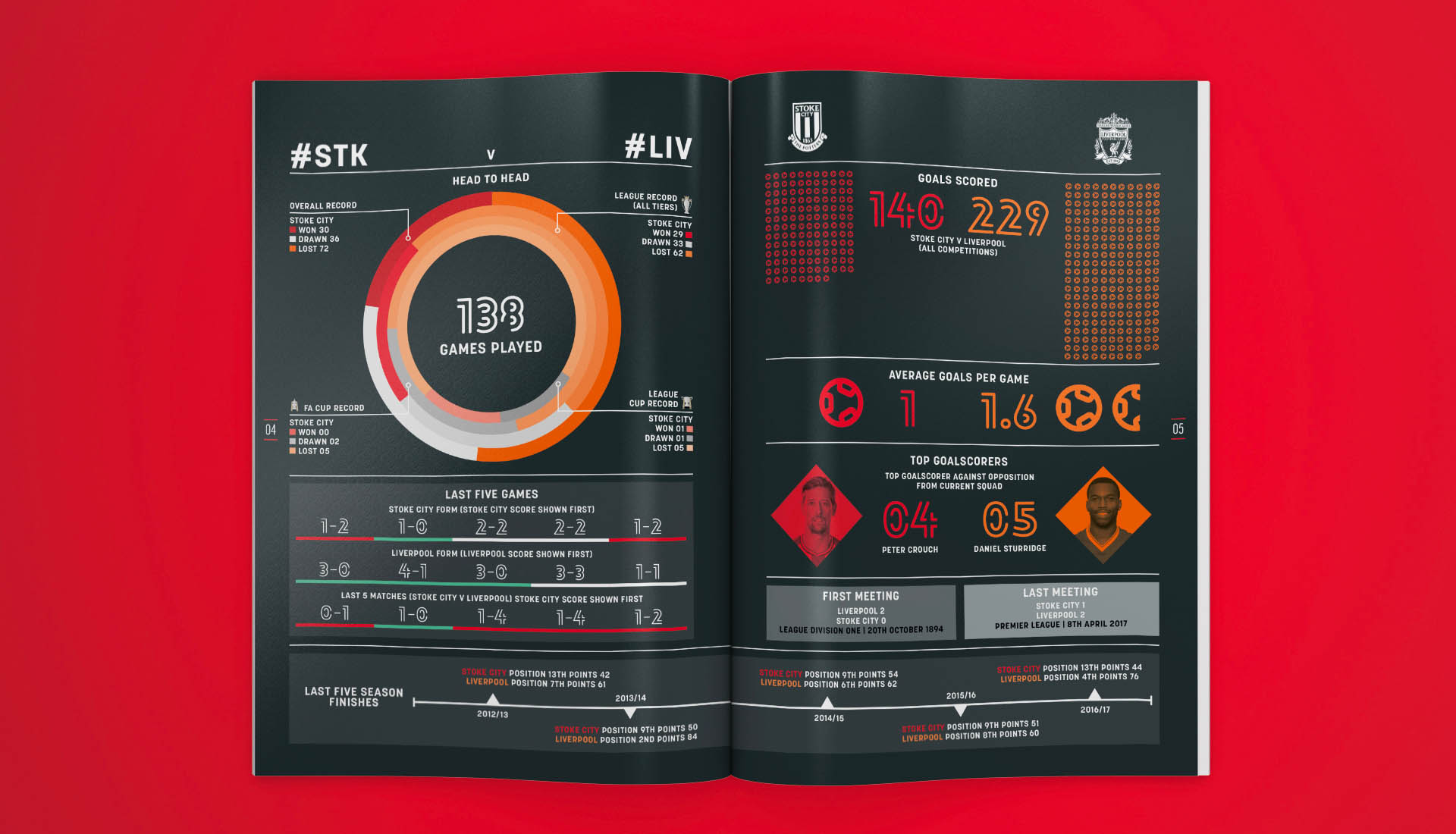
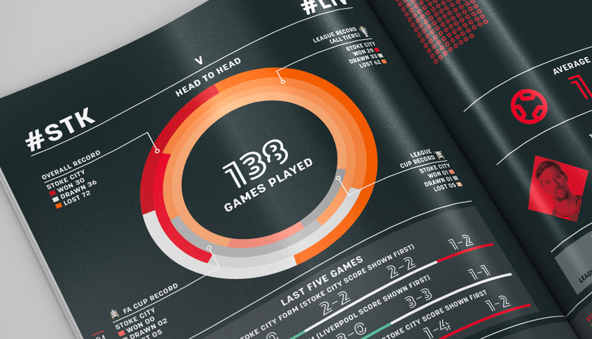
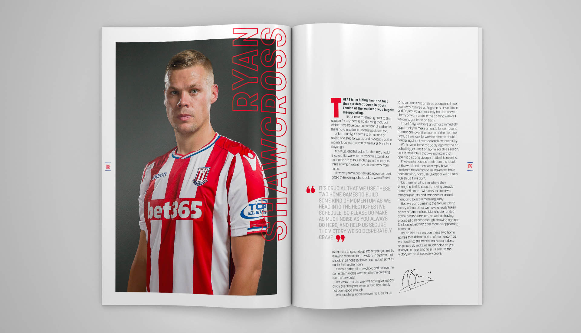
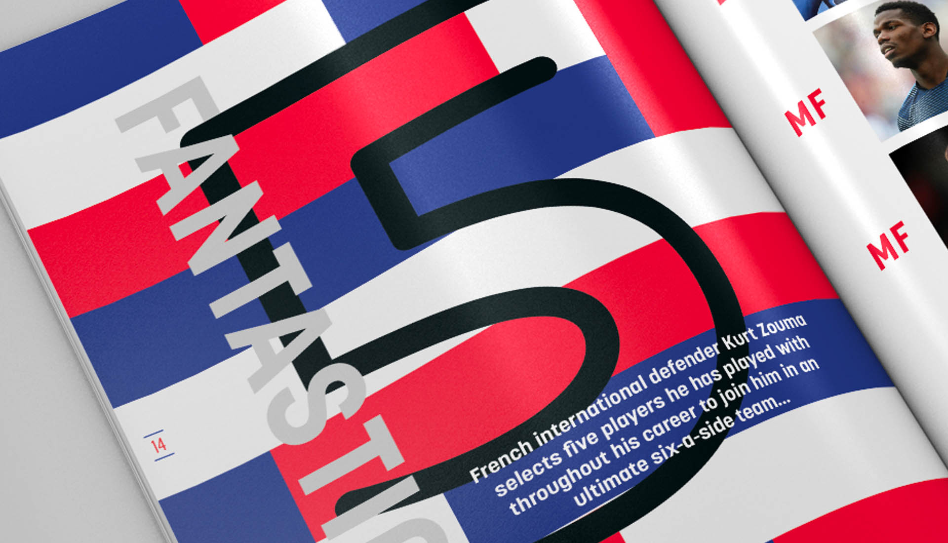
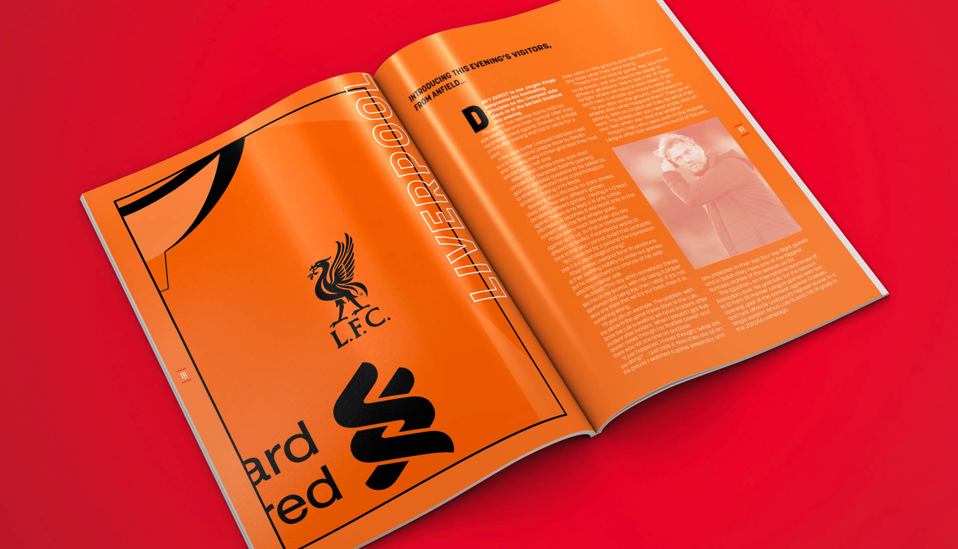
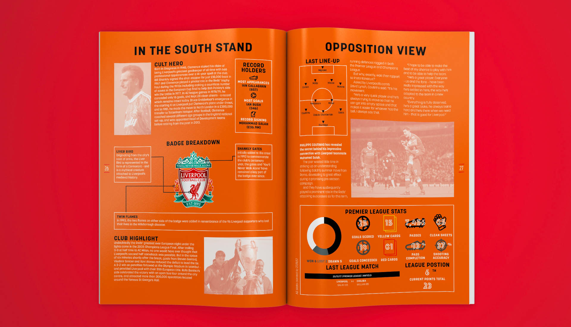
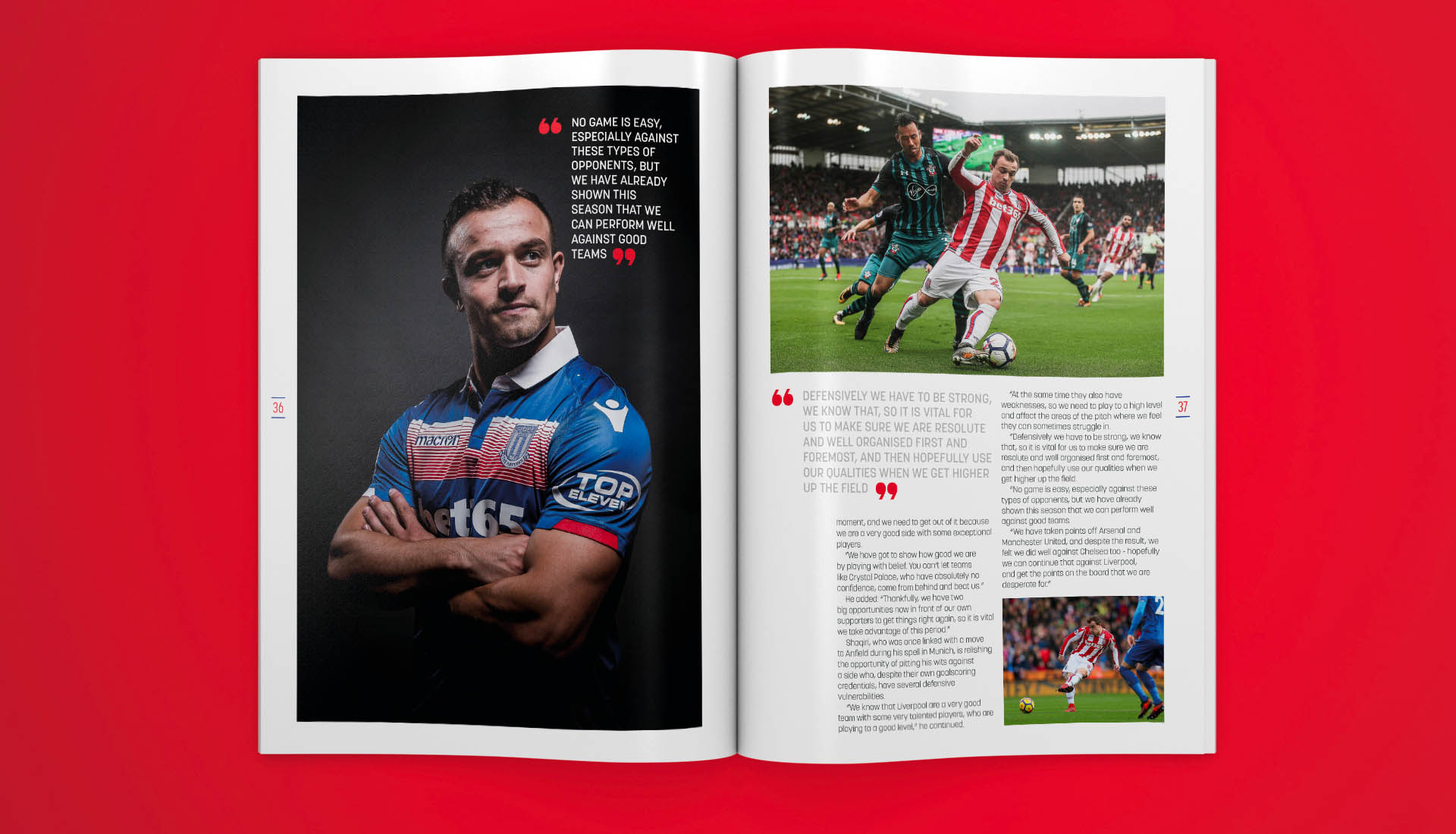
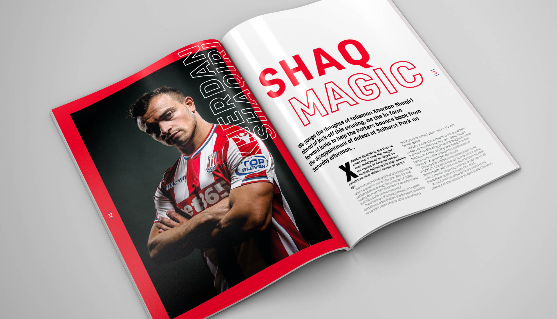
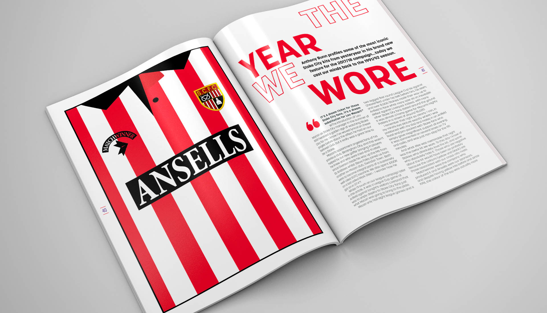
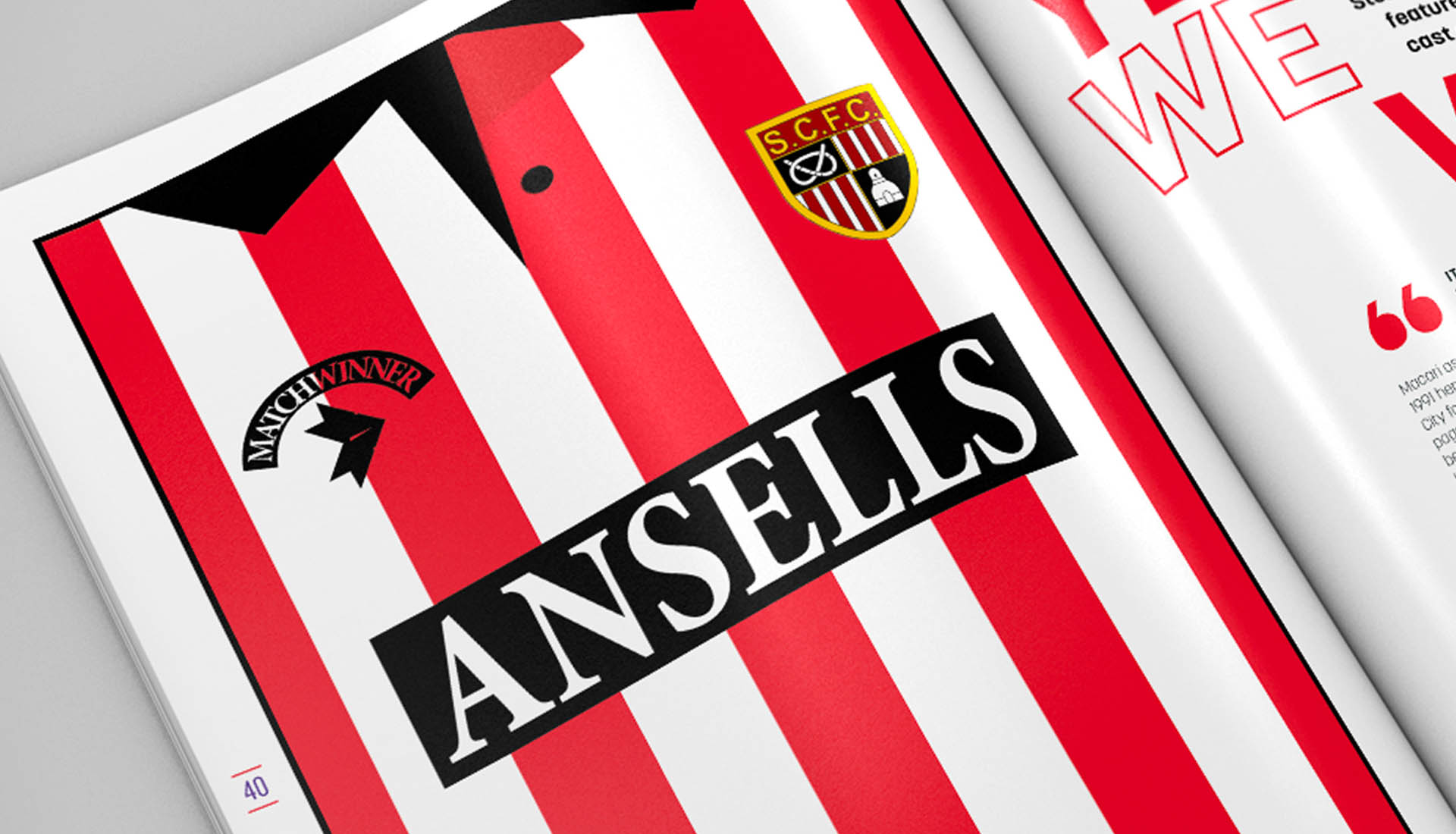
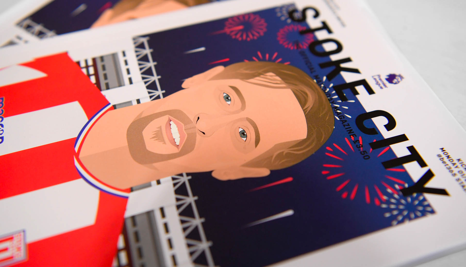
Continuing to embrace the creative opportunity through the medium of a match day programme, Stoke City worked with designer Adam Ward to create a series of vector based illustrations for their 2017/18 edition. Each player getting a spotlight on the cover, it's an example of where football meets art for the masses.
The Official Stoke City Matchday Magazine for the 2017/18 season in the Premier League, this print offering is published in collaboration with Trinity Mirror Sport Media and is entitled '#Pottersmag'. Adam explains that the layout, "was heavily designed around vector based illustrations used on the cover and throughout the Magazine. The cover illustrations were heavily influenced by work from Stanley Chow and David Flanagan.". A clean layout that brings a traditional form of football media up to contemporary standards, it's a strong offering that will stand out in a field so regularly sprinkled with emotive imagery.
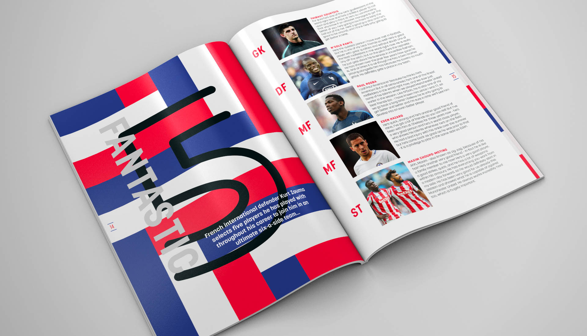
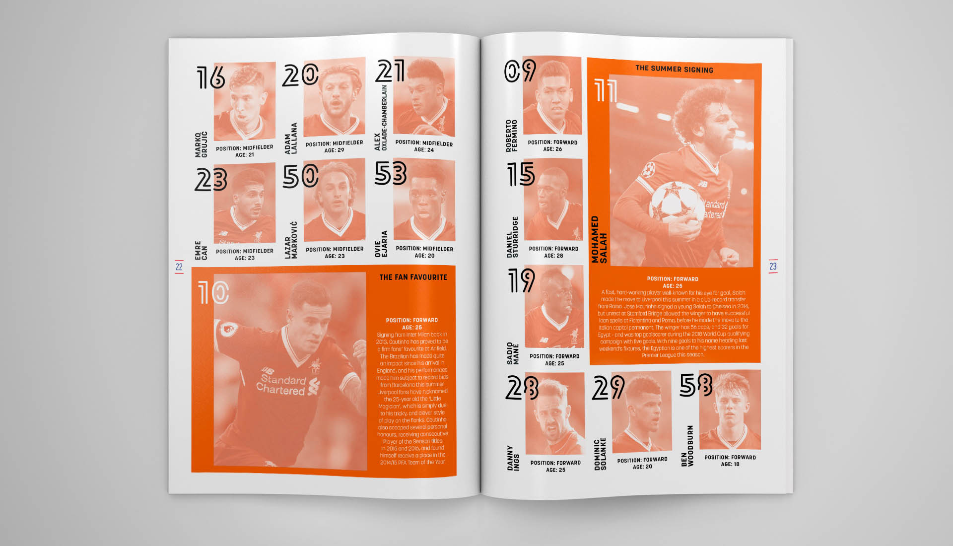
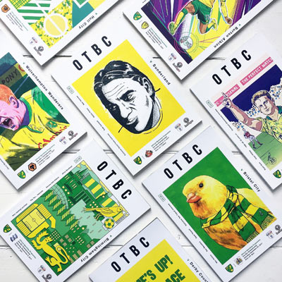
Sticking to a formula such as this makes for a consistent product and the clinical delivery makes for a sharp match day magazine. While there are others out there like Norwich City embracing a football art scene in their own way, this adds to the plethora of design inspiration that finds its way in and around football as part of the contemporary game. Setting fresh foundations and turning football heads towards a considered and designed approach, it's part of a wave that will only lead to bigger and better places. Take influence for the next wave for creative football from places away from football, that's what we say.
You can see more work by Adam Ward here.
