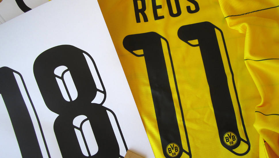
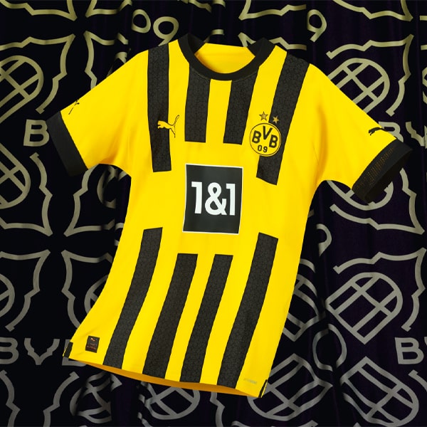
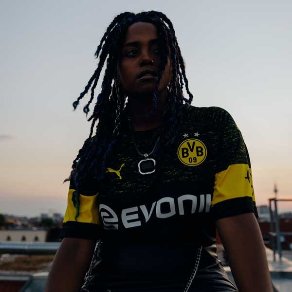
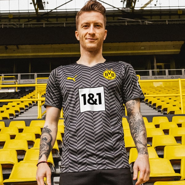
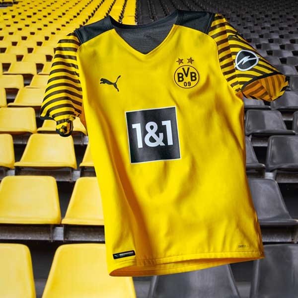
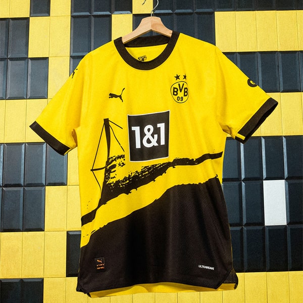
Trailblazers in their unrivalled quest to lead the free-thinking football world, Dortmund have been one of the go-to clubs for creativity. A club inspired by the fans, we take a look at the font that will be gracing their shirts for the 15/16 season in our latest look at football type.
Taking retro style and throwing it into the contemporary mix, this is arguably one of the best type's as we head on into the start of the season. To be worn across all competitions, we spoke to PUMA's Ulrich Planer to get the low down on the creation of the font.
What inspired the Dortmund design?
There is a current trend within this seasons kit designs, in that PUMA and adidas both re-issued a classic pattern from the 1980s (PUMA´s diamond graphic, ADIDAS´s Manchester United third shirt) and also HUMMEL´S current goalkeeper jersey root back to their archive. In addition, a lot of small high-end streetwear brands looked into the 1980s inspired football jerseys. The 3D numbers are a classic of that time. From the mid 70s to the early 90s it seemed like this was the only typeface that was used on the back of football jerseys. Of course also Borussia Dortmund was playing in this typeface.
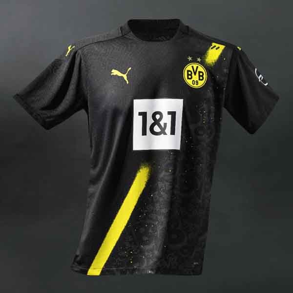
We thought of introducing this 3D numbers not only because of the current 80s design trend, but also because the thin lines that create the 3D effect also feature on the front of the home and away jersey, both horizontally and vertically. Again, the jersey as a whole was considered.
How many variations did you go through to reach the finishing line?
Usually we go through 2-3 initial ideas, sketch them up and see if the work or not. For the current Dortmund numbers, we very quickly agreed on stepping away from the original edgy 80s numbers and let the round club badge dictate the language. Looking at the Numbers 1, 4 and 7 the badge fits in perfectly. It is like with everything you design. Sometimes you have to start over and over again with new designs and nothing works and then you have projects like the current Dortmund numbers, where you come to the final idea very quick.
What did you most enjoy about creating the Dortmund type face?
In Germany with have special letter ß called "Eszett" or "sharp S". The sharp S was in the past only existing in lower case letters. When written in capital letters it was replaced by SS. This meant, that players like Kevin Großkreutz have been written like this: GROSSKREUTZ. In 2008 the capital sharp S was included by the German Institute for Standardization. We extended the typeface (the letters are existing since 2014) by adding the upper case ß only for Kevin. Let´s hope he stays at Borussia Dortmund and can enjoy his ß.
Taking us behind the scenes into the creative side of the game is truly unique. Many thanks to Ulrich and PUMA for helping us explore the appreciated culture of football that little bit more.
