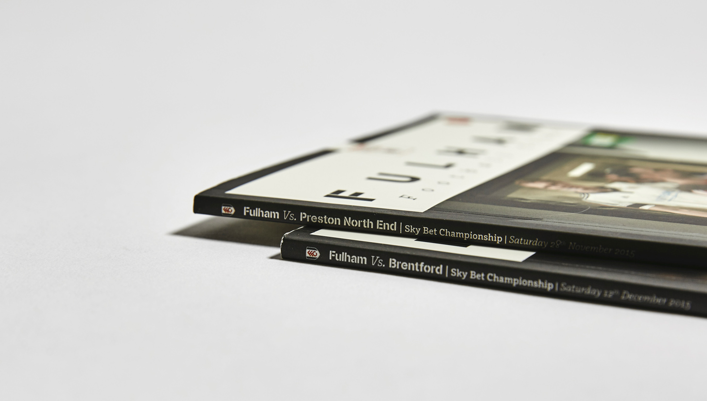
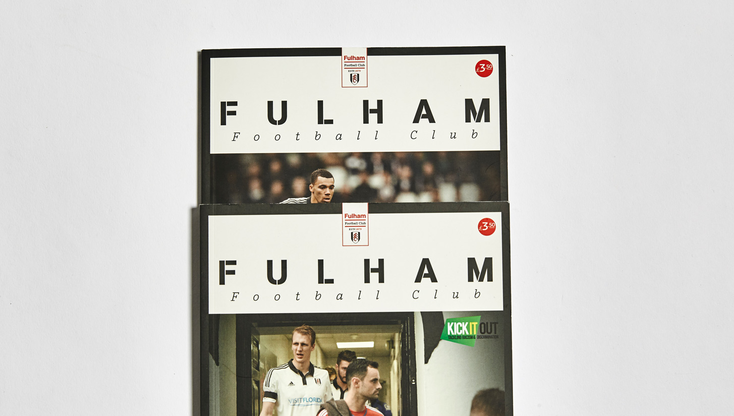
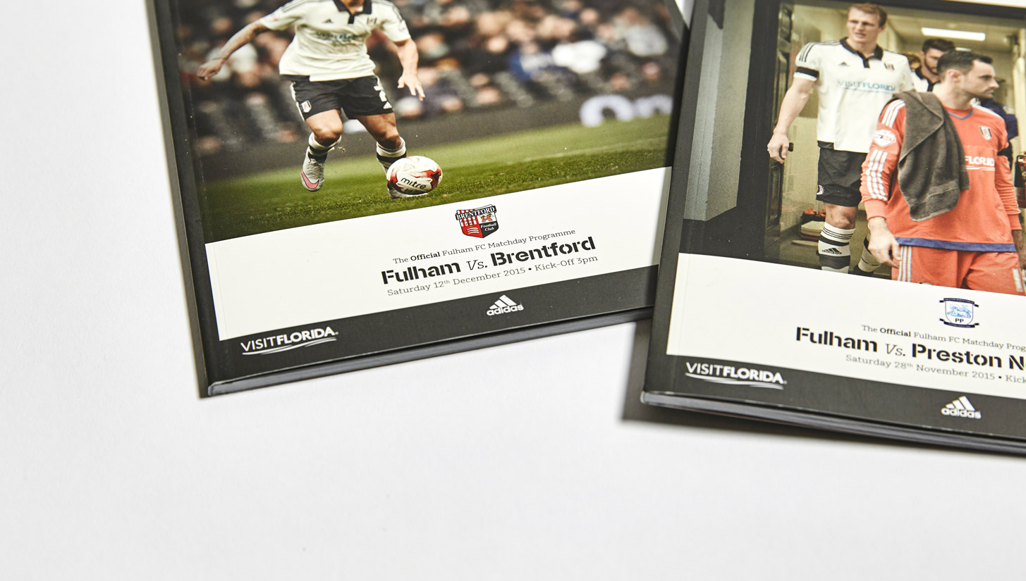
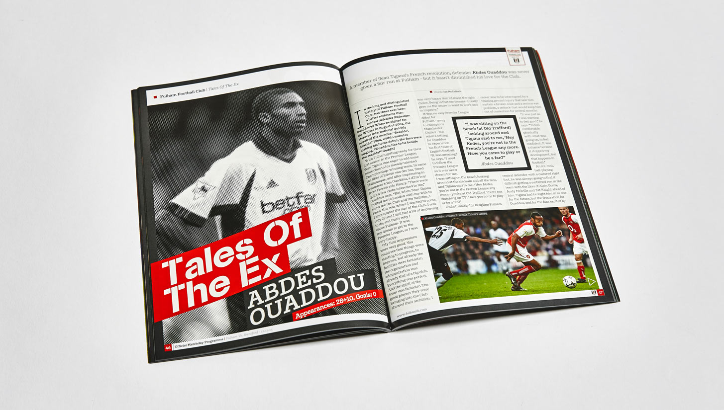
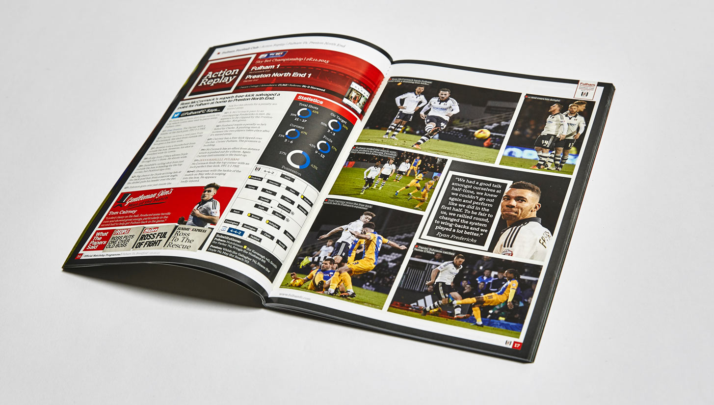
With a smooth matte finish and consistent design throughout, our latest look at matchday programmes from the 15/16 comes in the shape of Fulham FC
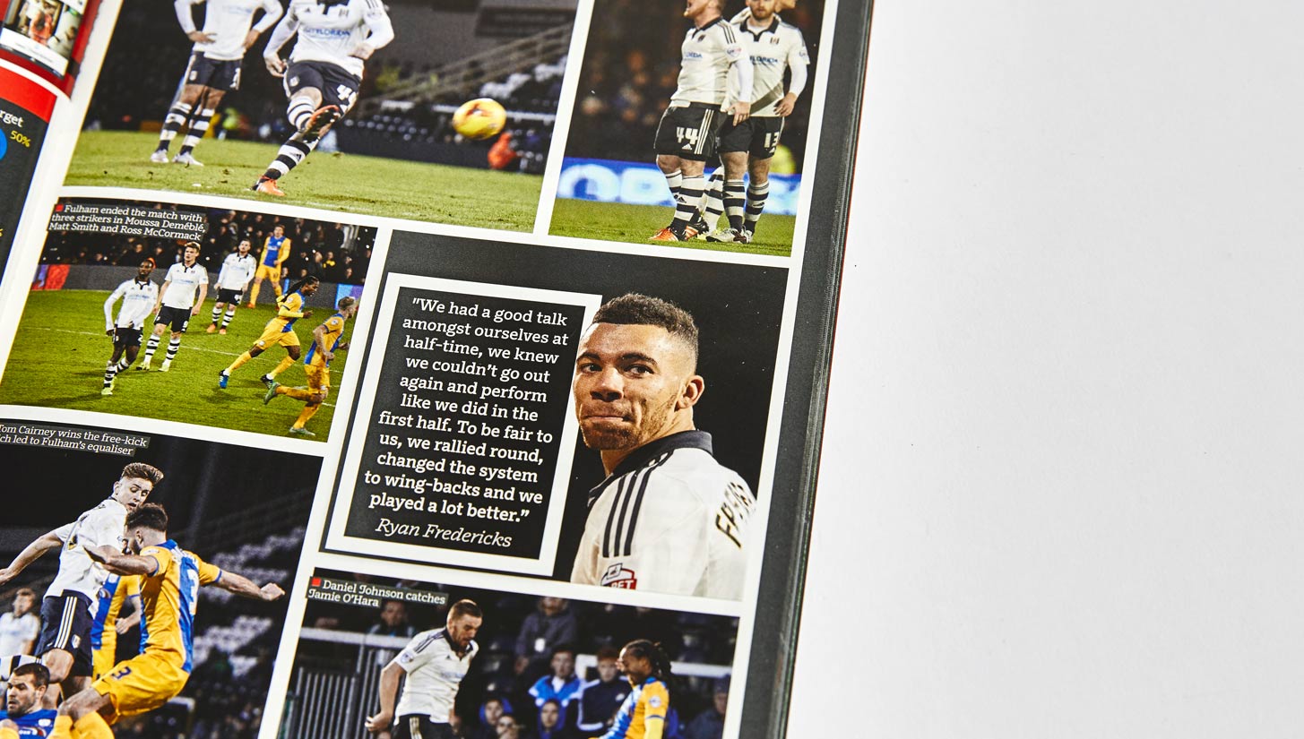
Keeping to conventions, this programme doesn't break outside the norm when it comes to it's shape and size but it does everything it should, at a high standard. From photography to finish the overall picture is one well tailored. Fulham is a club that embodies its traditions while embracing a contemporary game - Well structured style, it's imagery is stand out - crisp and curated, it's a strong product based on the cover alone. No nonsense, well branded and sharp.
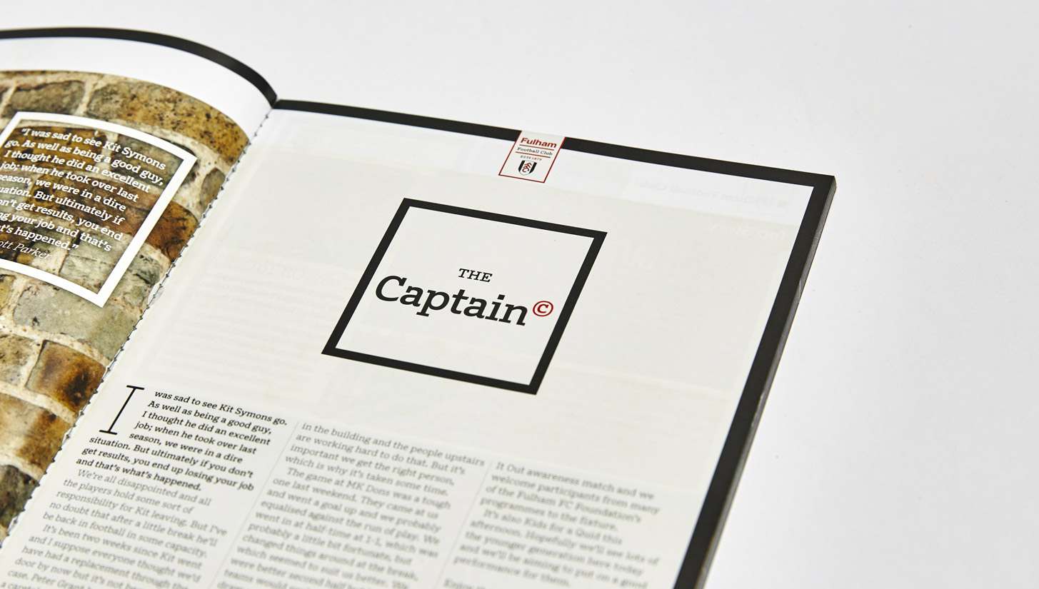
Inside it packs features that lean on the creative edges while telling stories of strength, there's plenty pre and post match reading to enjoy. It's got the regular stats and analysis which again is presented well and in total its 82 pages are content full. Interviews from inside and outside the club both players and fans help represent the club with interest. It's a good read, efficiently done. Kudos to those involved.


