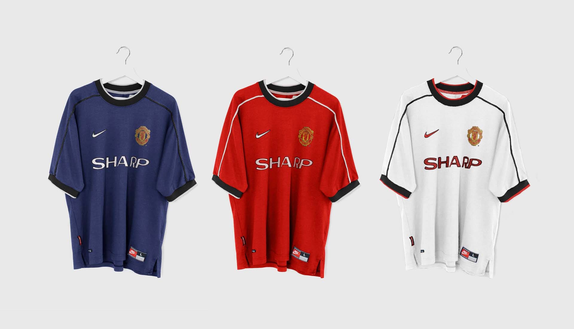
Taking a ‘what if’ approach to their latest design, Berlin-based duo Lukas Urbicht and Moritz Rose, collectively known as Lumo723 have created concepts of how Manchester United’s kit could have looked in the 90s if it had been produced by Nike.
The football shirt design world of the 90s was a gloriously unpredictable place, full of oversized, beautifully inconsistent, trippy patterns born from a total freedom to create bespoke brilliance. But with Nike only existing as a burgeoning force in the game at that time, one can only dream of what kits produced by Nike from that time would have looked like. Until now, that is. Step in Lumo723, who have imagined what a 90s-era Manchester United and Nike partnership might have looked like.
Lukas Urbicht and Moritz Rose, who have caught our eye recently with their array of concept boots – including a spring-ready Mercurial and a rather appealing Nike Phantom VNM Air Zoom T90 III – have now decided to turn their considerable talents to the world of concept kits, but with the aforementioned twist. The pair have created three 90s-styled Nike United kits: a classic red home kit, typical white away, and Navy third, all of which follow the same template that sees the beautifully baggy one-size-fits-all approach in full effect. All three carry that quintessential United sponsor from the 90s, Sharp, and each features the Swoosh on the right of the chest. Should it have been the classic Futura logo? Possibly, but we’re willing to let that slide.
Despite opening the decade in adidas, United’s kits were provided by Umbro from ’92 onwards, serving up some of the most iconic looks for the Red Devils, including the ’98-’00 kit within which they sealed one of the most memorable moments in the club’s illustrious history when they completed the treble. Nike’s association with the club then started in 2002, and ran until 2015. Now at least, we can enjoy the sight of what might have been. An interesting concept and well executed.
Check out more of Lumo723's work here.
