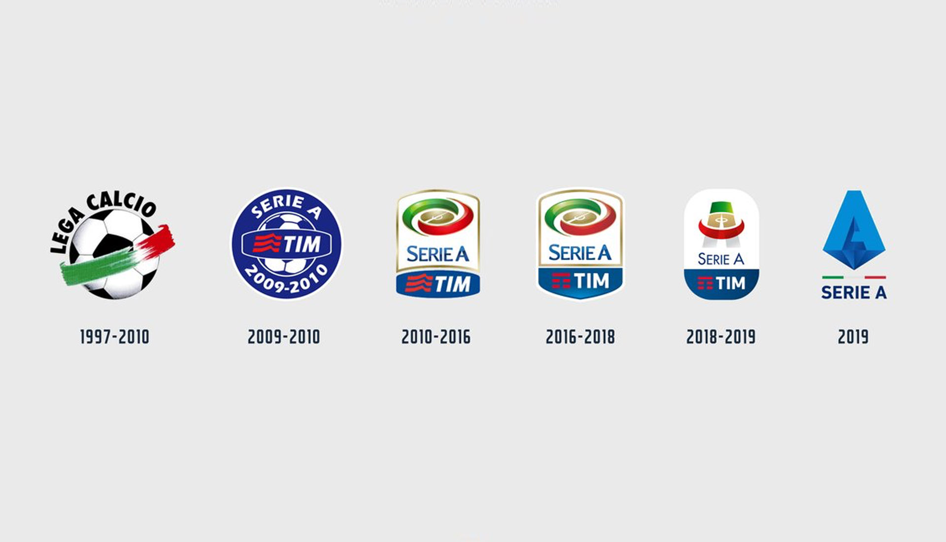
Serie A has undergone a visual update ahead of the summer as the Italian top flight league unveils a new-look logo which will carry the brand into the 2019/20 season and beyond. In terms of re-branding, it's pretty minor, but it's one that follows a modernised and minimalist design trend.
The moves comes as a bit of a surprise considering the league introduced a new logo at the start of the current 18/19 campaign, but at least this time it's more of a departure from the original crest which has been tweaked over the past few decades. It's got a bit of 'Avengers' about it and we'll let you decide if that's a good or a bad thing.
Taking hold of the "A" and strengthening it with a central position, the new crest is described by the league as "representing a diamond, perfect and precious, full of facets that increase its value and symbolize the teams and champions that make our Championship unique. At the base, the perspective from the bottom draws an inverted pyramid, the tip of which rests ideally on the tricolour strip that separates the logo from the name Serie A." So there you have it.

Was an update needed? We reckon so. Are we totally sold on this design? Unsure yet. Still, it'll take its position on all Serie A kits next season.


