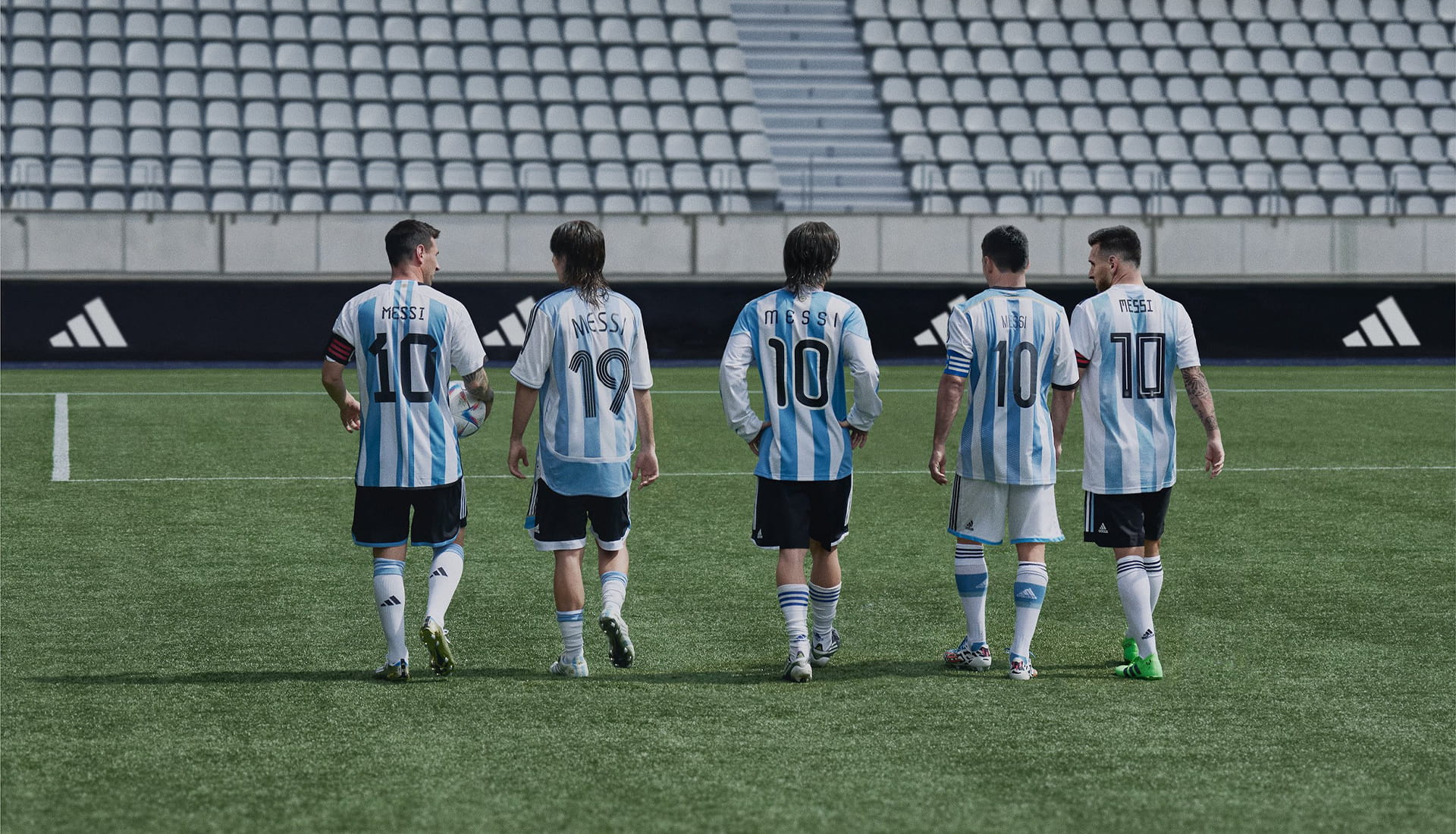
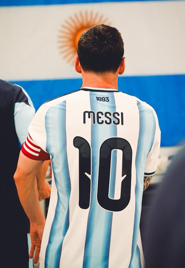
Two decades. One name. A legacy told not just in goals and trophies, but in the details stitched between the seams. This is a look back at the typography that framed the greatest story football has ever told. Lionel Messi, Argentina, and a feast for the eyes.
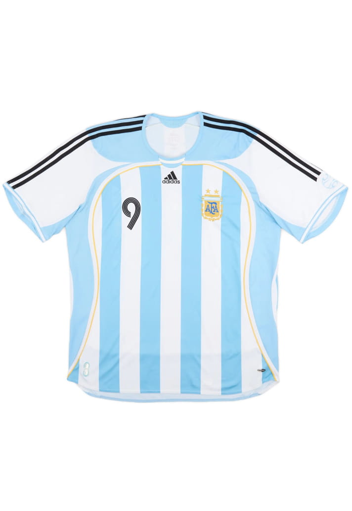
From a fresh-faced teenager pulling on 15, 18 or 19 to the weight of a nation resting on 10, Lionel Messi’s journey with Argentina has played out across some of football’s most emotionally charged nights. World Cups won and lost, Copa America heartbreak and redemption, Olympic gold, tears, joy, pressure, release. And through it all, the typography on his back has quietly evolved alongside the man himself.
This is a story told in numbers and namesets. In curves and cuts, blocks and serifs. In the subtle shifts of design language that mirror eras, expectations and identity. Over 20 years, Messi has transitioned from 15, 18, 19 to his now iconic 10 – each font a snapshot of a moment in time, each adidas shirt a chapter in an unparalleled international career.
This is Lionel Messi's Argentina career, told in typeset.
2006
First World Cup. Teamgeist. Iconic. And the font worked, bringing retro vinyl vibes across the tournament.
2008
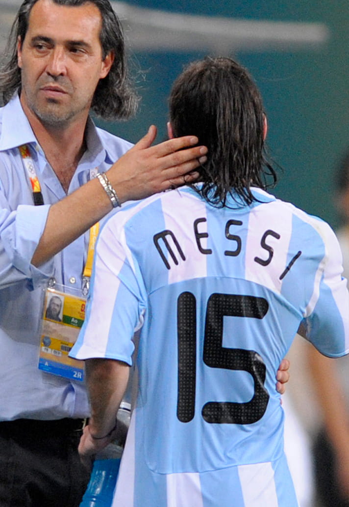
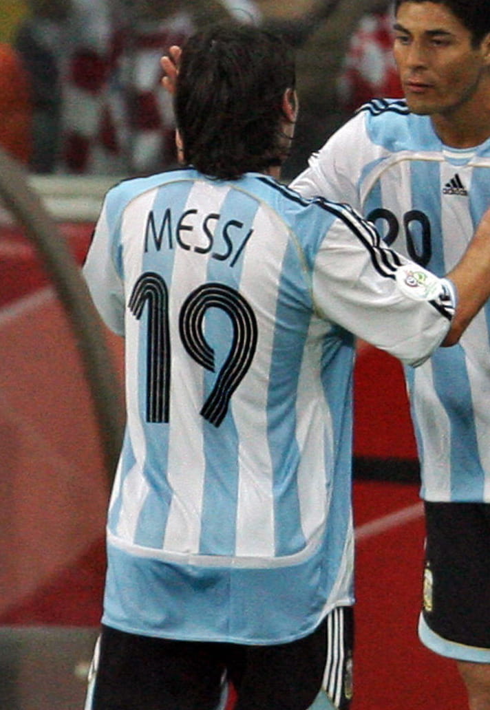
Olympics. Copa America. Switching from 19 to 15. Starting to make a mark. Font stark and impactful, sort of like the raw Messi of the era.
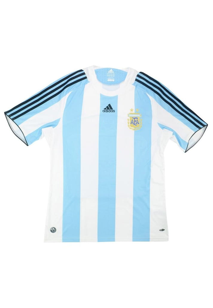
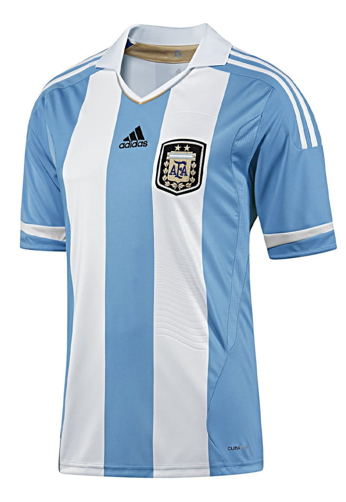
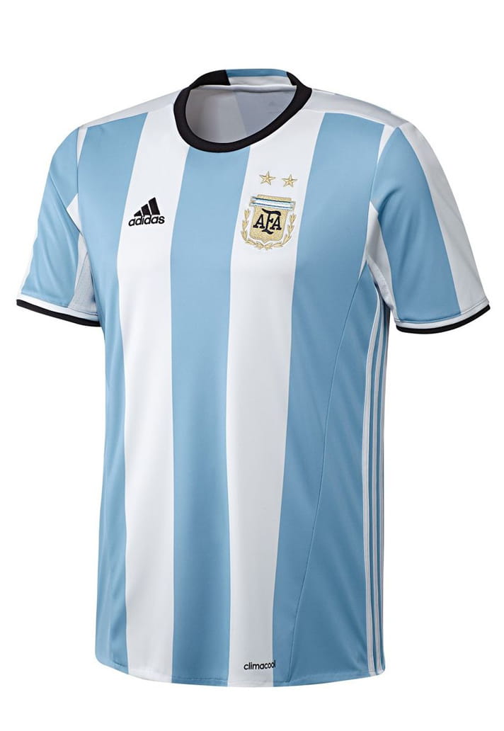
2010
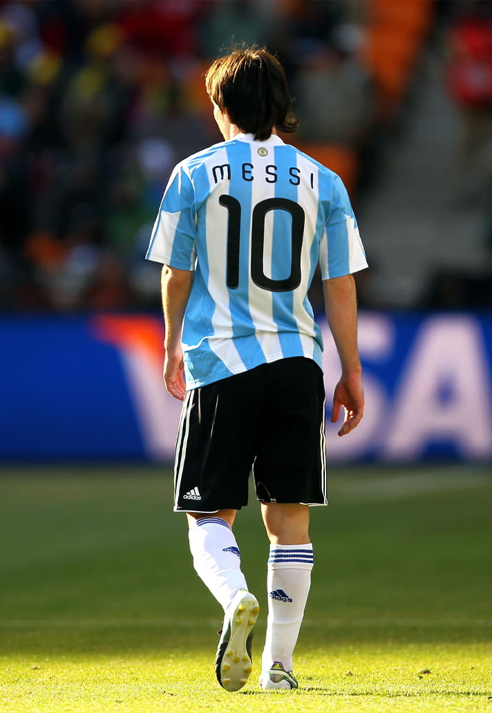
The no. 10 for 2010. The mantle arrives in time for a second World Cup, and with it a sleek tweak on the lettering and numbering. Soft, bubble‑like lettering paired with thick, curvy numbers indicative of the era. The shapes are generous and friendly, giving the kit a warm, playful, almost hand‑drawn character.
2011
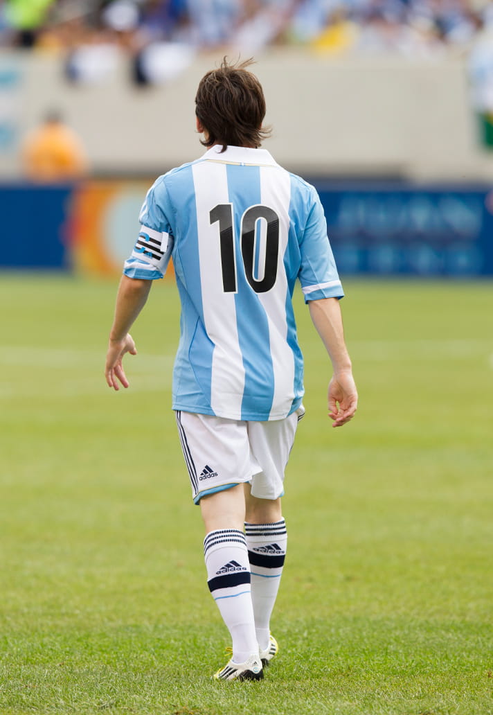
El Capitane steps up. A clean, retro-styled shirt design was accompanied by just numbering and no nameset, lending the whole package a vintage vibe.
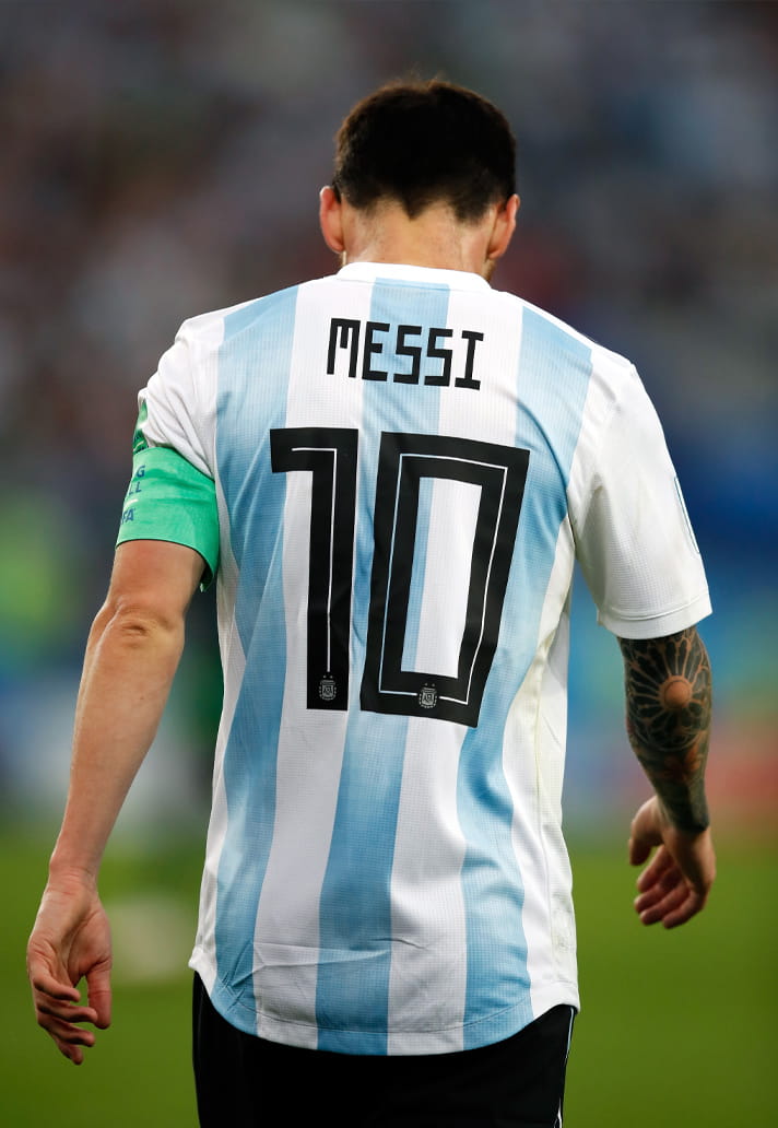
2014
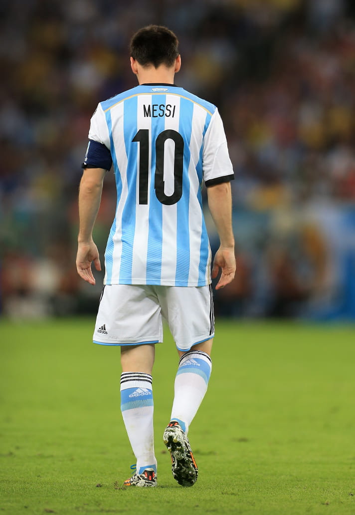
No nonsense font for what was Messi's third World Cup. Efficient. Does the job with no flourish. Very unlike the man himself you might say. But there are similarities. It's clean, compact and very tidy [insert your own pun about being Messi].
2016
Two years on and it's a case of spot the difference from the last entry, with a subtle tweak on the '1' being the only noticeable alteration.
2018
Russia, and a fourth World Cup. Things get a little jazzed up here. It's a squared, geometric design: the characters have sharp, angular corners with a digital‑style geometry rather than curves, falling in line with the overall aesthetics that adidas took for the tournament itself.
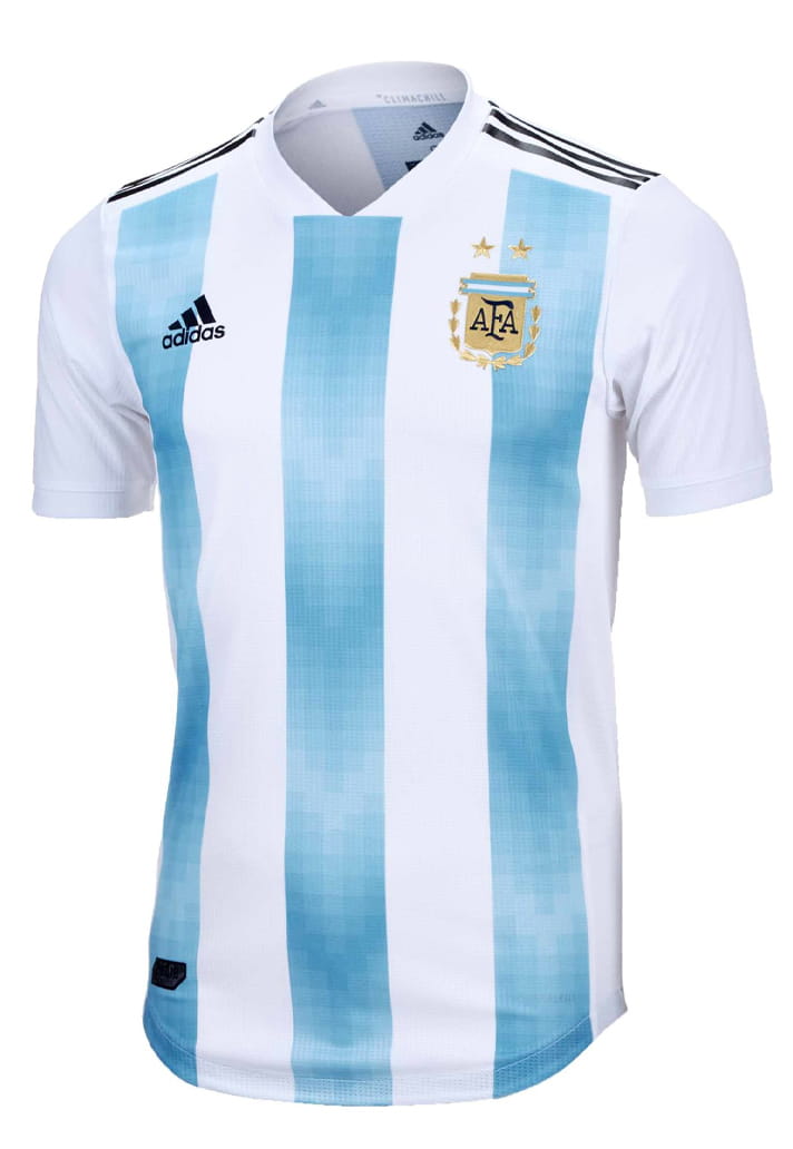
2019
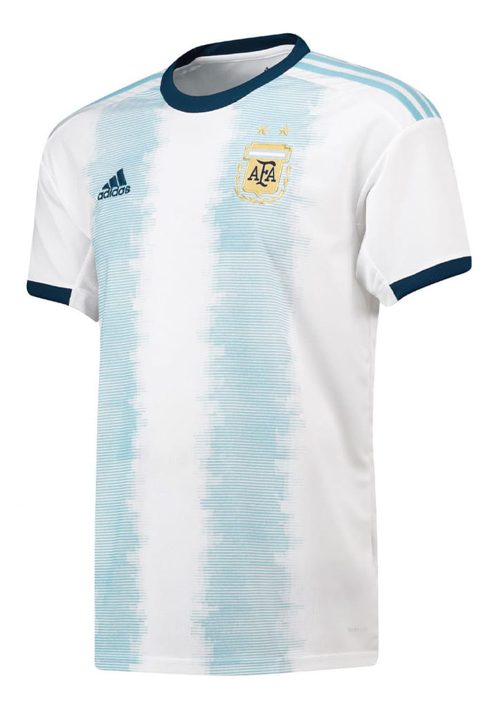
There’s a breezy, almost ocean‑washed quality to the teal print, helped along by a faint 3D shadow that nods to retro kits without losing its modern edge. Not the best Argentina shirt design ever, but arguably one of the best and most complementing fonts.
2021
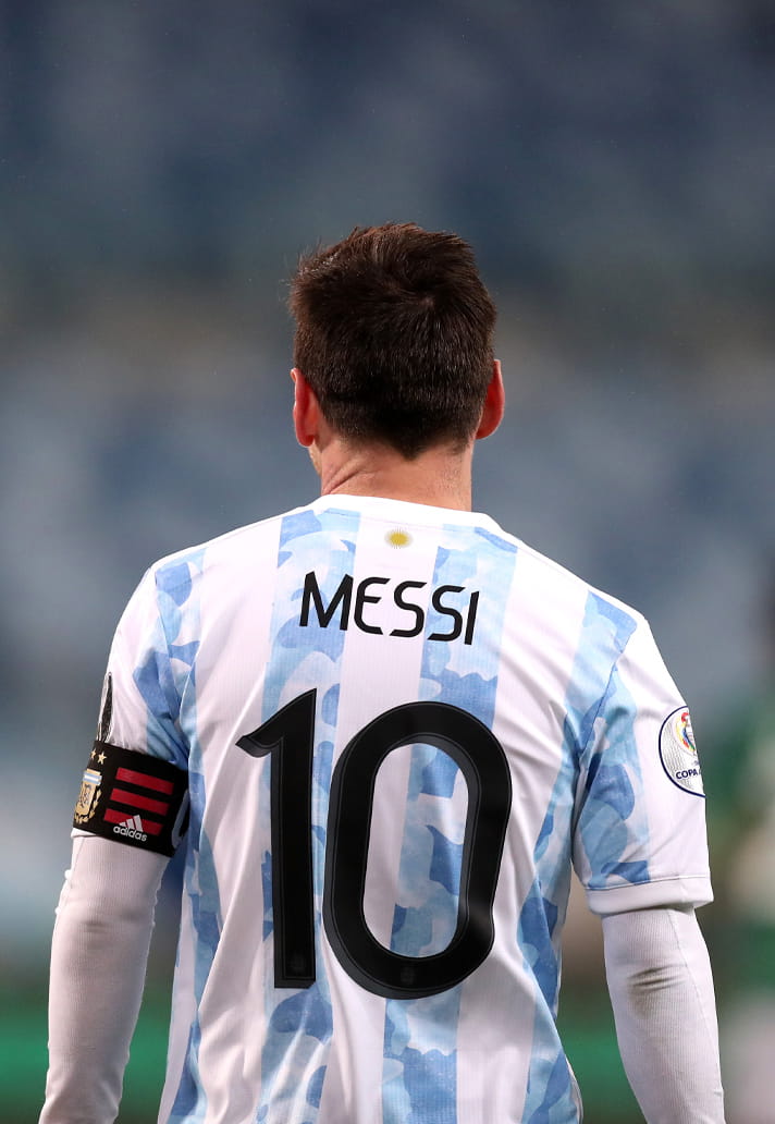
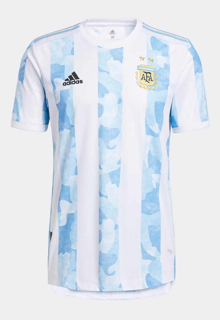
A clean, modern typeface: slim, rounded lettering paired with bold, sculpted numbers featuring soft curves and a subtle shadow effect. The style feels refined yet punchy, balancing clarity with a touch of flair—perfectly tuned for the cloudy, almost dream-like base of the kit design.
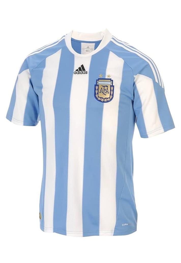
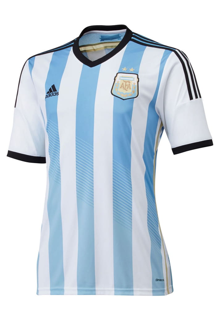
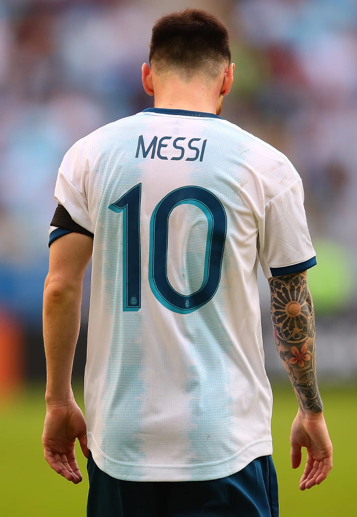
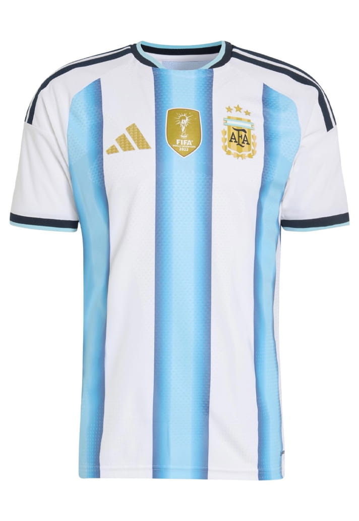
2022
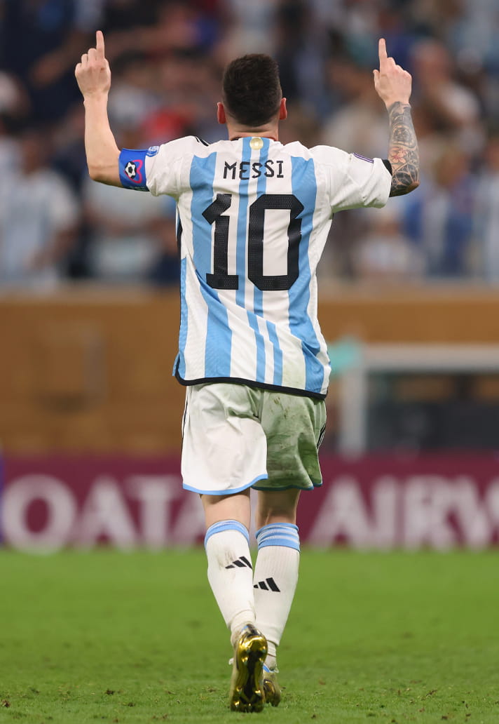
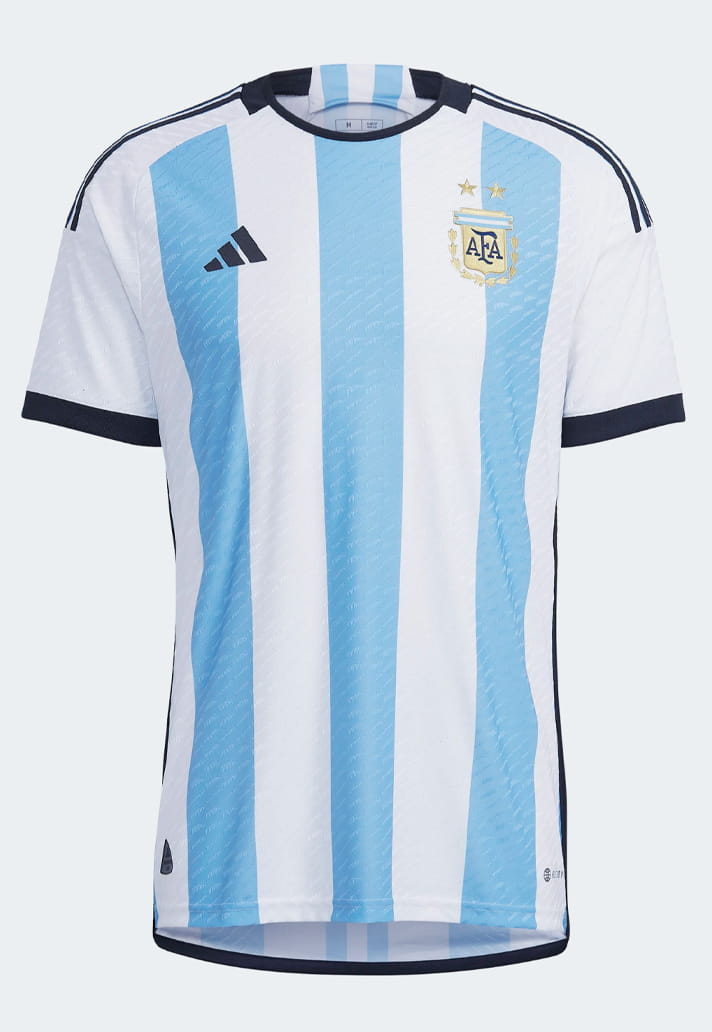
World Cup number five. Blocky numbers with angular cuts and segmented shapes gave the look a tech‑driven, battle‑ready aesthetic for Qatar and what was to come. Maybe not your favourite of the lot, but certainly the most significant given what Messi & co. went on to do.
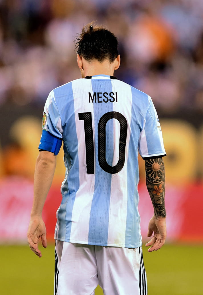
2024
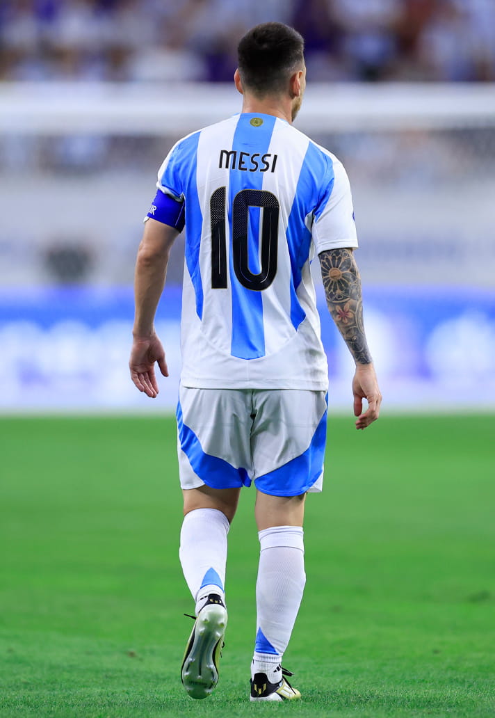
Another Copa America, but this time coming at it with the regal majesty of being World Champions. Slim, slightly rounded lettering paired with bold, smooth‑edged numbers that carry a soft 3D shadow for depth. All bordered in subtle gold for a fitting flourish.
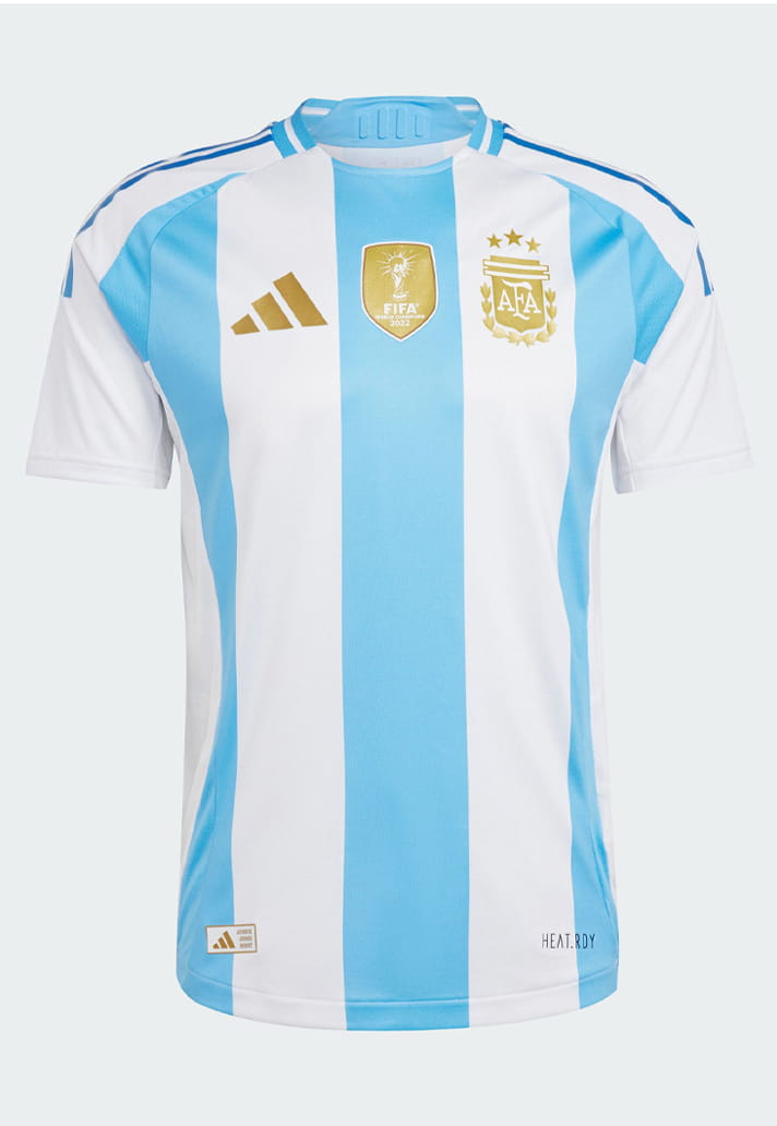
2026
And so we arrive at the dawn of the sixth and surely final World Cup of what has been a quite simply stellar career. Once again there's a retro‑leaning yet modern typeface: rounded, slightly playful lettering paired with bold, wide‑set numbers that use soft curves and generous inner shapes.
Got a favourite? Sound off on socials.