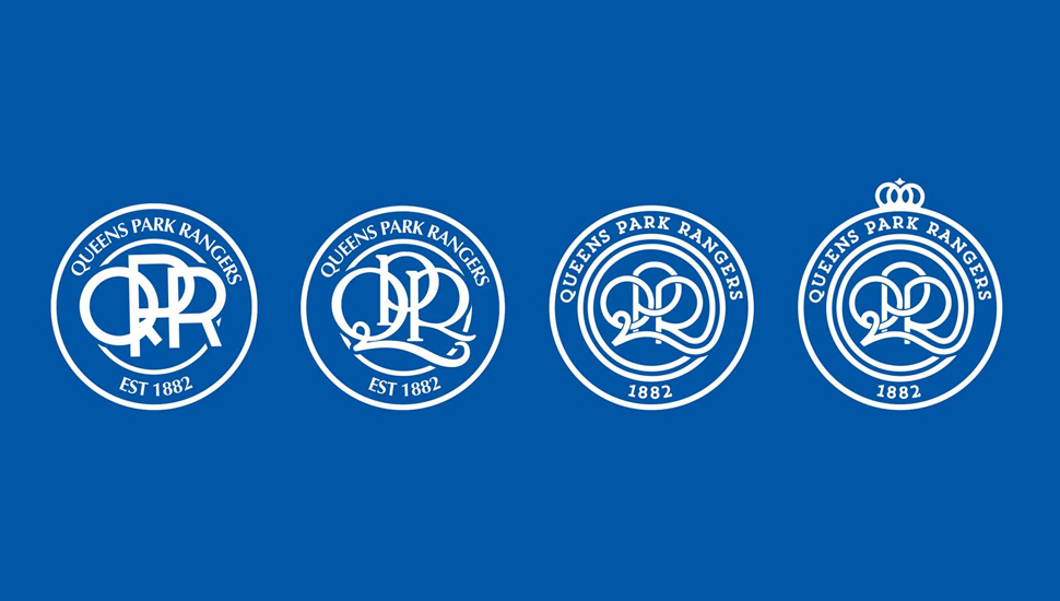
Having consulted with fans QPR are set to decide on a fresh crest that will land from 16/17 season. Going back to traditions, they're moving to clean though contemporary places.
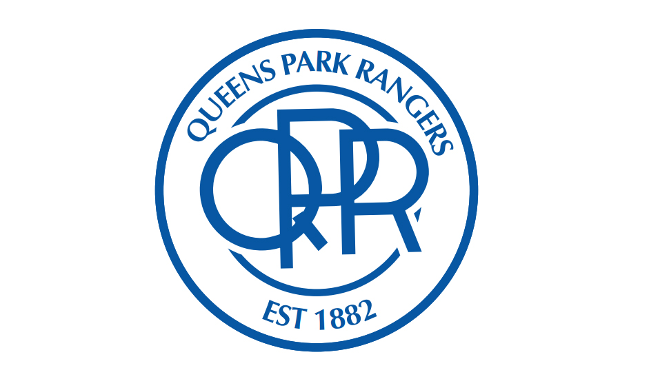
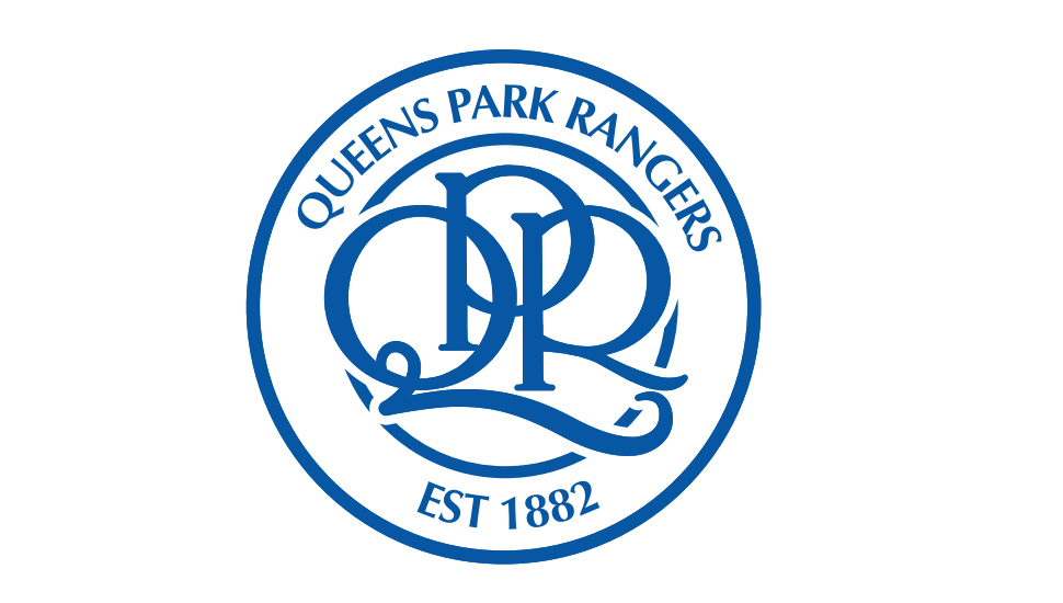
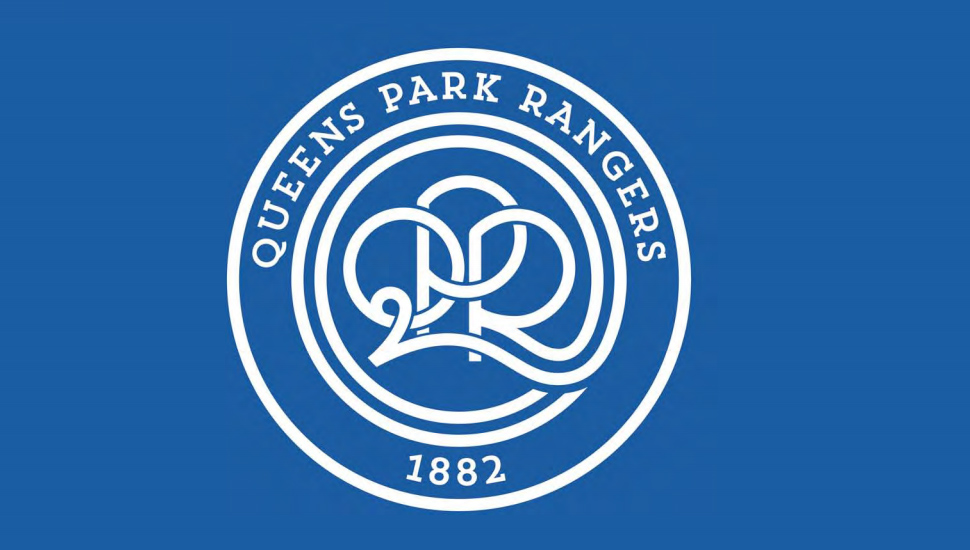
From sketches taking in much historical inspiration, the designs have been whittled down to a final four. The make up of the final select is largely three reworked design and a further one that adds a touch of additional detail which would imply there's a favourite among the select - purely speculating of course. Leaving it to the most important people, the fans, the club have invited supporters to make their choice which can be done here.
Adding to the designs, the club have gone a step further in mocking the designs onto the current home shirt which gives them a nice touch of context. You can see them in full here. The minimalist designs that pack charm and character are bold yet subtle, each looks strong individually and inspired by crests from the club's history it's very much about heritage. Taking the past and reinventing it for the future. Rangers fans can vote here.
