Reebok is back. In amongst the big brands, it’s the challengers that often bring the heat, raising the jersey design game. With that in mind and following the reveal of Charlton Athletic’s new kit, here’s why we’re excited to see Reebok back in English Football.
There are few things in the football shirt calendar that ignite the kind of romantic nostalgia that comes with the return of a long-lost logo — and in 2025, that iconic Vector is back on home turf. Like a long-forgotten anthem humming from the terraces, Reebok has officially returned to English football. And for anyone who remembers the crimson of Liverpool under Houllier, the sky blue of City before the Saudis, or the Reebok-branded Bolton kits that danced to Sam Allardyce’s rhythm, this return hits different.
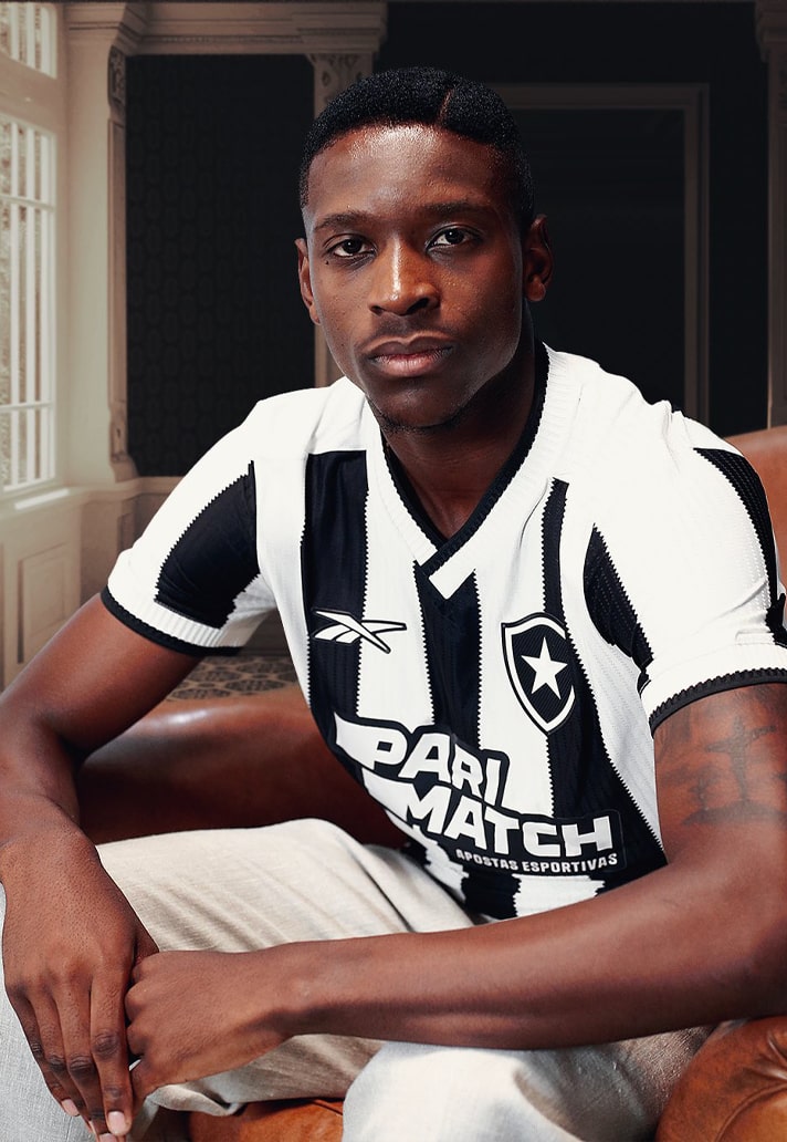
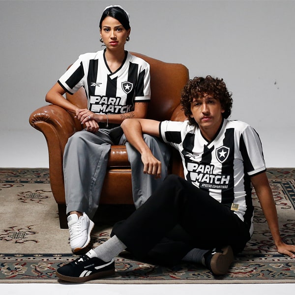
After testing the waters globally with the bold black-and-white of Botafogo and the red tide of the Panama national team, Reebok is now back on UK turf with newly announced partnerships with Charlton Athletic and MK Dons. It’s a move that not only signals the brand’s ambitions to replant its roots in football but also feels like a homecoming — a nostalgic reconnection with the golden era of Reebok’s football DNA.
For anyone immersed in the culture of English football in the late '90s and early 2000s, Reebok was part of the furniture. Their aesthetic was unmistakable: kits with bold cuts, angular piping, and colour palettes that walked the fine line between futuristic and street-ready. They weren’t just making kits — they were defining an era.
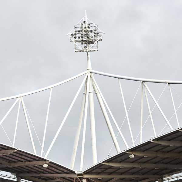
This was the brand that brought its name not only to Bolton Wanderers’ shirt but to their stadium, a rare flex in an era before naming rights were commonplace. The Reebok Stadium was more than bricks and mortar; it was the physical manifestation of a brand deeply intertwined with football’s working-class fabric.
And it wasn’t just Bolton. Liverpool, Aston Villa, West Ham, Manchester City, Fiorentina, Atlético Madrid, Cagliari, Köln — all these clubs carried the Vector across their chests at one point or another. Reebok was global, yes, but always carried that unmistakable British swagger, born from its origins as J.W. Foster and Sons, shoemakers from Bolton at the tail end of the 19th century.
Now under the ownership of Authentic Brands Group, Reebok has been freed from the void of adidas’ misjudged attempt to pigeonhole it as a gym brand. And it shows. The kits for Botafogo and Panama hint at a confident return to form: retro-inflected designs, two-tone collars, raglan sleeves, and those zigzag vertical stripes that feel ripped straight from a VHS recording of a 1997 Premier League classic.
The Vector isn’t trying to be something it’s not. It’s embracing its history, dusting off the archives, and stepping back onto the pitch with a sense of purpose. The new Charlton and MK Dons kits will be the next chapter in this story — and while these might not be top-tier clubs just yet, they represent the kind of grassroots connection and heritage that Reebok was always best at nurturing.
In an era where big brand domination threatens to flatten the unique character of football kits, the return of Reebok brings more than just a nostalgia trip. It’s part of a wider movement of challenger brands injecting much-needed creativity and diversity into the shirt design space. Brands like Macron, Kappa, Mizuno, and now Reebok are proving that you don’t need to be a superpower to innovate — in fact, not being one might be the secret sauce.
Where the heavyweights sometimes rely on template-driven releases and global scalability, challenger brands have the freedom — and often the hunger — to take risks. Think of Kappa’s bold throwback cuts for Venezia, Macron’s bespoke approach to nearly every club in its stable, or Mizuno’s ultra-clean, fabric-first kits that put craft before corporate. These brands are agile, design-led, and often more tuned in to what supporters actually want to wear — both in the stands and on the streets.
Reebok, with its archive of bold aesthetics and unashamedly ‘90s flair, fits that mould perfectly. Its re-emergence not only diversifies the football shirt ecosystem, but also forces the big names to take notice. Healthy competition like this is what drives kit culture forward — pushing everyone involved to up their game, refine their identity, and ultimately, make better shirts.
So here’s to the Vector rising once more on English soil. That unmistakeable over-sized Reebok symbol sitting across the shoulder is one we’d welcome back. Not enough over-sized logos these days.
Reebok’s return isn’t just a comeback — it’s a reclamation. Of history. Of style. Of identity. And for the football romantics among us, that’s something to celebrate.


