When Venezia FC first broke through the noise of modern football kit culture, it felt seismic. This wasn’t just another club dropping a nice shirt, but instead a genuine recalibration of what football x fashion could look like.
From 2021 to 2023, under the guidance of then-chief brand officer Ted Philipakos and in cahoots with Kappa, Venezia led the conversation when it came to objectively stylish kits. Every release felt intentional, confident, and culturally fluent.
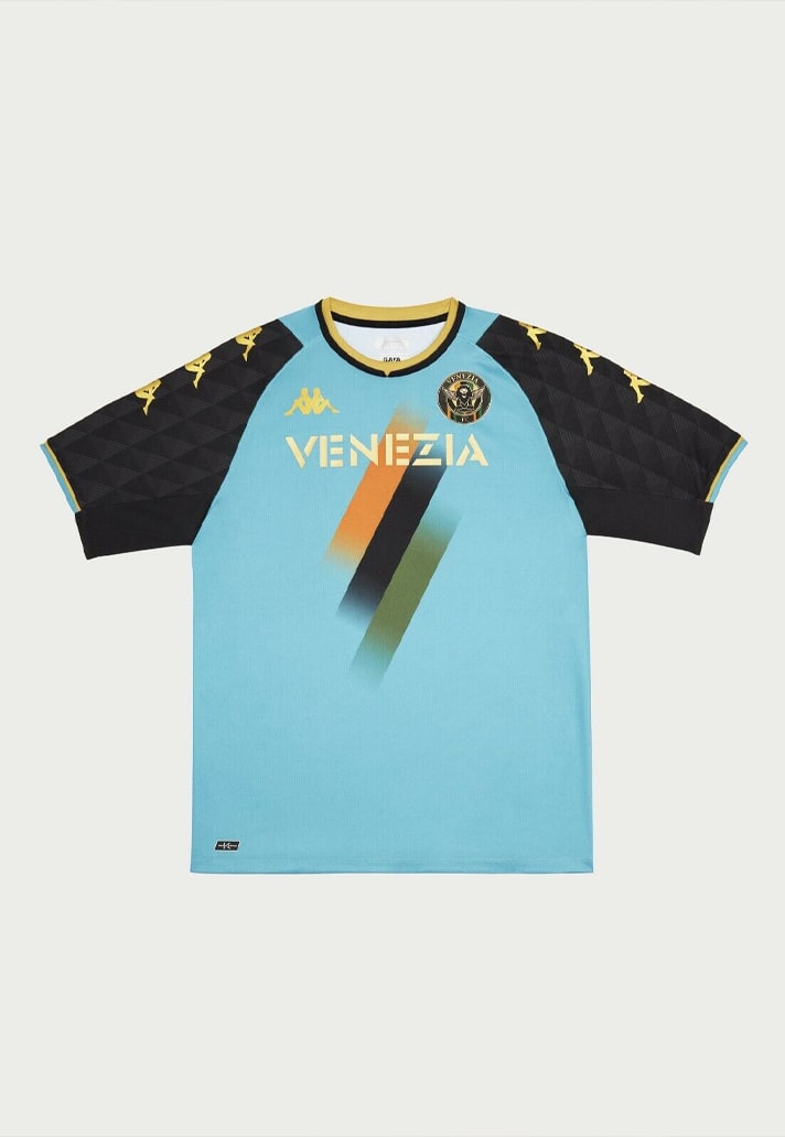
Fast forward to the unveiling of their 2025/26 Special Edition Fourth Jersey, created alongside Kappa’s successors NOCTA and designed by Drake Ramberg, and I find myself asking an uncomfortable question: is Venezia’s golden era over?
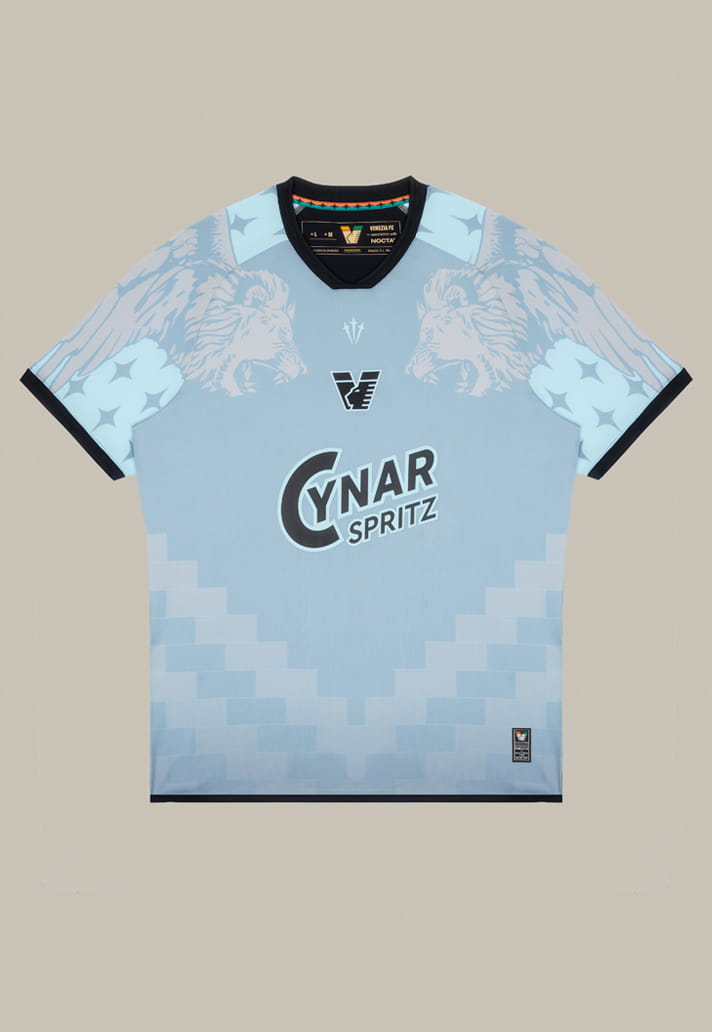
On paper, this should be a slam dunk. The jersey is rooted in the element that defines the city – water as origin, movement, shared identity. Layered blues reference the lagoon, fluidity, reflection, constant motion. Conceptually, it all tracks. Visually, it’s clean, tasteful, undeniably good.
But great? I’m not convinced. And that’s the problem. Venezia have set their own bar painfully high.
Because when I think about peak Venezia – 2021 through 2023 – I’m thinking about some of the best kit designs in the game, full stop. Not just aesthetically pleasing shirts, but a level of consistency and clarity of vision that very few clubs have ever achieved. Home, away, third, fourth – each one felt like part of a wider story. Each one stood alone and worked together.


And beyond that, with Philipakos at the helm, kit launch campaigns became a complete narrative, built through films, beautiful photoshoots and deeply rooted stories. Everything felt fluid and like it had meaning.
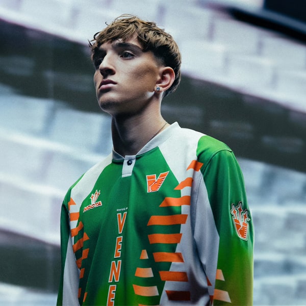
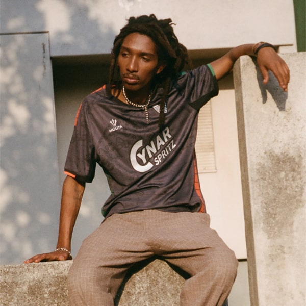
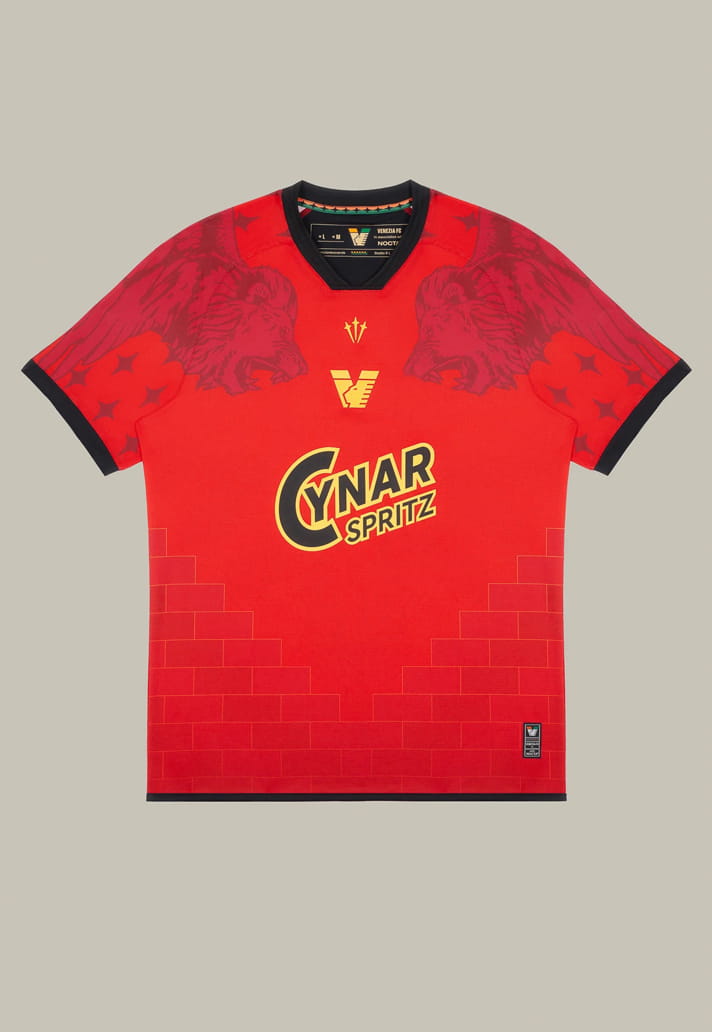
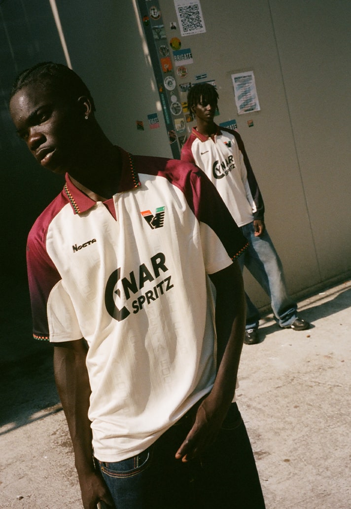
By comparison, this new fourth shirt feels… safe. And if I’m being brutally honest, isn’t it just a blue remix of their current fourth? The same fourth shirt that already had to be modified for competitive matches due to FIGC regulations, thanks to that beautiful but forbidden Winged Lion of Saint Mark graphic across the chest. A graphic deemed too decorative for the rulebook, and therefore destined to live mostly off-pitch.
That context matters. Because a fourth shirt that can’t really exist on the pitch immediately loses some of its power. Venezia built their reputation on kits that belonged in football while pushing fashion forward — not pieces that feel like glorified merch drops.
There are two big factors at play here.
The first is the switch from Kappa to NOCTA. Let’s be clear: Kappa were exceptional. For the better part of five years, they delivered hit after hit, understanding Venezia’s identity almost intuitively. Leaving that kind of form was always going to be risky.
NOCTA, though, was exciting. Drake’s first move into football. A global cultural brand aligning with one of the most fashion-forward clubs in the game. On paper, the ceiling was sky-high.
But reality complicates things. The deal came together late ahead of the 24/25 season, and it showed. Last season’s kits were fine, but uninspiring by Venezia standards. Understandable, perhaps. Transitional seasons exist.
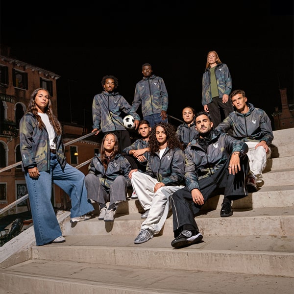
Which is why 25/26 feels more concerning. There really shouldn’t be any excuses now, and yet it feels a little like NOCTA are going through the motions…trying to replicate the magic formula that Kappa, with the help of Fly Nowhere and Bureau Borsche, had produced.
Personally, I like the current away shirt. A lot, actually. The home, though, feels average. And the third has that unmistakable marmite quality – upon launch you could tell it’d split opinion right down the middle. That’s not inherently a bad thing. Kit design should be divisive. It’s subjective. It sparks conversation.
But the fourth? Again, it’s fine. Perfectly fine. And that word keeps coming back. Fine isn’t what Venezia built their reputation on.
NOCTA can’t fall into the trap of thinking that the mere presence of their logo on a football shirt is enough. Yes, they carry a huge global influence. But people care about stories and narratives nowadays; they crave substance and they see through bullshit. Releasing the same shirt just in a different colour and dressing it up as a special edition and shooting beside the lake isn't enough...it all just pangs of laziness. So they need to find that organic connection to the club in the same way that Kappa did.
The second factor – and arguably the more damaging one – is sponsorship.
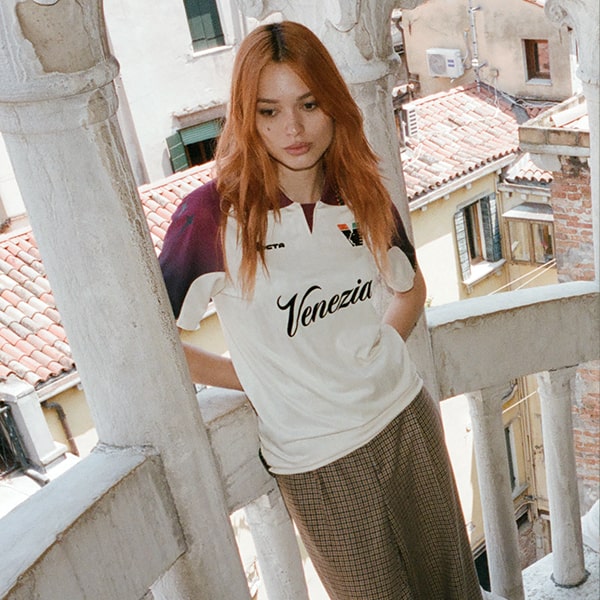
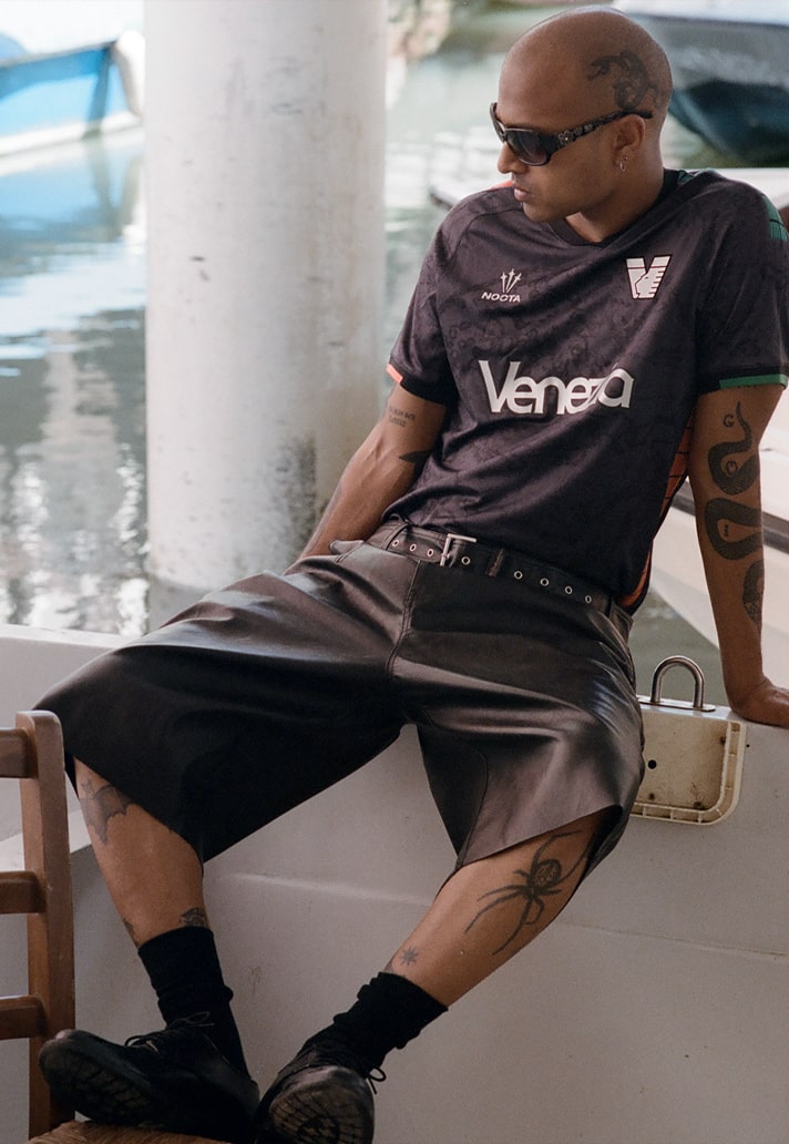
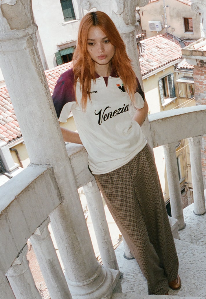
When Venezia truly exploded onto the global stage in 2021, they did so with a stroke of branding genius: “Venezia” across the sponsor slot. Civic branding as centrepiece. Bold, confident, unmistakable. It told you exactly what this club stood for. Yes, it caused regulatory headaches. Yes, it wasn’t the most commercially traditional move. But visually and culturally, it was unbeatable.
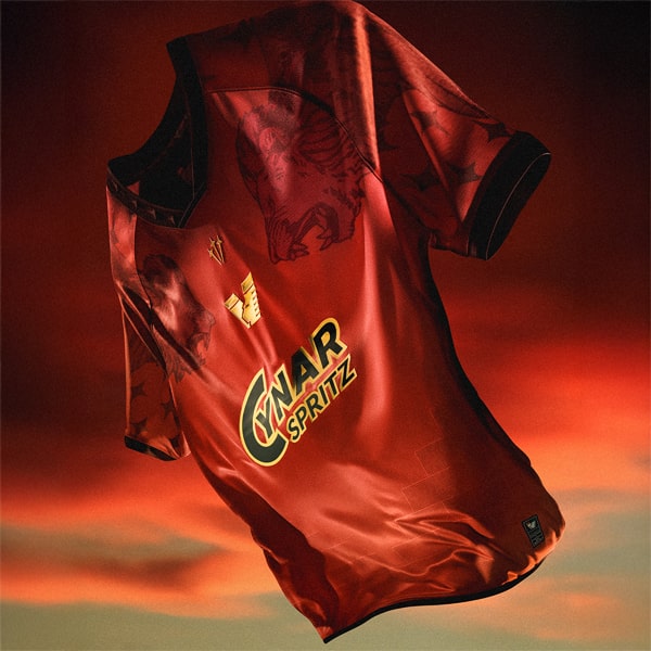
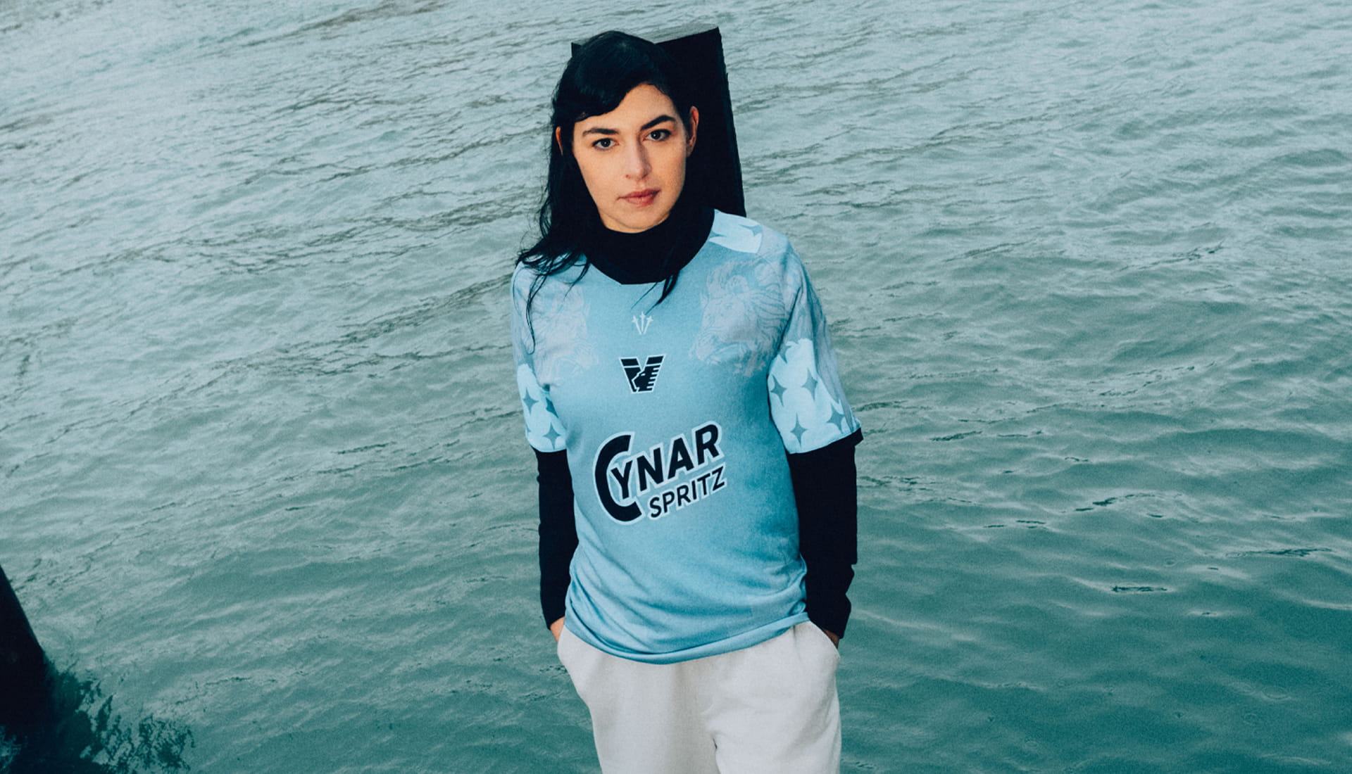
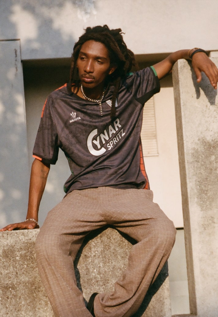
That identity carried them through until 23/24, when commercial realities kicked in. Becher wasn't great, to say the least. And the move to Cynar Spritz, while understandable from a financial standpoint, hasn’t helped the aesthetics of any kit it’s appeared on.
The proof is right there: every single Venezia shirt looks better with the “Venezia” sponsor option instead. Every one.
I get it. Football clubs need money. Wages need paying. Stability matters, especially for a club bouncing between Serie A and Serie B. But commercial doesn’t have to mean ugly. When done right, a sponsor becomes part of the design language rather than fighting against it.
Right now, Venezia need to decide what matters more: protecting and growing one of the most distinctive identities in modern football, or leaning too hard into money-first choices that slowly erode what made them special in the first place. Realistically, it has to be a balance – but that balance feels off.
For me, the golden era feels like it’s over. It was like a shooting star, burning bright, but gone in a flash. Can it return? Of course, anything’s possible. If Venezia and NOCTA want to recapture that magic though, they need to get braver again. Push further. Explore new territory. Lean harder into what NOCTA represents – streetwear, subculture, global youth energy – and translate that onto the pitch, not just into lifestyle pieces.
League position, promotions, relegations – they matter, of course. But identity matters too. Venezia built something rare over the last five years. A club that transcended results and became a reference point for the entire football fashion space.
The water metaphor still works. Fluid. Ever-changing. But right now, it feels like Venezia are drifting, not flowing forward. And for a club that once defined the current, that should worry everyone who fell in love with them in the first place.