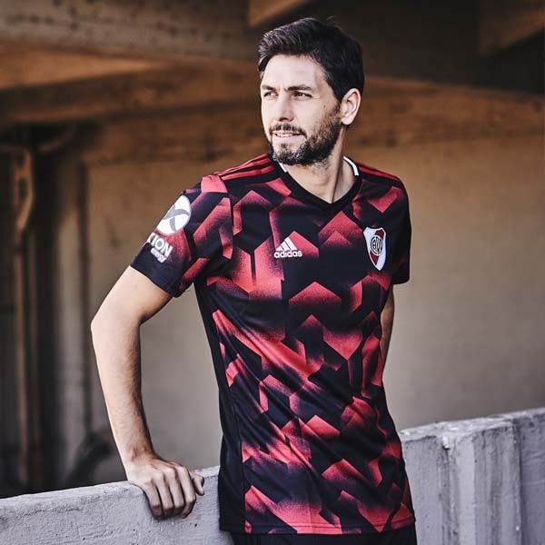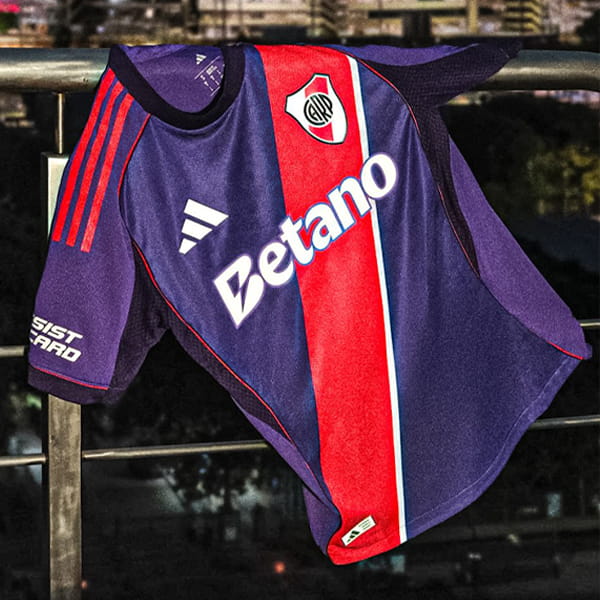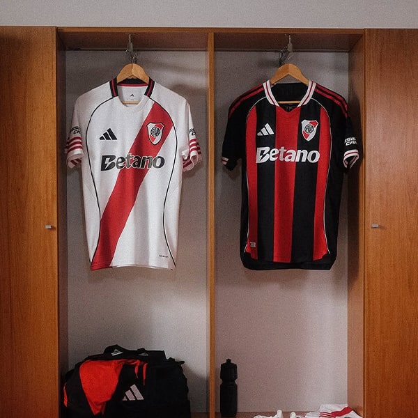
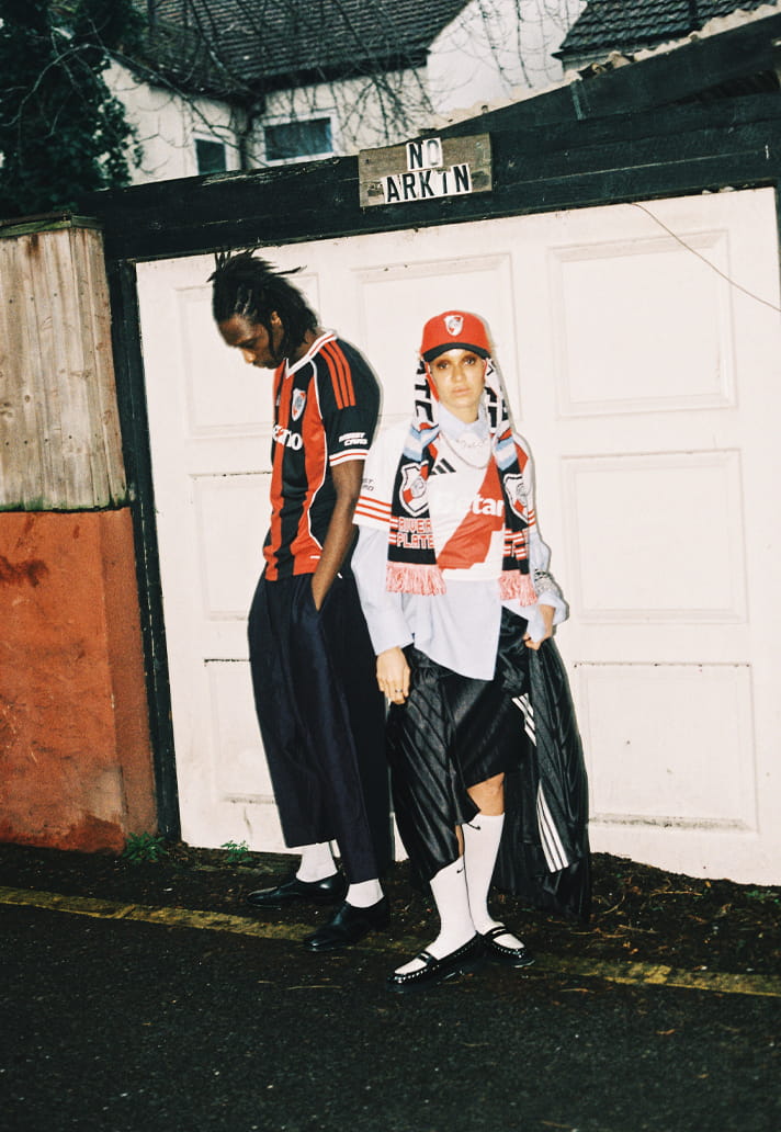
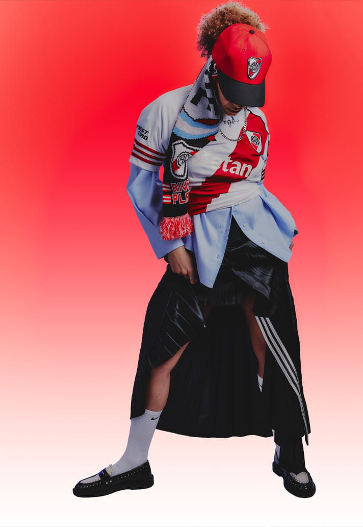
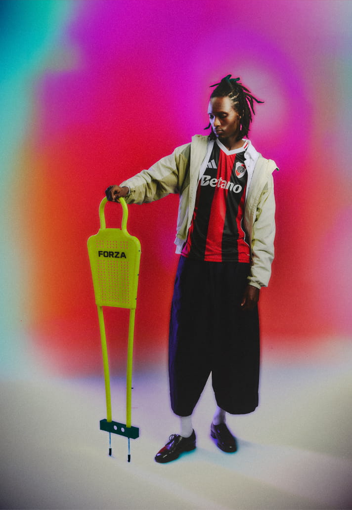
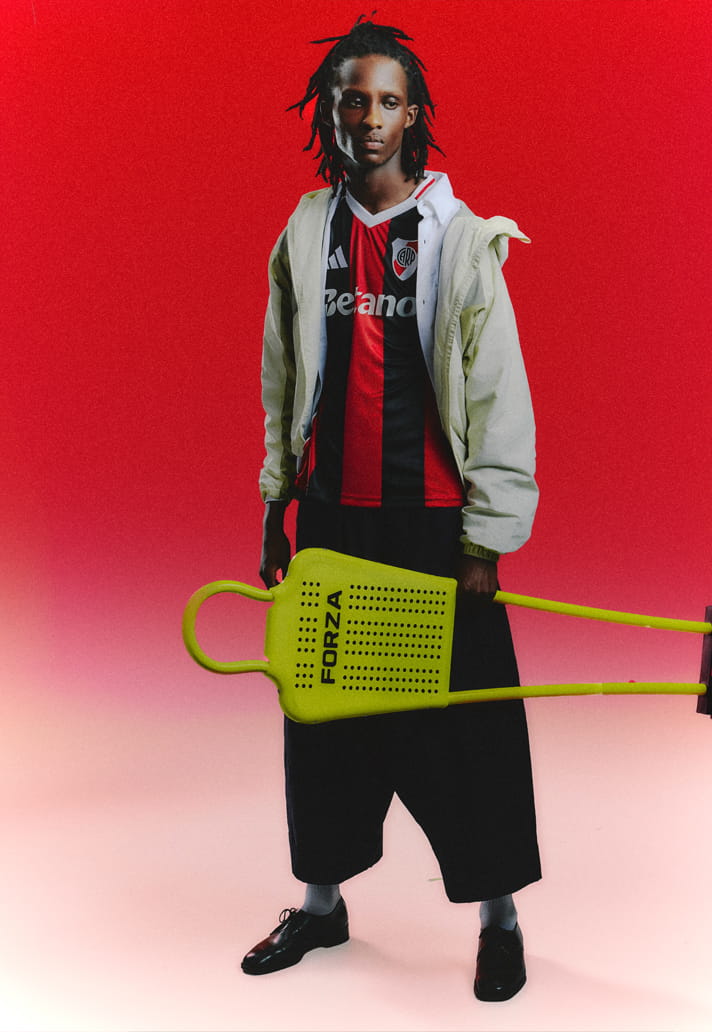
Some identities are sacred. Others are stretched. River Plate’s 25/26 away kit sits right on that tension. A club defined globally by a single diagonal gesture choosing instead to explore something more structured, more direct. Red and black stripes replace the iconic sash. It’s a shift. But not a betrayal. It’s a reinterpretation.
The palette still carries weight: red that feels urgent, black that grounds it, white accents that frame the whole composition. But it’s the verticality that changes the rhythm. This isn’t a shirt that moves across the body, it moves through it. Strong. Linear. Assertive. And within that shift, every element has to recalibrate.
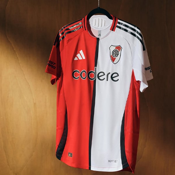
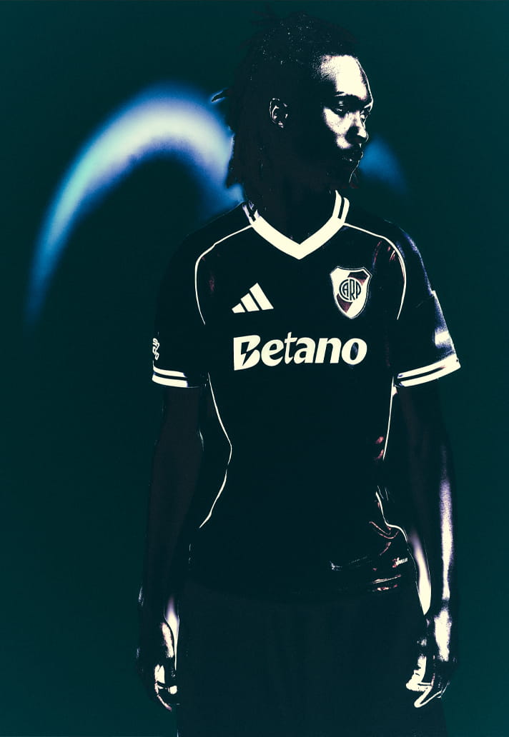
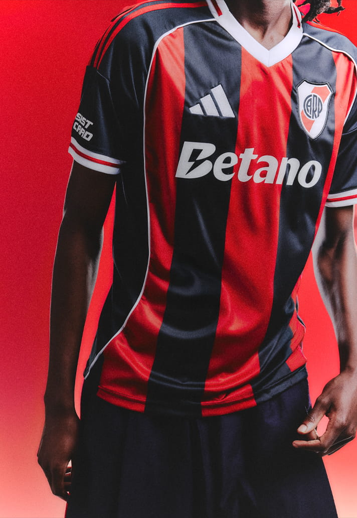
Because when you disrupt a classic, balance becomes everything. The Betano mark sits at the centre of the chest, rendered in crisp white. Against the alternating red and black stripes, it acts as a stabiliser. It cuts cleanly across the pattern, unifying the movement beneath it. The typography holds its own, but it doesn’t overpower. It respects the geometry of the shirt.
That’s where the integration lands. Because on a striped kit, a sponsor can easily fracture the design. Break the flow. Interrupt the rhythm. Here, it does the opposite. It connects. It brings cohesion to a composition built on contrast. It becomes the anchor point.
The adidas mark sits minimal and precise. The River crest is bold, unmistakable and holds its place with quiet authority. White piping traces the edges, sharpening the silhouette, giving the shirt structure. Everything is intentional.
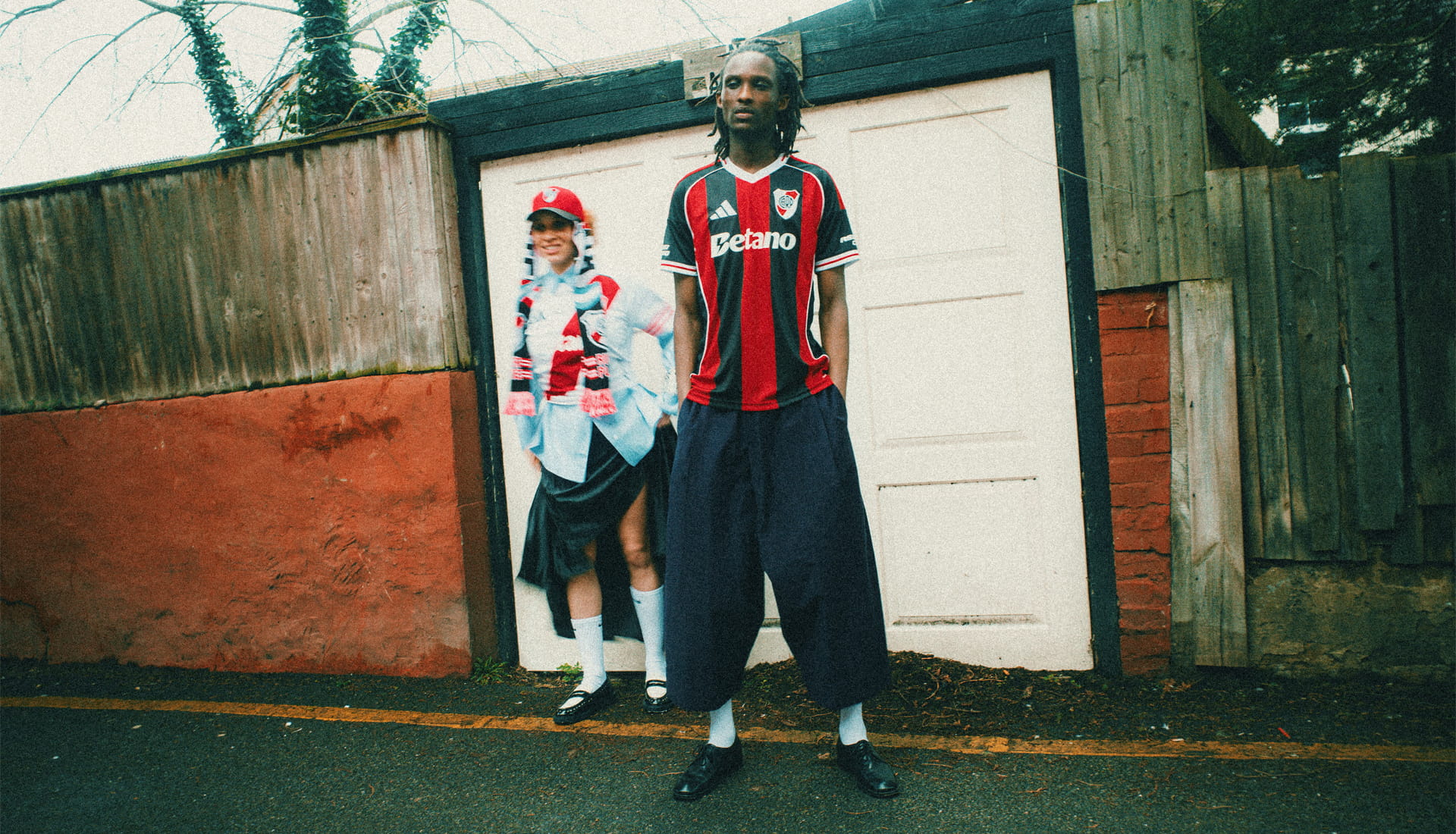
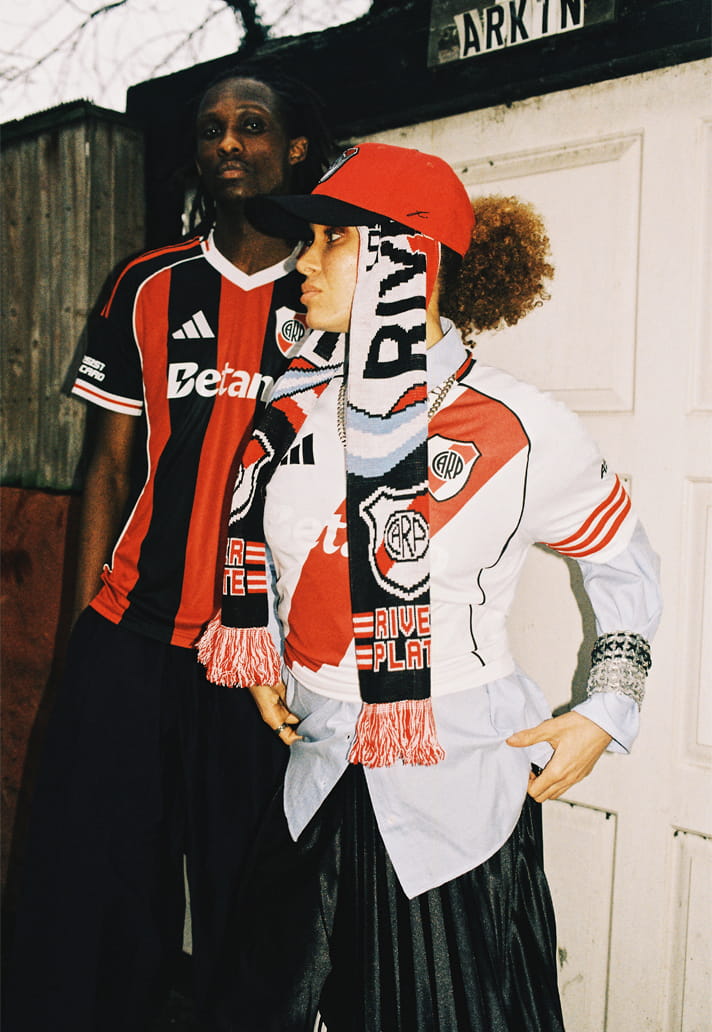
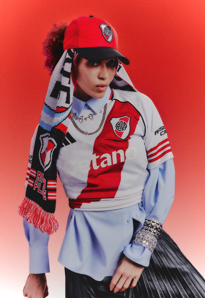
In our editorial framing, that tension between heritage and evolution becomes the story. Styled in real-world settings, layered with fan culture, the shirt carries attitude. It feels defiant. Confident in its divergence. And crucially, the sponsor moves with that energy. It doesn’t dilute the statement. It reinforces it.
Because when a club steps outside of its most recognisable visual code, the details matter more than ever. The sponsor has to understand that balance. It’s about choosing when to lead, when to support. Here, Betano finds that line perfectly. Present. Clear. Integrated.
Step back and the composition resolves: Red and black verticals. White accents. Crest. adidas. Betano cutting through the centre. Tradition, reworked. Identity, reframed.
River Plate’s 25/26 away kit is proof that evolution doesn’t have to erase history, it can challenge it. And when a sponsor aligns with that moment, it doesn’t just sit on the shirt. It helps carry it forward.
Photography by SoccerBible.