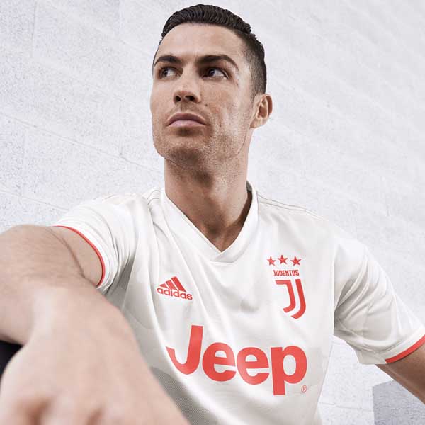
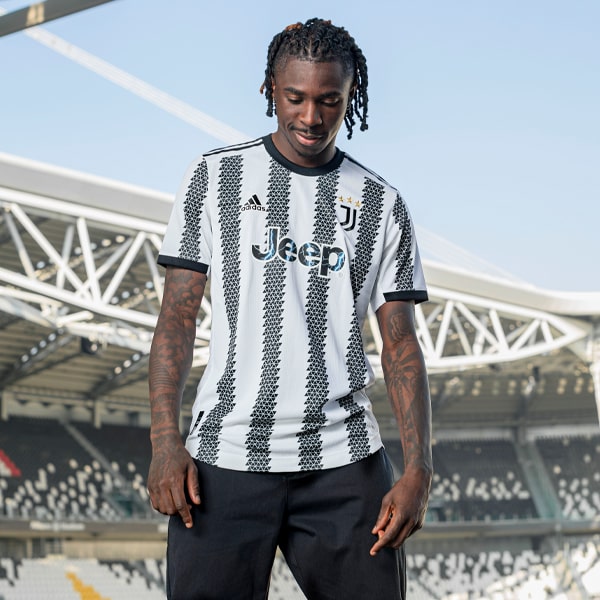
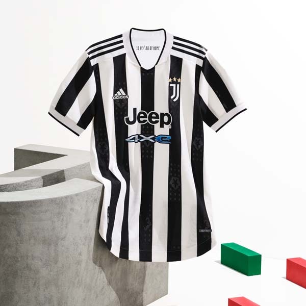
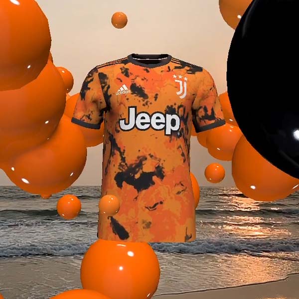
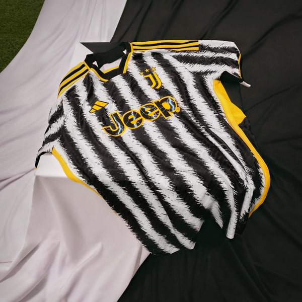
Embracing the tradition of a club while implementing a fresh slice of modern movement, all while trying to appease fans, players and club officials alike? That’s the challenge that was faced by the adidas design team when reinventing the iconic Juventus bianconeri shirt for the 2019/20 season.
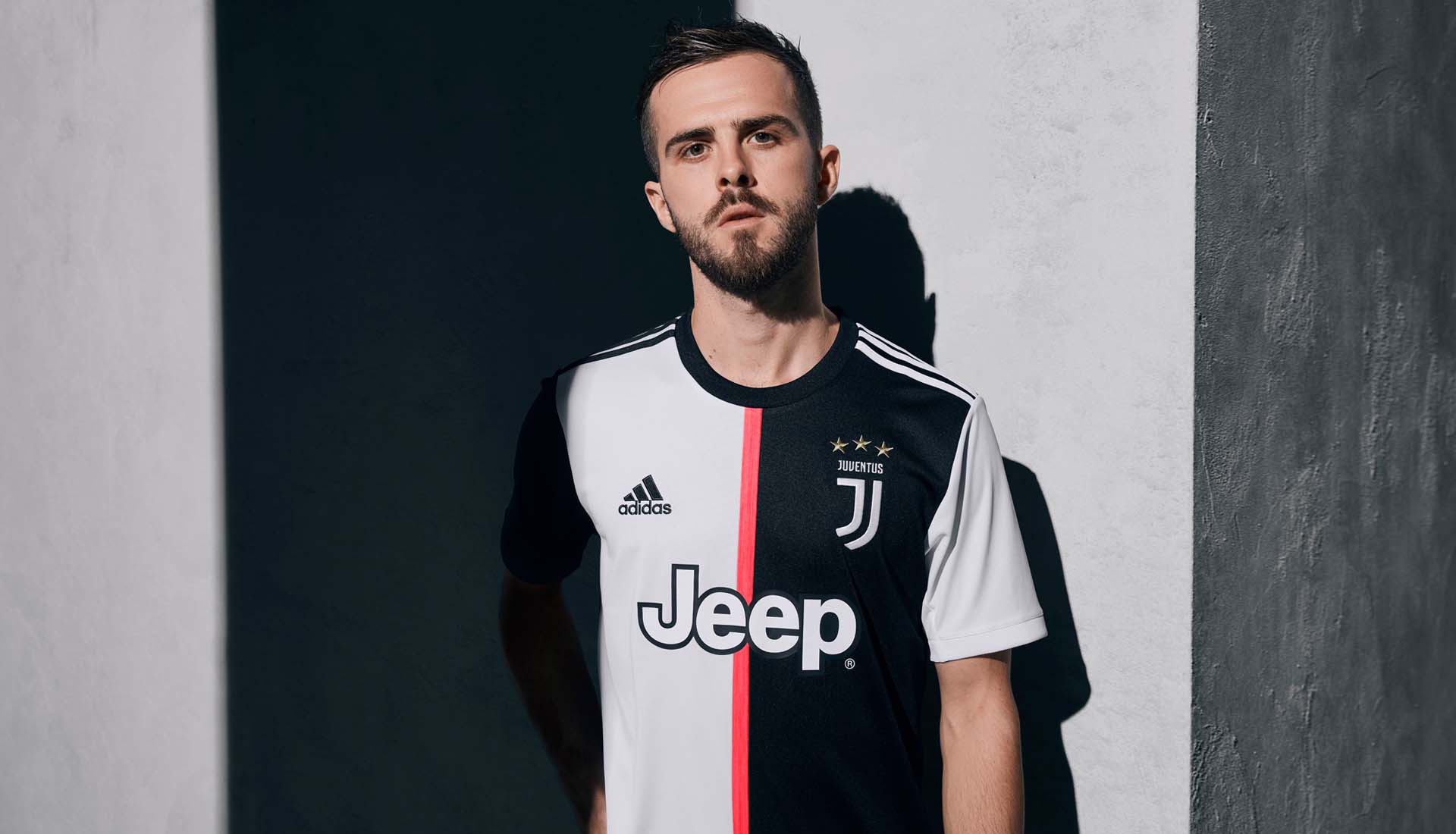
It’s a challenge, but it’s one that adidas Design Director, Inigo Turner relishes, embracing the Three Stripes mantra of authenticity to progression. We sat down with Inigo to discuss everything about the new Juventus shirt, from the revolutionary new look that introduced a 50-50 look divided by a pink stripe to the reactions on social media and a lifestyle focus.
Ini, how did the process start for designing the new Juve shirt, is it just you and your team sat round sketching after a meeting with the club?
So to begin with, as a football department, our creative director and team form a creative direction for the season, so that would inform the approach a little bit in terms of how we would create the design. From there we would work with the design team on various different design ideas and design options, working on a 3D tool, so we would have a very accurate render of how the kits would look and from there we would present that to the club.
Earlier on in the process we would also reach out to the club and ask for anything they would want to bring in for the season that could be different or new, or any stories that they’d want to tell. That consisted of a face-to-face meeting where we went to Turin. So that’s sort of in a nutshell how we would start the season. We’d present the concept to them and then they’d give feedback.
Is it normal for clubs to knock back a few designs before you settle on one?
I would say it’s different every time. I think Juve in particular, we have a good understanding with. We’ve got a really good relationship with them creatively and we always communicate throughout the process with them. We have discussions around the designs, and we do more than one design in some cases, could be multiple designs, but it’s not a standard thing that they knock things back. Sometimes something from the first attempt will make it all the way through and that’s the shirt that you see on the field. Sometimes it can be that we’ve had to redesign it a few times, so it’s different each time to be honest.
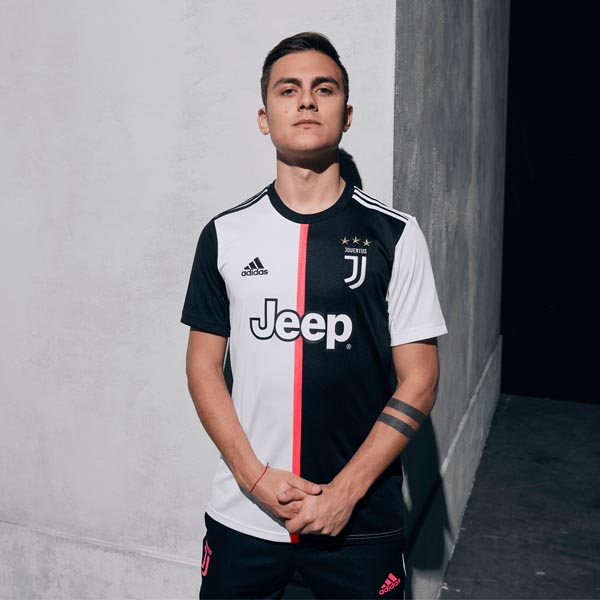
The new Juve shirt has the pink dash down the front. Is that something you had to sell to the club?
Yeah, it’s obviously a very new design, a very different design, and the injection of a really vibrant, screaming pink was something that they were super keen to do and there was a reason and a rationale behind why we did it; we wanted what we call this authenticity to progression where we have an authentic reference point in a story and then we do it in a really modern way to push the look and the aesthetic forward.
The reference was the first kits, when they wore pink and also the half-half shirt and we put it down the middle, splitting the shirt. A little subtle reference to the pink shirts where they used to wear a neck tie, a black neck tie. Obviously it’s not black, it’s pink, but where it fits in to that aesthetic is that it’s a little nod to that story. They were up for it and they wanted to do something a little different, and they understood that we could really make the shirt look quite different by a very subtle little injection of something different, like the pink in this case.
As a designer, it must be quite exciting to have that creative licence for a home shirt. Home shirts can often be quite bound by tradition. Normally the creativity is reserved for the away or even third shirts...
Yeah, it’s great. We were fairly clear that we could make a much bigger statement when you do it on the home. The home is the one which everybody wants to have, it’s the big icon and they wear it most of the time. It’s worn in probably 70-80 percent of the games in the season, so everyone’s going to see it. It’s a massive statement when you do something like that with a home shirt. So, yeah, we all went in there with open eyes and said if we want to do something different here, lets do it on the home and not do it on the third or the away and they were fully open for that.
We knew that by doing this, we would lead the industry rather than follow, and that’s important for us to be at the forefront as the number one football brand that we take the conversation forward ourselves and we don’t wait for someone else.
Is it a bit of a balancing act between respecting tradition and trying to do something new and keeping it modern?
Massively, yeah, and that’s what we want. With this authenticity to progression, we don’t want to ignore what went before. We want to reference the past, it’s important: we respect the fans, we respect the history of the club, we respect the team and all those elements are super important, but we want to remix things and do it in a really modern way and that’s what we did here.
It worked out really well where everyone’s super happy with the results. I think the story around how we communicate it, that collectively the shirt becomes the stripes worn as a thousand people behind the goal or as the team standing together in the line up and you see this bolder version of stripes. It’s about standing together and representing the club as one. That was a really interesting concept and something where I think we could move football shirt design forward and also be inclusive with the team and the fans.
Football shirts are big in lifestyle circles right now. Do you think about how the shirt is going to look off-pitch as much as you think about how it’s going to look on pitch?
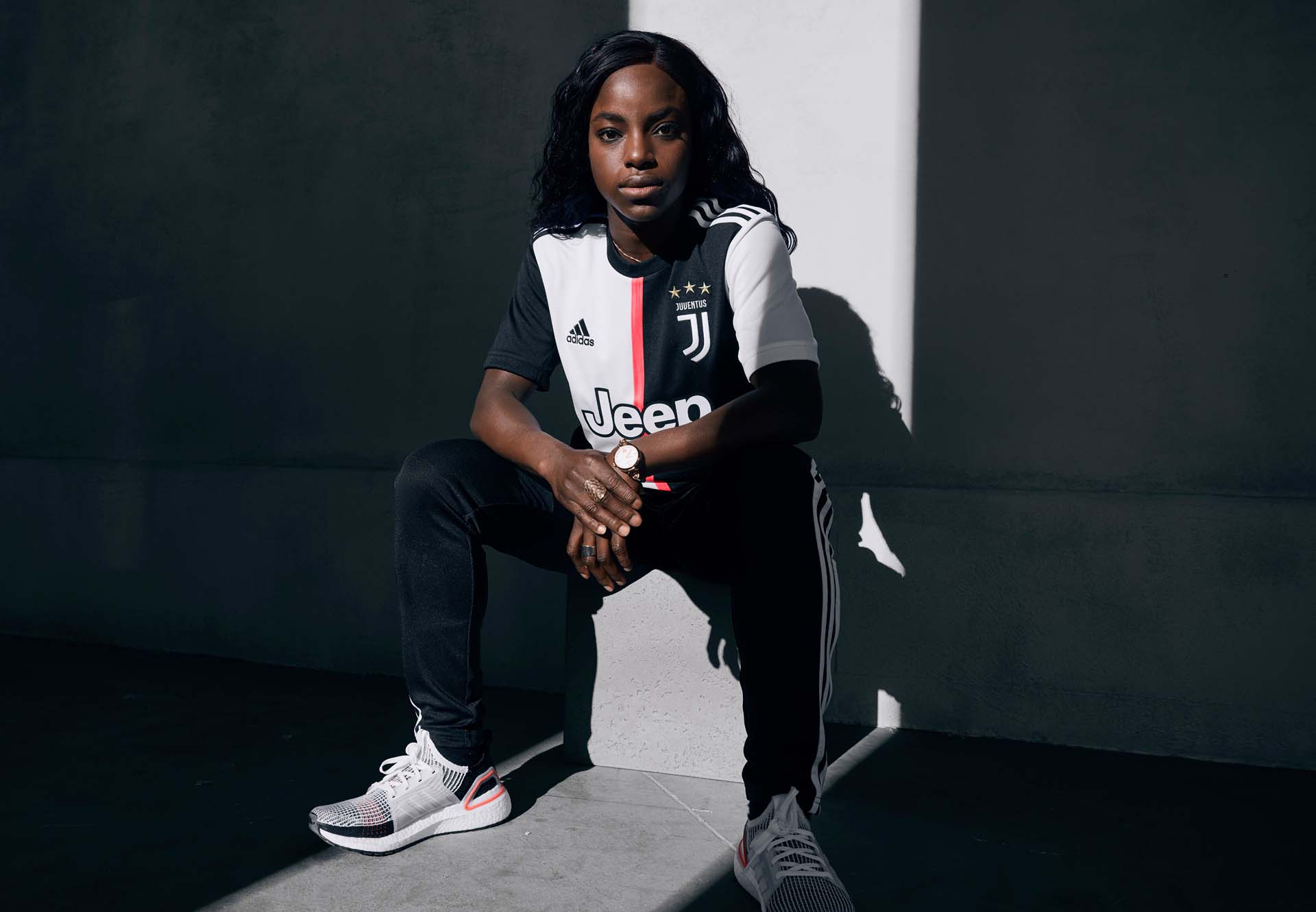
Oh yeah, 100 percent. We also have something that we call stadium to the street and it’s a way we approach product design. Everything’s done with the idea of shirts being worn 24/7, so I think the modern football fan doesn’t just wear the shirt to the stadium, but then they’re not just worn on the field, they’re worn by fans and players alike, so we want to make sure that it looks good when that’s done, sort of how that outfit comes together, both as a kit and when it’s worn with an adidas Tiro track pant or with jeans or whatever it is. It’s important that we want it to be something that is on point and culturally going to work in streetwear and men’s wear and women’s wear worlds as well as in sports performance worlds.
When a kit is launched, do you look at comments on social media to assess the positive and negative reactions?
Yeah, of course. We’re fully aware and read a lot of comments. It’s super-interesting, obviously. You get a lot of mixed reactions when you get something as bold as that and people will react in different ways. I think that when a design is so challenging or so modern it can take longer to resonate with certain fans. That’s only a natural thing and we fully understand it. We’re always reading everything and going in with our eyes open and definitely listening to what the fans are saying and it’s really important to us. They’re the people that are going to have to wear it and look at it as well.
The crest still looks so sharp. It all just lends itself to creating a modern kit, doesn’t it?
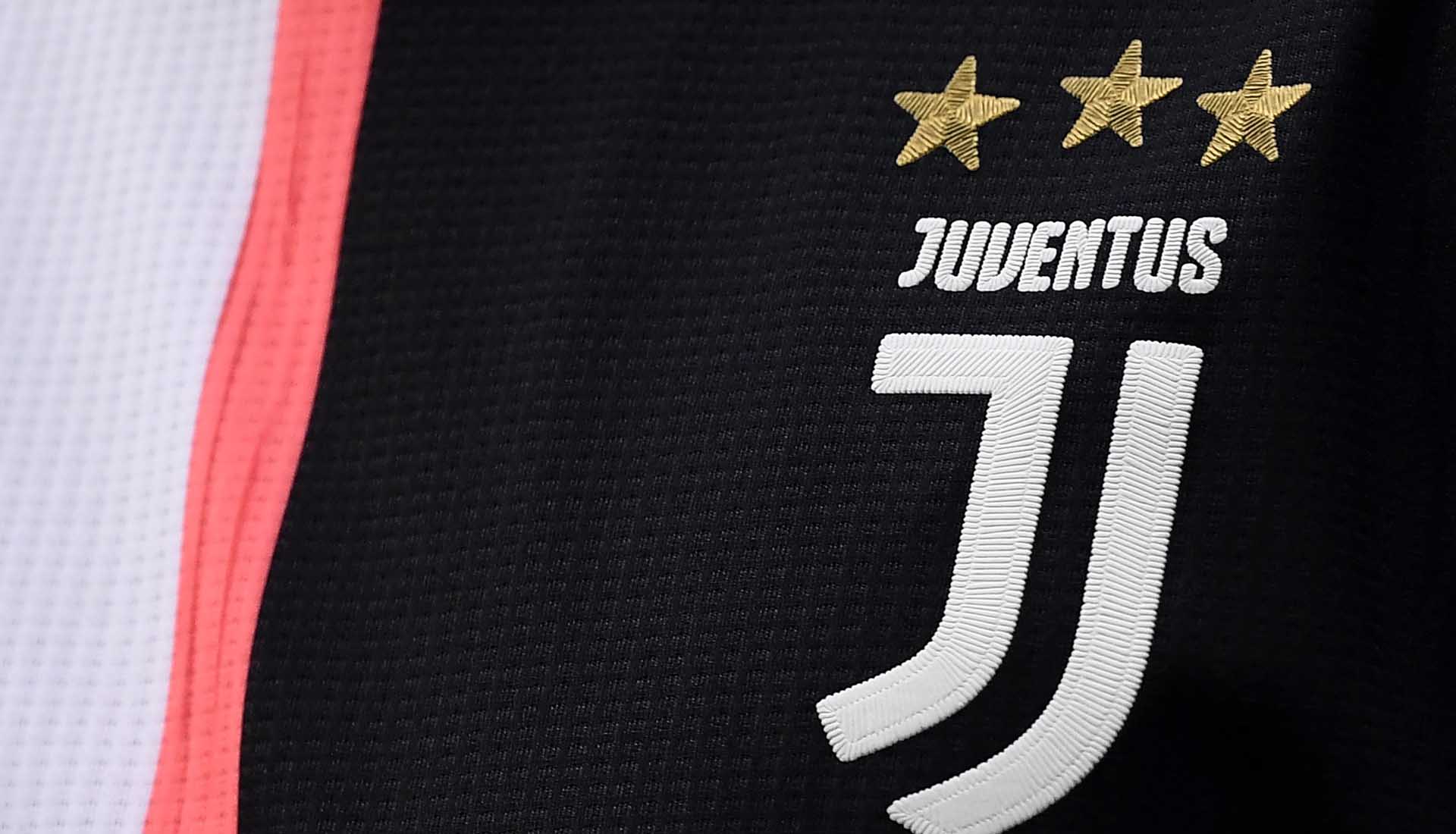
I think the ingredients that go into Juventus are really ideal conditions for designing football shirts, so the modern ‘J’ icon is beautifully simplistic and an industry leading idea to have. It’s great. It works really well and is really sharp, and then the Jeep logo looks great on the shirt. I think everyone’s envious of having that logo. I think on the shirt it looks really good. The black and white is iconic, it’s a brilliant palette to work with, so for us, Juventus is a pleasure to work with.
How do adidas allocate which designers work on which team? For example, do they mix it up and not let you work on the same team in consecutive years?
We have a team of very international designers and we basically work as a team on all the designs. We have allocated designers for different clubs, but it’s really a team effort. We come together on a daily basis and look at what everyone’s doing and give ideas and that’s the best way to get the best out of all of the creative talent that we have here. In Juventus’ case Francesca Venturini was the project designer and she has a great relationship with the club. She goes there to present the designs and does an absolutely fantastic job. She’s also from Turin so local knowledge is always something that’s very helpful if we have it, and we always seek it out. But it’s a very collective effort across the team and we work as a wide-a-pool as we can.
You’ve designed shirts for a huge iconic clubs like Juventus. You’ve also designed for your own club, Manchester United, and then a brand new club like LAFC. That’s quite a different mix of challenges. How do they differ?
That leads on nicely from the last question I’d say. Local knowledge is key. Also communication, they’re really different, and each club has its own personality and its own owner or the people that we have to work with on the creation. They’re always different. So working with LA was brilliant and really different. They’re a really young club and going to the city and understanding the culture of it, immersing ourselves for ten days in the city and speaking to the club, the fans, watch a game, really find out what it is to be in that city and what football means locally. For us it’s really important, and like you rightly said, it’s different everywhere; they’re all different and we try to treat them as individuals and to give them their own unique look. It’s important that they have their own DNA coming out through the stories.
Last question. Give us some clues... what’s your favourite 2019/20 adidas jersey that’s not yet out?
Oh wow, not yet out? Hmmm… OK, I would personally say that I’m really looking forward to the launch of the new Arsenal kits, so specifically for me, the home, because it’s just an adidas icon and I’m really excited to see how that goes and how the fans take to it and the reaction to it. I think it’s a beautiful shirt and it’s going to be real, really exciting.
Shop the 2019/20 adidas x Juventus collection at prodirectsoccer.com
