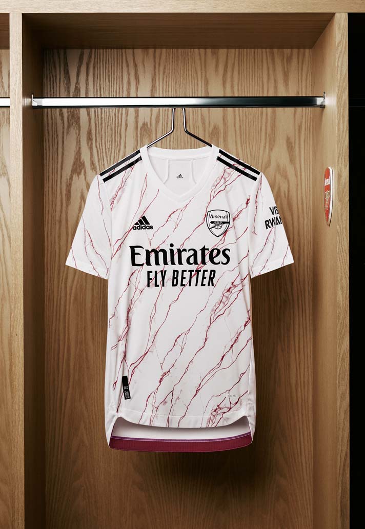
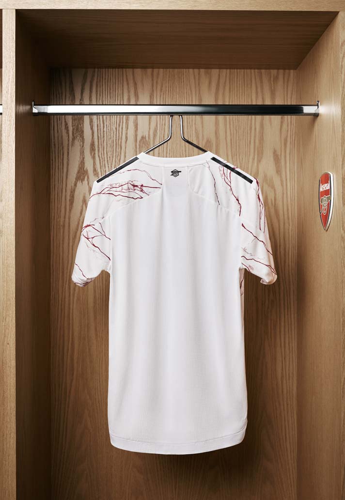
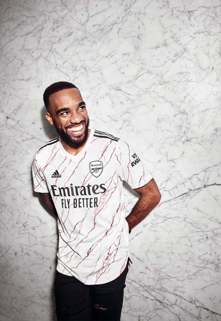
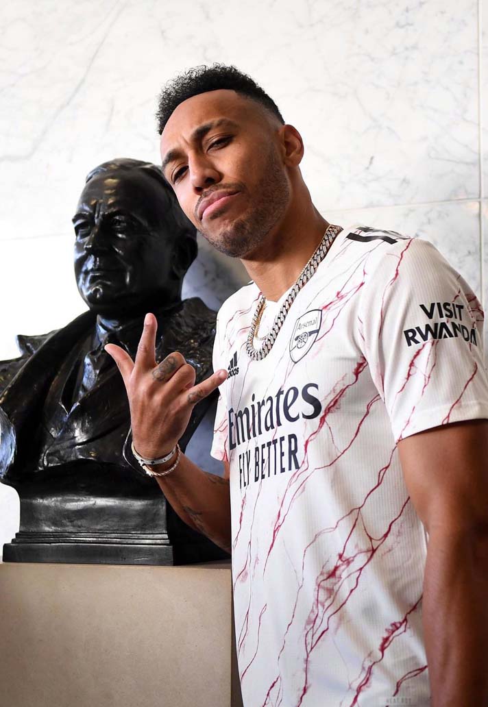
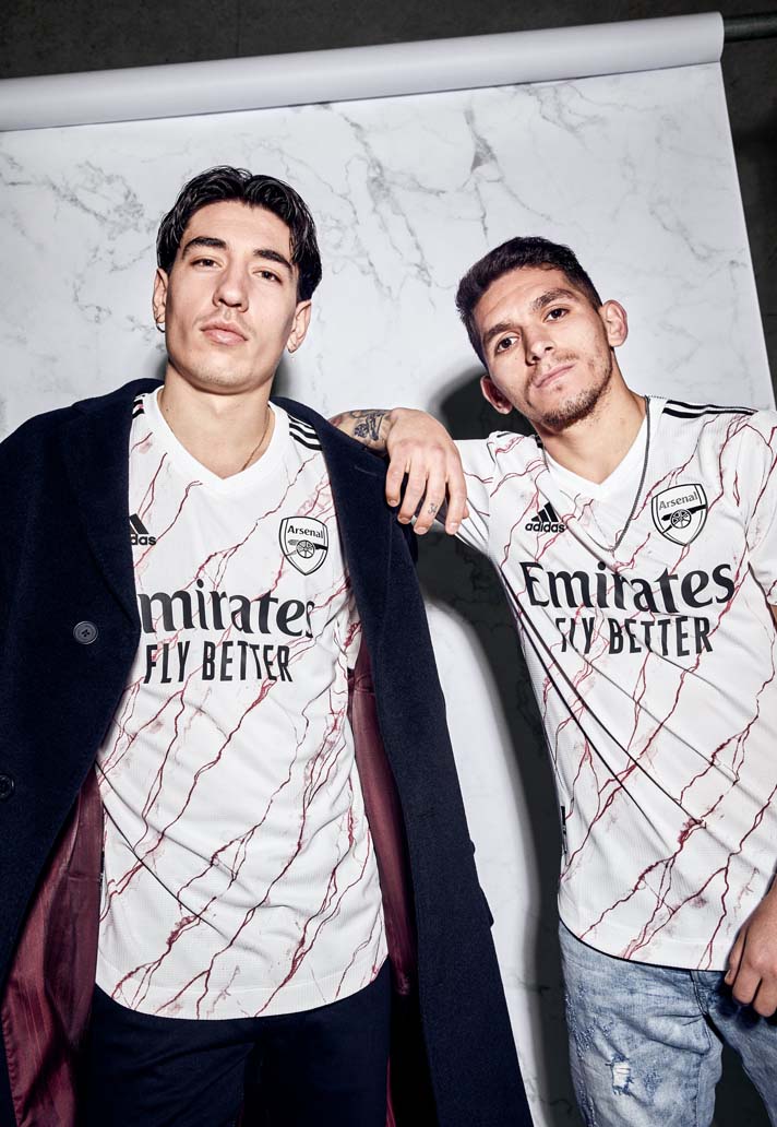
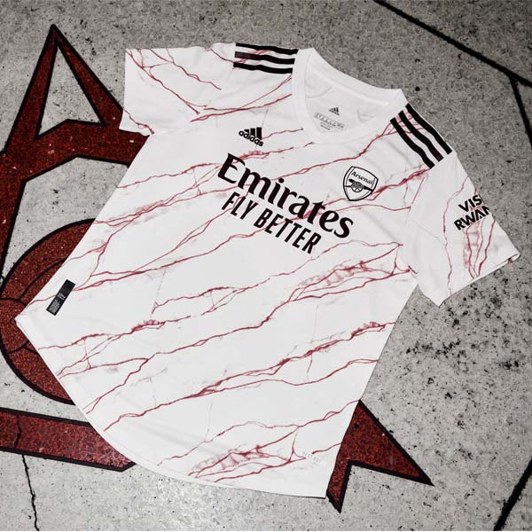
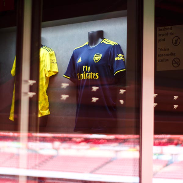
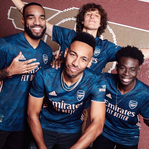
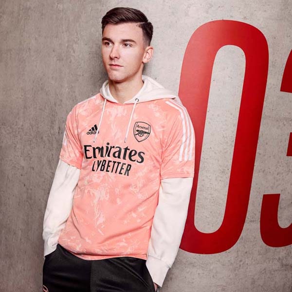
Following up the retro-infused away design of last season was always going to be a tall order, but the team at adidas have risen to the challenge, producing yet another standout design for the Gunners. To talk us through the challenge and the process behind the Arsenal 20/21 away shirt, we spoke with James Webb, Product Designer at adidas.
As well as being a visually stunning design, the new Arsenal away shirt strikes that perfect balance of being infused with the ‘Art Through Football’ mantra that has driven the Three Stripes’ offerings this season, while still staying true to the iconic heritage of the club. It’s quite the feat, and Webb was only too happy to shed some light on the story behind what is one of the wildest designs that we'll see in the Premier League this season.
Arsenal and adidas aren’t holding punches when it comes to pushing the game through kit design, typography - how would you describe the overall mission of the two brands together?
With season one, we wanted to create a statement that showed what the club was about while celebrate kits from the past whereas for season two, it was fuelled by our art direction which was championing ‘Art through Football’. So we tried to move away from anything that would have been deemed predictable. We wanted to be as bold and provocative as possible. We felt this was also in line with Arsenal’s visual identity as well. We’ve seen the club re-invent themselves decade after decade and we wanted to celebrate this open mind and forward thinking mentality.
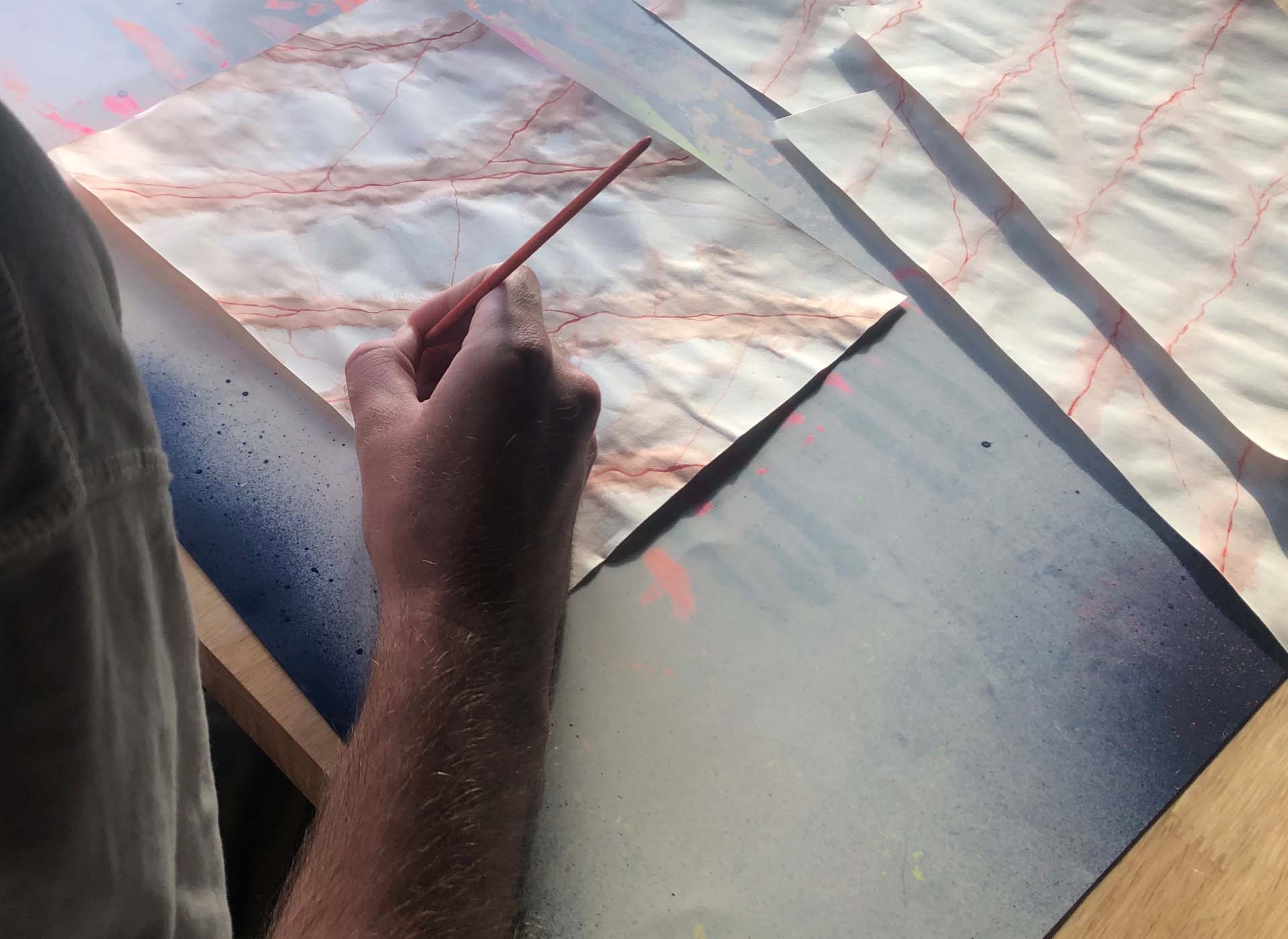
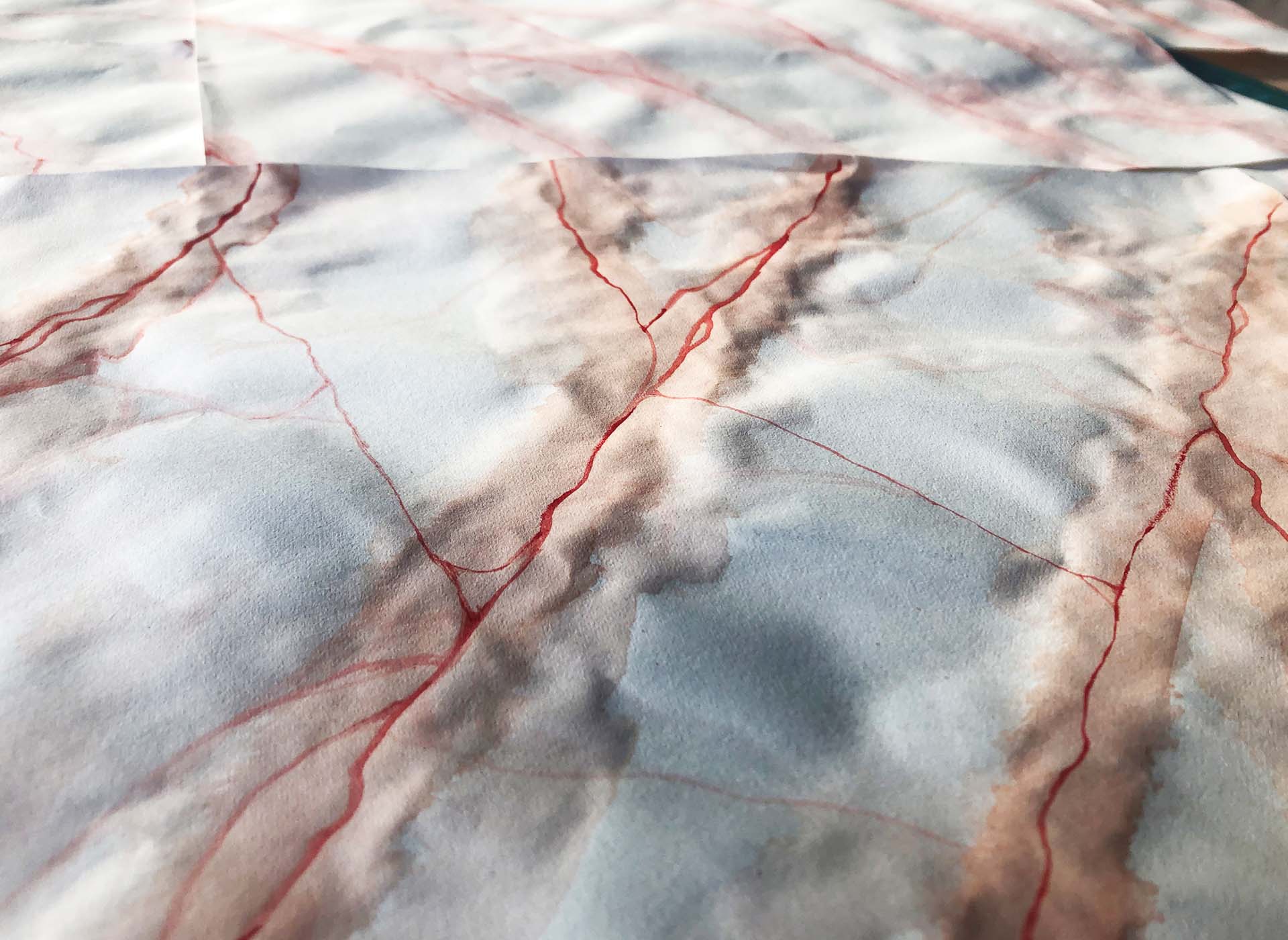
When we came to put the art direction into practice, we started by experimenting through different formats. We chose to move away from the digital side of design and be more hands on. We used free-hand illustration, different dyeing techniques and all manners of art. From there, we looked at specific stories that related to Arsenal which ultimately led us to the art deco history that the club is entwined with. From there we can expand the story telling and the graphic that has been used across the away shirt.
Season one, the fans had a level of expectation with adidas becoming a partner once more and we had to deliver that. For season two, we didn’t want to rest on those laurels – we wanted to re-invent the expectations of the fans as well. We wanted to establish a new period that people can look back on in the future. The graphic is prominent on the home jersey but then on the away we’ve pushed it and I don’t think it will be what people are expecting for the right reasons.
We live by the mantra of ‘Stadium to Street’. It’s been our ethos across multiple seasons and with that in mind, we’d never create something that wasn’t wearable off the pitch but we do want to deliver bold designs and big aesthetics"
This away shirt is so clean yet it’s got that punk edge – could you let us in on the process a little? How many designs did you have to go through before you landed here?
For us it was all about building on momentum from season one to season two. We don’t want to become predictable as a brand. Similarly, Arsenal don’t want to become predictable as a club. Their visual identity is something we want to be aligned with but we also want to be at the forefront of a new era with them. For us it’s about being playful, bold, progressive and unexpected.
In terms of the process, it was about finding that medium ground that meant we were pushing forward whilst delivering something for the fans. Each designer of ours was given the open opportunity and encouraged to push the boundaries with their designs. For Arsenal specifically, we wanted to try and stay true to the club's DNA. We uplifted the colour from the bright red to a more maroon colour and re-engineered logos from the past and put them on the jerseys. We really wanted to bring that punk mentality to the forefront of season two.
The players have been shot in it ahead of time – what was their response?
When it comes to press photos ahead of time, previously, we got good soundbites of feedback from the players but this time around we got some real insight and a really strong response. From the club too, it’s something we’ve seen a lot of excitement around and you can tell there’s good energy from both players and the club for this season's kits.
What was the feedback from season one – did that persuade the club to be more adventurous and let you guys off the leash further?
The club is great to work with. It’s a very forward thinking club. They’re open minded when we’re presenting new sketches and new ideas. They always have the fans at heart so they’d never let us deviate too far away from what the club stands for which is great because there’s open dialogue then between us and them and work together to move forward. Everything from the names and numbers to the marble influence, the club felt we had a good story and idea to tell. Ultimately it got to a point where the club felt they would be delivering the fans with a shirt they deserved.
The club’s brand image is moving in a strong direction with adidas a big part of that – is that part of the shared vision also?
100%. Delivering designs as compelling as this in our eyes puts us back to the place that they belong. It’s only a matter of time before they get back to the top on the field. When you look at their global reach, there will be people from all over the world looking at North London and hopefully getting excited by what they’re seeing. The design direction was to entice and reinvigorate that flair and the passion that the fans have but also aiming to resonate with fans of different generations. From the Art Deco period, the 90s, the 00s when they re-invented themselves all over, now moving into an entirely new era, the club are just as forward thinking throughout those times as they are now.
Use of contemporary typography, a shirt that has a strong visual language – what trends did you take into consideration or spot over the last few seasons that you wanted to put into this design?
We live by the mantra of ‘Stadium to Street’. It’s been our ethos across multiple seasons and with that in mind, we’d never create something that wasn’t wearable off the pitch but we do want to deliver bold designs, big aesthetics and we’ve seen how the game is constantly changing. We don’t want to be predictable in any way and deliver the same thing season on season. The creative direction of Art Uniting Football gives us the foundation and for me to test my design skillset and the rest of the designers on the team as well. There’s multiple times when we’ve felt uncomfortable in the process which is healthy to move you into new places and the right direction. All those experiences can help us and adidas grow and break new ground in future seasons.
It’s massively wearable – it feels like football shirts in general over the last few years have taken a real art inspired approach - what excites you about football shirt design for this modern era?
The thing that excites me the most is the endless possibility that football shirts hold. Putting a shirt out there and landing it with a global audience is huge. It’s almost like an album cover. It’s a statement of time, a statement of a period, it reflects what a club is about and ultimately it’s a canvas like a piece of art. Ultimately it’s a canvas that belongs to the respective club and basing things on those principles - a band never stays still, it always evolves and football is the biggest testament to that because clubs span over years and over decades and over centuries but they never stay still. Players come in and out and philosophies change but the DNA remains the same, that’s the most important thing.
When you produce such a strong and wearable shirt, how much do you think about incorporating it with an adidas originals wardrobe and mixing performance and lifestyle that way?
It’s more about celebrating the club and our mutual history. Why not embrace that and champion what is great about the archive. Also we want other clubs to look at Arsenal with that punk mentality in mind. It’s about putting Arsenal on a pedestal and celebrating them for what they are.
It’s a weird time all over the place now but that also means this will be a moment in history people look back on and those football shirts will be encapsulated for eternity. How does that feel when it comes to leaving a legacy and making a mark on football?
I think that’s for the fans to judge whether we’ve done that. We want to leave a positive mark but it’s all about celebrating their connection to football shirts and their passion. They have the love for their club and obviously without them neither the brand or club would be in existence so it’s very much pleasing the fans. The North London faithful are brilliant, they’re very expressive and opinionated and it’s something that imbeds yourself in your mindset when you’re designing the jersey - they’re always front and centre of our minds when we’re creating jerseys for the future.
Pick up the Arsenal 20/21 away shirt at prodirectsoccer.com
