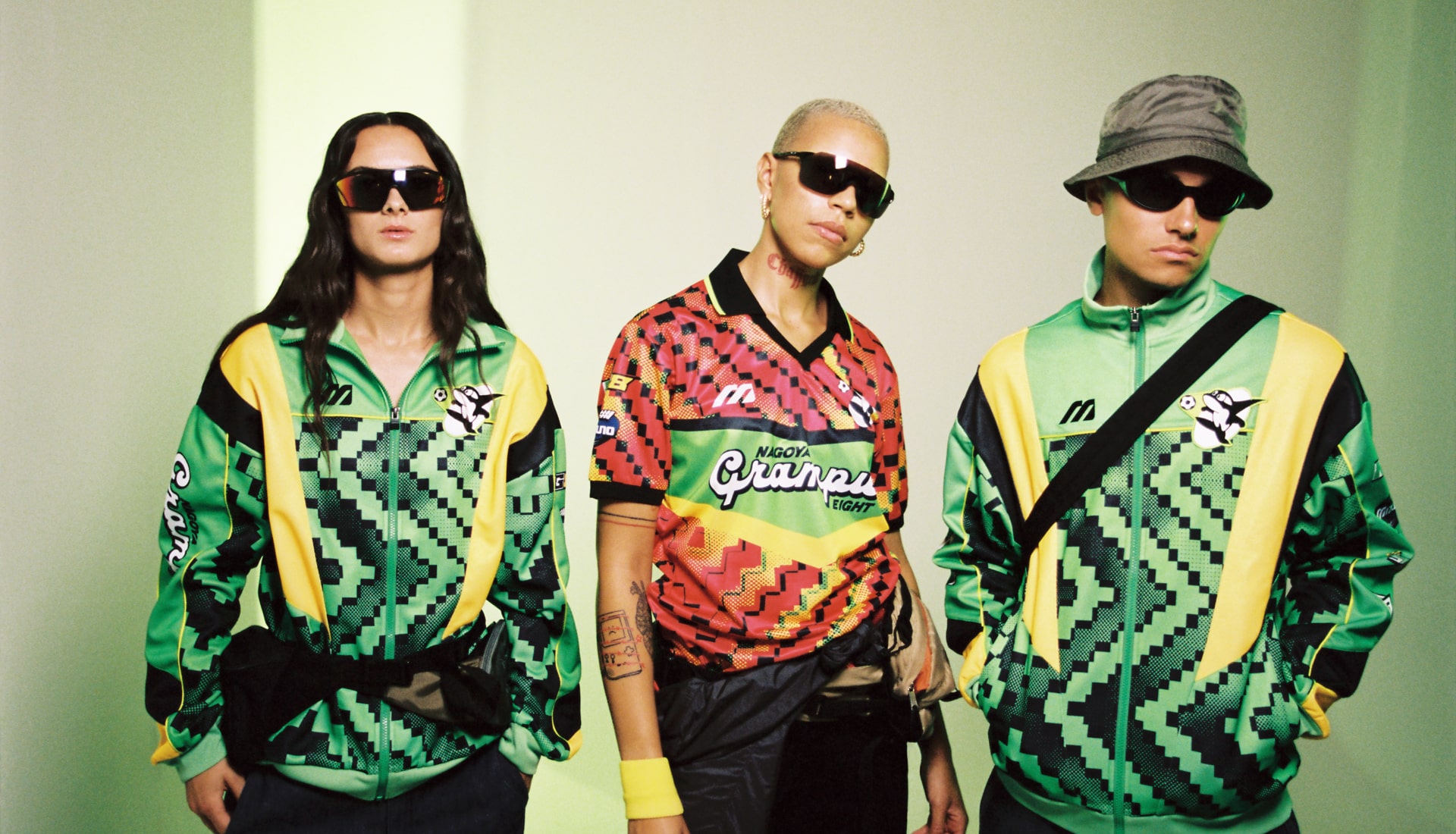
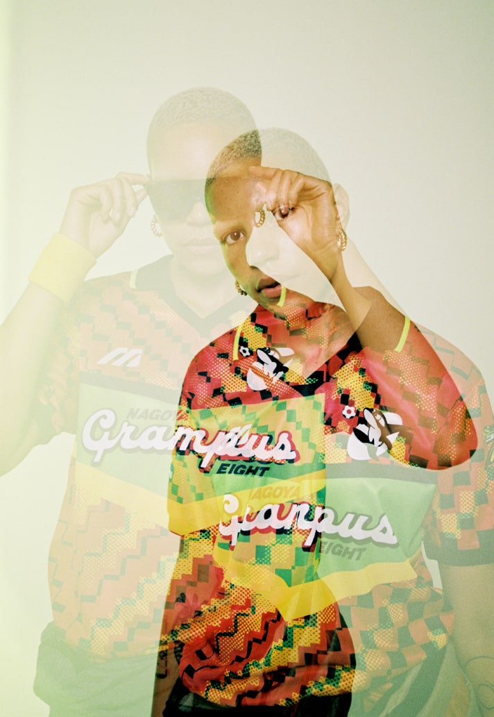
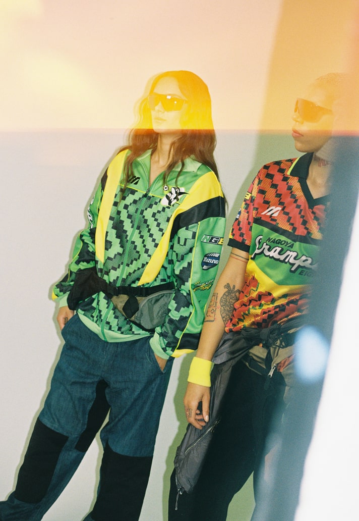
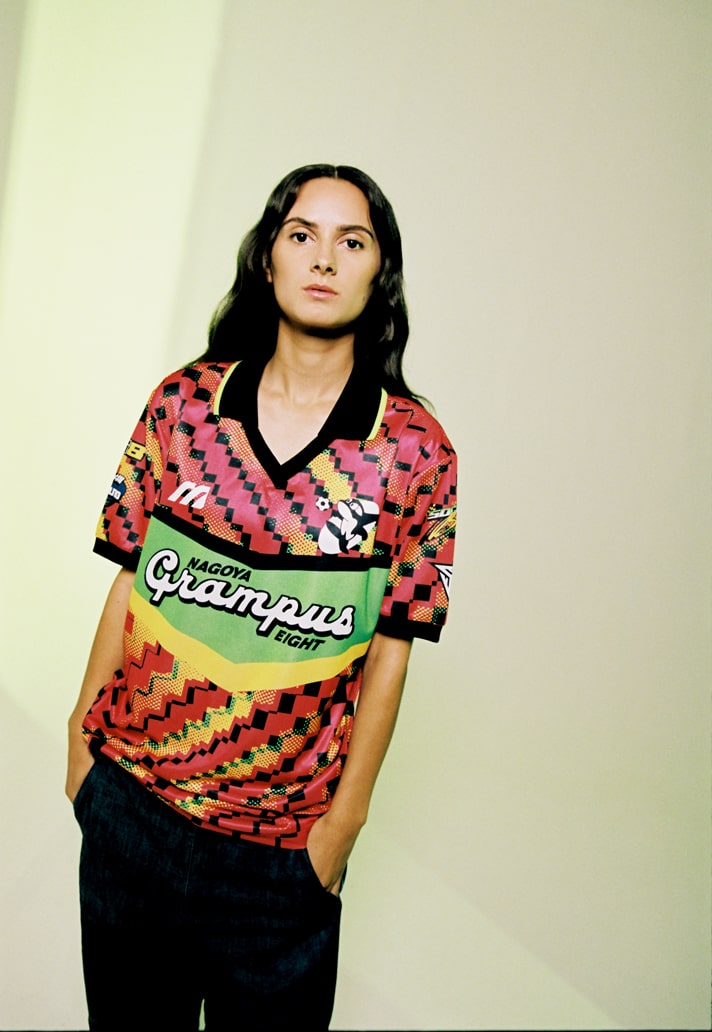
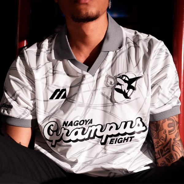
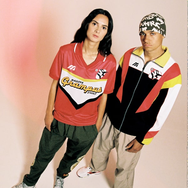
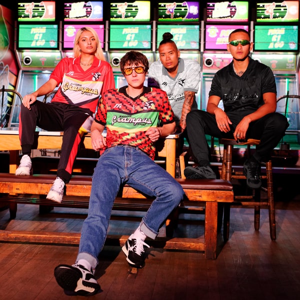
Fuelled by nostalgia but reworked for a modern day audience, get an insight into the ideation and design process behind the Mizuno x SoccerBible x Fokohaela Nagoya Grampus Eight Heritage Capsule from one of the key creative influences on the collection, Jason Lee, Creator of independent football art house, Fokohaela.
Seeking to forge a path that leveraged their unique history within Japanese shirt design from the 90s, Mizuno approached us at SoccerBible with an exciting project. The approach was fuelled by their knowledge of our unique line of sight within football, aware of our ability to tap into the deep heritage and history that the brand have in the game and bring it into a contemporary space. Engaged from the off, our mind instantly went to Jason Lee, creator of experimental studio, Fokohaela; this is a man who shares our passion for 90s Japanese football kits, and who has regularly caught our attention through his left field approaches to the ever-increasing influence of football culture.
Uniting with us on this unique creative vision, Lee set about creating the capsule, aesthetically guiding its evolution and bringing it to bright, bold life. Following its launch, we spoke with him to get his own perspective on the project, from its exciting start to its vibrant finish, getting insight on his own personal influences along the way.
You've been involved in this project, with us, from day one. How would you describe what you wanted to achieve through the design?
I've collected J-League kits and merch from the 90s because of their eclecticism, so the idea was to capture the same energy with a 2021 spin.
Where did you pick up inspiration and where did the shapes, patterns and tones come from?
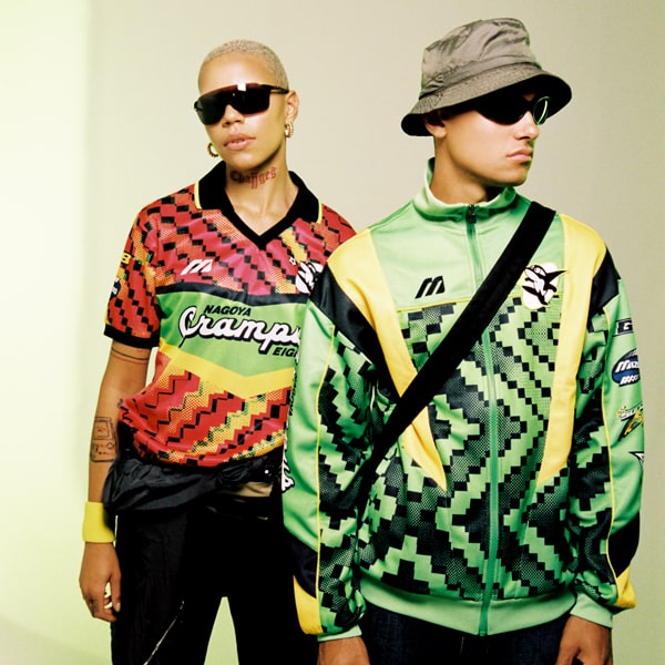
Japan has always been ahead of the curve on many fronts, including visual trends as seen in the 90s OG Mizuno Nagoya Grampus kits. Motocross is part and parcel to Japan, whether it be the bike manufacturers or the Japanese logos emblazoned on motocross jerseys. I wanted to mix the visual impact of motocross aesthetics into football, which may seem disparate, but I find a lot of overlapping synergies between the two.
Japanese jersey's are so incredibly iconic. Without it being a straight up nostalgia trip, how hard was it to nod to the past but create something fresh for the future?
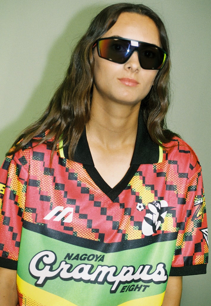
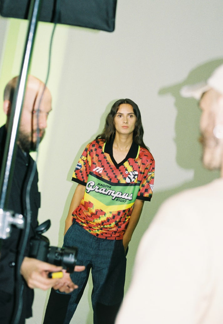
This Mizuno shirt template is iconic and it was a matter of adding layers to it to create something that wasn't fettered by the past. It helps that I'm a 90s Japanese football kit fan, so the project felt very natural from the off.
The jacket is so vivid too. It's unique to be able to take references from a jersey and create a complementing piece like this. Can you tell us about it?
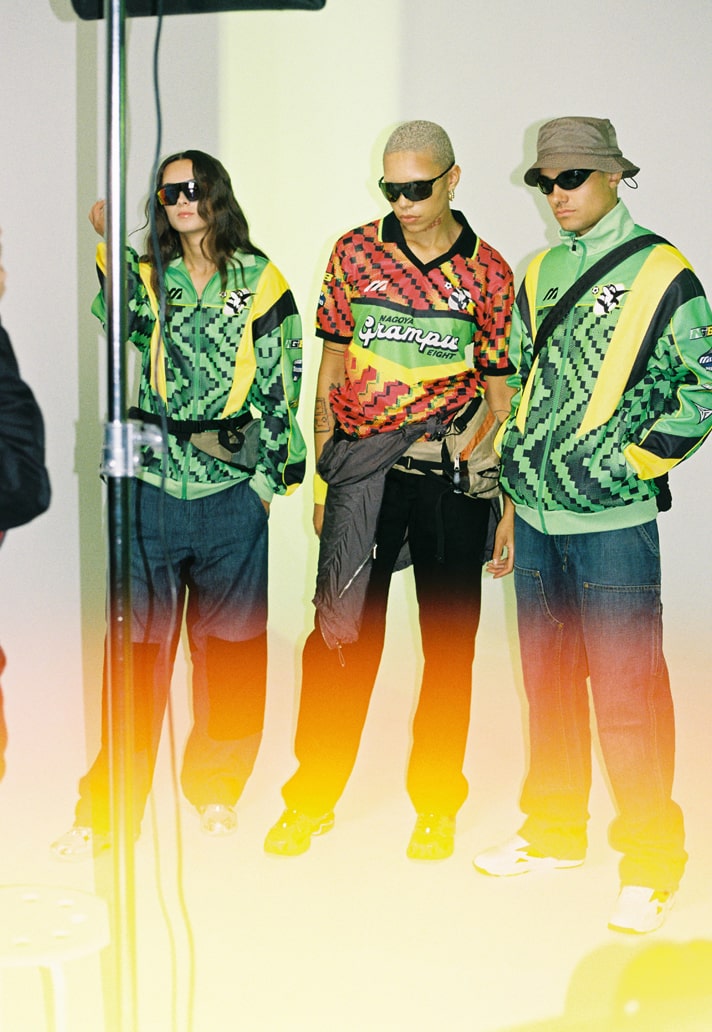
Besides sharing the moiré checkerboard pattern of the shirt, the idea was to take the neon green and celebrate that on its own. It seems natural for neon green to be a third kit colourway for Nagoya Grampus; a colour the club could make iconic by integrating in future kits.
As well as being so immediately eye-catching, there's a lot of hidden detail in there. The re-imagining of the SoccerBible branding as an example – can you tell us about those elements that are to be discovered?
All the logo graphics harken back to motocross. The SoccerBible, Mizuno, and Nagoya Grampus logos have all been given a treatment where at first glance, the logos look as if they are motocross brands.
This really smashes open the gates for Mizuno Football to embrace a lifestyle and jersey culture scene of football. How exciting is that as a prospect for you?
Lifestyle has always been a part of football, but not incorporated as intentionally as we see brands doing now. Given the history and library Mizuno football holds, it's natural for the brand to forge a path forward and continue what the 90s gave us, albeit in a 21st century way.
Shop the Mizuno x SoccerBible Nagoya Grampus Eight collection at prodirectsoccer.com
