A World Cup is always busy, but one thing is for sure – a kit design can speak a thousand words. Words of intent, words of a nation united. It can define a tournament way before any ball is kicked on the pitch. Sergio Mareco, one of the designers behind adidas’ 2026 Federation kits, took us through the journey of creating these latest looks.
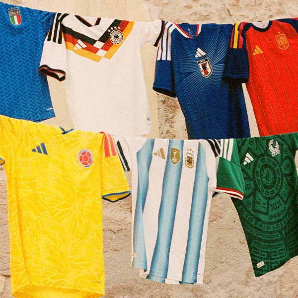
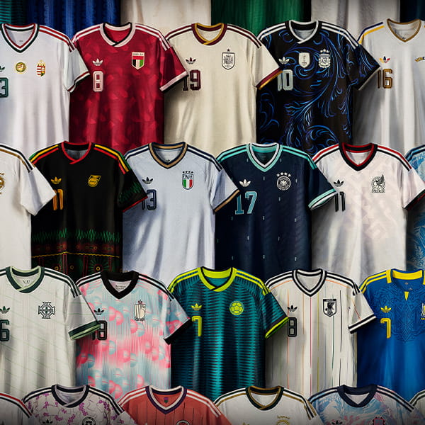
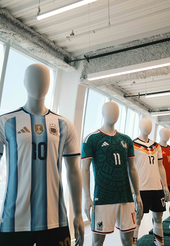
Every World Cup kit tells a story, through the colours, the patterns, the details. They become symbols of a nation on the biggest stage in football. Adidas are doing what they do best for 2026, creating fresh looks that carry the legacy of a nation whilst moving the game to new heights. Blending nostalgia, innovation, and elegance for a new generation of football culture.
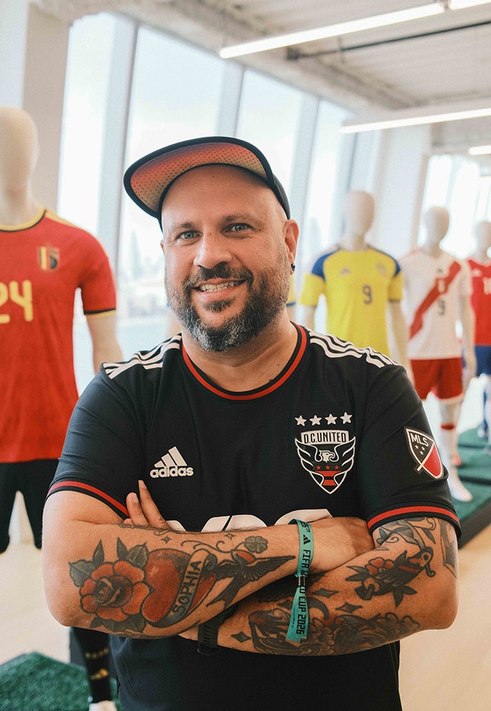
Of course, behind each design lies a creative process. A million decisions to be made that will define a country’s tournament. We sat down with Sergio Mareco, one of the designers, to discuss the craft, the meaning, and the pressure of designing for the world.
Let’s start from the beginning — where did the journey begin for these kits? Did you start with a sketch or a story you wanted to tell?
The whole process actually started about three years ago. It begins with the base style team, who create what I like to call the canvas — the foundation for the graphic design. I’m a graphic designer, so my role comes in with the artwork and colour combinations, but it all starts with that base.
Then the federation and the local markets create a brief for us. They’ll outline the story or theme they want to tell. Some federations come with a clear direction, while others are a bit more open… so we’ll bring ideas to the table and help shape it. From there, we start sketching. We present the designs internally, then to the markets, and finally to the federation until we reach final approval.
When you’re translating a country’s culture into a kit, how do you find that balance between heritage and modernity?
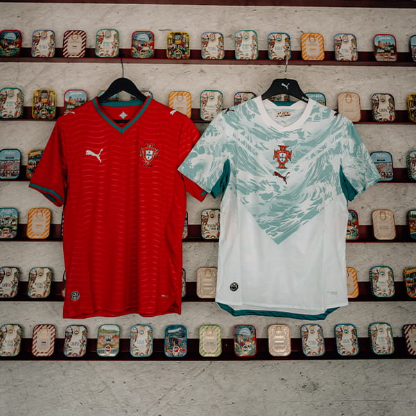
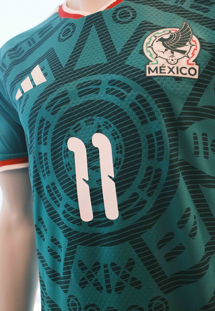
That’s a really good question. For example, with Mexico — the culture is so rich that we felt a responsibility to represent it respectfully, but also with a modern twist. It’s not about copying or replicating the past; it’s about reinterpreting it through a contemporary lens.
When I visited Mexico City, I spoke with the federation, visited museums, and absorbed as much of the culture as possible. As a Latin American designer, that connection comes naturally — but it’s still about giving that culture a fresh, forward-looking expression. It’s like architecture: you’re inspired by the pyramids, but you don’t rebuild them — you create something new that still carries the spirit of what came before.
Is there a particular kit from this collection that’s a personal favourite?
It’s difficult because I genuinely love all of them. Every kit goes through such a detailed process that, by the end, you’ve refined and approved every element. But if I had to choose, I’d say Colombia.
The Colombian jersey was a really special journey for me. The concept of the yellow butterflies — how to bring that to life and make it work visually — was a creative challenge. I learned new tools, like how to sketch and layer artwork on the iPad, and how to make everything fit together. It was a very fulfilling project.
We’re seeing a lot of retro influences across football kits right now. How do you balance nostalgia with innovation?
In my opinion, those two things can run in parallel. The innovation often comes through in the materials — the fabrics, trims, and the way those elements are applied. The nostalgia comes more from the visuals: the artwork placement, the colour palette, the storytelling. You can create something that feels familiar and emotionally connected, but still technically advanced. For us, it’s about achieving that duality — something rooted in memory, yet forward-looking.
Can you talk a bit about the difference between the home and away kits in this cycle?
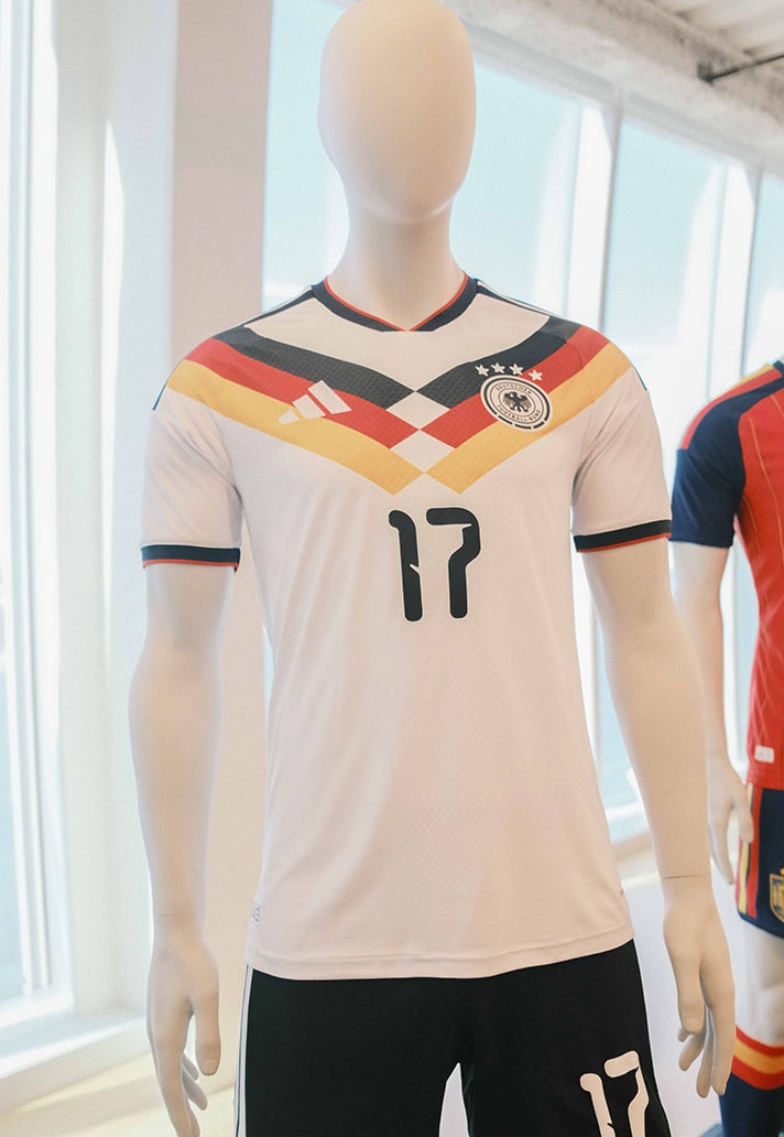
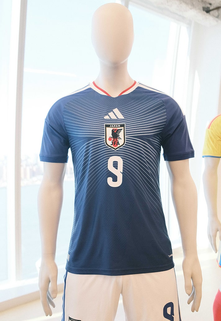
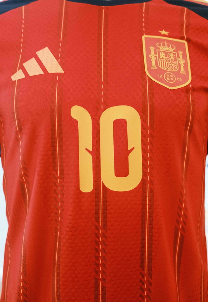
Yes — the home kits are always about tradition and national identity. They’re symbolic. So, for example, with Mexico, you expect green. With Argentina, you expect the blue and white stripes. Those visual cues are sacred — they connect directly to the nation’s spirit.
The away kits, however, give us a bit more creative freedom. But I can't say too much yet!
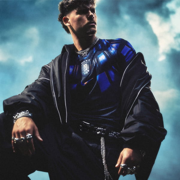
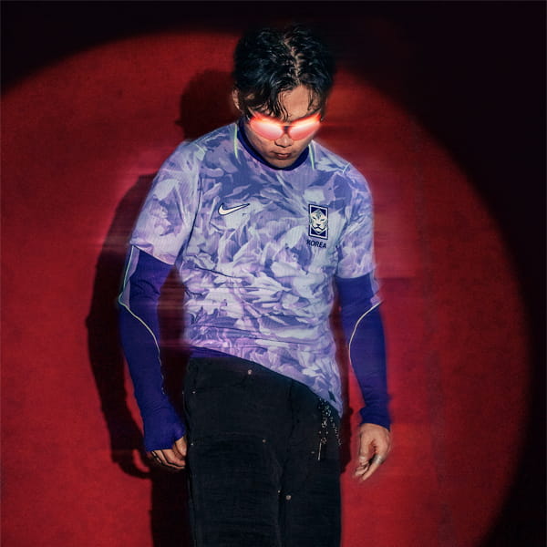
Speaking of fashion — football and fashion overlap more than ever. Do you design with the street in mind as much as the pitch?
Totally. Fashion is part of culture, and culture is part of football. When we’re designing, especially the away kits, we’re thinking about how they’ll live beyond the stadium — how they’ll be worn with denim, shorts, skirts, or sneakers. We see them as lifestyle pieces, not just sportswear.
Every fan remembers the first national team kit they fell in love with. Which one stands out for you?
I don’t have just one, but I have vivid memories. Watching Brazil in the 1990s against Argentina — I still remember feeling devastated when we lost! But then in 1994, when Brazil won, it was pure joy. Those memories are attached to the jerseys — the colours, the emotions.
And my first club jersey — I still have it. It’s adidas, of course.
And personally, do you prefer designing home kits or away kits?
I like both, honestly. The home kits are more challenging because you have less freedom — you need to innovate within tradition. The away kits allow for more experimentation, so they’re easier in that sense. But both are rewarding in different ways.
Finally, if you could sum up each kit type in three words — what would they be?
Home kits: Tradition. Iconic. Nation.
Away kits: Fashion. Streetwear. New.

Shop 2026 FED kits available now at prodirectsport.com/soccer