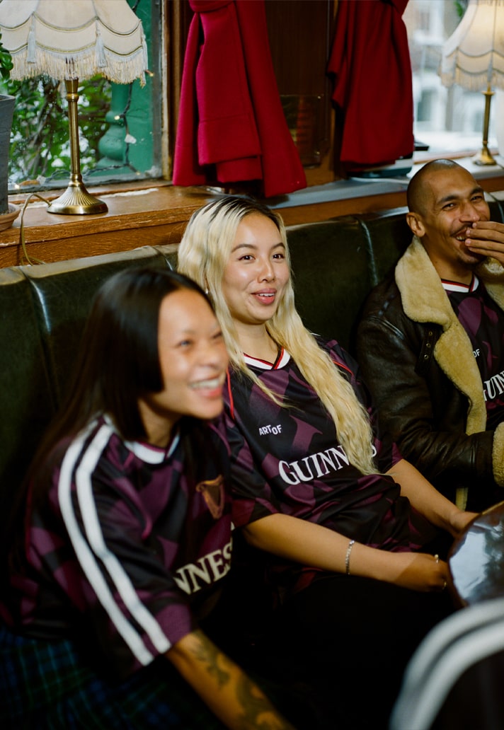
There are collaborations, and then there are cultural moments. When ART OF FOOTBALL and Guinness linked for Season 1, the reaction cut through football culture with rare clarity — a meeting of heritage, craft and creative curiosity that felt instantly iconic. Season 2 goes deeper. Not louder, not bigger — deeper.
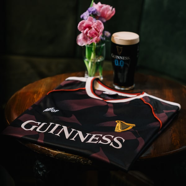
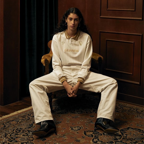
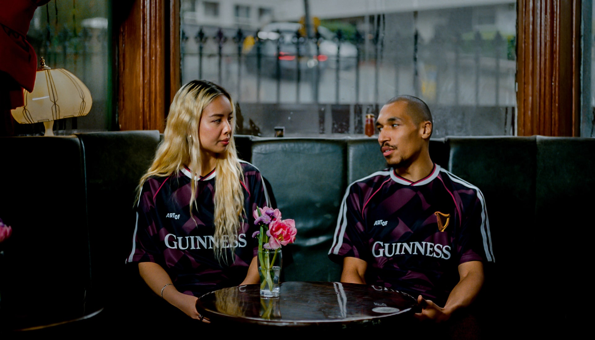
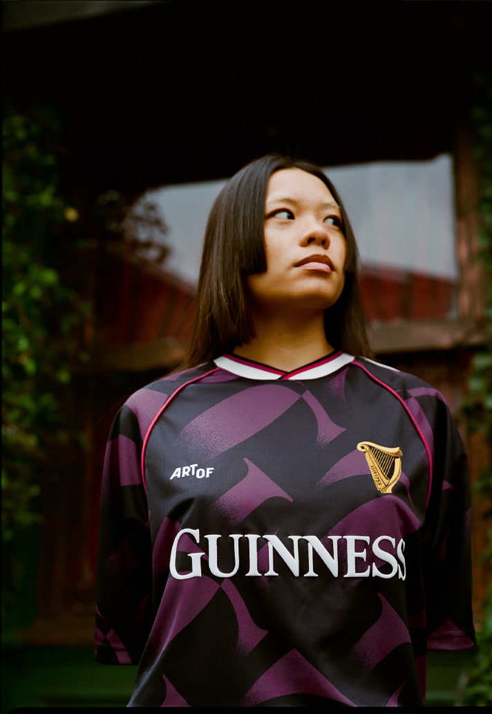
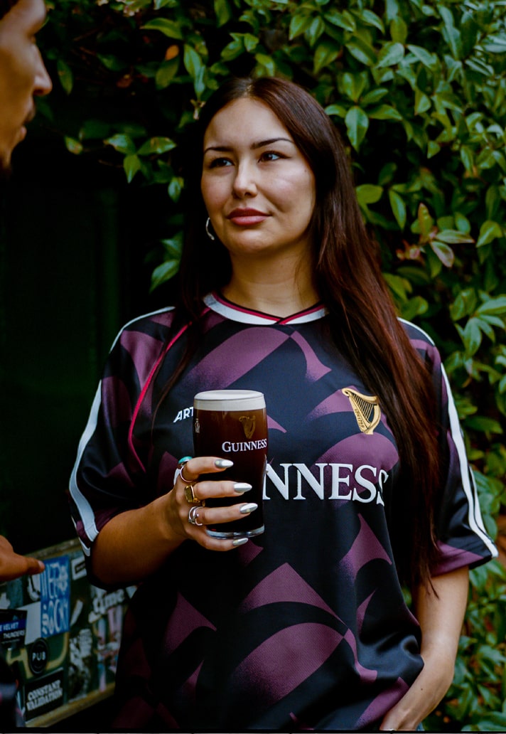
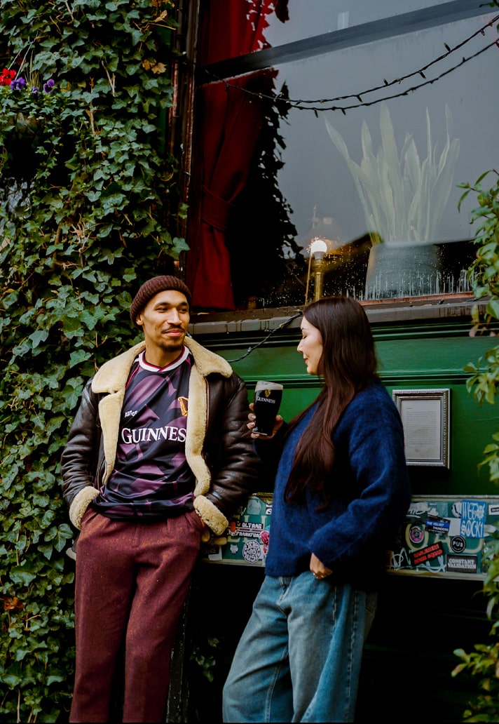
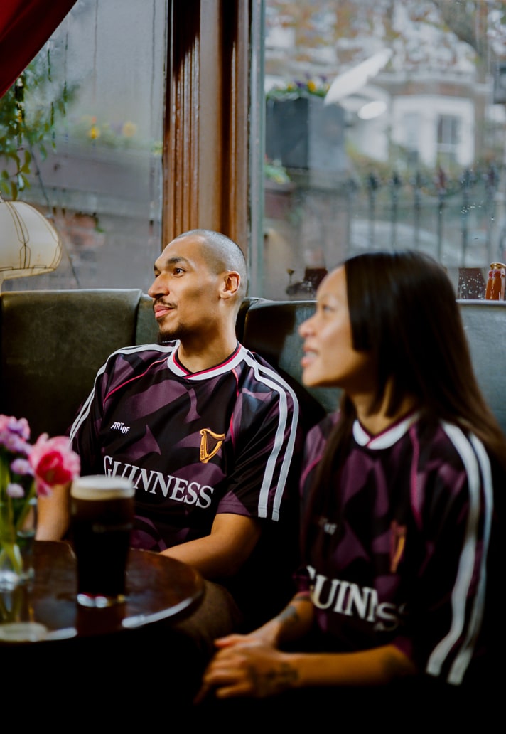
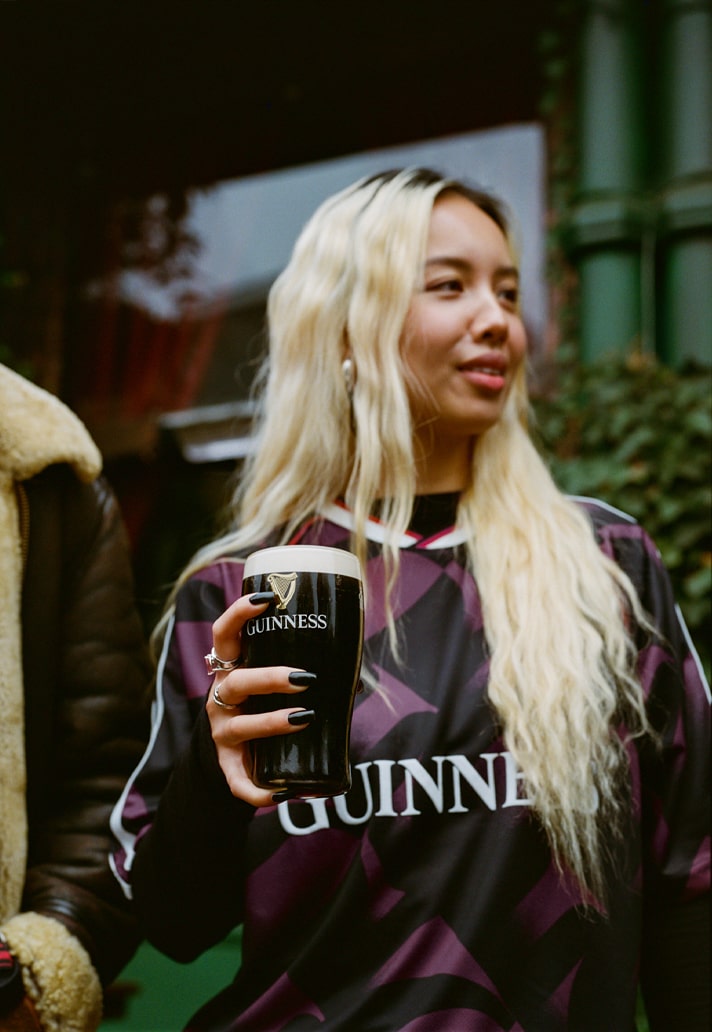
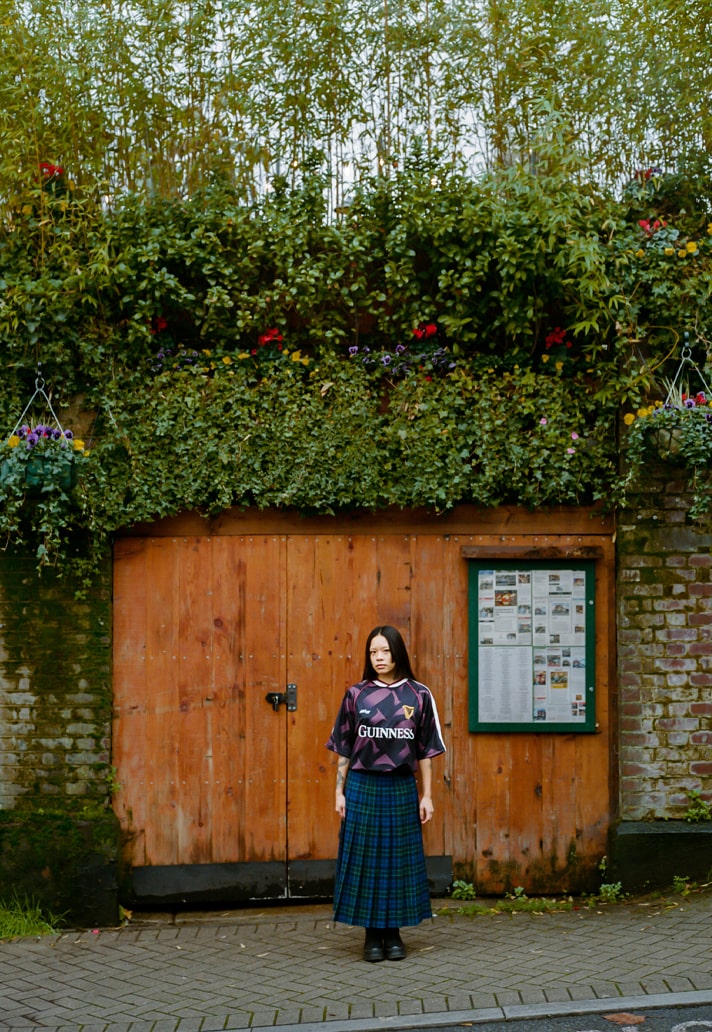
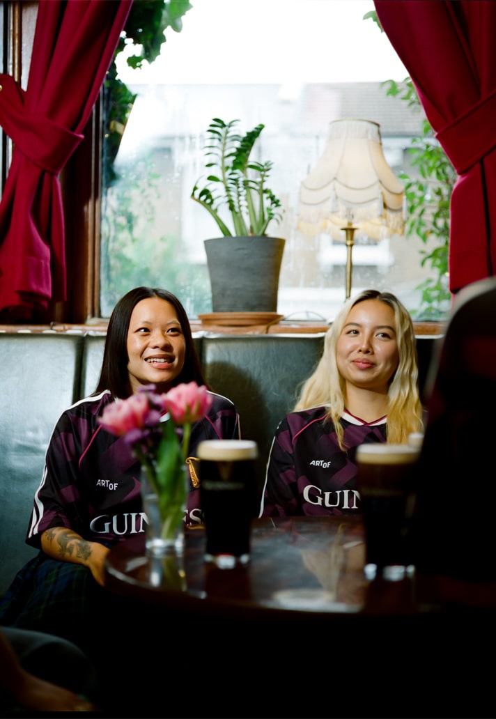
As the game accelerates at an overwhelming pace, the ART OF x Guinness partnership moves in the opposite direction, championing the art of slowing down, of savouring the ritual, of reconnecting with why football matters in the first place. Their new 25/26 jersey is a celebration of that philosophy: a nod to the early ’90s, a study in texture and craft, and a love letter to the culture that lives in pubs, on terraces, and in the moments between the whistle and the pint.
We sat down with some of the ART OF team — Senior Designer Matthieu Webber, Head of Content Farai Dube and Head of Brand Kelvyn Quagraine — to unpack the thinking behind Season 2, the symbolism woven through the shirt, and what this collaboration says about the direction football culture is heading.
Season 1 of ART OF x Guinness became a cult favourite in football culture. When you approached Season 2, what was the creative anchor that set the tone for this evolution?
Season 1 was a breakthrough moment for us. It proved that Guinness’ heritage and visual identity could live naturally inside football culture when filtered through our design language. The response was incredible, but it also created that classic “second-season pressure” — the feeling that whatever comes next needs to outdo the first. That can easily stifle creativity if you let it.
So instead of trying to be louder or bigger, we grounded Season 2 in a shared emotional truth about where football is right now. Everything feels fast: more fixtures, more noise, more content, more product. Players are fatigued and fans are oversaturated. We wanted to move in the opposite direction.
With a brand like Guinness, you’re blessed with a library of rich assets and stories. That allowed us to build a second chapter that didn’t repeat Season 1 but instead added depth. The creative anchor became the idea that football, like a great pint, is best enjoyed slowly.
Our focus was on crafting a jersey that felt like an antidote to the chaos — something you notice more the longer you live with it. Every detail nods to Guinness’ core values of communion, togetherness and ritual. Season 2 isn’t about outshining the first; it’s about deepening the relationship between the brand, the product and the culture around football.
The collaboration leans into the idea of slowing down and appreciating the game beyond metrics. How did that philosophy manifest tangibly in the design process?
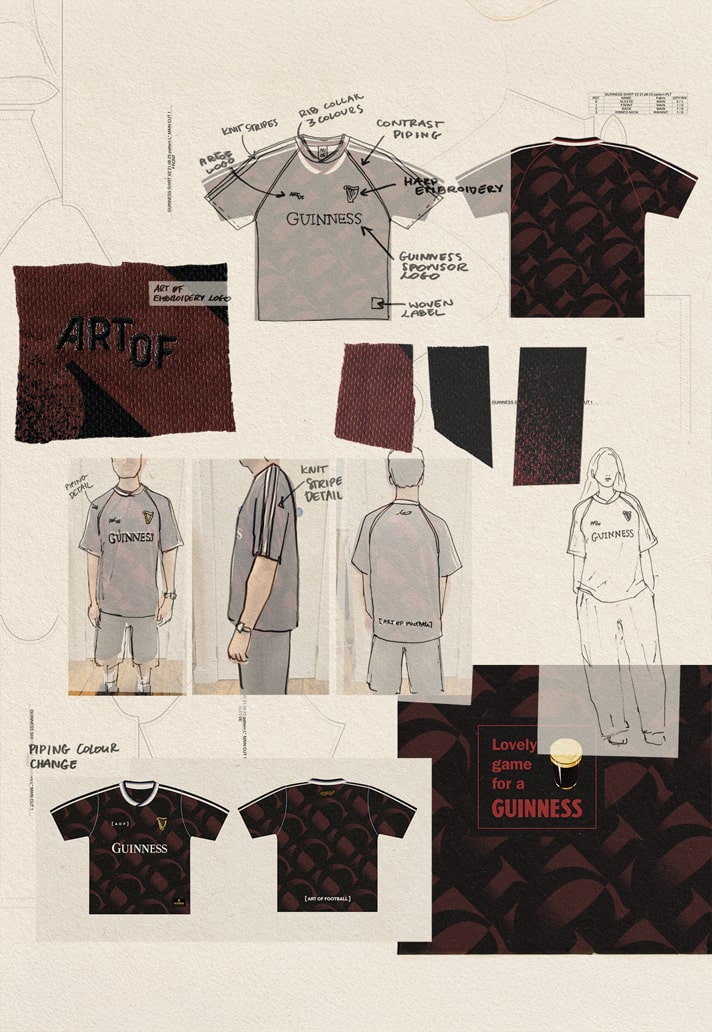
A big part of that philosophy is resisting the urge to overcomplicate. The shirt focuses on recognisable elements of both Guinness and classic football design — things people already feel connected to. The design language itself speaks to that slower pace, drawing from an era when stats and metrics didn’t dominate the conversation. It allowed us to create something simple, beautiful and familiar in a very intentional way.
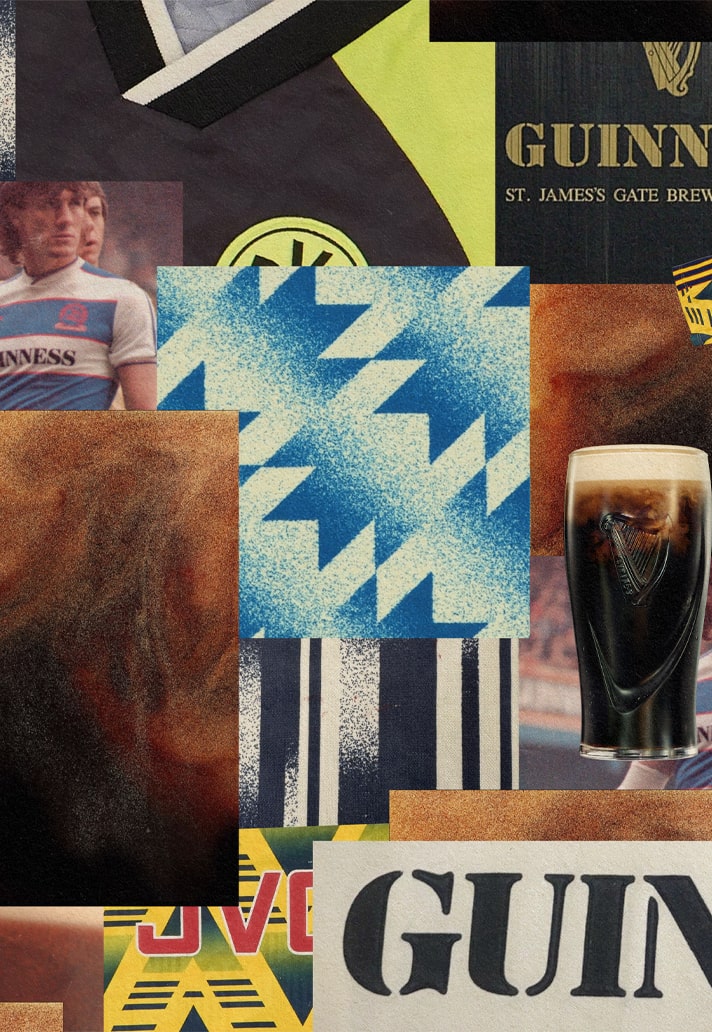
The early ’90s influence is clear in the silhouette and collar. What drew you to that era, and how did you ensure it felt like a reinterpretation rather than a throwback?
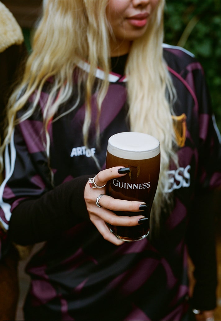
The early ’90s — the golden era — is remembered fondly by fans, so we wanted to capture that nostalgia without leaning into pastiche. The key to reinterpreting the classics was taking inspiration from small, distinctive details and applying them to Guinness’ heritage. A good example is the use of puff print for the Guinness wordmark sponsor. It’s a subtle way of merging two worlds without feeling retro for the sake of it.
The textured “G” pattern inspired by the rise of a pint settling is a clever nod to Guinness. How did you translate that moment into a visual language?
What made the visual language so effective was the clear link between the iconic Guinness “stippling” effect and the surge of a freshly poured pint. Early ’90s shirts often used handmade gradients, and that aesthetic became a subtle way to visualise a settling pint within the design. It’s understated, but once you see the connection, it feels instantly right.
"The goal wasn’t just to make another shirt, it was to craft an item that embodied connection, patience, and cultural relevance. Something you’d wear because of how it feels, not just how it looks."
Football shirts often have symbolic colours, but the deep ruby hue is particularly evocative. What narrative did you want that colour to carry?
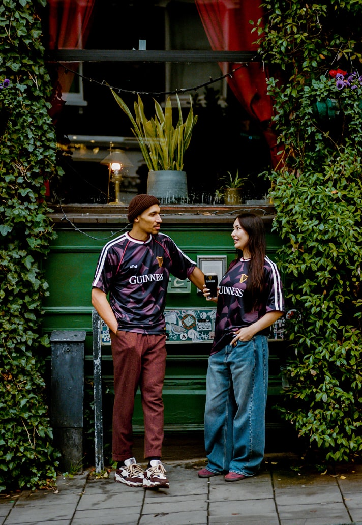
Football shirts communicate identity through colour, and we wanted this jersey to do the same. The ruby red has obvious associations with warmth and the festive period, but it also challenges the assumptions around Guinness’ colour palette — specifically the drink itself. Next time you’re in the pub with a Guinness, hold it up to the light. That ruby glow is the story we wanted the shirt to tell.
ART OF and Guinness describe themselves as “custodians of care and connection.” How do you balance storytelling and craft so the shirt becomes more than merchandise?
For us, everything begins with a cultural truth. If we root a project in something real about how people feel or behave around football, every creative decision has purpose. Guinness has endured because it treats craft as storytelling — the ritual, the pour, the consistency, the heritage. We wanted to mirror that philosophy.
For this campaign, the cultural truth was simple: football is better when you slow down and savour it. At a time when the game feels overloaded, we wanted the jersey to reintroduce that sense of care and appreciation.
Once we anchored ourselves in that idea, the process became joyful. Every stage — from moodboarding to sampling — centred on the fan experience and the timelessness of a Guinness pint. The goal wasn’t just to make a shirt; it was to craft an item that embodied connection, patience and cultural relevance. Something you’d wear because of how it feels, not just how it looks.
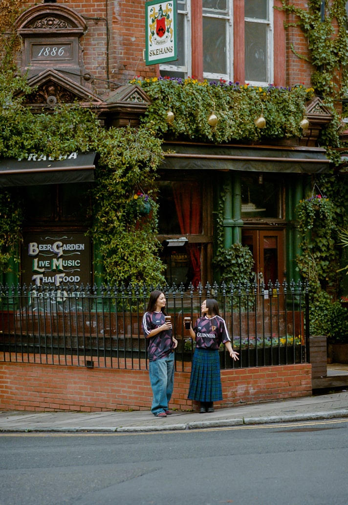
Community sits at the heart of this release. What scenes or stories shaped the emotional DNA of the jersey?
We started with an insight about the state of football culture: everything felt academic, overanalysed and exhausting. We saw an opportunity for the jersey to stand for something bigger — to deepen the meaning of the partnership between ART OF and Guinness. It’s a symbol of the love of the game in its purest form.
We also noticed something unique about this year’s release window. For the first time in a long time, Boxing Day won’t be dominated by Premier League fixtures. That opens a beautiful opportunity for fans to head to non-league grounds and reconnect with their local clubs.
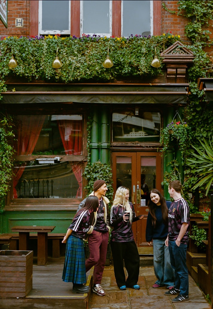
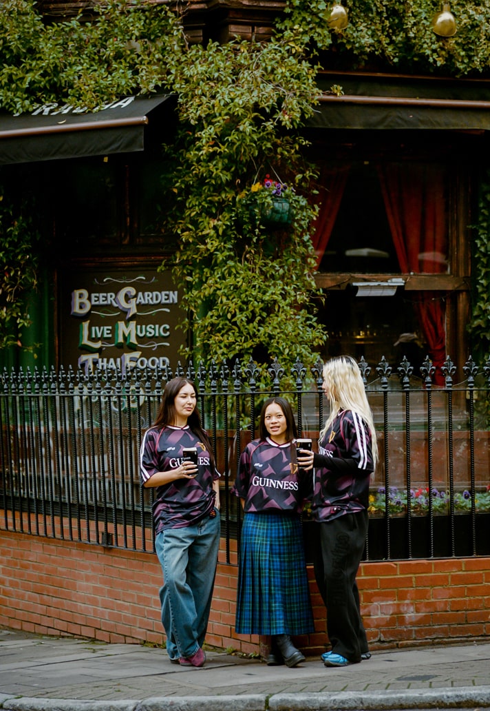
There’s something magic about that ritual — friends returning home, siblings flying in from abroad, neighbours reuniting on a terrace. No VAR, no over-analysis, just tackles, mud, unpredictability and a Guinness before or after the match. That’s where the “good old football” stories live, and where community feels strongest.
Those scenes guided everything — the content, the tone, the creative direction. Because whether you’re in London, Lagos, Dublin or New York, that feeling of returning to your football people is universal.
The ART OF emblem and the Guinness harp each speak to their own heritage. How did you ensure both identities coexist without overpowering each other?
The collaboration was always about translating Guinness’ iconography onto a football shirt in an authentic way. ART OF already has a recognisable place within football culture, so it became about building space for Guinness within that framework. The result feels balanced — two identities speaking in harmony rather than competing for attention.
"This jersey is a statement that slowness has value. That craft still matters. That not everything needs to chase the algorithm."
This collaboration arrives as Guinness prepares to open its Covent Garden brewery. How did that moment influence the creative or cultural direction of Jersey 2?
It feels like a pivotal moment for Guinness to cement itself at the heart of UK football culture. The opening of the Open Gate Brewery in Covent Garden — right in the capital — is symbolic. It’s a physical home for a brand that has been part of football rituals for generations.
With fans travelling into London to experience the space, we wanted the jersey to be something they could encounter up close — to feel the weight, the texture, the craft. The brewery becoming a cultural destination pushed us to think about the shirt not just as product, but as part of a wider ecosystem of ritual and storytelling.
Creatively, it challenged us to design something worthy of that environment. Culturally, it reinforced the idea that Guinness isn’t observing football from the outside — it’s stepping fully into it. And now the shirt has taken on a life of its own. What started as a response to a moment in time has become something fans are folding into their matchday identity.
In a landscape where football kits are increasingly fast-moving and data-driven, what does a jersey like this — rooted in patience, ritual and craft — say about where football culture is heading?
We’d like to think football culture is circling back to the qualities that made people fall in love with the game in the first place. You can feel it: long-ball specialists returning, mavericks being celebrated again, players pushing back against overloaded schedules, fans calling out disposable product. There’s a renewed appreciation for heritage and for things made with intention.
Football has always been about connection and escape — simple, human experiences. And when the pendulum swings too far toward speed and volume, there’s always a counter-movement pulling things back towards care and meaning.
A jersey like this is part of that shift. It’s a statement that slowness has value, that craft still matters, that not everything needs to chase the algorithm. If anything, it shows fans are ready for a return to a more considered football culture — one rooted in something deeper than the moment.
The new ART OF x Guinness shirt is available now at art-of-football.com