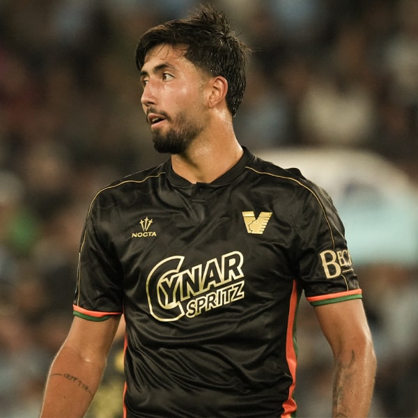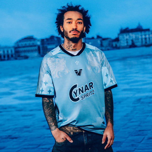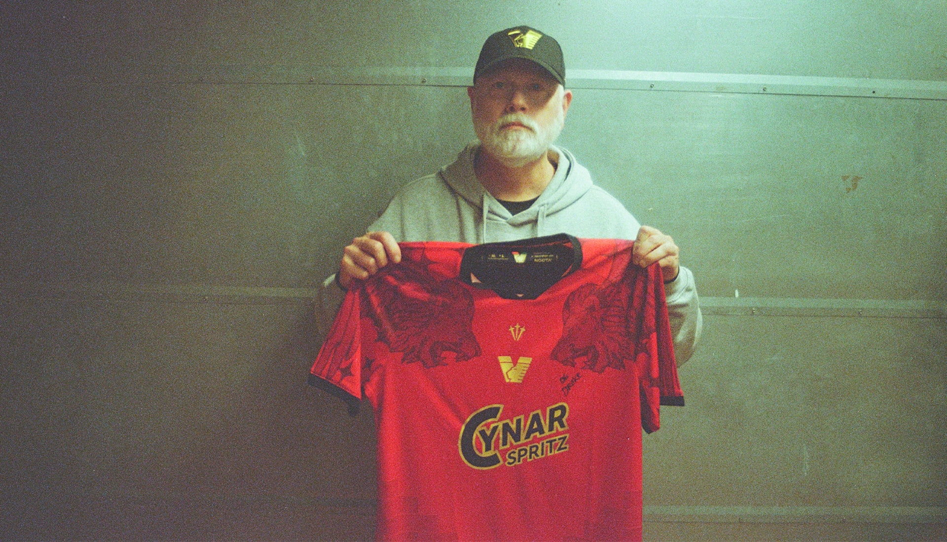
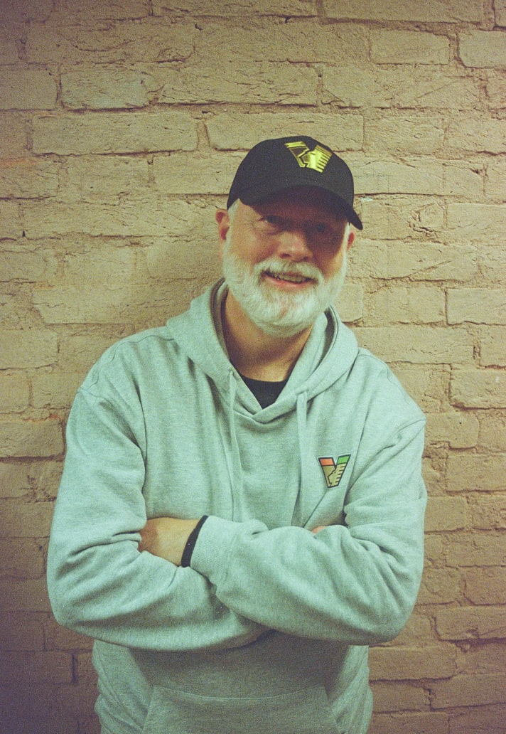
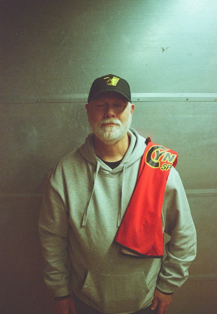
Drake Ramberg isn’t just a name in football design history – he’s one of the architects who changed the game. After nearly three decades away, the man behind Nike’s ’90s icons returns with Venezia × NOCTA’s fourth kit: a jersey steeped in Venetian culture and dripping with creative intent.
When we talk about the pioneers of the football jersey design game, Drake Ramberg should be one of the first names you think of. One of the main brainchild’s of Nike’s historic period during the 1990s, the Oregon native helped flip the script and rewrite the rulebook. From Arsenal’s joyous JVC years, to Italy's instantly iconic pre-millenium run - these kits did more than mark moments. They defined them.
So after almost 30 years away from the Beautiful Game, Drake Ramberg is back. Venezia and NOCTA made the call, and he answered with a 2025/26 fourth jersey that is steeped in Venezian culture. We caught up with one of the design GOATs, and naturally, nothing was off the table…
What was the initial spark of inspiration for the Venezia × NOCTA fourth kit, and how did the concept evolve from your first sketches to the final design?
So it all started when Diego (Moscosoni) reached out to me and said the club was interested in having me collaborate with them for the fourth jersey. I’ve always admired their work and it feels so authentically Italian! It’s the first time I’ve worked on anything football related since 1996 and although I’ve followed football culture ever since…It’s important to understand as much about the club and the city as a starting point. Once you have the initial co-collaboration between club and brand, it’s just a case of massaging things for the rest of the process.
Venezia has a strong visual identity and NOCTA has its own distinct design language - how did you approach blending these two worlds without diluting either brand?
Of course you have the individual sponsors which tell the joint story but my main interest is always the club and the city and what kind of narrative we can paint from this perspective first and foremost. I’d find it hard to design something that places the manufacturer front and centre. They already have branded-wear for that. Creativity should always be driving-force and everything else should follow. If you’re doing it right then both sides should be elevated.
When designing a fourth kit - often the most ‘expressive’ or ‘experimental’ jersey - how did you decide how far to push creativity while keeping the kit grounded in football culture as well as the club’s heritage?
I'm always going to push it! But again, it's a healthy balance. And you’ve really got to listen to your partners with the club, because they know where those edges are. And even though it's a fourth jersey, it's still all the 10 outfield players out there wearing it. I think some of the original stuff I had was more contrasted. Then you factor in FIFA, UEFA, Italian Federation, you know there's a lot of eyeballs on everything you design. You realise things can't be too contrasted!
Can you walk us through your end-to-end creative workflow for this project? Where did you start, and what steps defined the process?
My initial go-to is always to draw by hand and paint. But there are shortcuts now, you know? So you can kind of create something quickly - which is ultimately what you need to be able to put it onto a garment in a two dimensional space. And with the miracle of Adobe Illustrator, you can start looking at it in a quick way, with all the different placements. It’s all in the “toolbox.”
The kit likely went through feedback loops with Venezia & NOCTA - was there a part of the collaboration that pushed the design in a new or unexpected direction?
So I had one original version that was a lot more geometric. Kind of inspired by the lion, and I did get feedback through Diego. He was kind of like my translator and connector with the club. So you find out quickly you know what might be tough to get approval on. It’s important that original versions are pretty close to what your end vision looks like. You don’t want to present a buffet with all these different ideas which might confuse people.
Plus, I didn't have total visibility of what the away/ third jersey looked like. So, you want to make sure that it's not overlapping or infringing on the direction of the other jerseys. You want each to stand apart and be unique.
Venezia’s identity is rooted in the city’s art and architecture. Which cultural, historical, or visual cues from Venice influenced the design?
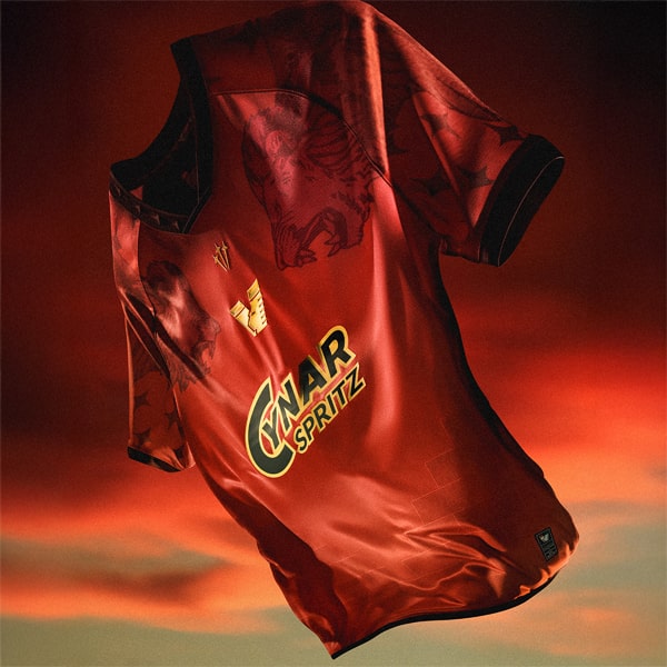
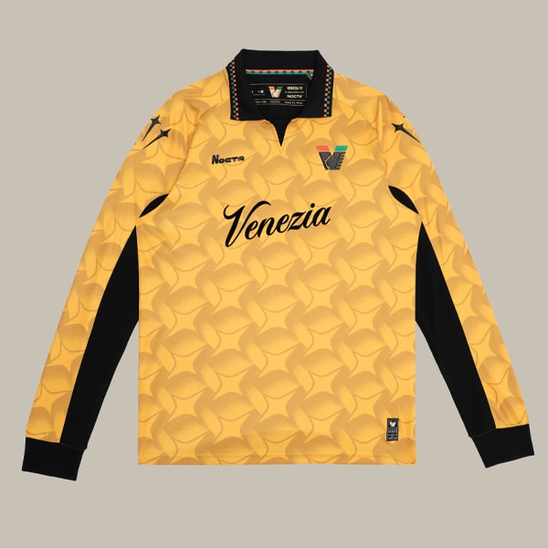
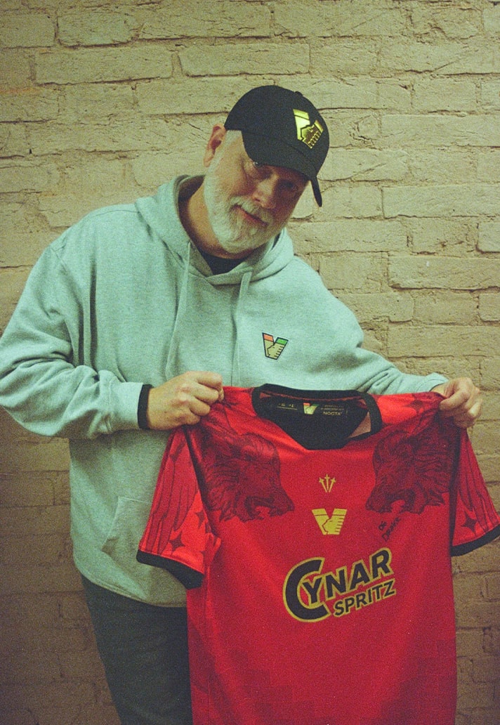
You can see the brick pattern on the architecture in Venice and that was something that just felt like a signature element, representing Gothic architecture from the city. So that was factored in on the sleeves. It has the Nocta stars subtly. Then the Lion of Saint Mark, as well as the eight pointed stars in gold. I thought those stars were so unique, because most stars you see are five-pointed. This gave it extra meaning.
Every kit tells a story. If this fourth kit had to be described as a narrative or emotion, what would that be?
I think I wanted to do a good job representing the club, and I want the players to feel as strong as a flying lion, right?! I played sports. I know how it is to put on a special jersey and you just feel it. I just can't wait to see them line-up for the first time in this jersey. It's giving me goosebumps already! Hopefully we did a good job representing the club and the city of Venice.
Which part of the design are you personally most proud of, and why?
It allowed me to get off the computer, do some hand painting, and then bring that to life. Also the star on the back was paying homage, a little, in my mind, to the Arsenal goalkeeper kit (in 1996). It's a different star. But, there's something where you might say ‘oh yeah, there’s a connection.” So if they know Nike’s history or my history, they can make the link. I didn't just stick a star out there. It's like a real part of Venetian culture. Perfect really.
If you could add one final detail or alternate version of the kit - the “director’s cut” version - what would it look like?
It’s hard to say without seeing the full kit out on the field. That's where it shines. You know, win, lose or draw, the mission is the same: to look fucking cool.
The Venezia 25/26 Fourth Jersey is available at shop.veneziafc.it