Taking a trip into an alternate reality, adidas have unveiled a collection of international jerseys with their own Three Stripes spin for France, England, Senegal, USA, and the Netherlands.
Launching under the ‘The Danketsu Project’ header, adidas have set their sights on five international teams that are currently housed with the German brand’s biggest rivals in Nike and PUMA, offering up reimagined versions on their jerseys, emblazoned with Three Stripe additions. The Danketsu Project celebrates a message of inclusivity, with Danketsu itself being the Japanese word for unity. The inspiration behind the collection is the shared love of the game that we all have.
Right, now that’s cleared up, what we actually have is adidas playing in someone else’s sandbox. Is this a cheeky move? Sure, but we’re all for it, and it’s interesting to see what a brand can do when there is no pressure from any governing body.
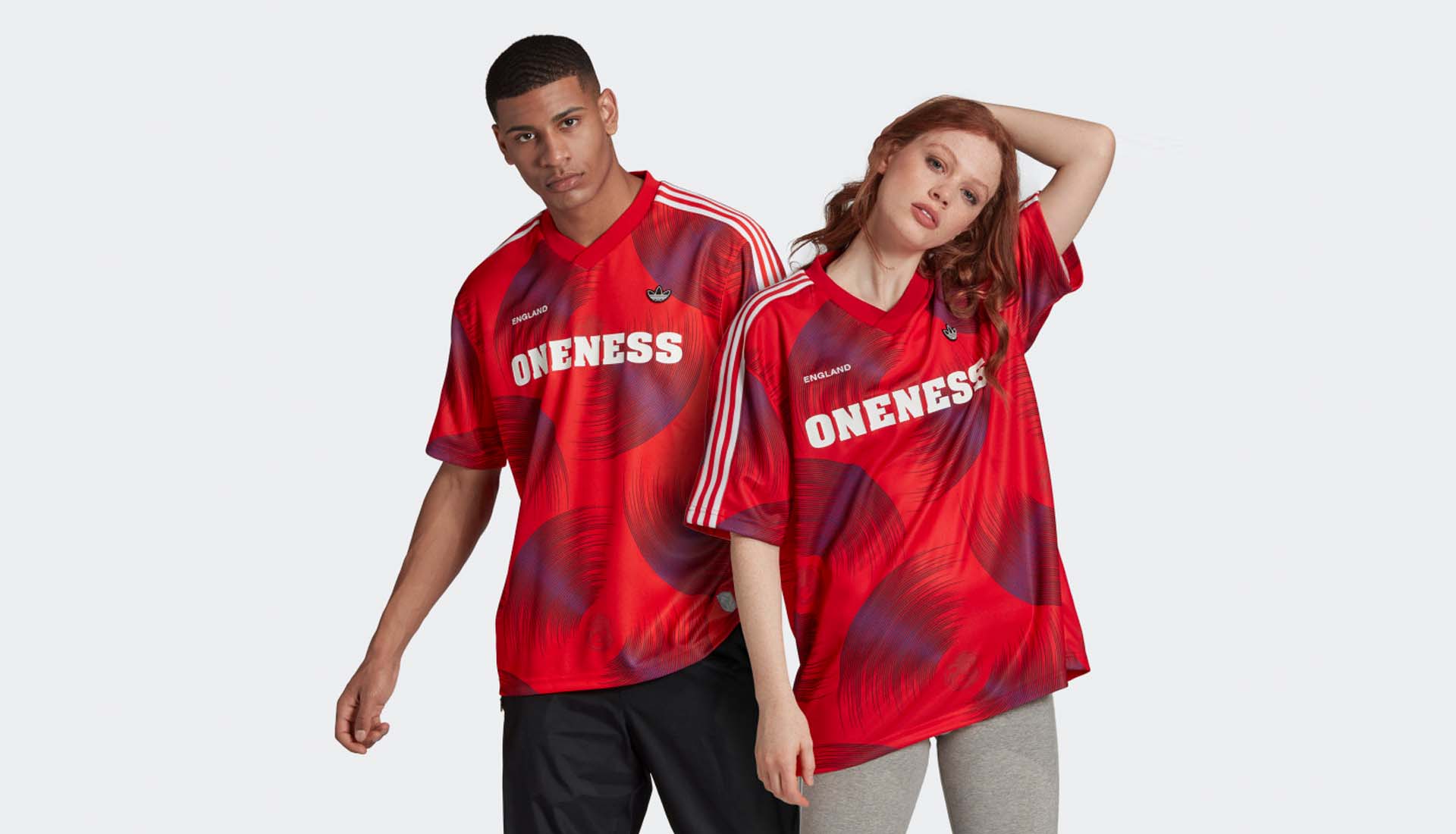
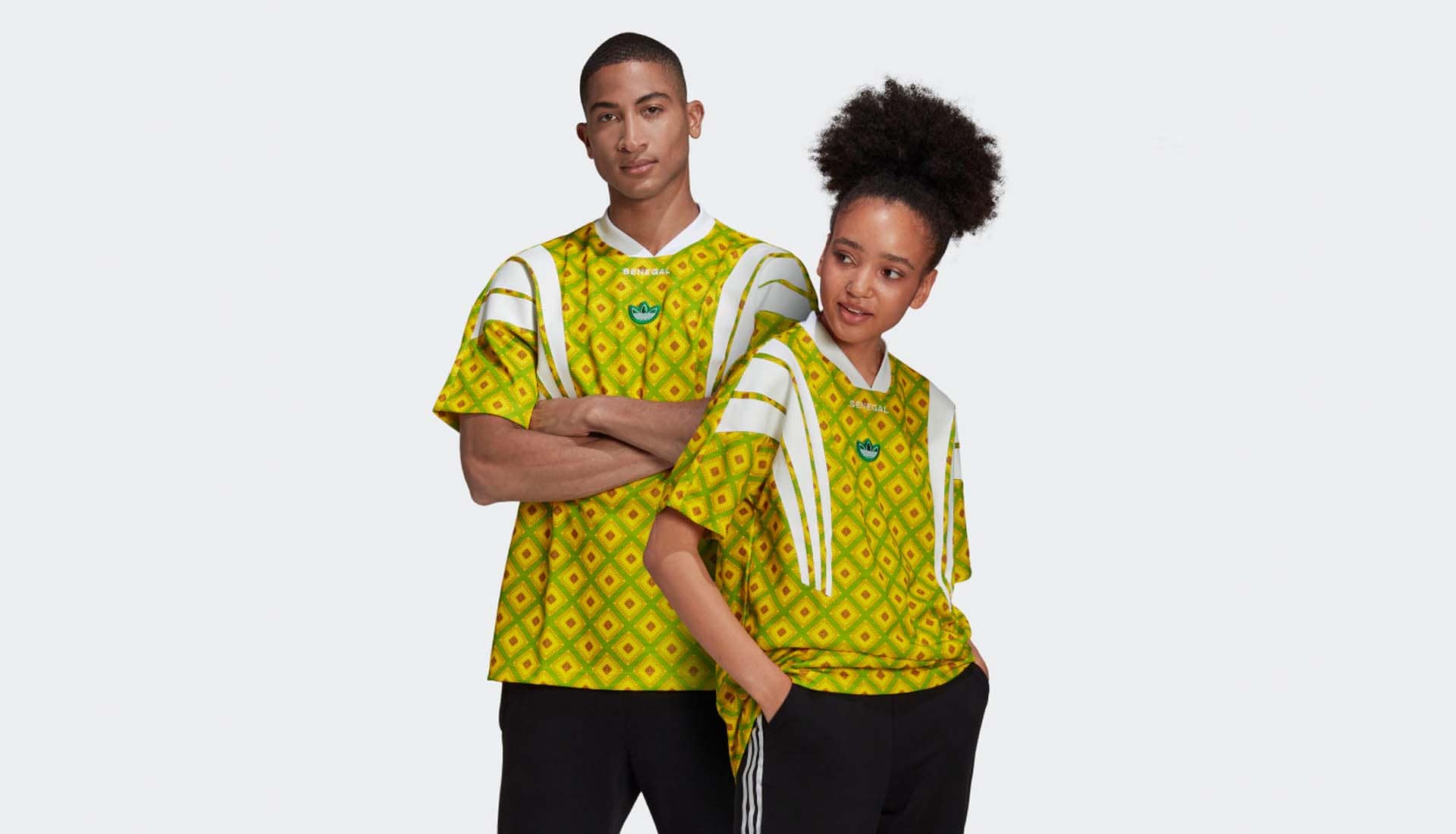
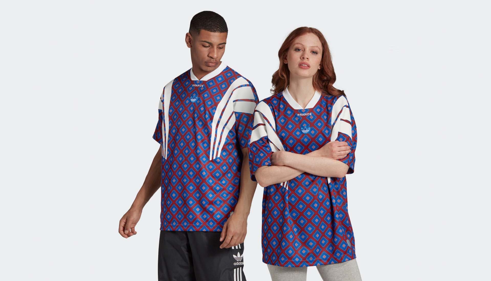
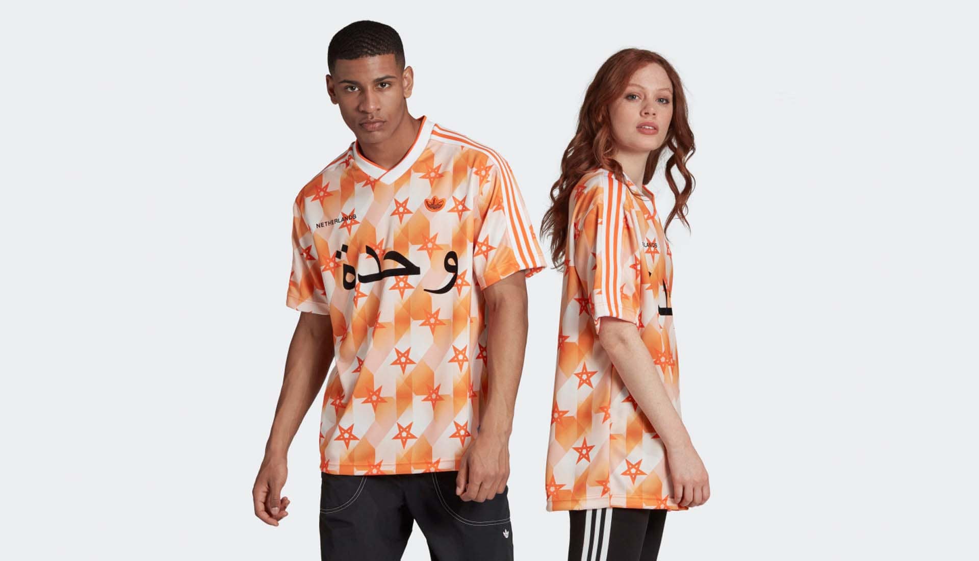
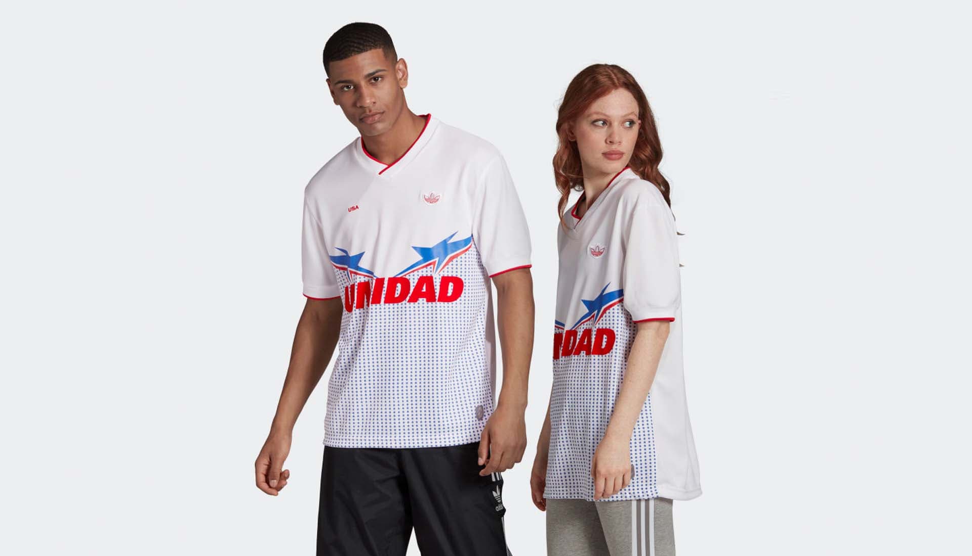
The teams in focus are France, England, the Netherlands, USA (all currently partnered with Nike), and Senegal (PUMA), and what you don’t get, obviously, is any sign of the countries’ official FA logos. The retro-infused designs use bright, bold colourings, representative of each nation. Three Stripes are then incorporated into the design, either in the classic shoulder placement, or in an EQT-esque execution that runs from the shoulders down the body, as seen on both the France and Senegal jerseys. They’re topped off with the iconic Trefoil on the chest, alongside the name of the country that the shirt represents.
Both the France and Senegal shirts incorporate the same Senegalese patterns and French graphics, paying homage to the close link that the two nations share.
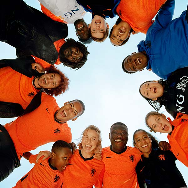
The unmistakable pattern from the ’88 Holland jersey is paired with the Moroccan star for the Netherlands design, paying homage to two beloved communities, while the England shirt features a spinning graphic emanating from a lion head crest (think the Thundercats logo and you’re pretty much there). It’s all served up on the deep red base that England often use as their away colours. Finally, the USA design features a blue star graphic that dominates the lower half of the white shirt, with red trim on the collar and cuff completing the famous red, white and blue combo. Nice approach, if a little on the border.
Pick up the international shirts at adidas.co.uk
