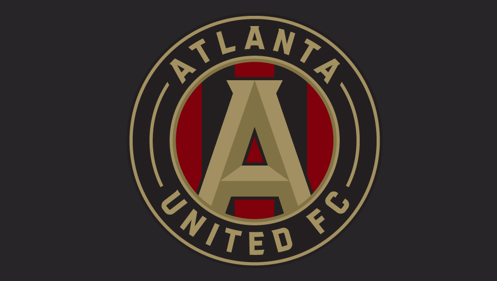
Set to join the MLS in 2017, Atlanta United FC unveil their new logo and tell the story behind one of the next teams to join the league.
The finished article, a clean design comes from a club setting out high standards from the off, even if it is all a little 'Avengers'. Having already put the wheels in motion in building a fan base, it is interesting progression to watch.
Breaking down the logo which takes inspiration from the city's seal and the city's Olympic heritage, the key aim was to create a symbol of unity and globalization. At it's core, the passion for this city is high. The bold "A" at the center of the logo sets out to put focus on the strength of the city. With the foot of the "A" anchored to the circle, this is to emphasise the connection with the community. A city rich in culture, the five stripes that sit at the back of the logo each represents one of the values set out by the club: unity, determination, community, excellence and innovation. You can see the full evolution of the logo here.

The video also contains plans of the proposed stadium of Atlanta United FC. It's clear to see, they're not messing around.
Another new name for the fast moving MLS with a chance to create a legacy. What do you think of the logo? Let us know your thoughts in the comments below.


