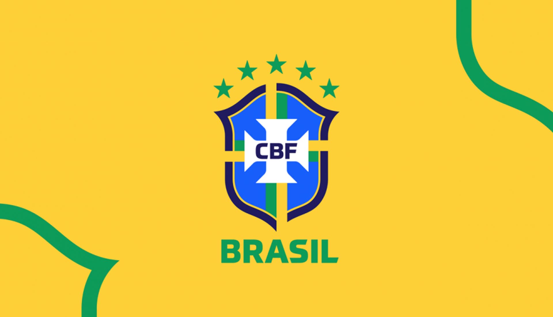
Brazil have unveiled a new crest that sees the Selecao’s signage sailing in with the most subtle switch up. The fresh look was revealed during new president Rogerio Caboclo's inauguration ceremony.
Rogerio Caboclo, a 46-year-old finance lawyer, took office as the new president of the Brazilian soccer confederation, and one of his first acts was to reveal a redesign of the Brazil crest. He took up the position hoping he could clean up the image of the scandal-tainted body, and CBF have taken a literal approach with the new crest, cleaning it up and modernising it with some slight tweaks.
With a sharper blue tone around CBF’s name and fewer stripes on each side, there’s a cleaner aesthetic to the new crest, which doesn’t alter any of the key elements from the previous iteration. Instead of two yellow stripes with a green one in the middle, the new design only includes one yellow and one green stripe that cuts through the outer edge of the shield for a more modern and less institutional effect than the previous crest. A specific font was designed for the ‘CBF’ on the crest by Brazilian designers Dalton Maag.
The objective of the redesign is to improve brand awareness, make it more effective in the digital world, while broadening public knowledge about all the work done by CBF. The new crest will be worn by the Brazilian national teams from 2020, and it does not feature on the recently released Copa America 100th Anniversary jersey.
