Having well and truly established themselves as a disruptive force in world football culture in recent years, Venezia FC take the next step in their modern evolution by presenting a new brand identity, created by world-renowned Munich-based design studio Bureau Borsche.
Through progressive ideas, striking design and aesthetics, and passionate representation of their home city, Venezia FC placed themselves in the vanguard of contemporary football clubs redefining the relationship between sport and culture. On the back of what were arguably three of the best kits not just of last season, but in recent memory, the question was always going to be where do they go now? And the answer emphatically comes in the form of a bold and thoughtful rebrand that honours tradition while moving the club forward into a new era.
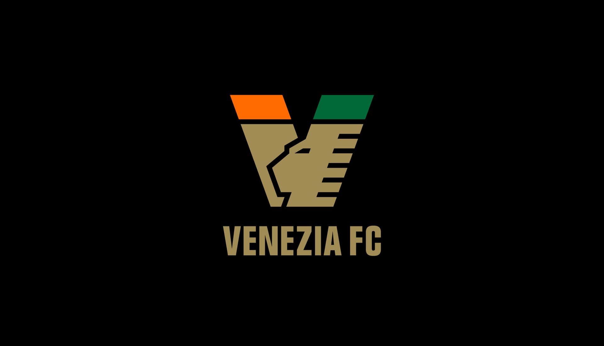
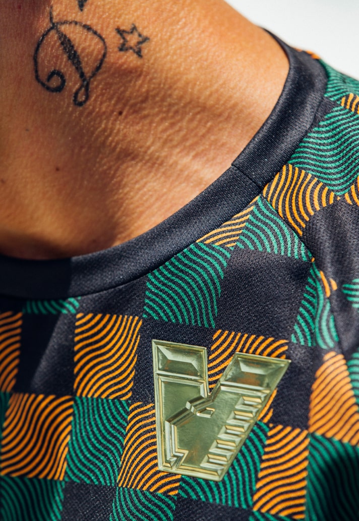
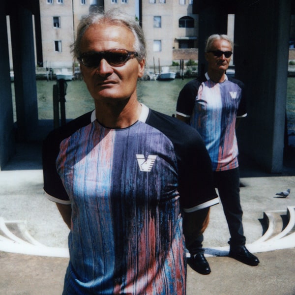
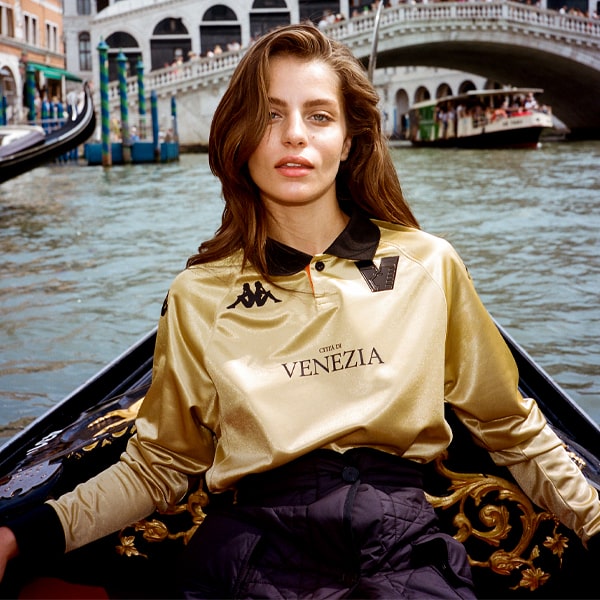
The Lion of Saint Mark, the winged lion that stands as the symbol of the city of Venice, has always been at the heart of the Venezia FC brand, and Bureau Borsche have skilfully designed a strong “V” crest that seamlessly integrates a modern reinterpretation of the historic symbol in a more minimal and abstract form, producing a fresh lion that feels more sleek, fierce, and stylish than the one it replaces. In a clever flourish, the horizontal lines representing the lion’s wings are a clear reference to the Venetian gondola's traditional iron prow with its protruding blades. The “V” is capped by the club colours, orange and green, which, upon close look, present the appearance of orange and green flags.
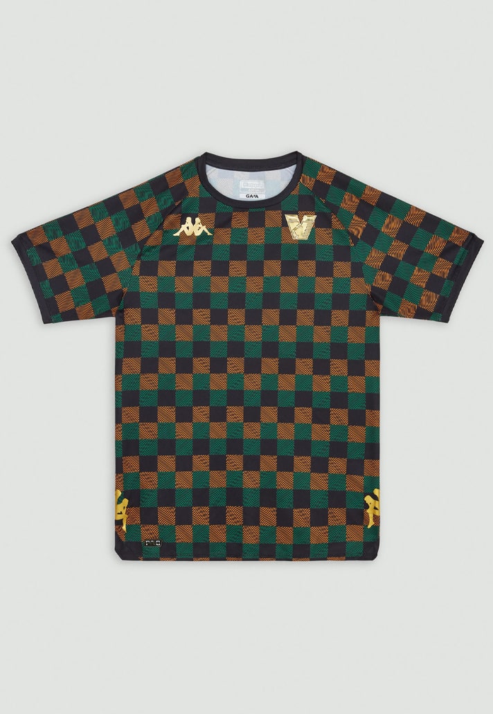
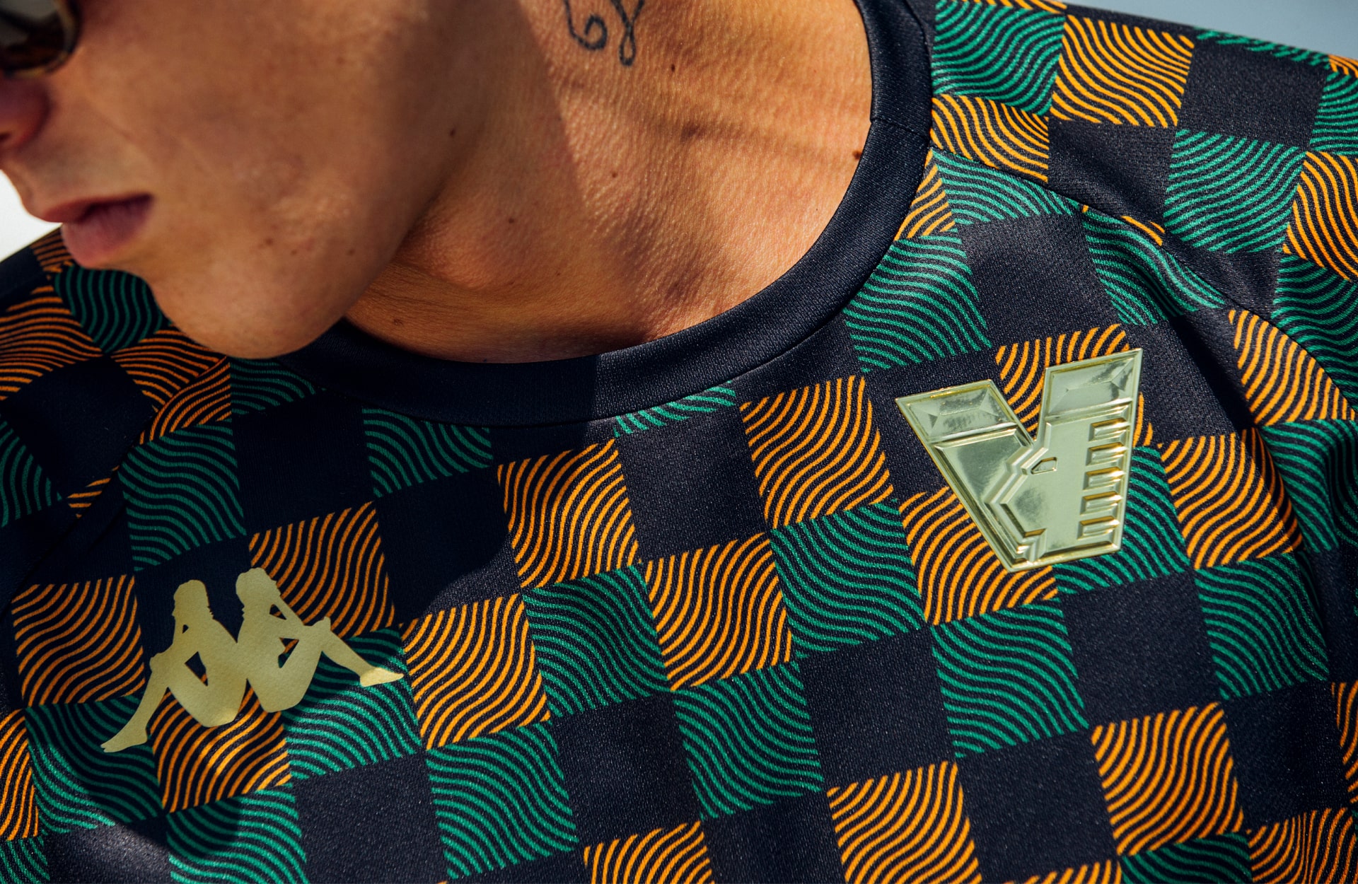
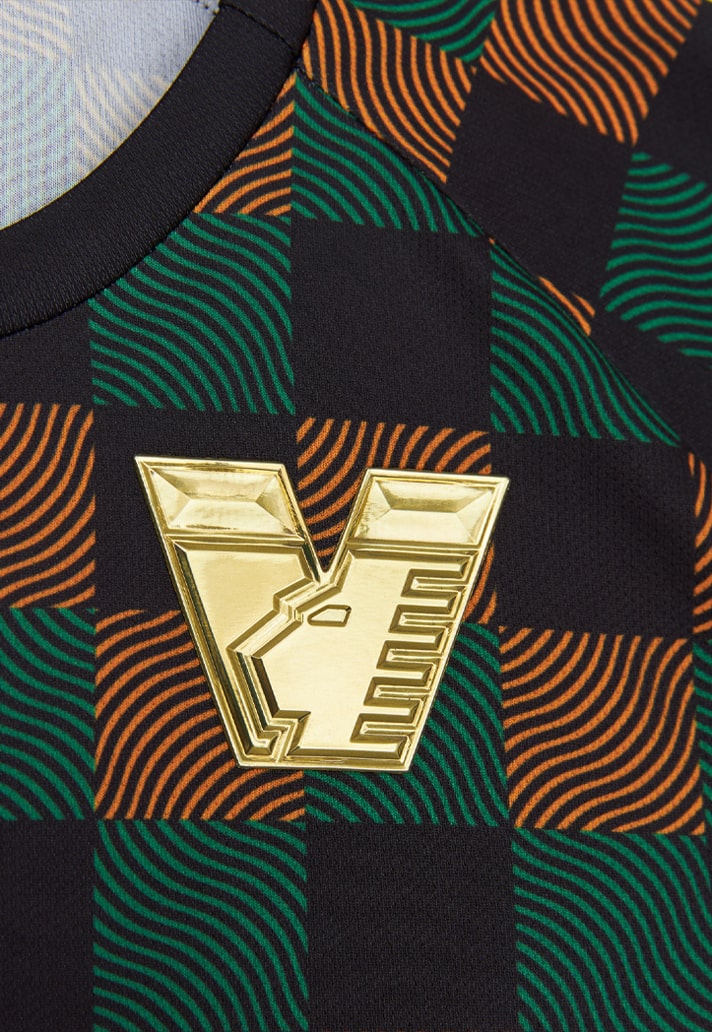
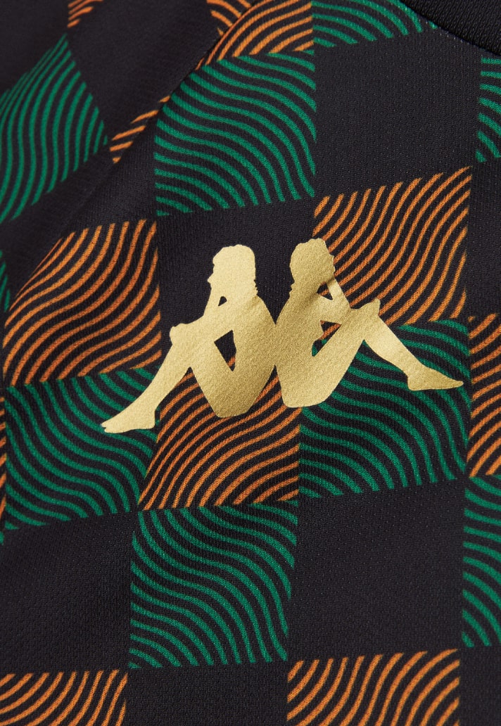
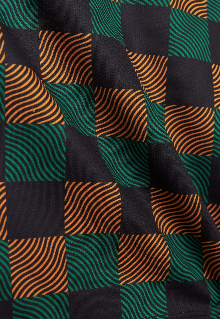
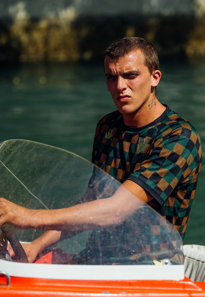
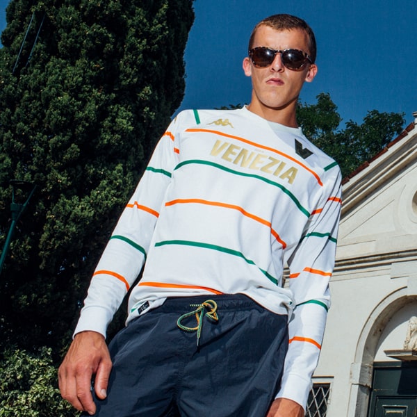
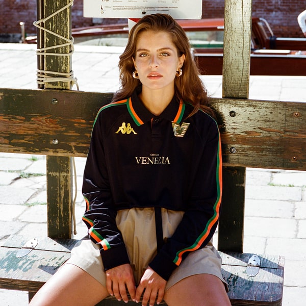
To mark the rebrand, Venezia have also unveiled their prematch shirt for the 22/23 season – the first to feature the new “V” crest. The design features an edgy orange-black-and-green checker design, an eye-catching wave texture through the checkers, and the new club crest in total gold. It arrives as the initial drop from the club’s eagerly anticipated wardrobe for the coming campaign, marking the second season of the celebrated partnership with Kappa, with the three kits set to be released on 7 July, 14 July, and 21 July.
Looking to find out more about the rebrand itself and the process behind it, we spoke with Venezia FC CMO Ted Philipakos.
Talk us through the decision making process – when did you feel the club needed to take a look at their identity?
The outgoing crest — which was designed in 2015, the year before I arrived — has always been problematic. In 2020, when I returned to the club, we decided to stop using it entirely — from the kits to social media, we’ve been using a modified version, isolating the lion while scrapping the rest, with the lion switched to gold and paired with an arancioneroverde checker. But that was just a stopgap measure; a new visual identity was necessary. In the context of the evolution of Venezia’s brand and modern design in general, the outgoing crest was obsolete. And though we would set out to create something more modern, at the same time there was an opportunity to realign with the club’s heritage, most notably by returning the lion to gold, as it had been throughout history.
What was the mission from early off? Did you have an idea in mind?
In the broadest sense, we had three key tasks to achieve. First, there was the lion — the winged lion of Saint Mark has always been at the heart of the Venezia FC brand, but the version we replaced looked like a Disney character, so that had to change to something more intimidating yet stylish. Second, the previous crest was busy and without a clear idea; the general direction had to be more modern, minimal, and bold. Third, while moving towards modernity, we had to honour tradition.
Must have been a tough brief to set. What went into that?
It’s tough to approach this kind of change in a 114-year-old club. But it was made easier working with Bureau Borsche. Obviously they bring great vision and talent, but also they had designed our website and web shop in 2021, so we already had a working relationship and shared sensibility for months leading into this process, and I think that was helpful in what was ultimately a very organic process.
The club is out there on its own in being a true cultural representation of creative industry coming into football. What environments did you imagine this branding living in?
I never really thought about it that way. I think a lot football club marketing directors would tell you something like, we want to be at the intersection of football and art and fashion and music, etc., and they end up producing a lot of superficial nonsense, which is effectively spam that only numbs the audience, in part if not largely because they view it as a means to an end, without any real authenticity and substance and purpose in the work. In our case, we just do what feels natural for us, for a club that represents the city of Venice and our own values and sensibility, and wherever that leads us organically is where it leads us.
Working with Mirko Borsche – can you tell us about what that brought you?
Mirko is a visionary. And besides his creative talent, what stands out for me is his sensitivity or empathy. He cares very deeply about how the work might affect a community of people, and that’s key when you’re working with a football club. Mirko and his team put incredible effort into establishing meaning behind the work, and we work in the same way. Not only Mirko, but Jean-Pierre Meier and many others who have had a hand in the process. They have worked in art, culture, fashion, sport, they have worked in Venice at the Biennale in 2019, so they had all the context that you could ever ask for to approach this project with Venezia.
What statement would you like this branding to send out?
I hope it’s a visual, psychological, emotional representation of what you know or imagine Venezia FC to be. I think articulating it as “brand statement” would only undercut that.
What’s your take on the end result when you think back to where you started?
The work embodies the purpose and feeling that we hoped to achieve. But that’s our perspective. Some people struggle with change, and this is a pretty bold change, and art is subjective, so, we’ll see how people feel about it, but we’re pretty confident that, at least after some time processing and living with it, if not immediately, many supporters will feel proud of it.
The 22/23 pre-match shirt is available for pre-order on shop.veneziafc.it
