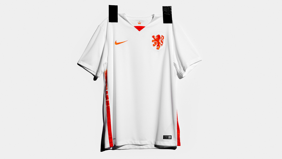
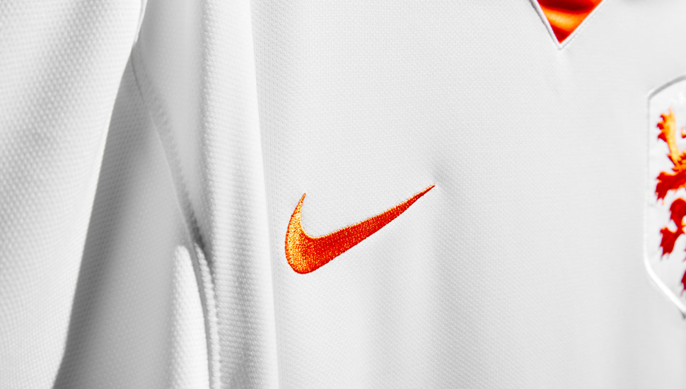
The hunt for a bad Netherlands kit continues as Nike reveal another classic away strip using the country's evocative national colours. The simplicity of the shirt amplifies the classic enlarged crest and graphic shorts, which complete the clean but stylish design.
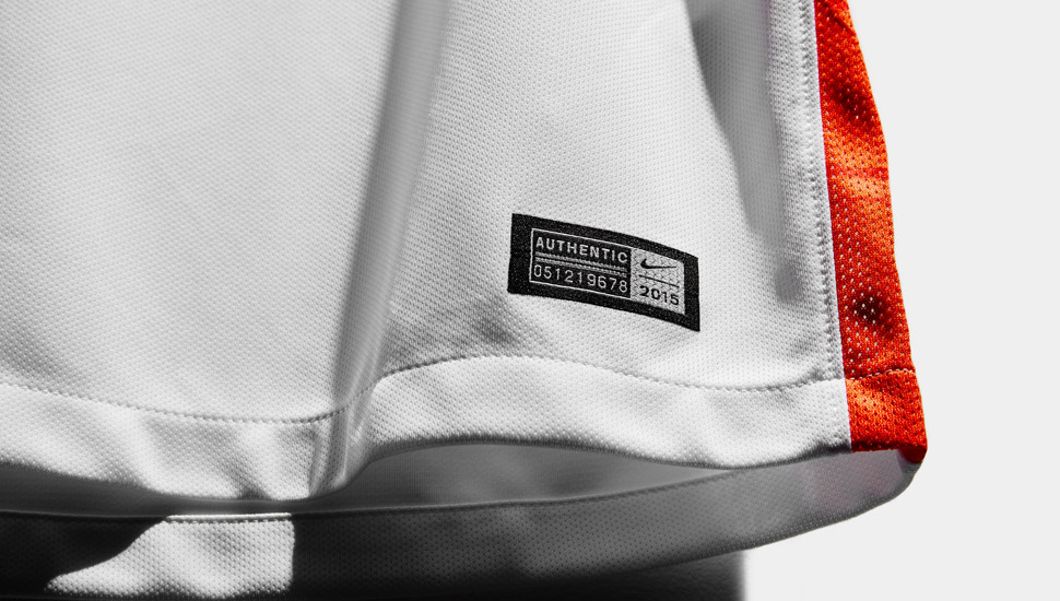
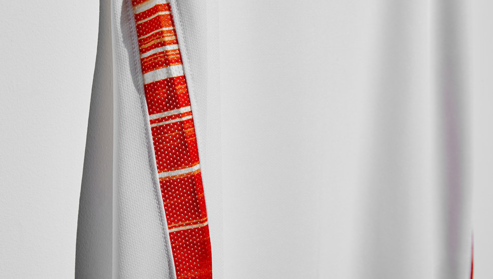
The combination of innovative graphics with the iconic Dutch color palette of orange and white creates a one of the most instantly recognisable national team strips in the game. Nike have a history of beautiful Holland jerseys but for the 15/16 away strip it's all about those shorts. The gradient speed graphics of orange and white light rays are where it's at and they continue to flow up the side panels of the shirt.
The graphic on the shorts is used to create a strong sense of motion and a blur of color and light when the Dutch players are in action (top image may be slightly exaggerated). The renowned Dutch graphic designer and typographer Wim Crouwel has created a special font for the names and numbers on the kit. The bold and modern font also maintains a retro appearance, reminiscent of the style seen throughout football during the 1970s.
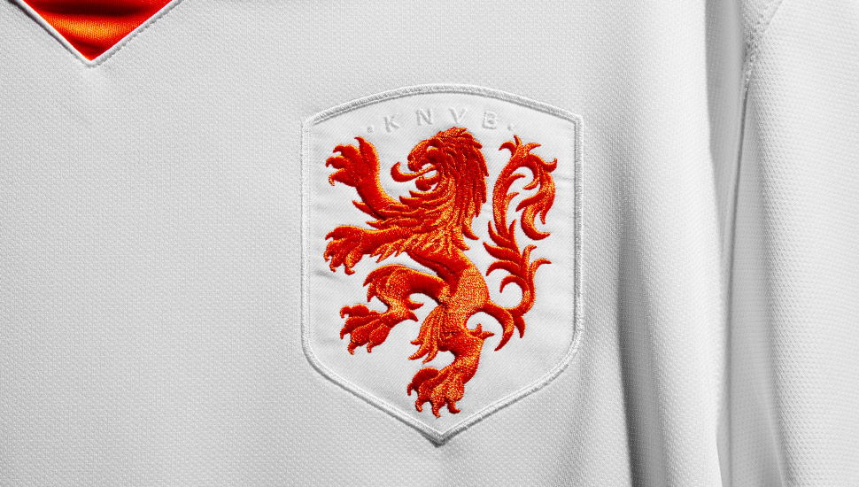
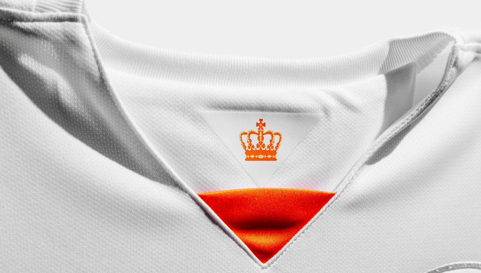
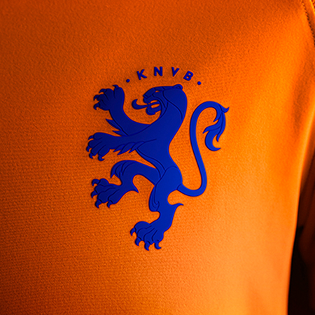
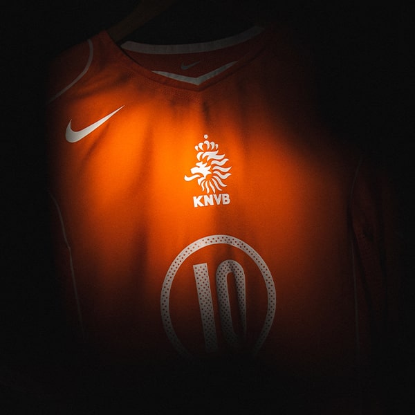
The away shirt continues to feature the enlarged lion symbolizing Dutch football values of simplicity, honor and unity. A tab inside the back of the neck displays the crown that sits upon the lion’s head on their association’s crest. The perfect blend of retro feel and modern design, together with the new Portugal away shirt Nike have kicked off their 2015 replica game bang on point, we eagerly await what the Swoosh have planned for the England shirt.
The new Netherlands away kit will be available from selected online stockists including Pro-Direct Soccer from March 21.
