Igniting a nostalgia trip whilst embracing the contemporary game, the launch of the 2018 adidas kits for the FIFA World Cup in Russia has seen adidas Football embrace their archives. Taking an independent look at the inspiration we explore how the past has helped shape the future.
The Three Stripes have been at the front of the game in recent years when it's come to re-shaping the off pitch game. A stadium to street mantra that provides the direction for how they position much of their product in the modern game, their 2018 World Cup jerseys pull on those stylised heart strings, taking inspiration from the early 90s.
The 90s was a time where experimentation in football kit design ran riot. It's no wonder they're looked back at with such fondness. For 2018 it's all about 90s shapes merged with modern innovation. The bagginess may be lost, but the swag is as strong as ever.
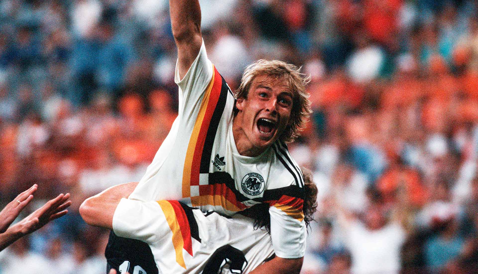
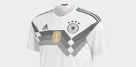
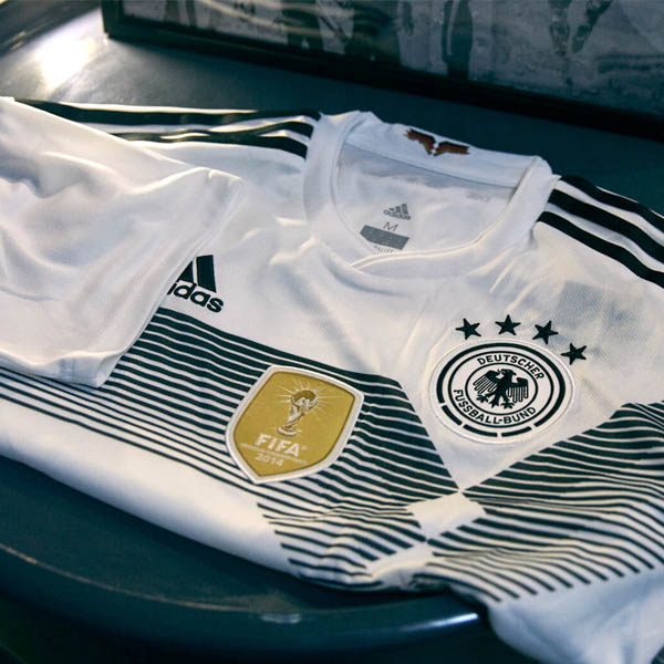
There seems like no better place to start than Germany, the football federation closest to the adidas brand. The stripes are synonymous with a German kit and the most celebrated shirt from the archives is that of the 1990 instalment. The 2018 result is a movement into creative places that sees a 90s icon moulded around a modern cut.
On first impression, the 2018 Russian home shirt might sit on the more simple side of the scale. Once you explore the heritage that lines the story though, there's plenty of inspiration that re-models the 1988 Olympics shirt almost 30 years on. The Soviet Union won gold at the games - a significant win that is echoed through the threads of the 2018 instalment. There's also subtle tweaks thanks to the latest Team Russia badge.
There's a bodacious archive in which adidas could have dipped into for the 2018 Spain home shirt, but it was the 1994 World Cup ensemble that formed the foundations. Spain reached the quarter-finals of the '94 tournament in the United States, and while this inspired number may have sparked political contraversy, it's safe to say that it's got a wealth of character and a splash of Sangria.
The obvious design inspiration for the 2018 World Cup Colombia shirt is there for all to see. The progressive use of straight edges and sharp shapes means that the 2018 shirt is not just a fresh take on the kit from Italia '90, but one that takes the game to whole new places. All that's needed now is to get all Colombian players wearing a three necklace combo and we'll be set. Valderrama, you are and always will be the man.
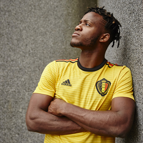
Dialling up the digits and taking us back to the diamonds of 1984, the 2018 Belgium home jersey is a beast. Subtle changes, such as the removal of the white rectangle that housed the previous diamonds in favour of a natural approach has given this one a winning look. Somewhat symbolic too given the number of high profile gems that the Belgian side has in its ranks. If they can get this team going, they've got enough talent to take any tournament to town.
Sweden will have to defend a 1-0 lead at the San Siro tonight to book their place in Russia next summer. And if they do, they'll get to wear this fine dress to the ball. Going back to that less is more way of thinking, this is Scandinavian sophistication for you. Pinstripe diagonal detail matched with the strongest of collars. Yellow isn't an easy colour to work with but this one pulls it off nicely.
Pick up a range of the adidas 2018 home shirt from prodirectsoccer.com
