While we’ve seen all home shirts for the 2019/20 season, we’ve had to wait a little bit longer for the complete away collection, with Watford dragging their heels and being the last to reveal theirs to the world. But now all 20 shirts are out, and we’ve rounded them up to take a closer look. As we did with the home shirts, we’ll mark them out of 10, because why not. Let’s go…

Arsenal
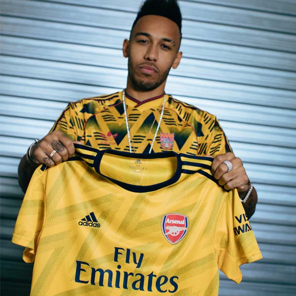
Going retro and bringing back the bruised banana design from the 90s, one of their most famous collaborations with the club, adidas once again smash it out of the park for Arsenal's away shirt. 10/10

Aston Villa
Decent effort from Kappa, this. Keeping it clean and simplistic with a nice diagonal pinstripe embellishment across the body. Sponsor and branding become less offensive when they take on the claret to counter the predominant blue. 7/10

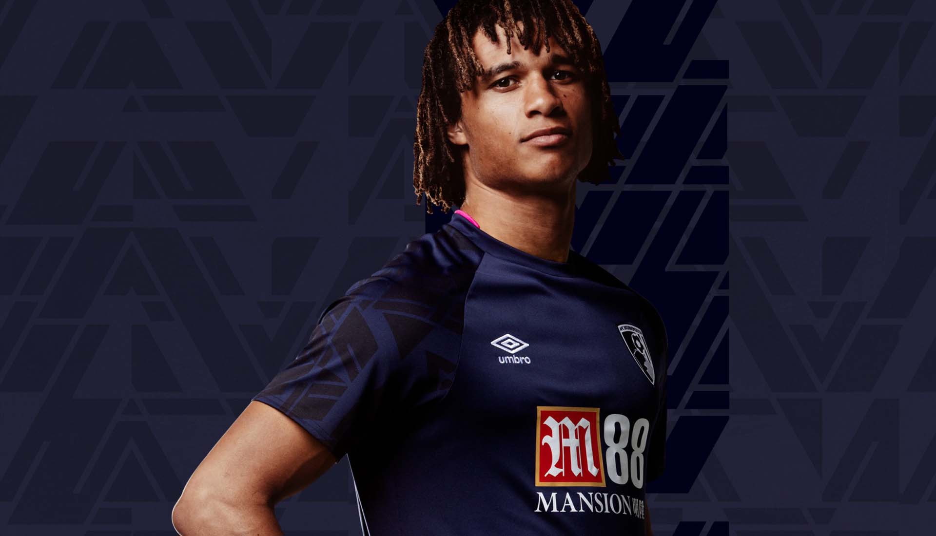
Bournemouth
Inspiration for the new away shirt was taken from the popular pizza graphic that featured on the club’s 1992/94 alternate jersey, with a similar pattern now present on the sleeves of the away shirt giving it a little individuality. 7/10

Brighton
Clean, monochromatic look from Nike for the Seagulls' away. Not much to dislike here really. Equally not loads to get excited about either. 6/10

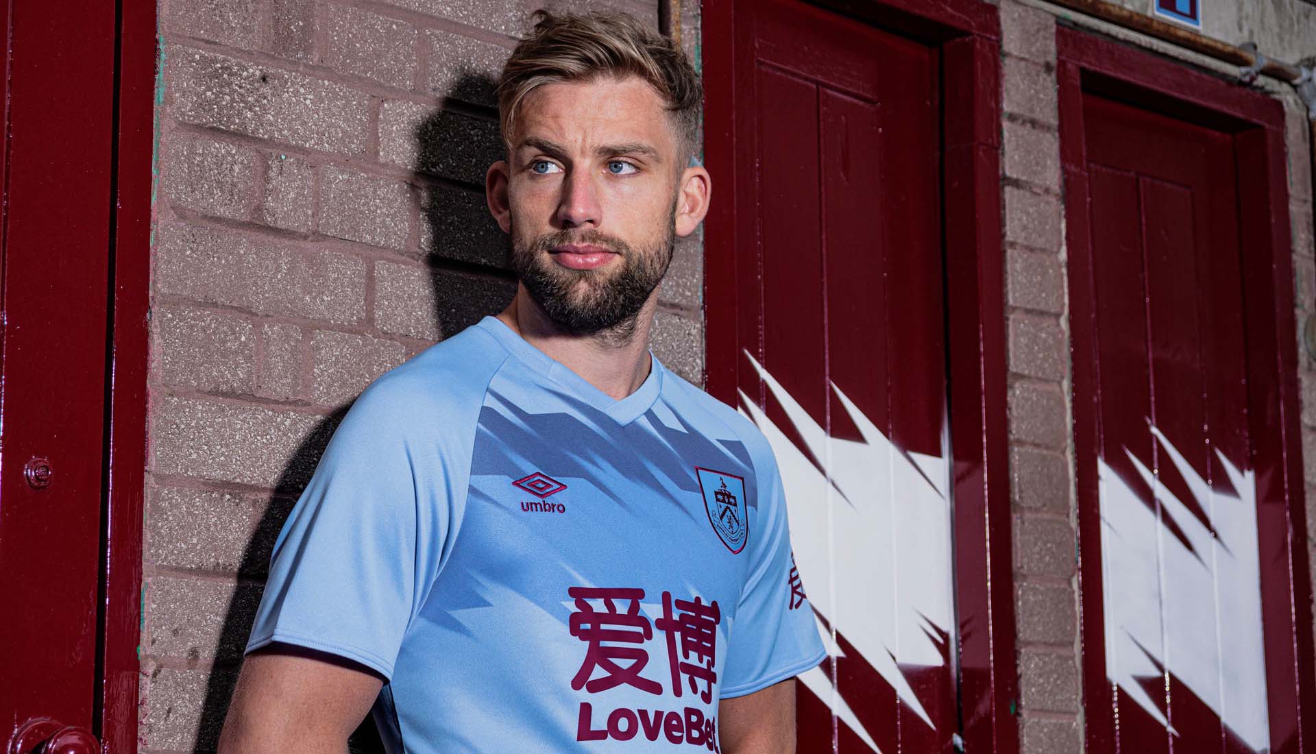
Burnley
This away shirt more than makes up for the clean-yet-uninspiring home offering. Umbro ramp it up with a stunning graphic across the upper chest, with crest, branding and sponsor appearing in claret. Superb. 9/10

Chelsea
A clean and stylish design inspired by 1960's Mod culture which once thrived on the club’s doorstep. Far less divisive than the home shirt, this should keep Chelsea fans happy. 7/10

Crystal Palace
Hats off to PUMA for completing a home and away double delight for Palace. The away shirt stands out thanks to a wavy overlaying graphic that breaks up the combination of home colours on a black base. Once again though it's one chunky, dominating, Manbet-shaped sponsor away from being right up there. 9/10

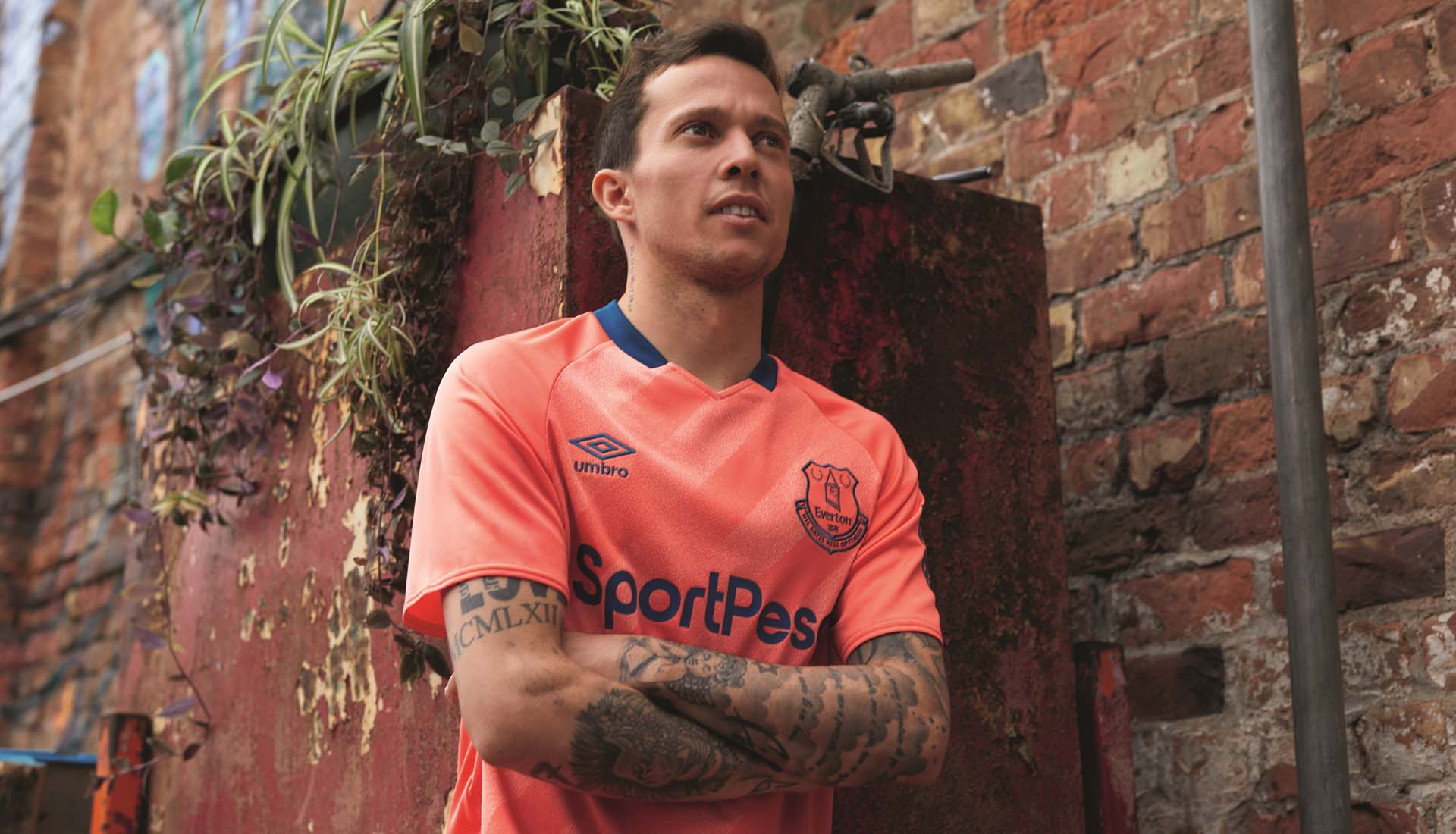
Everton
Nice execution of "Living Coral" with navy trim that harks back to the kit that was worn by the team throughout the club’s first league title-winning season in 1890/91. Never going to be a favourite, but equally not set to feature on any 'Ten Worst Kits' lists either. 7/10

Leicester City
Those cunning Foxes tried to pull a sneaky on everyone by releasing not one, but two away shirts. Well we're not having that. Pink is your designated away kit for the purposes of this review. And it's alright. Bit of a generic template that reminds us of Germany kits from the 90s, which is no bad thing, but nice blackout of the crest to complement the overall aesthetic. 7/10

Liverpool
Keeping it clean and tidy, New Balance take a white base and add accents of navy and red through the sponsor and branding and on the sleeve cuff detailing. Easy on the eye, but not overly adventurous. 7/10

Manchester City
You can see what PUMA were going for with this one, and it could've been so good. Feels like there's just one colour too many. Shame. 6/10

Manchester United
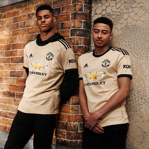
Is this good or not? Can you have snake skin on a football shirt? We're going to go with no for both. Brave to try something different, but you wouldn't be thrilled if this was your club's kit, would you? 5/10

Newcastle United
Interesting colour selection from PUMA for Newcastle's second strip, and this time it's not completely ruined by the sponsor. 7/10

Norwich City
Loving what Errea are doing here. Taking an unapologetic approach with the colouring and just running with it. Check out that shoulder graphic... such a shame that it's ruined by the godawful sleeve sponsor. So close. 8/10

Sheffield United
Another clean and tidy approach from adidas for the Blades, but ultimately it's a generic template with nothing much to stand it out. Sponsor looks less offensive here than on the home shirt at least. 6/10

Southampton
Not really sure what Under Armour were going for with this one. It’s not bad... it’s just not good either. Better than the home effort at least. 5/10

Tottenham Hotspur
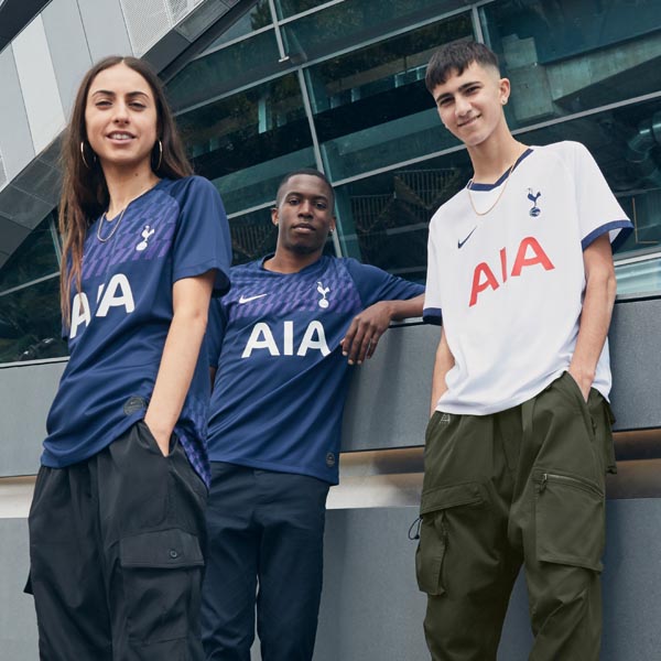
The Spurs away shirt makes more of a statement than the home shirt, thanks to a vivid purple graphic on the upper chest of the navy base. Saves it from being distinctly average. 7/10

Watford
Another use of one of adidas' generic templates (see Sheffield United). Colour choices are nice, but not a lot of character and nothing to distinguish it. 6/10

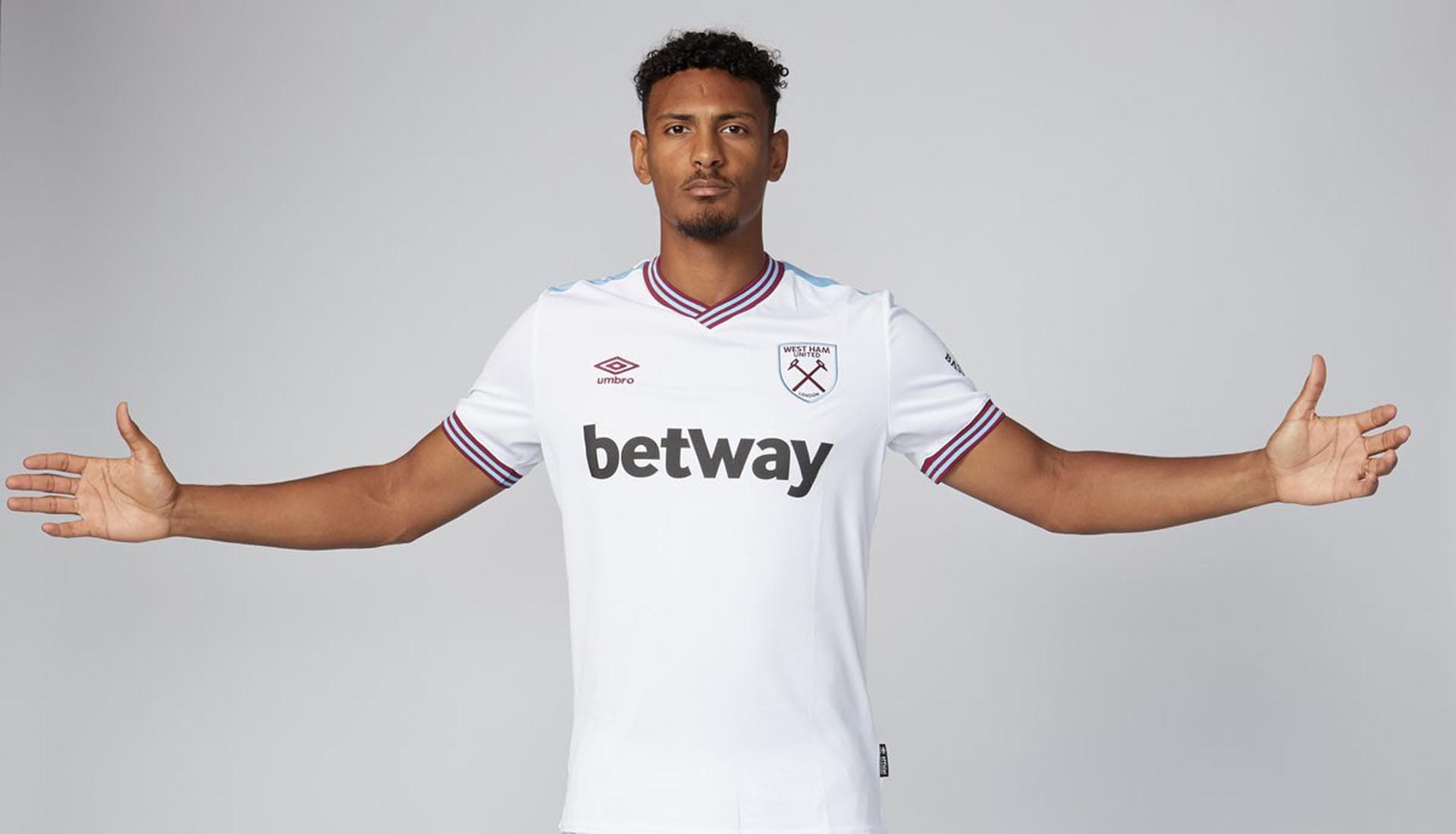
West Ham United
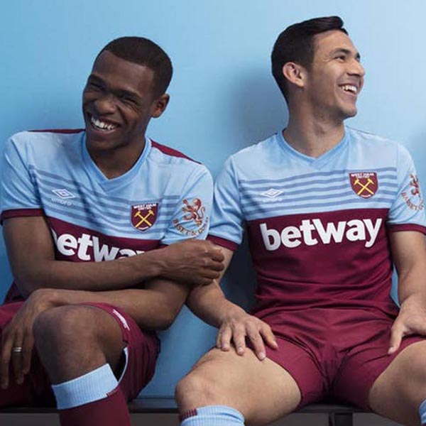
Umbro showing just how easy this design lark can be. Offering a stripped back shirt that instantly places the emphasis and focus on that retro collar and cuff combo. Hats off. 9/10

Wolverhampton Wanderers
A nice execution from adidas, inverting the home colours to make black the predominant colour, accented by orange. The diagonal pinstripes give it that little bit extra too. 8/10
Check out what we thought of the 2019/20 home shirts here.
Shop all 2019/20 Premier League replica at prodirectsoccer.com
