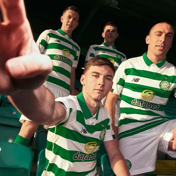
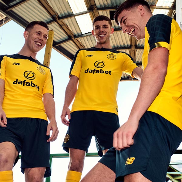
New Balance continue to showcase their 2019/20 replica work by unveiling another stylised cookbook, this time in Glasgow for Scottish Champions Celtic. The brand are celebrating the DNA of each of their clubs by creating unique and individual kits that tell the stories at the heart of the cities that they represent.
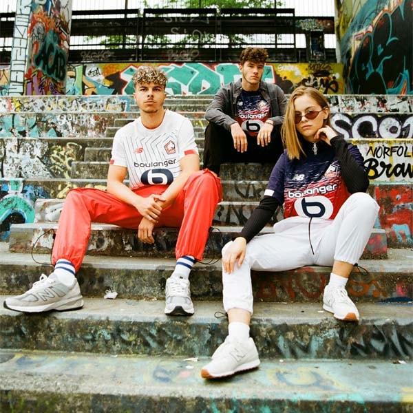
Celtic have been supplied with three shirt designs by New Balance, and the brand have taken to the streets around Celtic park to shoot the shirts in their alternative but natural setting – away from the white lines – onto the streets, into the cafes, pubs and anywhere where the famous green and white hoops will be repped throughout the new campaign.
In the first of a short series, we speak to the design team at New Balance to talk about the inspiration behind the design process for their 2019/20 kits, which has seen a celebration of the character of each individual city as an overriding theme. Off to Glasgow we go...

Tell us about the process of designing the Celtic kits...
There are many factors to consider when deciding on kit components and we take inspiration for our designs from all sorts of places. The key for us is speaking to the club and fans to get a really well rounded set of views on what will make the best possible kit. We also think about what we have done in previous years with the club, in order to ensure we’re offering players and faithful fans something fresh and new while also respecting the club’s history and traditions.
Where has the inspiration been drawn from and what tweaks have been made to the kits this season?
Our philosophy is about creating beautiful, minimalist designs, which deliver top performance. Every detail matters. The simplicity of the home jersey allows the Celtic’s iconic hoops, crest and the Celtic cross to be front and centre. The away kit draws inspiration from the familiar and much loved rich yellow gold and green colour combination of kits featured in the early 2000s. It harks back to the days of club legend Henrik Larsson, and the team who won the domestic treble in 2000/01.
What have the design team learnt about the club and what it stands for throughout the process of designing the shirts?
From the start of the partnership, between New Balance and Celtic, we've been humbled by the dedication and commitment of everyone connected with the club has. Celtic play such a huge role in the community and is ingrained in the city and its culture. The club places the players and fans at the centre of things during the design phase and pushes us to make sure we’rereflecting what the club is all about in our kit designs.
Are there any things about the culture in Glasgow that you have learnt while you have been designing the kits?
Absolutely. To prepare for each design, we make multiple trips to Glasgow to visit the club and take inspiration from the city. Glasgow has a rich historical heritage and a really progresive outlook at the same time. It’s a really diverse and exciting place, so it’s great to get out and about around the city to soak up the culture. In terms of what we’ve learned from our time in Glasgow – the people we meet are united by a sense of pride, passion and conviction in their city. That’s underpinned by a warm, friendly and welcoming approach.

Are you actively thinking about how the shirts will look in an off-pitch environment as much as how they will look on the players?
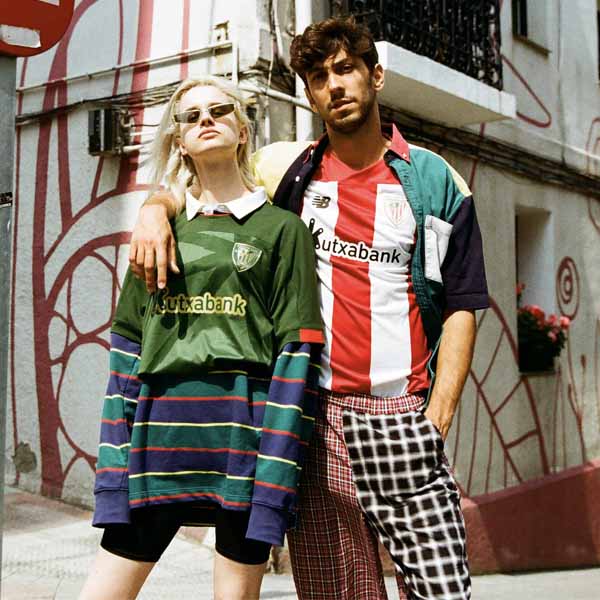
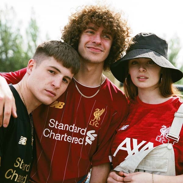
It is imperitive that the jersey can transcend the football arena and appeal to fans away from a matchday. One of the stand out trends emerging is the blurring of the lines between performance, lifestyle and street culture. Fans demand products that look as good on the street as on the pitch. That’s what we work to deliver.
You’ve got the Celtic cross on the neckline of the shirts, it’s a popping feature. Those bespoke elements are what makes the shirt and identity of the club aren't they?
We believe that by scrutinising and questioning every single detail that appears on the kit jersey, season upon season, you are constantly evolving the design. This approach drives you on to enhance and improve on previous iterations. This constant evolution allows us to identify and create truly bespoke jerseys that really represent Celtic and its fans.
What trends do New Balance design see coming into the game in the near future?
We're very excited about the advancement of wearable and nano technology and its application within the sphere of football jersey creation. This trend has the possibility to enhance performance and progress the look of the jersey over the mid to long term. We see this as the next big trend and it’s one we’re looking at closely.
Looking at basketball as an example and the culture that has been created around that sport... Is there the same appeal to football shirts now as there has been with basketball?
We definitley feel the football shirt is enjoying a strong resurgence in terms of its presence away from the terraces. There is a strong correlation between the music scene and the football jersey culture for example which we think is an interesting development. Football jerseys are now becoming a form of self expression and we are keen to play our part in that.

The third kit is a bit tasty with those chevrons. Tell us about that one...
It’s beautiful for all the right reasons and pushes boundaries nicely... The third kit inspiration comes from the historical 1919/1920 Celtic reserve kit which featured a bold white contrast chevron on a green jersey. We wanted to celebrate the iconic chevron kit which is enjoying its 100th year anniversary in 2019. We have taken the design and refreshed it using a striking colour palette which will really pop on the pitch and away from the stands too, while also celebrating the heritage of Celtic and its links to youth culture.


Pick up all 2019/20 FC Porto kits at prodirectsoccer.com


