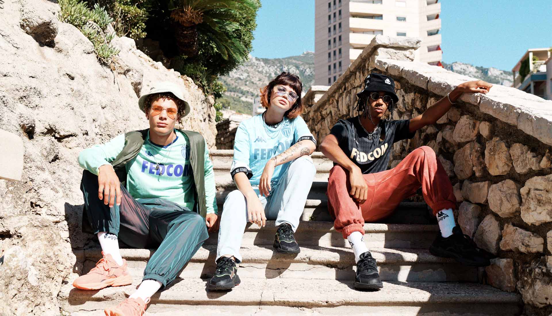
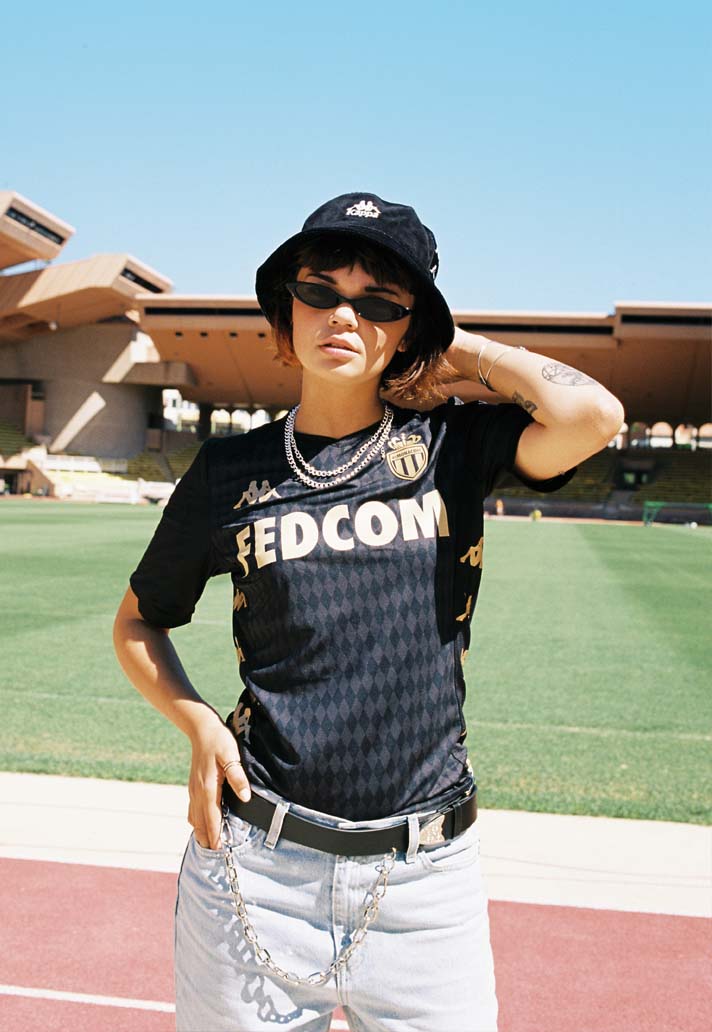
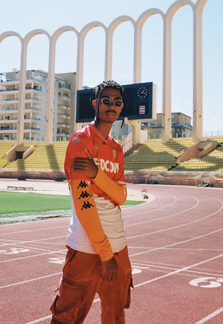
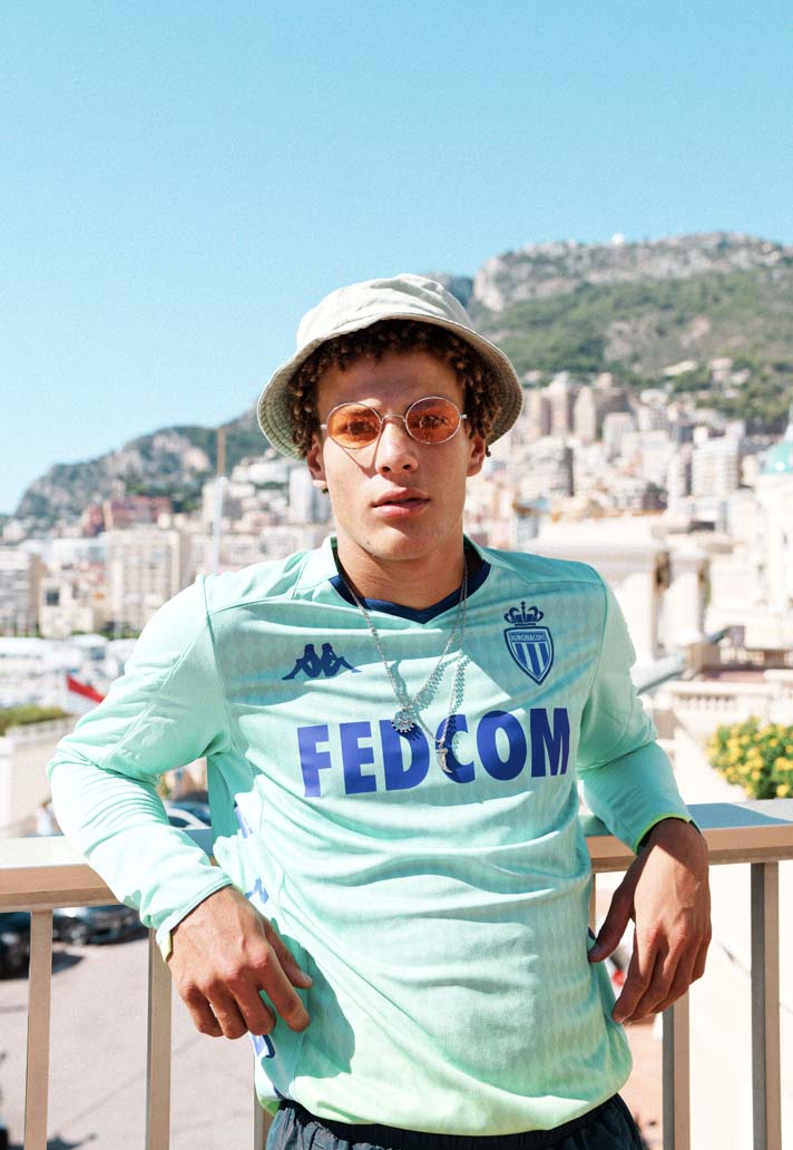
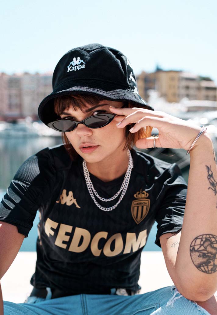
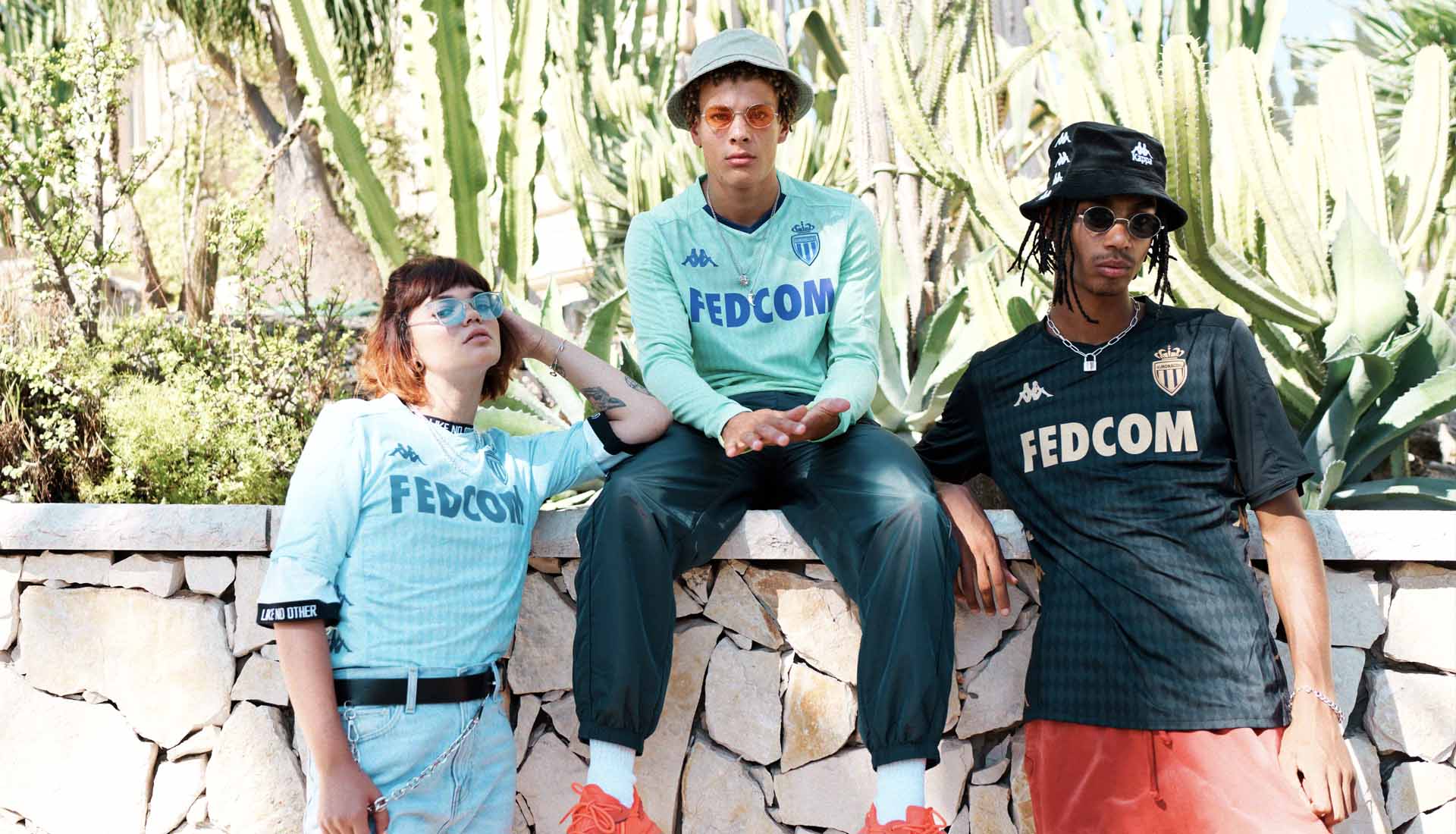
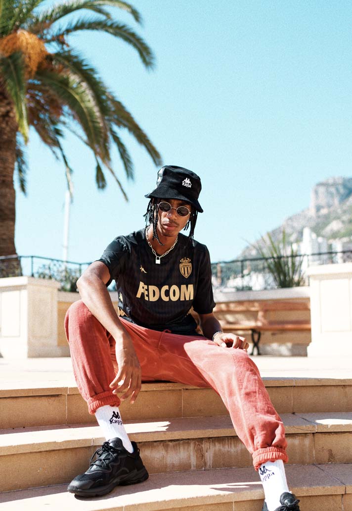
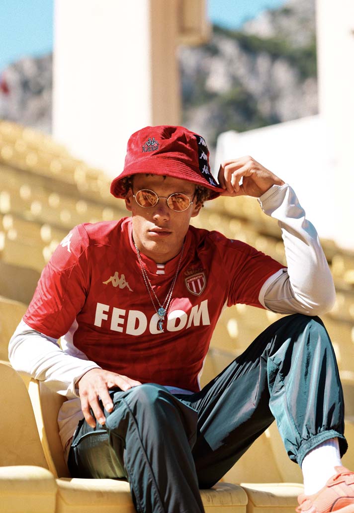
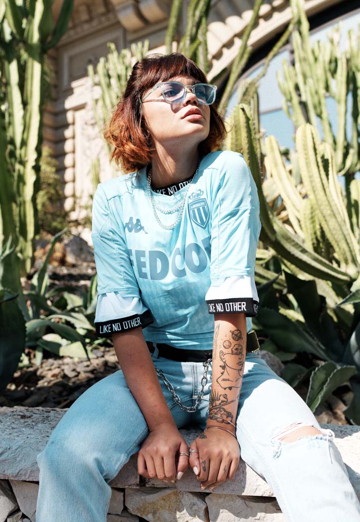
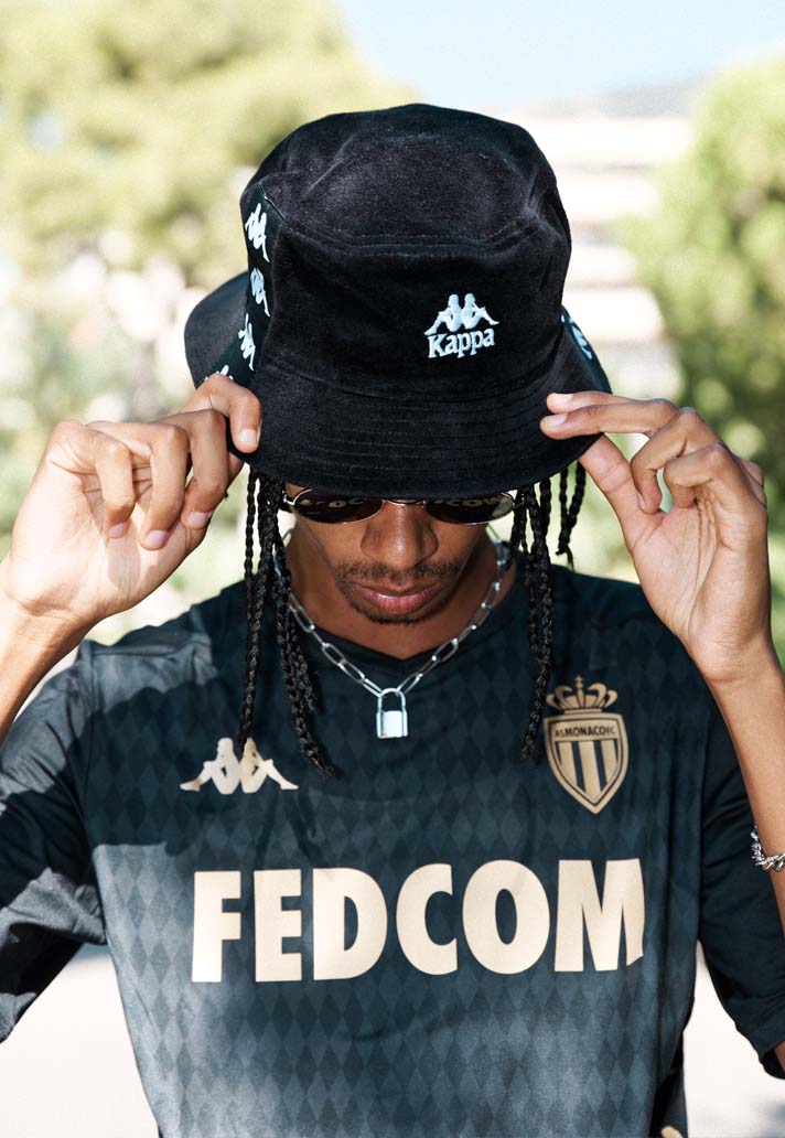
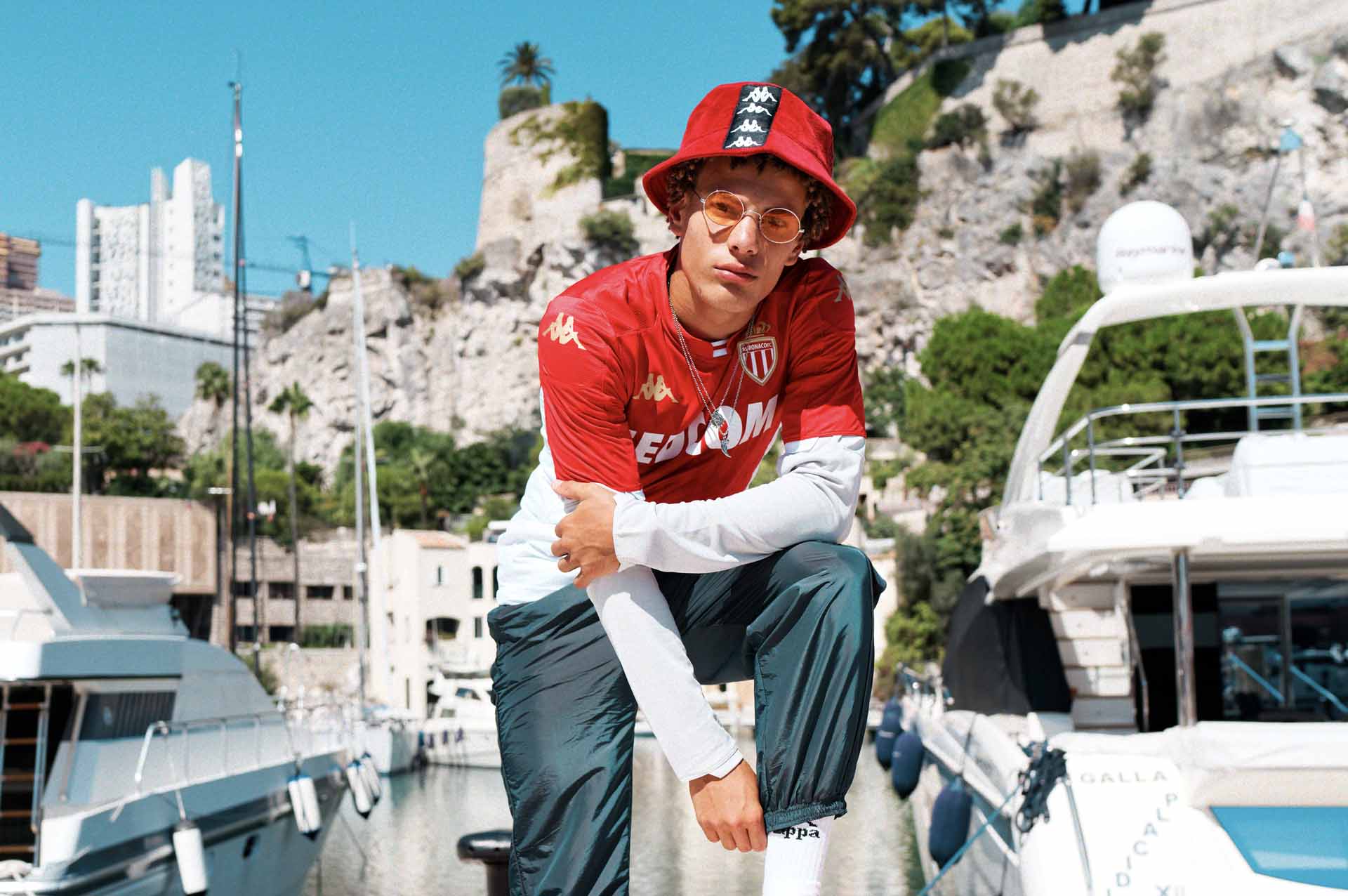
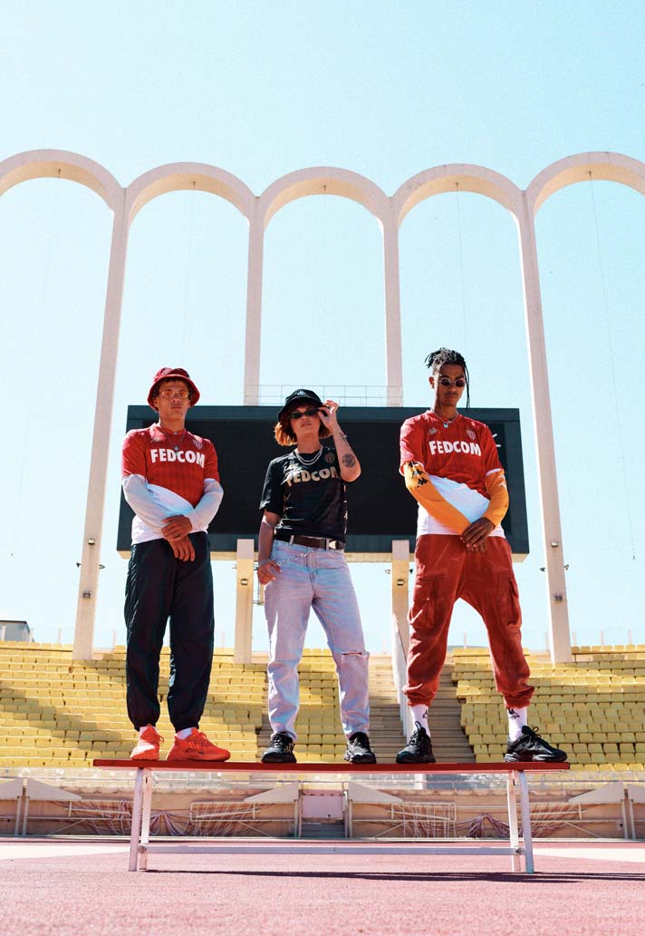
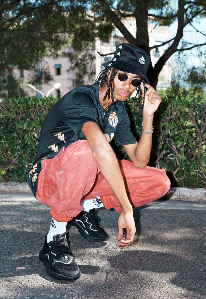
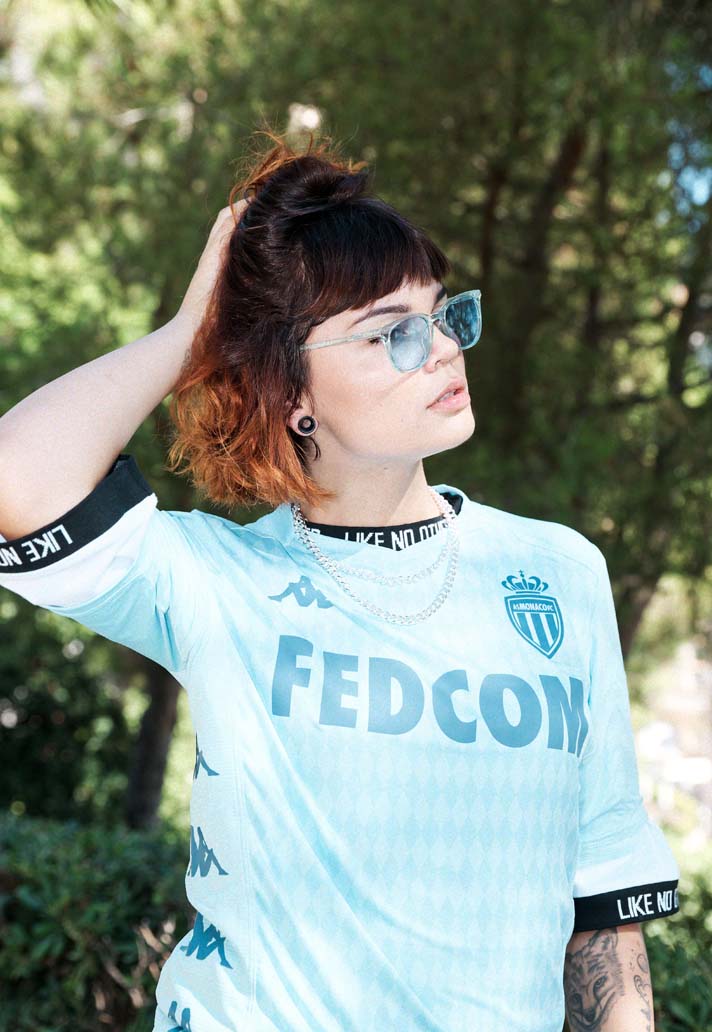
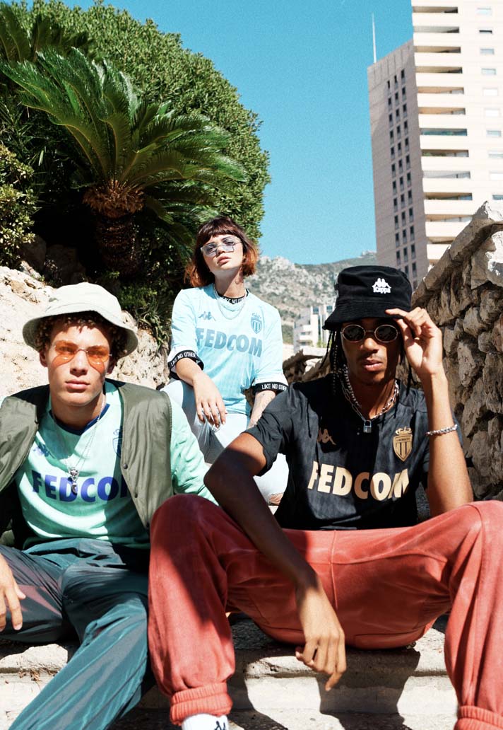
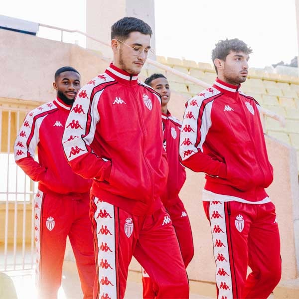
Arriving as a welcomed delicacy on the 2019/20 shirt scene, Kappa – back with Monaco after an 18-year break – have delivered a triple treat in the form of three of the best looking shirts seen this season. And now they’ve all been captured together in a lookbook shot in and around the Stade Louis II stadium, with the stunning backdrop of their home city providing a framing worthy of the shirts themselves.
Kappa and Monaco are together once more after a break of almost two decades, and on this evidence the relationship looks stronger than ever, with the brand providing the club with three outstanding shirts for the 2019/20 season. Now, as if to exemplify the strength of their designs, Kappa have framed the shirts within their native backdrop in an exquisite lookbook. Rarely does a team get three stunning kits in one season, and even more rarely do a brand get it so right on the first time of asking; Kappa setting their own bar extremely high from the off.

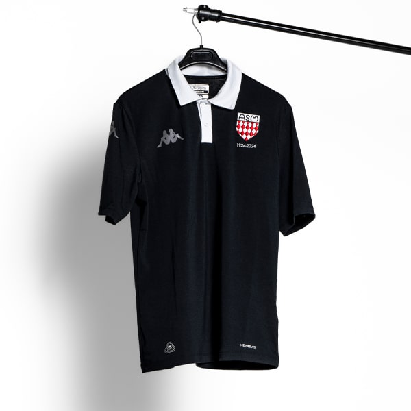
All three shirts are linked by a simple design that sees a diamond graphic reminiscent of the Principality’s coat of arms running throughout. It’s a minimal design feature but it’s one that ties all three shirts together for a strong running theme as well as a sense of individuality for the club.
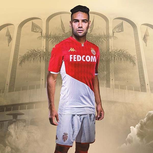
Kicking the collection off is obviously the home shirt, which takes the traditional diagonal design and tweaks it to absolute perfection by simply setting the divide between red and white slightly lower. Subtle gold detailing lends the shirt a regal feel that’s worthy of the region, and that’s carried across on to the away shirt.
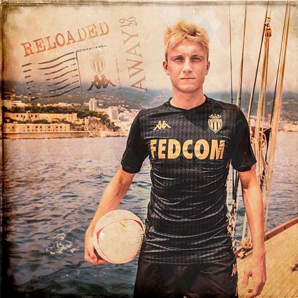
Simple but incredibly effective, you can’t underestimate the effectiveness of a black and gold design, and it's executed brilliantly for the away shirt. Oh, and the ‘Kappa Banda’ travelling down the sides in gold is just the ultimate sign off – not many brands that could get away with repeating their logo so many times with the overall design just looking all the better for it. And that same feature is carried across to the third shirt, which takes on colours that are inspired by the Mediterranean. Lap it up. It's a modernised dish with three scoops of delicious 90s flavour.
Pick up all three Monaco shirts from prodirectsoccer.com
