Creative Soccer Culture

Our Top 30 Football Shirts Of The 2019/20 Season

Every 2019/20 shirt is now out after Nike saved some of the best until last with their later flurry of third kits. So now we're going to have a crack at picking out our favourite 30 shirts from the 2019/20 season. “30?” you say, “Couldn’t you have narrowed it down a bit more than that?” No. We could not. Honestly, we couldn't.

Was this originally planned as a top 20 list? Yes. Yes it was. But brands seem to have upped their creative game for the 2019/20 season and we've been spoilt by a plethora of outstanding individual designs, which has also allowed us to used the word plethora. Here we try to order a blend of nostalgia-driven retro rippers and fresh feels and if there's one thing that we can agree on; it's that we're not going to agree on this. Shoot us down, we're ready...

Sao Paulo 3-min.jpg

30. Sao Paulo Away

A clean and simple design that sees a nice bespoke blast from adidas, with the Three Stripes branding on the sides appearing in red and black, which, with the core white of the shirt, nods to the famous tricolour trademark of the Brazilian outfit.

top 4-min.jpg

29. Go Ahead Eagles Away

A beauty of a bespoke design for the Dutch side sees a sublimated graphic that's reminiscent of the Nigeria World Cup kit joined by gold detailing.

Umbro 7-min.jpg

28. Burnley Away

The Burnley away shirt is everything you could want from a secondary option, inverting the home colours and adding a nice big, striking graphic across the chest. Sean Dyche couldn't care less, but Burnley will look the biz on the road this season.

top 1-min.jpg

27. Rangers Home

Dutch brand Hummel make their first of two appearances on this list, dressing out Stevie G's boys in a smart design that sees a subtle striped jacquard pattern down the front.

top 2-min.jpg

26. Zenit Home

For Zenit's home shirt Nike introduced a modern take on the club's traditional sky blue and white, with a geometrical graphic of gradient triangles covering it. Fresh look for the Russians.

Real 1-min.jpg

25. Real Madrid Third

With a vibrant green as its base, which symbolises the club’s forward thinking vision, the Real third shirt looked to the redevelopment of the Santiago Bernabeu for inspiration while also paying tribute to some of the club's great shirts of the past with the addition of navy trim. 

Milan 5-min.jpg

24. AC Milan Home

Keeping Milan's home look feeling fresh with the simplest of tweaks, PUMA simply reverted to classic narrow Rossoneri stripes, harking back to the look of the kit in the 1969/70 season, a period of great success for the club.

top-inter-milan-home-19-20.jpg

23. Inter Milan Home

Introducing diagonal stripes in the usual vertical setup for a fresh and modern twist that still respects the tradition of the club. Often difficult to do on a home shirt, but Nike nailed it.

5-barca-away-19-20.jpg

22. Barcelona Away

Who doesn't love a sash? Barca's away strip sees their home colours splashed across a bright yellow canvas. Add to that the fact that it also pays tribute to La Masia's founding year, and you've got a stunning looking shirt with a nice story behind it.

1-tottenham-spurs-19-20-third-shirt-min.jpg

21. Tottenham Hotspur Third

The first of Nike's retrolicious 90s-inspired third shirts to be released and the first to feature on this list, but certainly not the last. The Spurs third shirt features several nods to the past, with a classic collar and colourway for the club being joined by the returning Futura logo.

1-flamengo-away-19-20.jpg

20. Flamengo Away

The Flamengo away shirt features a classic red and black hoop synonymous with the club's home look and it's placed on a clean white base, with the red hoop coming complete with the ‘Mengo’ sublimated graphic that is the standout feature of the home shirt.

1-hearts-19-20-home-umbro-min.jpg

19. Hearts Home

Umbro provided a modern twist on a traditional Hearts home kit with matt shine jacquard fabric in a shattered diamond design to the front body and sleeve panels. All three Hearts kits were strong this season, with the home just edging it for us.

18-as-monaco-kit-2019-20-kappa-min.jpg

18. Monaco Home

Kappa returned to Monaco and instantly hit all the right notes by taking the traditional diagonal design and tweaking it to absolute perfection by simply setting the divide between red and white slightly lower. 

2-chelsea-19-20-third-shirt-min.jpg

17. Chelsea Third

The next of Nike's retro third kits, the Chelsea shirt features a standout collar that's been lifted straight from the 90s. The hint of orange harks back to the 1994/96 away kit – the first time orange had been used by the club.

Kaizer 1-min.jpg

16. Kaizer Chiefs Home

The Amakhosi are looking to get back to the top following disappointing finishes in recent seasons, and Nike have provided a bit of inspiration in a dizzying design that's reminiscent of the shirt they wore in the 2012/13 season, in which they won the league and cup double. Takes balls to stick that on a home shirt.

top 3-min.jpg

15. Club America Home

You're always guaranteed some wild designs from Central America, the likes of which you don't tend to find in Europe, and Nike didn't disappoint with the Club America home shirt, which sees a strong graphic across the upper chest with sponsors squeezed onto every available space.

top-atletico-madrid-19-20-third-shirt-min.jpg

14. Atletico Madrid Third

That same collar from the Chelsea shirt appears here once again alongside the Futura logo for the complete throwback feel. The shirt also utilises the light blue colouring that the club wore during their successful 90s period.

Hull 3-min.jpg

13. Hull City Home

One of the best examples of taking what a club is about and ingraining it in the design of the shirt. Modern, striking, unique, outstanding. Fine line between superb and naff. Umbro finding the right side of that here.

1-psg-third-19-20-min.jpg

12. PSG Third

Clean as you like while also incorporating the club's primary colours in a design that's lifted straight from the 90s. Easy to see why this one featured at London Fashion Week.
3-19-20-roma-away-shirt.jpg

11. Roma Away

We've already spoken of our love for a good sash design, but when that sash is a lightning bolt that also ties the design to Jupiter, the Roman God of the Sky and the theme on the home shirt, then we're on to next level appreciation.

Umbro 8-min.jpg

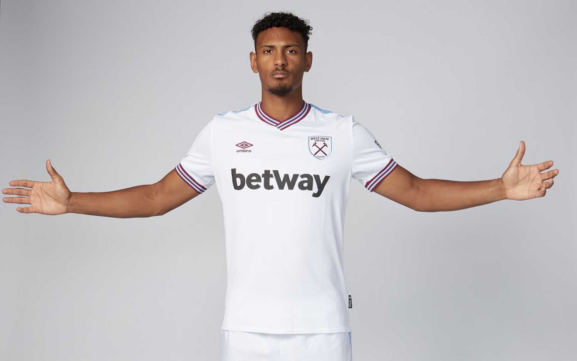
10. West Ham Away

Inspired by the Hammers’ historic 1980 FA Cup-winning team, the West Ham away shirt sees a clean design combined with a retro collar and some subtle brand detailing on the shoulders that also ties to the club's home colours. All over this, especially as it's available on the club store without the front sponsor for an even more throwback feel.

1-pique-third-shirt-19-20-interview.jpg

9. Barcelona Third

Taking inspiration from the 1996/97 season, this gloriously retro design sees the iconic "teal green" shade that conjures memories of Brazilian legend Ronaldo as he famously scored 47 goals in his solitary campaign with the club. Complement that base colour with the retro style collar in the club's primary Blaugrana colours, along with some sublimated graphics that pay tribute to the city's history, and this was always going to rank high.

Cornithians 3-min.jpg

8. Corinthians Third

Unapologetically brash, the Corinthians third shirt features a distinctive and disruptive design that pays tribute to three historical moments in time when the club’s fans have literally taken over away stadiums and driven their team on to victory. Completely unique, this shirt looks just as good off the pitch as it does on it.

20-as-monaco-kit-2019-20-kappa-min.jpg

7. Monaco Away

You can’t underestimate the effectiveness of a black and gold design, and it's executed to perfection here, with the ‘Kappa Banda’ travelling down the sides in gold for the ultimate sign off. Linked to the home and third shirts through the sublimated diamond graphic that pays homage to the Principality’s coat of arms. This shirt's got it all.
1-arsenal-home-19-20.jpg

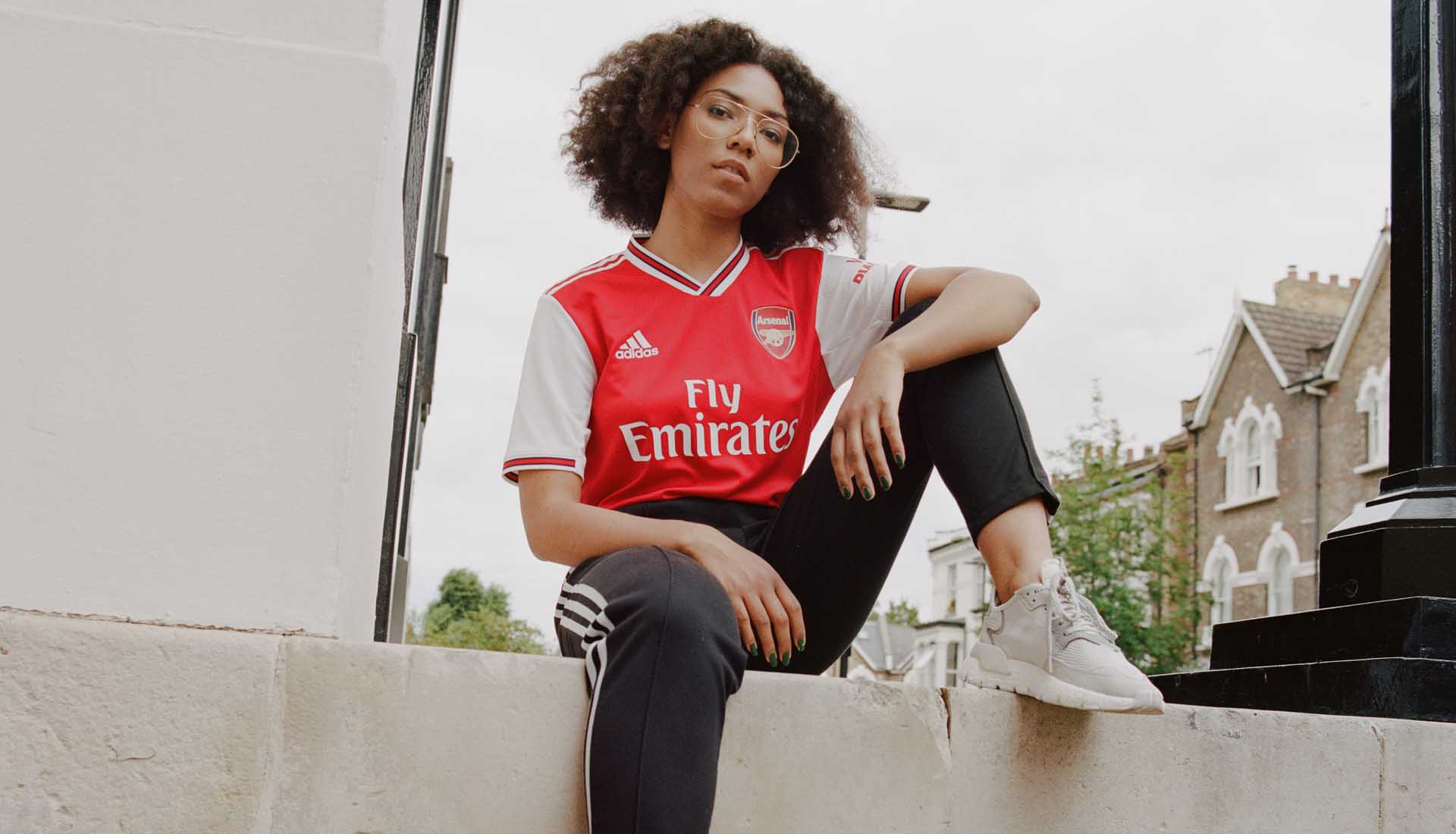
6. Arsenal Home

The Three Stripes coming back has lent the new Arsenal home shirt a retro vibe that has hit all the right chords with fans and critics alike. Classic all-over red body, complemented by popping white sleeves and contrasting collar and cuffs emblazoned with a central red stripe and black trimming. Only thing that could've made this perfect would've been the return of the Trefoil. But we're being exceptionally picky.

12-arsenal-away-19-20.jpg

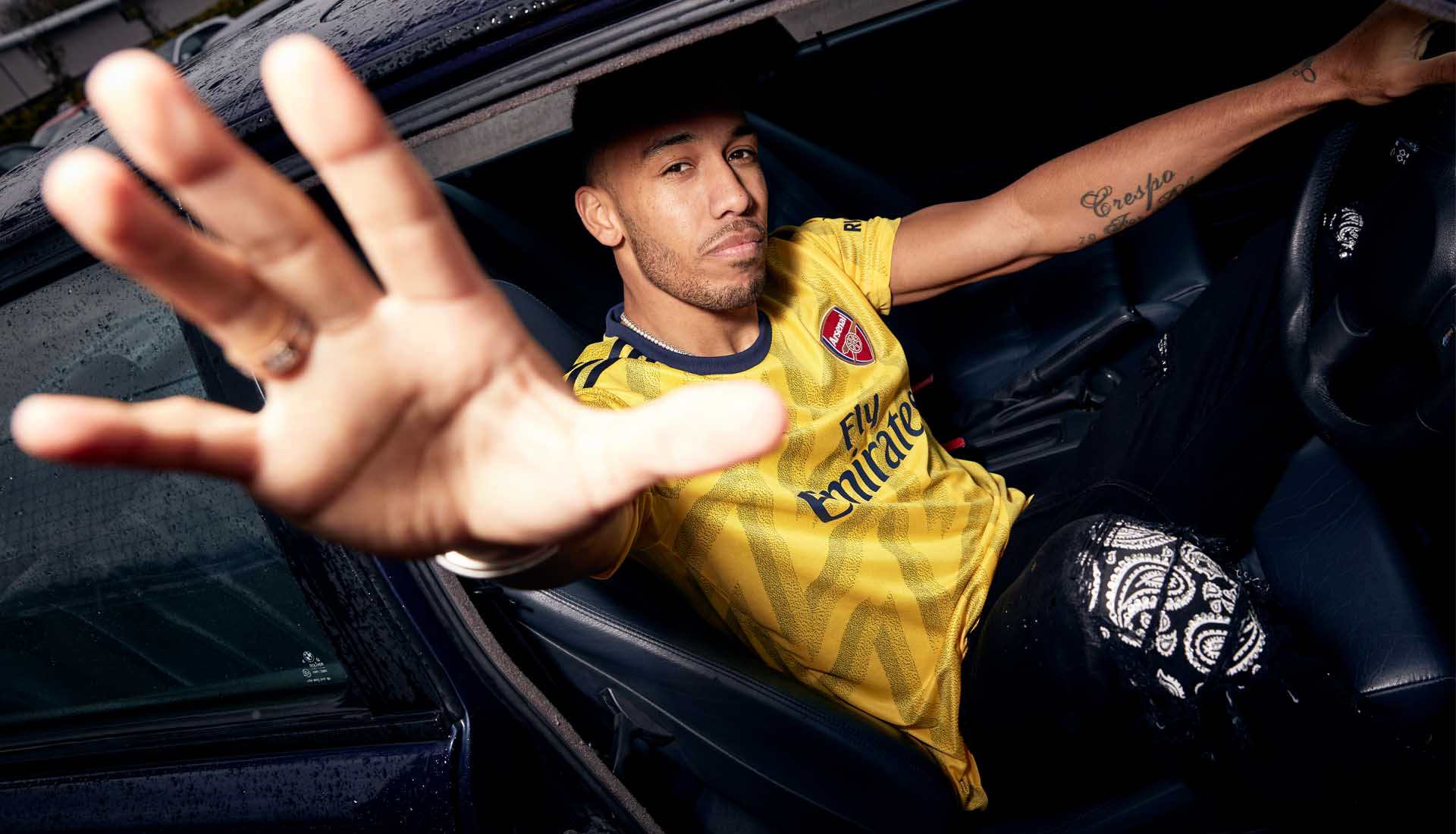
5. Arsenal Away

The return of the 'bruised banana' was always going to be huge for Arsenal and for adidas, and it certainly didn't disappoint. 

top-roma-home-19-20.jpg

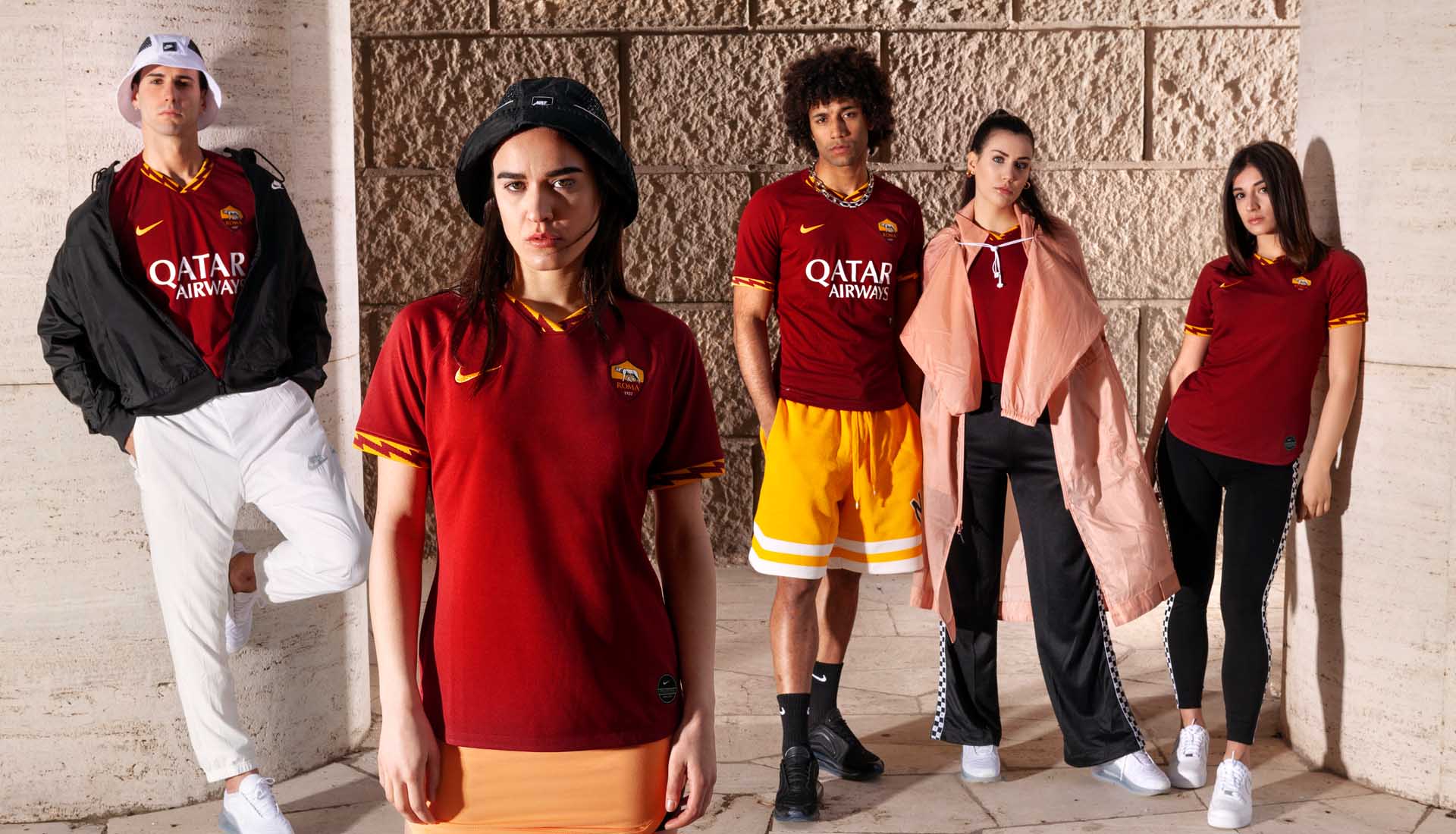
4. Roma Home

Minimal yet seductively statement, the addition of the dynamic lightning bolt on the collar and cuffs lights up an otherwise classic Giallorossi design. Such a simple addition, and yet executed to absolute perfection.

6-psg-away-19-20.jpg

3. PSG Away

Stepping up from third shirt to away shirt, Jordan supply a design that's flooded in the iconic infrared shade first introduced on the Air Jordan VI back in 1991. This results in a blistering away look that's framed with a black trim on the collar and cuffs. Simply striking.

inter milan kit header.jpg

2. Inter Milan Away

Vivid aquamarine framed by black and gold. On paper it shouldn't work, but it just absolutely does, providing Inter with a proper regal feel that's inspired by the shirt that Julio Cesar wore when the club clinched a historic treble in 2009/10.

Roma 5-min.jpg

1. Roma Third

This is what shirt design is all about. An outstanding design that's linked to a shirt that has taken on cult status with the Giallorossi faithful, it delivers a retro pleasure punch of pure satisfaction. Drink it in. Delicious.

So there you go. We're at @SoccerBible on Twitter if you wanted to tell how wrong we are. Shop all 2019/20 replica at prodirectsoccer.com

Author
Daniel Jones

The Creative Soccer Culture Brief

Sign up to our newsletter and we'll keep you in the loop with everything good going on in the world of Creative Soccer Culture.