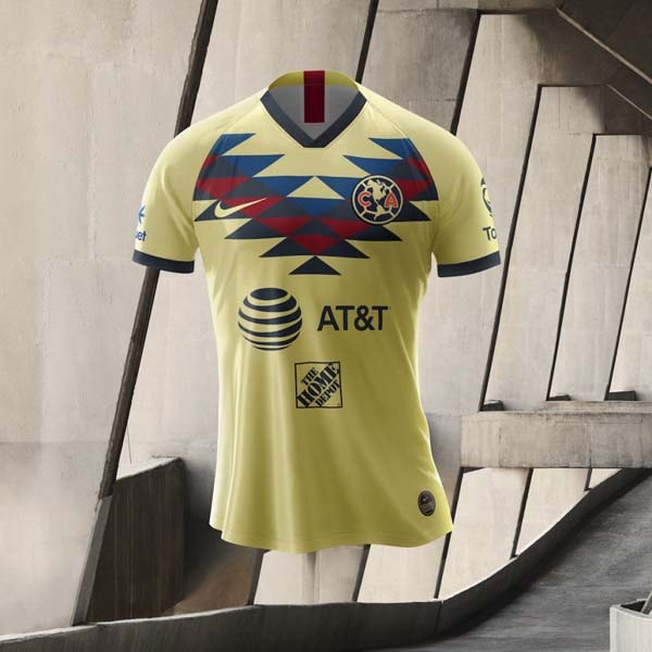
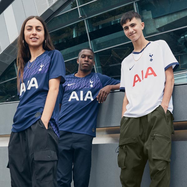
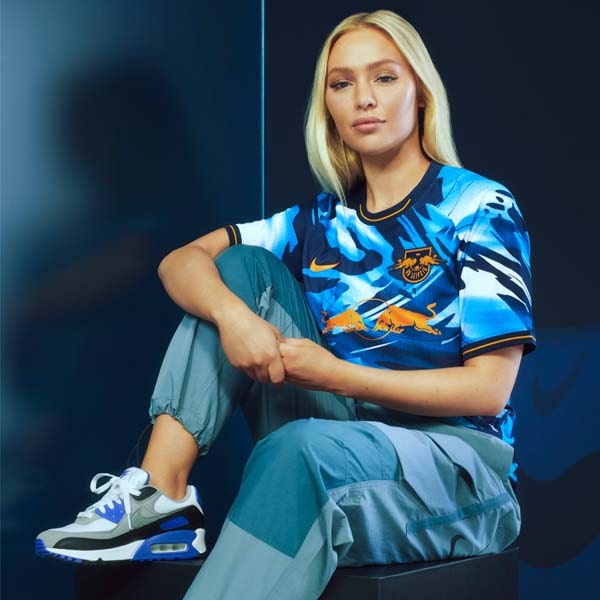
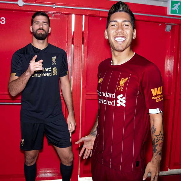
The launch of the Roma 2019/20 third shirt was the final piece in Nike’s throwback third shirt puzzle, completing the most pleasing of retro power-punches for Barcelona, Atletico Madrid, PSG, Inter Milan, Roma, Galatasaray, Chelsea and Tottenham. The designs all feature a number of archive influences, chief among them being the welcome return of the Nike Futura logo as Nike perfectly time their dip into the primed retro market.
Over the last few seasons brands have been looking to the past for inspiration for shirt designs, reinterpreting classics for the modern day, and this season Nike have capitalised on this boom in the retro market, releasing third shirts that draw influence from the 90s for its key teams across Europe. The 90s, as we all know, was a stunning decade for kit design; a time when bold, block colours, oversized shirts, and superfluous collars reigned supreme, and their return today is a most welcome one.
Reserved primarily for European competitions, third shirts have always allowed designers a little more freedom, and with nostalgia levels currently set at an all-time high for the 90s, Nike have looked to that decade for what has to be the simplest, yet most satisfying of tap ins: bring back the Futura logo, some wonderfully exuberant collars that anyone under the age of 20 will have to research to appreciate, add in a link to a past design from the decade and you've got yourself a belter of a shirt. While some designs feature nothing more than a subtle nod to a feature from a shirt from the 90s, others have been surprisingly faithful in their recreation, and here we take a closer look at all the shirts and their inspiration.
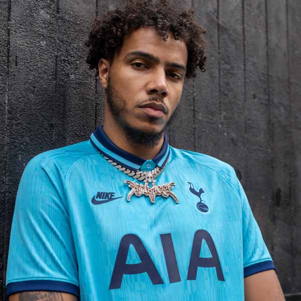
Tottenham Hotspur – The teal colouring of the Tottenham third shirt is a familiar one for fans, having been used several times throughout their history, starting in the early 80s. But the shirt that has influenced the design the most is the 1991-94 away shirt, with its navy collar and allover graphics. The design also influenced Tottenham’s prematch shirts, with the sublimated ‘SPURS’ wording being lifted straight from it.
Chelsea – The Chelsea shirt is a slightly tenuous link that sees pops of orange that hark back to the 1994/96 away kit – the first time orange had been used by the club – although the black base is more reminiscent of the black away colourings favoured in the mid 00s. For the ultimate throwback feels though just stand and admire that collar. Yeah, if you were born after the 90s then you probably hate it. For anyone else, it's the return of a classic.
Inter Milan – With the dark base and bright yellow Pirelli sponsor, the influence of the 1997/98 away shirt on the Inter offering is clear to see. Despite their longstanding relationship, this is the first time that the Pirelli logo actually appears in its original unaltered form, with the red wording on a yellow background, complemented by the yellow pops through the collar, cuffs, branding and club crest.
Barcelona – Adopting a similar "Teal Green" colour scheme to the Barca shirt will bring back fond memories of Brazilian legend Ronaldo's solitary season with the club, in which he famously scored 47 goals on the way to winning two prestigious tournaments in the 96/97 season. Chuck in a similar retro style collar in the club's primary Blaugrana colours, along with some sublimated graphics that pay tribute to the city's history, and you've got yourself a fine looking shirt with some real meaning. Fans should be all over this.
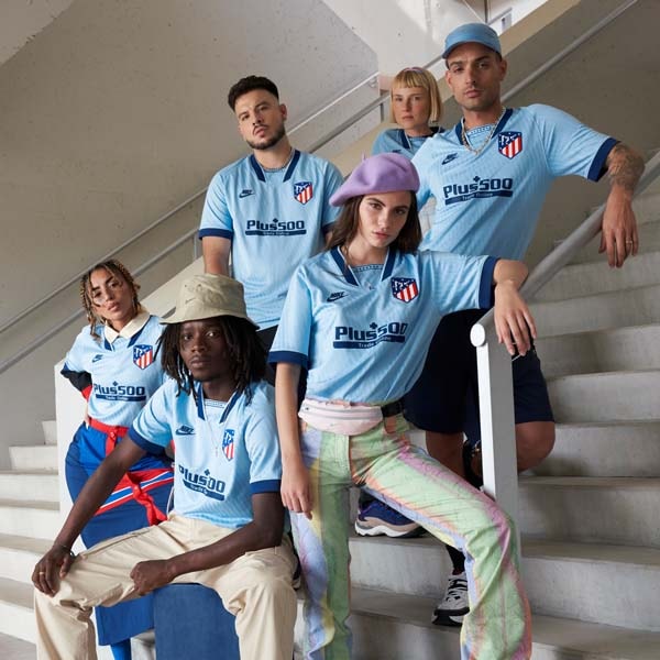
Atletico Madrid – Atletico Madrid’s third shirt taps into the 1990/91 away shirt by going back to a similar light blue colour. This was a season in which the club won the Copa Del Rey and were runners-up in La Liga, sparking a decade of great success for the club, and the shirt is remembered fondly by fans as a result. Another appearance for the stylised collar doesn't go amiss either.
Paris Saint-Germain – One of the most faithful recreations, the PSG third shirt takes a lot from the source material of the 89/90 shirt, with a very similar template that sees the white design topped by a fold over button-down collar. This one’s hit a lot of the right chords, with it even making an appearance at London Fashion Week recently. Expect nothing less from PSG.
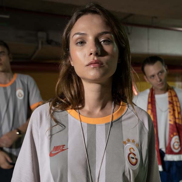
Galatasaray – The Galatasaray design combines the two shirts from the 1999/00 season – a season of unprecedented success for the club – taking the grey colouring of the away shirt and mixing it with the tonal stripes of the home – the first time the club had worn stripes on their home kit.
AS Roma– The AS Roma shirt is another fairly faithful recreation, albeit of a shirt that was only used once, in a 1-0 loss to Monaco in the Champions League in the 1991/92 season. Forced to wear it after their home and away shirts were deemed unsuitable, it was marked as unlucky after the result and was never worn again, although it has taken on something of a cult status with the fans. The 2019/20 version sees a sublimated graphic with deep club ties through the body, with Giallorossi trim covering the throwback collar and cuffs. Definitely a fan favourite.
Pick up all of Nike's 2019/20 third shirts from prodirectsoccer.com


