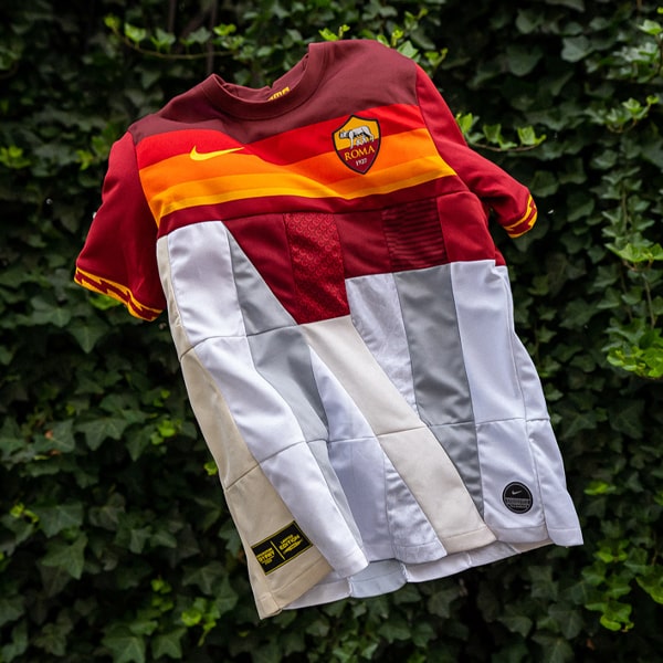
With the recent launch of the Roma 20/21 third option we got out last Nike shirt for the Serie A side – for the time being at least – after it was announced that the pair were going their separate ways. It brings to a close a seven year period of pure sumptuous class, and now we look back on the best that the partnership produced.
Few cities in the world have deeper folklore than Rome. It is rich with gods and warriors, myth and fact, and Nike have not been shy in mining all of this when looking for inspiration. As a result, few teams have looked as good as Roma over the last seven years. Sure they’re fortunate to have one of the best and most instantly recognisable home colour combinations in European football, but that does not instantly make a classic shirt. But over the seven years of partnership, Nike have absolutely nailed the tone, aesthetic and story behind the club’s shirts. And as difficult as it was to whittle down, here are the best of the bunch in our opinion...

10. 14/15 Home
Starting where it all began, and for their first Roma home shirt, Nike produced this clean (some might argue safe) offering. It was a no-nonsense maroon affair, complete with formal collar, and finished off with the pop of colour on the cuffs. There was also a surprise sign off in the form of yellow text hidden underneath the collar that read: “La Roma Non Si Discute Si Ama.”

9. 15/16 Away
At first glance, Roma's away shirt just seemed to be a clean, white affair. But a closer look revealed a tone-on-tone sublimated graphic map, capturing the labyrinth of Rome’s vicoli. The alleyways can be seen connecting to the city’s architectural masterpieces, making a shirt purely dedicated to connecting the club to its citizens, made all the better by not having a sponsor to spoil it. To finish, the piping down the side of the kit ran into the shorts, creating a beautiful aesthetic with the red and yellow ribboning on the cuffs.

7. 20/21 Home
For Nike's final home shirt, inspiration was drawn from a classic. This season marks 40 years since Roma’s victory in the 1980 Coppa Italia, a triumph that marked a successful end to a memorable two-year period for the club where it wore the famous and distinctive gradient kit known affectionately as the ‘ghiacciolo’ (‘ice lolly’) – another beloved creation of the late Piero Gratton, the father of the Lupetto badge. And so the 20/21 shirt proudly displays those horizontal Giallorossi stripes across the chest once more.

6. 16/17 Away
The 16/17 away shirt was stripped back to a marble white base, harking back to the grandeur of ancient Roman columns, and also ensuring that all attention was on the simplified, throwback Lupetto club crest, all in recognition of the club's 90th anniversary. The lack of sponsor once again ensured that it was a case of style winning out.

5. 2019/20 Home
Such a simple tweak to the design, and yet such a striking impact... The lightning bolt on the collar and cuffs, which also featured on the socks, is associated with the Roman ‘God of the Sky’, Jupiter, and it lights up an otherwise classic Giallorossi design. So good and part of a trio of absolutely phenomenal designs for the season.
4. 20/21 Away
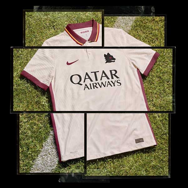
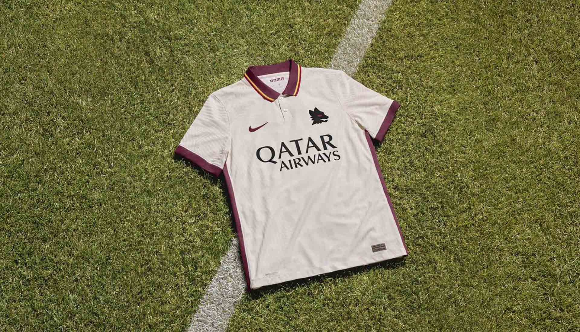
Yet to be worn on the pitch, Nike's last Roma away shirt features a stripped back ivory design, highlighted by that polo collar, which comes in dark red with yellow and red border details, bringing to mind the club’s away shirts from the early 1980s — a golden era for the club. That dark red also features on the sleeve cuffs and down the sides of the shirt, framing the design and placing emphasis on the iconic Lupetto badge.
3. 19/20 Away
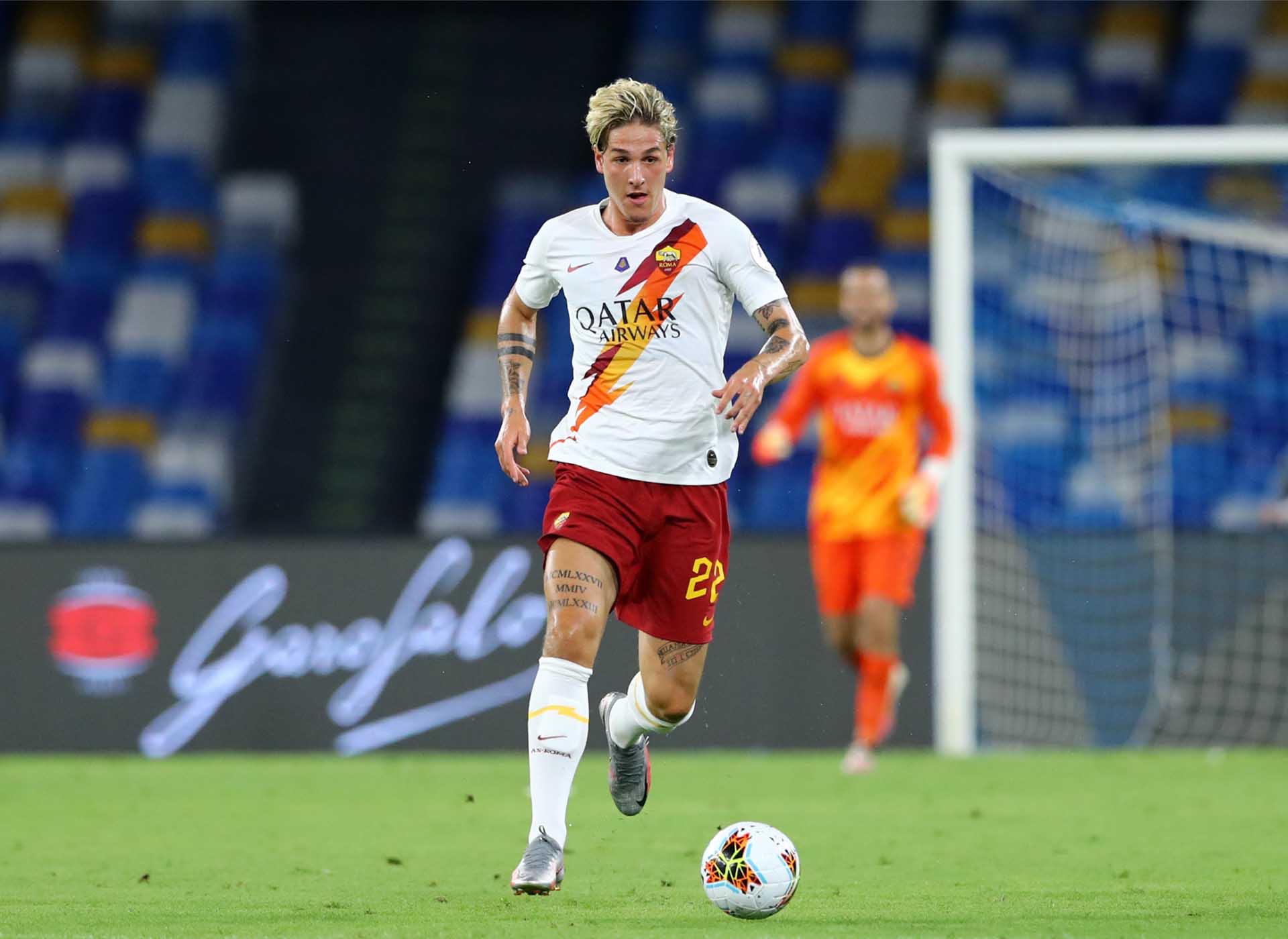
Where the home kept that lightning strike subtle, the away for the 19/20 season just went balls out with it, using it as a sash in the club's colours, reminiscent of the 14/15 away shirt. But the running theme of Jupiter, the Roman god of the sky just capped off the collection. Unreal.

2. 2017 Derby Edition
Special matches call for special shirts, and that was one thing that Nike knew all too well. Created for the Rome 'Derby della Capitale' against Lazio, the first special edition shirt coincided with the club’s 90th anniversary. The traditional dark red base with gold details was designed to evoke the red tunics and bronze armour and helmets the Roman legions wore when they fought to defend the city. For the second leg, the club moved the world’s most famous city slogan, SPQR — Senātus Populusque Rōmānu (The Roman Senate and People) — front and center across the chest, again in gold. Special editions don't get much better.
1. 19/20 Third
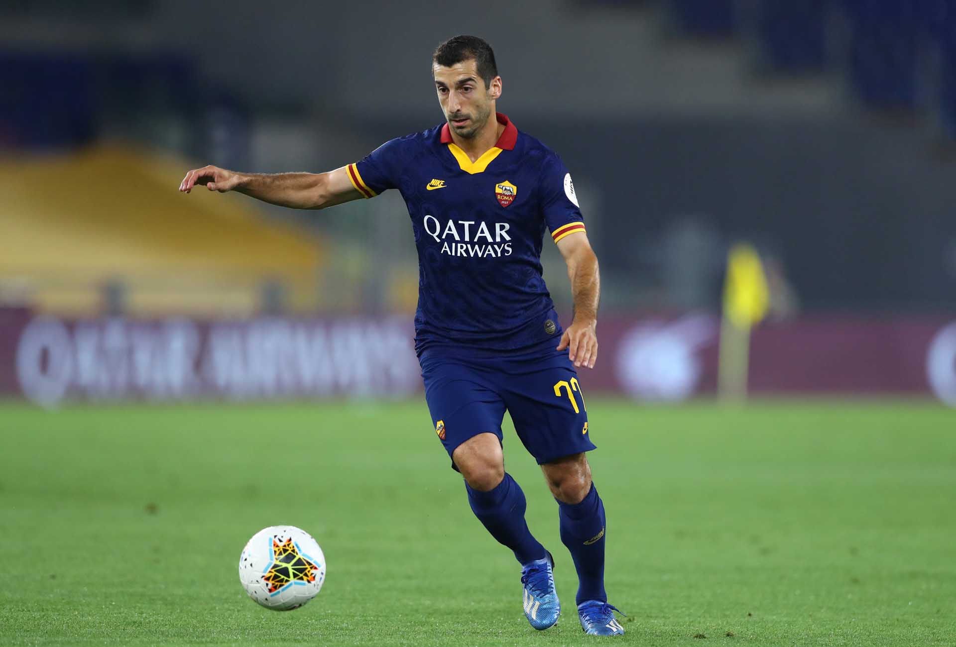
Completing the club’s 2019/20 wardrobe in some serious style, Nike drew inspiration from a rarely-seen Giallorossi club classic from the 90s. Released as part of Nike's throwback-themed third shirt collection for the season, the navy base with an allover jacquard pattern complemented by a vivid Giallorossi trim, which covers the throwback collar and the cuffs of both sleeves, was finished off with the returning Nike Futura logo. Ridiculously good.
So there you go. You may not agree on the order, but sure you'll agree that it has been an era of pure quality.
Shop the Roma 20/21 shirts at prodirectsoccer.com


