With the majority of shirts for the 20/21 season now revealed, we’ve taken it upon ourselves to sort through the lot to come up with our Top 20 designs. Sure it’s going to be controversial, but that’s half the fun, right?
We’ve already announced our Top 20 Premier League shirts of the 20/21 season, and now a few weeks on and with most teams’ offerings unveiled, we’ve cast the net a little wider for our Top 20 Shirts Of The 20/21 Season. Not restricted to any one country or continent, this is what we in the SoccerBible office think are the best club designs from across the globe. That's right, no space for the likes of Nigeria here. And believe us, it wasn’t easy; this could easily have been a top 50. But we had to stop somewhere, so if you’re favourite is not in there, well, tough. Let’s get started, shall we?
20. Galatasaray Home – Providing a contemporary twist on the club’s classic design, the Galatasaray home shirt takes the usual 50-50 split of of the club’s colours and updates it with a blurred effect between the two that runs right down the centre of the shirt, which represents the flame of Galatasaray fans meeting with the team. Strong start.
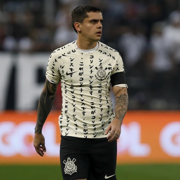
17. Corinthians Away – Clean kit, oversized badges – there's a lot to like with the Corinthians away shirt. The fact that it also pays tribute to the 1990 title winning team on the 30th anniversary of their legendary victory just adds another level of appreciation.
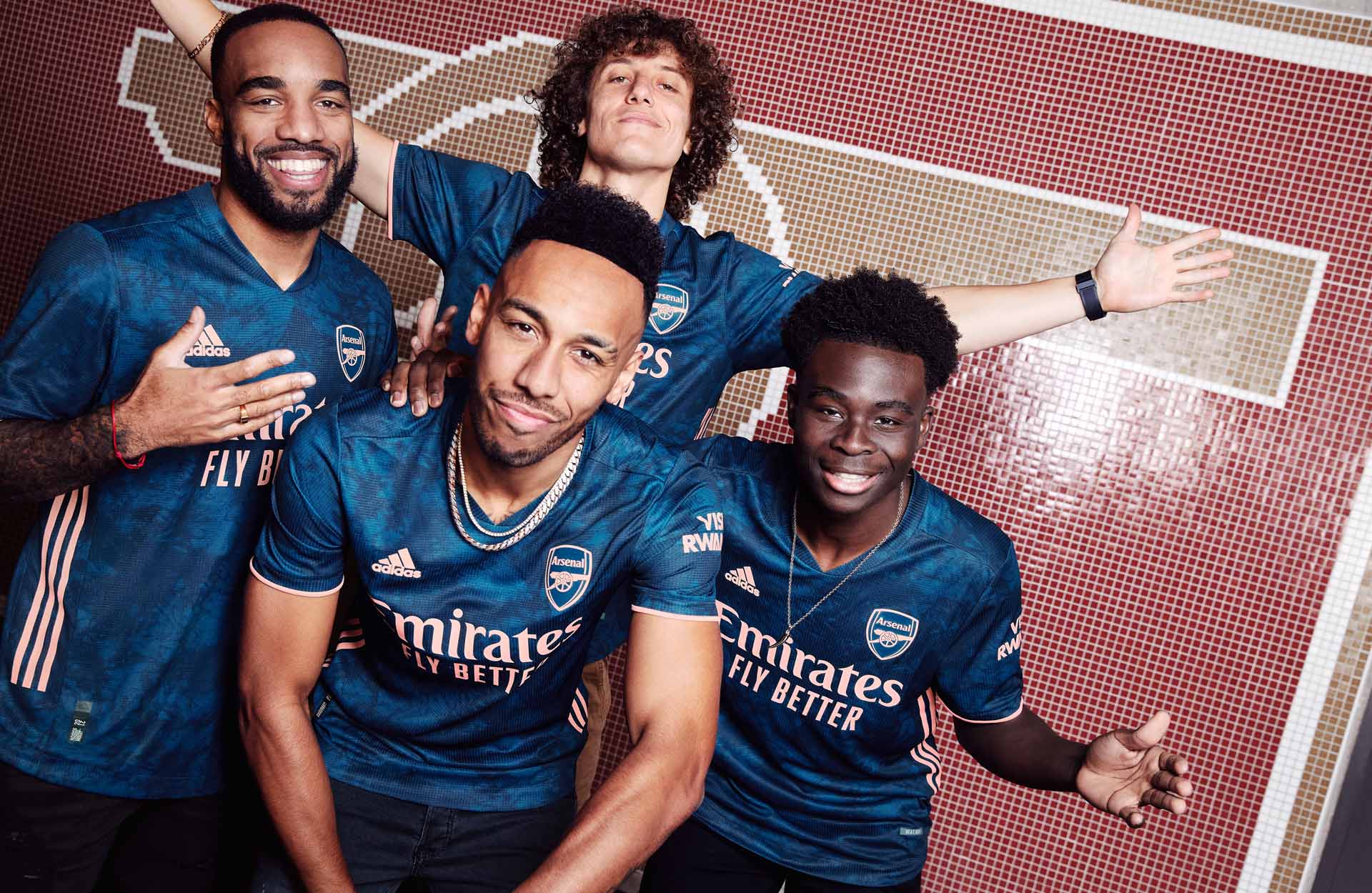
15. Arsenal Third – The design of the Arsenal third shirt saw colours representing the lights and atmosphere that illuminate the Emirates Stadium during a night match, with the blue and navy elements referencing the night sky, and the vibrant lights of the stadium brought to life in the lighter flash orange details. But who really cares about all that when it looks this good?

14. Barcelona Home – The design of the Barca home shirt features a look that's inspired by the 2011 Champions League winning shirt as well as the club's successful 1920s period, while a halftone gradient effect across the red and blue stripes lends it a deep texture. It's another fresh tweak on the classic Catalan aesthetic.
12. Juventus Third – The Juve third shirt brings a bold orange colour to the Bianconeri for the first time in the club’s history in an expression of confidence and vibrance to reflect the team’s spirit on the pitch. Further evidence – if it were ever needed – of the club’s constant progression.

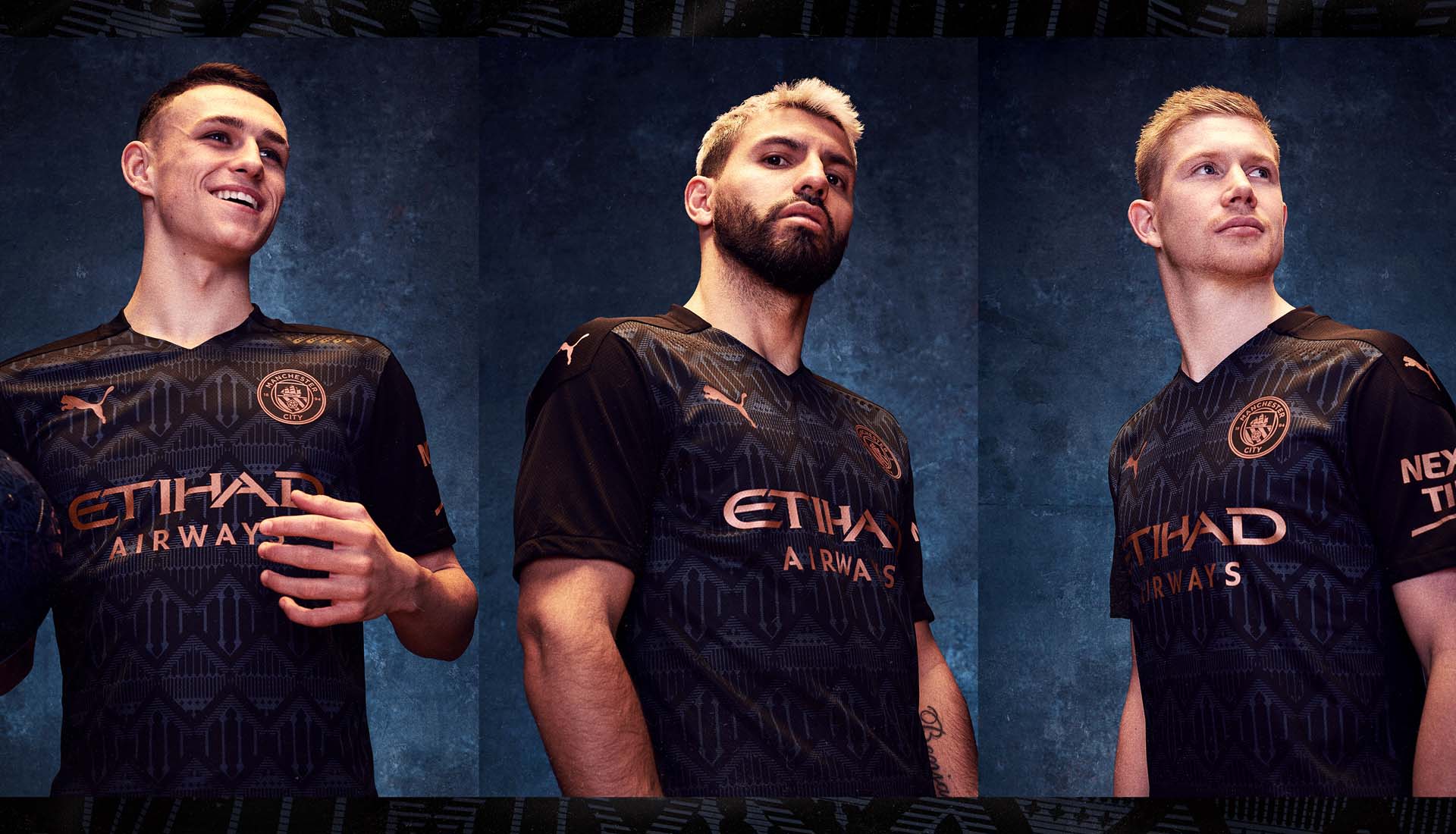
11. Manchester City Third – Proper marmite this one, with fans split right down the middle of either loving it or hating it. But we land firmly in the former camp, with a wild design that epitomises where football shirt culture is right now. Your dad will hate it, but honestly, this is a shirt of art.

10. Paris Saint-Germain Third – Welcome to the top 10, and here's where Leeds United fans can feel hard done by, for there was only room on the list for one Burgundy shirt with gold accents, and were it not for PSG's latest hook-up with Jordan brand, then the Yorkshire club would've been in. As it is though, the self-styled kings of the cross-over are just impossible to ignore.

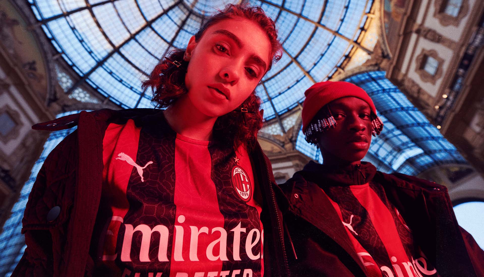
9. AC Milan Home – A sleek design inspired by the elegance and grandeur of the city of Milan, its magnificent structures and its iconic architecture, the Milan home shirt also feels traditional and in line with the club's values. All boxes ticked in the finest style worthy of the fashion houses of the City itself.

8. Inter Milan Home – When you're talking about recreating the traditional home look but at the same time keeping it fresh, you don't get a better example than the Inter home shirt. Inspired by postmodern Milanese designers of the 1980s, it features reimagined Nerazzurri stripes in a pop style, designed in waves and zigzags, alongside a crew neck collar and black side stripes. And yes, it's fine if you want to start supporting Inter now.
7. Valencia Third – Inspired by the works of the Valencian painter Joaquín Sorolla and the light of the Mediterranean, the Valencia third shirt features a soft print in a combination of grey, lavender and sky blue tones. Soft, subtle and a totally different shift to anything else on the list.
6. Red Star FC Away – The shackles are well and truly off, as Red Star joined up with We Are Acid FC to create something that's free of the confines of tradition. It’s in the finer details of this shirt that the majesty is held; the toile de jouy – the famous French fabric pattern style – is used to retrace the club's history, with ten sketches made up of famous players, supporters, Bauer, the Olympic, and future generations. Look deeper and admire this stunning execution...

5. Arsenal Away – We originally had the Gunners' third shirt just ahead of the away when we ranked the 20 best Premier League shirts of the 20/21 season, but we've since had a change of heart, with the unique design of the away just growing on us. Inspired by the patterns, colours, and motifs found amongst the iconic East Stand of Highbury and its prestigious marble halls, this is bloody beautiful.
4. Ajax Away – The design of the Ajax away shirt takes a mix of blue tones with and mixes it with a modern interpretation of the types of graphic patterns that were popular in the eighties and nineties. Disruptive in its execution, this is yet another unique look that stands alone.
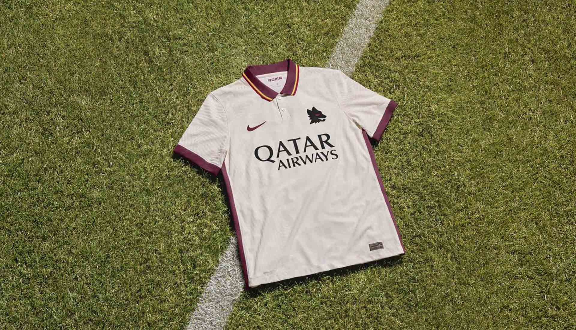
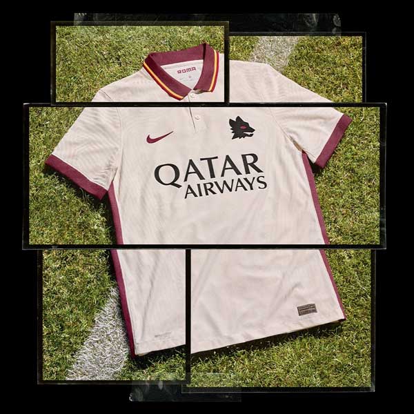
2. Roma Away – Roma and Nike together just don’t do bad shirts, do they? That's why it's all the more sad that this is one of the last ones we'll get from the partnership. But what a way to sign off; the stripped back ivory design of the shirt highlighted by that polo collar, which comes in dark red with yellow and red border details, bringing to mind the club’s away shirts from the early 1980s — Bellissimo!

1. Liverpool Away – Kicking off their new partnership in some style, the Liverpool away shirt instantly announced what Nike were all about. Where New Balance found their groove with their home shirts towards the end of their tenure, they never quite nailed the away and third shirts. But Nike came in with an offering that at once nodded to the tradition of the club, while taking them into unexplored territory in the most radical way.
Honourable mentions for the Real Madrid third shirt, Kaizer Chiefs home, Marseille away and Dortmund home, with the latter only missing out due to the jarring sponsor.
So there you go. Now you can shout at us on social media for how wrong we got it...
