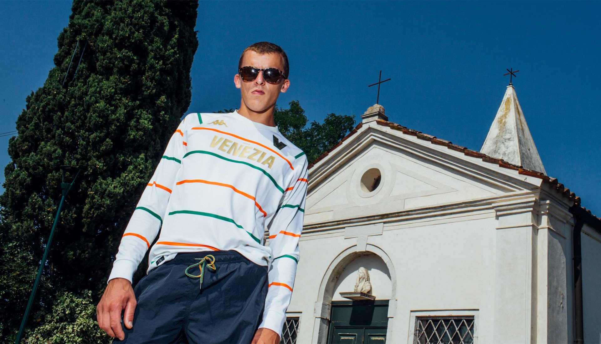
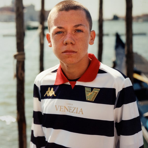
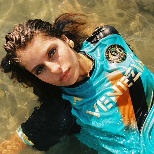
As promised, one week on from the launch of their new home shirt, Venezia drop their highly anticipated away shirt for the 22/23 season, which arrives in contrasting lighter tones to the home option.
After last season’s quadruple hit of shirt goodness there was a lot of anticipation surrounding Venezia’s new kits for 22/23. Following on from a rebrand that modernised the club crest, the Italian side unveiled its new home shirt (the long-sleeved version selling out in just over 24 hours), and now, seven days on, they release their new away shirt.
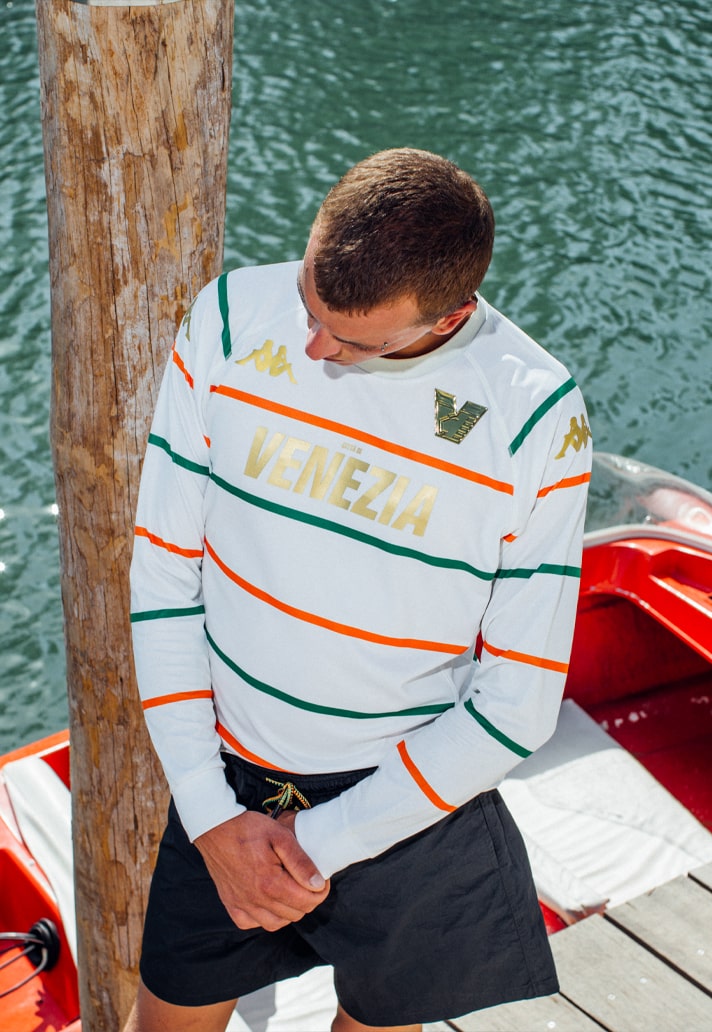
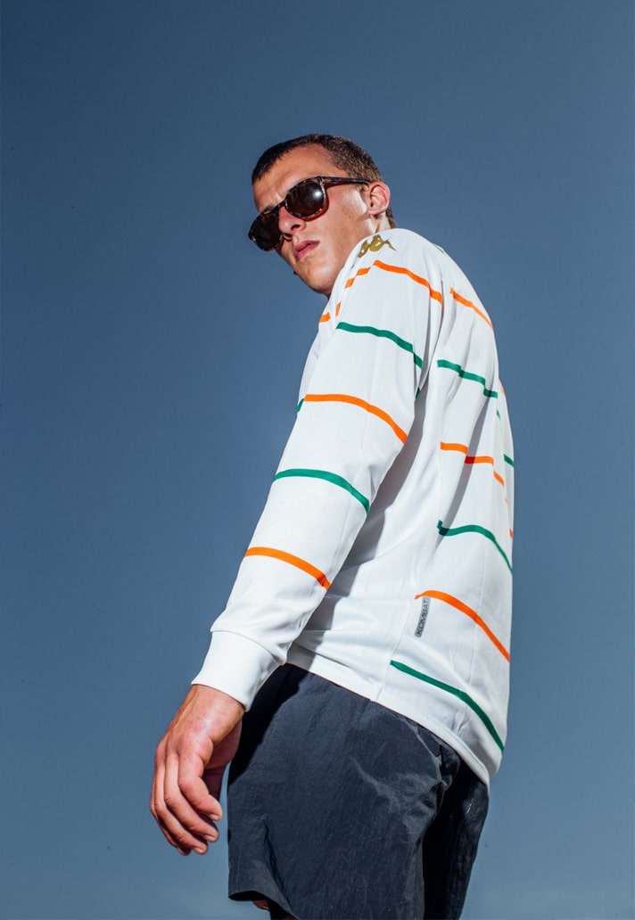
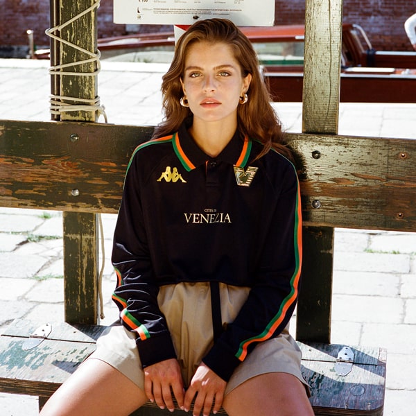
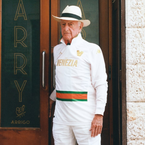
In a similar fashion to last season, the away shirt takes on an opposing look to the home by shifting into lighter tones. Whereas the home shirt, in deep black with subtle orange-and-green taping, has the tone of high fashion, the away shirt, in a light cream with prominent orange-and-green stripes, has a fresh, sportier look. There’s also no traditional collar here – a prominent feature on the home design – instead replaced by a classic crew neck style. However, there is still the option for long sleeves, as there was for the home shirt.
Another notable change is in the font used for the “Città di Venezia city” script, which now appears in a far bolder and more modern typeface. Despite their differences, the shirts — both designed by the acclaimed studio Bureau Borsche — are complementary and still share a connecting thread, both in terms of their minimalist approach and the fact that the orange-and-green lines that run through both the home shirt and the away shirt are precisely equal 10 mm lines. A small detail, but a nice element that gives a feeling of shared DNA.
The Venezia 22/23 away shirt — in both long-sleeved and short-sleeved versions — is available now at shop.veneziafc.it
