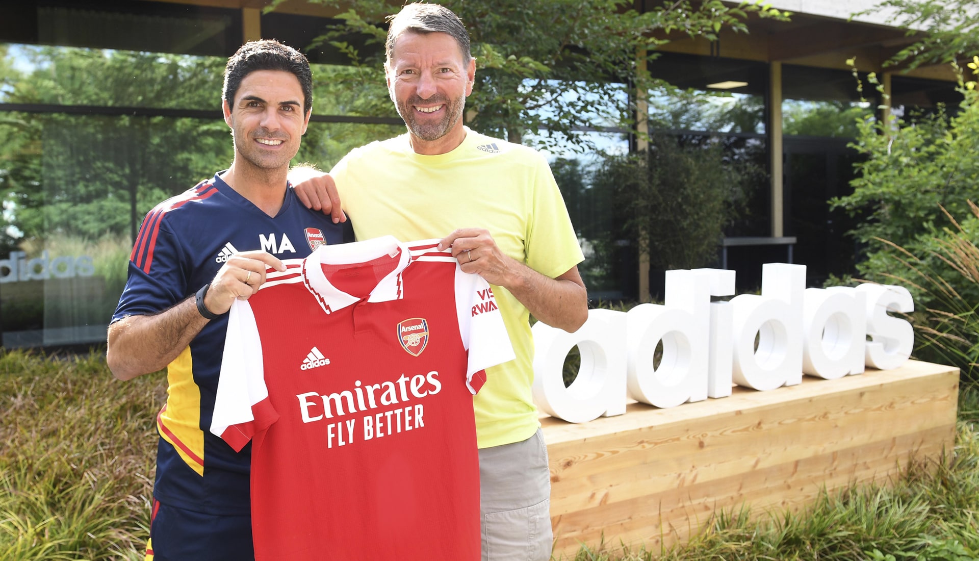
Since the partnership recommenced in 2019, adidas and Arsenal have hit some of the highest highs with their kits, and so it’s a pleasure to hear that an extension between the pair has been agreed and announced, taking them up to 2030.
Few teams in world football can boast a kit repertoire as strong as what Adidas has provided Arsenal with over the last few years, the sheer level of consistency could only be matched by a few (we’ll give you Ajax straight away, but, again, adidas). The progressive partnership has struck the perfect balance between nostalgic call backs from the archive, bringing back some of the club’s most iconic looks from the Three Stripes’ first stint with the Gunners, which spanned from 1986-94, and contemporary classics that have been infused with the very essence of the club itself. And so it will be music to most Arsenal fans’ ears that the an extension to the existing deal has been announced, taking it to 2030.
With that news, it’s the perfect time to look back on the latest partnership too far, in which they’ve broken new ground with compelling purpose-led campaigns and product ranges rooted in London’s culture which continue to inspire and engage the club’s supporters around the world.
A Strong Start
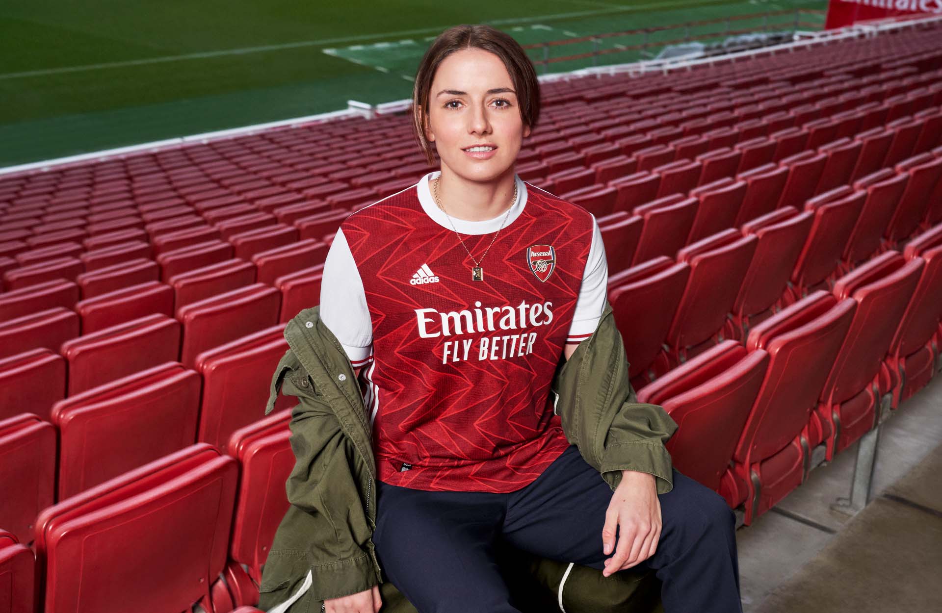
Right from the off, after a 25 years apart, adidas nailed Arsenal’s 19/20 home kit, with a design that paid homage to the past, with a distinctively modern twist.
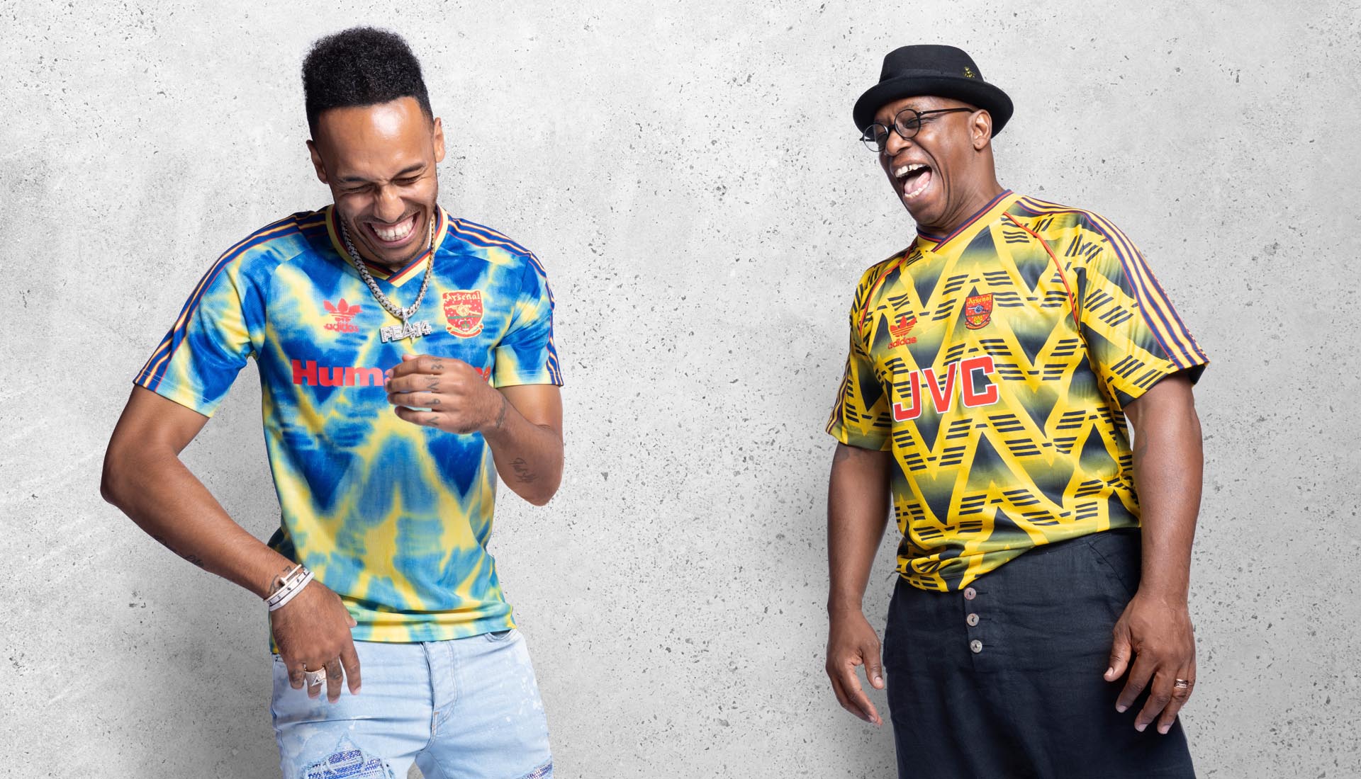
That home shirt was accompanied by an absolute blast from the past, with a contemporary return for the iconic “Bruised Banana” design for the 19/20 away shirt. A minimal, shaded zig-zag pattern adorned the famous bright yellow, bringing the past into the present.
And the set was completed with the elegant dark navy third shirt. The rich colour was complemented with yellow detailing along the sleeves and club crest, and rounded off with fitted sleeve cuffs and a crew neckline with a yellow and black trim running around the back of the neck.
Retro Revival
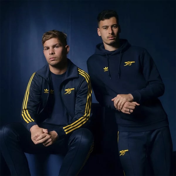
Leaning into the strength of their archive, adidas then rode the crest of the nostalgia wave that the returning ‘Bruised Banana’ brought, answering the demand in the most satisfying of throwback fashions by offering up a retro-inspired apparel collection under the Originals header. Not a bad way to celebrate a first season back, and a trend that would continue for the following two seasons.
Second Season Styling
Emphatically answering the age old question of how do you follow up what was practically perfection, adidas switched attention from the archives to the history of the club. The 20/21 home shirt arrived with a design that paid homage to the geometric crest that the club used from 1936 – 1949. The chevron graphic within was inspired by the “A” of said crest, while it was also a nod to the layout of the tiling on the floors of the East Stand’s famous marble halls – the historical home of Arsenal before its 2006 move to the Emirates Stadium.
Speaking of which, the wild design of the 20/21 away shirt took inspiration from Highbury’s iconic marble halls for what was a beautifully bespoke look that virtually bled red.
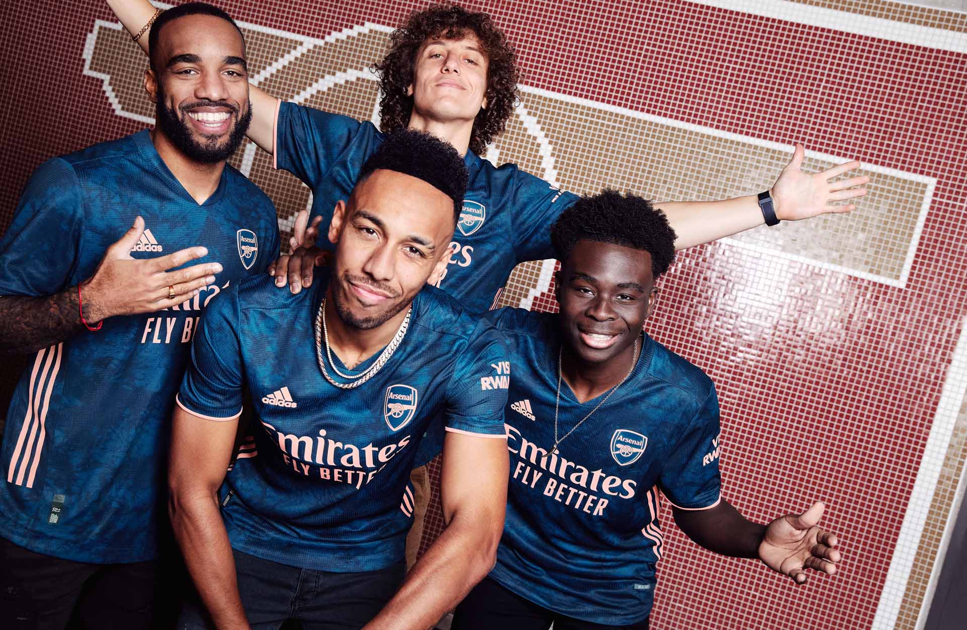
The third shirt was then the finishing flourish that placed Arsenal’s second season wardrobe from adidas on a par with their outstanding first. The design was created from a custom set of tie dye prints which infused together to produce a subtle all-over design, complemented with bright pink trims.

A Human Connection
Adidas and Humanrace unveiled their collaborative football jerseys in October 2020, and taking their place in the Three Stripe line up was Arsenal, with a vibrant offering typical of the wider collection. Each of the co-created jerseys – designed together with Humanrace Creative Director and long-term adidas collaborator Pharrell Williams – were informed by each club’s past, with their legacies serving as the foundations of the design process.
For the Arsenal shirt, Pharrell explored the adidas archives to select one of the most recognised kits from the London club’s history, once again opting for the ‘bruised banana’ jersey from the 1991-93 seasons, giving it a hand painted, paint-bleed effect update.
A Change of Formation
Then came a switch up that few would have seen coming, with former formal wear partners and US-based streetwear brand 424 stepping up their relationship with both brand and club to put their spin on a range of apparel that combined streetwear with adidas’ performance product, continuing to blur the lines between fashion and sport.
In Their Stride
By the third season, adidas were comfortably in their groove with Arsenal, and it wasn’t set to slip. Kicking off with a vibrant 21/22 away shirt first, which took inspiration from the 1971 double winning team and saw the return of a stripped back version of the club’s crest, in position in place of the traditional crest for the first time since the 1988/1990 kits, the balance between retro and progressive was once again struck to perfection.
The 21/22 home shirt saw a departure from inspirations from yesteryear, instead, it simply arrived with a clean design in the classic Gunners’ mould. The only change up saw collegiate navy branding on the shoulders alongside the traditional red and white look. Unmistakably Arsenal.
Then came the third shirt. Quite possibly saving their best for last, the third shirt landed with a design that took inspiration from the iconic lightning strike look from the 95/96 season. The design from the 95/96 season was revamped, with the lightning bolt being replicated across the whole shirt in the same colour scheme as the original. Striking just doesn’t do it justice.
No More Red
This season also saw one of the most visually striking campaigns to date, when adidas and Arsenal announced ‘No More Red’, a powerful joint initiative that addressed knife crime. The campaign launched with Arsenal wearing a one-off all white kit, removing the Arsenal red against Nottingham Forest in the Emirates FA Cup Third Round.
Ahead of the Game
Adidas’s endeavours with Arsenal weren’t just restricted to match attire either, with increasing exploration of the prematch wardrobe leading to a collaborative collection with Transport for London, and, later that season with Stella McCartney. The latter was part of a wider set from the British designer, representing her first steps into the club scene, for which she produced a limited edition 10-piece collection, designed to support Arsenal Women both on and off the pitch.
Still Strong
And so we’re into the current season, for which Arsenal have once again got one of the best sets going. The 22/23 home shirt saw the return of a collar for the first time since the 17/18 shirt – and that also made it the first-ever adidas-produced Arsenal shirt to feature one – and what a collar! Building off the 21/22 third shirt it featured the simple inclusion of a lightning bolt wrapping around its edge, crowning yet another brilliant home look.
The away combined a bronze cannon badge and bronze metallic trims with shades of black and carbon that showcase an AFC all-over graphic inspired by the Arsenal lettering that fans pass on their way to Emirates Stadium on matchdays, bringing an air of familiarity when the club are on the road.
Then finally, completing their set and going pink for the first time ever, this season’s third shirt saw a return of the iconic Ermine pattern, first seen on the club’s crest in the late 1940s.
Plenty more to come...
Shop all Arsenal replica at prodirectsoccer.com
